
Logo Design Services by Industry
Instead of forcing one look across every sector, we consider your industry, competitors, customers, practical uses, and brand direction to create a logo that feels relevant, distinctive, readable, and ready for real-world use.
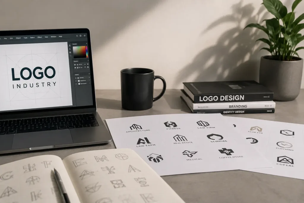
Why Your Business Sector Matters in Logo Design
A strong logo needs to communicate more than visual appeal. It should make sense for the business using it and communicate the right impression to the people that business wants to reach.
The right structure also matters. Depending on the brand, you may prefer a wordmark, monogram, emblem, mascot, abstract mark, or another approach. You can explore our logo design types to understand which format may suit your business best.
A law firm and a gaming company may both need memorable branding, but they usually need very different visual approaches. The same applies to a luxury jewelry brand compared with a local plumbing company. Typography, colors, symbols, spacing, detail, and overall tone should support the character of the business rather than follow a generic design formula.
Understanding the market also helps avoid misleading choices. A highly playful identity may feel wrong for a medical practice, while an extremely formal mark could make a casual bakery or entertainment brand feel distant.
Industry context gives the design a useful starting point without limiting creativity.
Property, Construction & Home Services
Property-focused brands often need to communicate stability, professionalism, and trust. Real estate branding should remain clear across listings, property signs, websites, and marketing materials, while construction branding often requires stronger forms and practical visibility. An architecture logo may take a more refined approach through structural shapes, precise typography, or carefully controlled geometry.
Visual balance becomes particularly important for businesses connected to homes and commercial spaces. Interior design branding can use elegant typography, thoughtful spacing, or understated symbols to reflect creativity and attention to detail. In comparison, a cleaning company identity should feel dependable, approachable, and easy to recognize on uniforms, vehicles, websites, and service materials.
Outdoor and technical service businesses have their own branding requirements. Landscaping brand identity may draw from natural forms without depending entirely on predictable leaves or trees. A plumbing company logo usually benefits from a straightforward identity that stays readable on vans, workwear, invoices, digital listings, and local advertising.
Food, Drink & Hospitality
Food businesses need branding that supports the experience they offer. Restaurant branding may reflect a particular cuisine, atmosphere, service style, or price position, while a broader food brand identity must often work across packaging, labels, delivery platforms, social media, and retail displays. Both require clear typography and an identity customers can recognize quickly.
Smaller specialty businesses can use more warmth and personality while remaining professional. Bakery branding may communicate craftsmanship, freshness, or tradition through carefully chosen lettering and visual details. A coffee shop and cafe identity can feel relaxed, contemporary, energetic, or artisanal depending on the location, audience, and customer experience.
Hospitality branding needs to create the right expectation before a guest arrives. Hotel branding can express comfort, heritage, modern simplicity, or premium service while remaining flexible enough for signage, booking platforms, room materials, staff uniforms, websites, and printed communication.
Fashion, Beauty & Personal Care
Presentation plays a major role in fashion and personal-care branding. Fashion and clothing branding needs enough flexibility for garment labels, packaging, websites, social media, and retail displays. A jewelry identity may use refined typography, distinctive letterforms, or elegant symbols to communicate quality without relying on common crowns and diamond icons.
Beauty-focused businesses often need an identity that feels polished while matching their specific audience. Beauty branding can range from expressive and colorful to restrained and premium. A hair salon identity should reflect the salon’s atmosphere, customer expectations, price position, and services rather than using the same scissors or hairstyle imagery seen across the market.
Personal-care services should feel recognizable without becoming visually predictable. Barber branding may use confident typography, heritage influences, or a clean modern structure depending on the shop. Spa branding often requires a calmer visual direction that works across signage, treatment menus, product packaging, robes, social profiles, and booking platforms.
Healthcare, Legal & Education Services
Trust and clarity are especially important for organizations providing professional care. Healthcare branding should feel credible and approachable without suggesting treatments or services the organization does not provide. Dental branding also needs a clean, reassuring identity, but it does not always require a literal tooth symbol to communicate its purpose.
Other professional fields require branding that supports authority without appearing distant. Law firm branding often benefits from confident typography, balanced proportions, and restrained visual details. An education and school identity may need a more welcoming or established character depending on the students, age group, teaching approach, and community it serves.
Technology, Creative & Entertainment
Digital and entertainment brands usually have more freedom to explore distinctive visual ideas. Technology branding should feel current without blending into the large number of generic circuit, node, and gradient symbols. A gaming identity can use greater energy and personality, but its silhouette and lettering still need to remain recognizable on screens, profiles, merchandise, and streaming platforms.
Creative professionals often need the brand name and visual work to support each other. Photography branding should remain subtle enough to complement photographs rather than compete with them. DJ branding can use expressive lettering, initials, rhythm-inspired forms, or a compact symbol suited to event graphics, social media, equipment, videos, and promotional material.
Fitness, Sports, Travel & Transportation
Active brands often need an identity with energy, movement, and strong visibility. Fitness and gym branding should reflect the personality of the facility, trainer, or wellness brand without automatically using weights or muscular figures. A sports identity may require greater visual impact, particularly when the identity appears on uniforms, merchandise, equipment, team graphics, or event materials.
Businesses connected to movement also need practical branding across different environments. A travel logo should represent the type of experience being offered instead of relying automatically on airplanes and globes. Trucking brand identity requires clear lettering and a recognizable structure that remains effective on vehicles, workwear, paperwork, websites, and roadside advertising.
A Strong Logo Does Not Need Obvious Industry Symbols
Using a familiar industry symbol can sometimes help people understand a business quickly, but it is not the only approach.
Real estate companies do not always need rooftops. Restaurants do not always need forks. Dental practices do not always need teeth. Technology businesses do not always need circuit patterns.
When too many companies use the same visual idea, the category can start to look repetitive.
A more distinctive solution may come from the company name, initials, brand story, service approach, architecture, location, customer experience, or an abstract concept connected to the business.
The goal is not to hide what you do. It is to find the right balance between relevance and originality.
Choosing the Right Visual Direction
There is no single logo style that works for every company within the same sector.
A boutique hotel and a budget-friendly family hotel are both hospitality businesses, but their visual identities may need completely different personalities. The same difference can exist between a luxury salon and a cheerful neighborhood salon, or between an established law practice and a modern legal technology company.
Before deciding on a direction, consider how you want customers to describe your brand. Words such as trustworthy, energetic, premium, friendly, technical, natural, bold, refined, traditional, or modern can help establish a clearer visual path. You can also explore different logo design styles to see how approaches such as minimalist, modern, vintage, geometric, or illustrative design can shape the overall personality of a logo.
Your existing brand materials also matter. If the business already uses specific colors, typography, packaging, interiors, or website styling, the logo should work naturally within that wider identity.
What Makes an Industry-Specific Logo Practical?
A logo must survive outside the design presentation.
It may appear in a website header, social profile, email signature, storefront, product label, vehicle graphic, uniform, business card, advertisement, app interface, invoice, or printed document. Some businesses will use almost all of these applications, while others may rely mainly on digital platforms.
This affects how much detail the design can reasonably contain.
Fine lines, tiny lettering, complicated illustrations, and subtle effects may look attractive when enlarged but lose clarity at smaller sizes. On the other hand, making every logo extremely simple can remove useful character.
A practical identity balances personality with reproduction, readability, and scalability.
You can also explore our logo design portfolio to see how different visual directions can work across a range of brands and business sectors.
Color Should Support the Brand, Not Follow a Rulebook
Certain colors appear frequently in particular markets, but that does not mean every company in those markets should use them.
Blue is common in professional and technology branding because it can create a calm, structured appearance, but using blue does not automatically create trust. Green can feel natural or fresh, yet it is not required for landscaping, wellness, or environmentally focused businesses.
Color decisions should consider your audience, positioning, competitors, existing brand assets, and where the logo will appear.
A strong concept should also remain understandable when color is limited. This is useful for stamps, engraving, embroidery, documents, monochrome printing, and other situations where the full palette may not be available.
Typography Can Change the Entire Personality
The company name is often one of the most important parts of a logo, so typography deserves the same attention as the symbol.
A serif typeface can feel established, editorial, classic, or luxurious depending on how it is used. Sans serif lettering can appear modern, minimal, friendly, technical, or bold. Script and handwritten styles can add personality but may become difficult to read when they are overly detailed.
Spacing, letter proportions, capitalization, line breaks, and the relationship between the icon and wordmark all affect the final result.
The right choice is the one that supports the brand rather than simply following a current design trend.
Before Ordering Your Logo
You do not need to know exactly what your finished logo should look like before starting, but clear information about the business makes the design direction stronger.
It helps to identify your company name, industry, main services or products, target customers, preferred brand personality, and where the logo will be used most often.
If certain icons, colors, styles, or visual clichés do not suit the company, mentioning them early can keep the concept focused.
References can be useful for communicating taste, but they should guide the direction rather than become designs to copy. An original identity should belong to your business.
Once you have a clear idea of what your business needs, you can review our logo design pricing to compare the available options before starting your project.
Building an Identity That Can Grow With the Business
A new logo should solve today’s branding needs without becoming unnecessarily restrictive.
Businesses may add services, open new locations, introduce products, update packaging, change advertising channels, or expand their digital presence. A logo that depends too heavily on one specific product or narrow visual idea may become less useful as the company develops.
That does not mean every identity needs to be completely abstract. It means the concept should represent the brand at an appropriate level.
LogoPixa focuses on creating visual identities that are clear, original, memorable, and practical while still respecting the individual character of the business.
If you would like to know more about our approach and what we focus on when developing brand identities, you can learn more about LogoPixa.
Frequently Asked Questions
Should my logo clearly show what my business does?
Not necessarily. A recognizable industry symbol can improve immediate understanding, but it can also make the identity look similar to competitors. The best approach depends on your name, audience, positioning, and how much explanation your brand needs.
Do businesses in the same industry need similar colors?
No. Industry conventions can provide useful context, but they are not strict rules. Your color palette should support your individual brand personality and work well in the places where the identity will appear.
Is a symbol required in a business logo?
No. Some brands are better served by a strong wordmark, lettermark, or monogram. Others benefit from an icon combined with the company name. The structure should be chosen according to the brand rather than added simply because competitors use one.
Should I follow current logo design trends?
Trends can provide inspiration, but building an identity entirely around a temporary visual trend can make it age quickly. A stronger approach is to use contemporary design principles while keeping the core concept appropriate to the business.
Can a detailed logo work for every application?
Usually not. Detailed artwork may lose clarity when reduced for profile images, small labels, embroidery, or mobile interfaces. If detail is important to the brand, the composition should still remain readable and recognizable at practical sizes.
What information should I provide before logo design starts?
Useful information includes your business name, sector, products or services, target customers, preferred personality, color preferences, intended uses, and anything you specifically want included or avoided. The clearer the brand direction is, the easier it becomes to develop a relevant concept.
How do I know which logo direction suits my business?
Consider how you want customers to perceive the company and where they will encounter the brand. A professional service may prioritize credibility and clarity, while an entertainment business may have more room for expressive typography or energetic graphics. The right direction should fit both the audience and the business itself.
Should my new logo look similar to competitors?
It can make sense to understand visual conventions within your market, but copying the same symbols, colors, or layouts can weaken distinction. Competitor research is more useful for identifying what is common so your identity can remain relevant without becoming interchangeable.