
Architecture Logo Design
LogoPixa creates distinctive visual identities for architects, studios, and design-led firms with careful attention to proportion, typography, and usability. Explore the portfolio to see different ways architectural ideas can become memorable brand marks in competitive professional markets today.
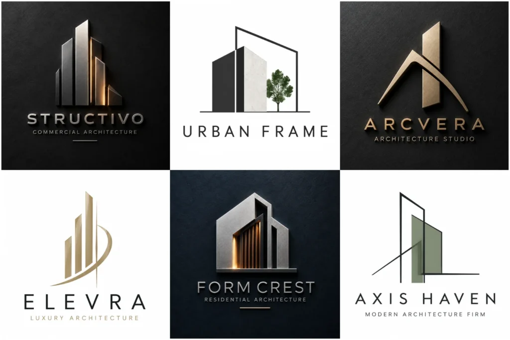
Explore Our Architecture Logo Portfolio
Explore a varied selection of architectural identity concepts created with different visual approaches, from restrained geometric marks to refined typography and line-based symbols. The portfolio focuses on original ideas, balanced construction, professional execution, and practical use across real branding situations.
Some concepts are created to demonstrate creative directions rather than represent paid client work, giving you a broader view of what can be achieved for different types of architecture businesses.
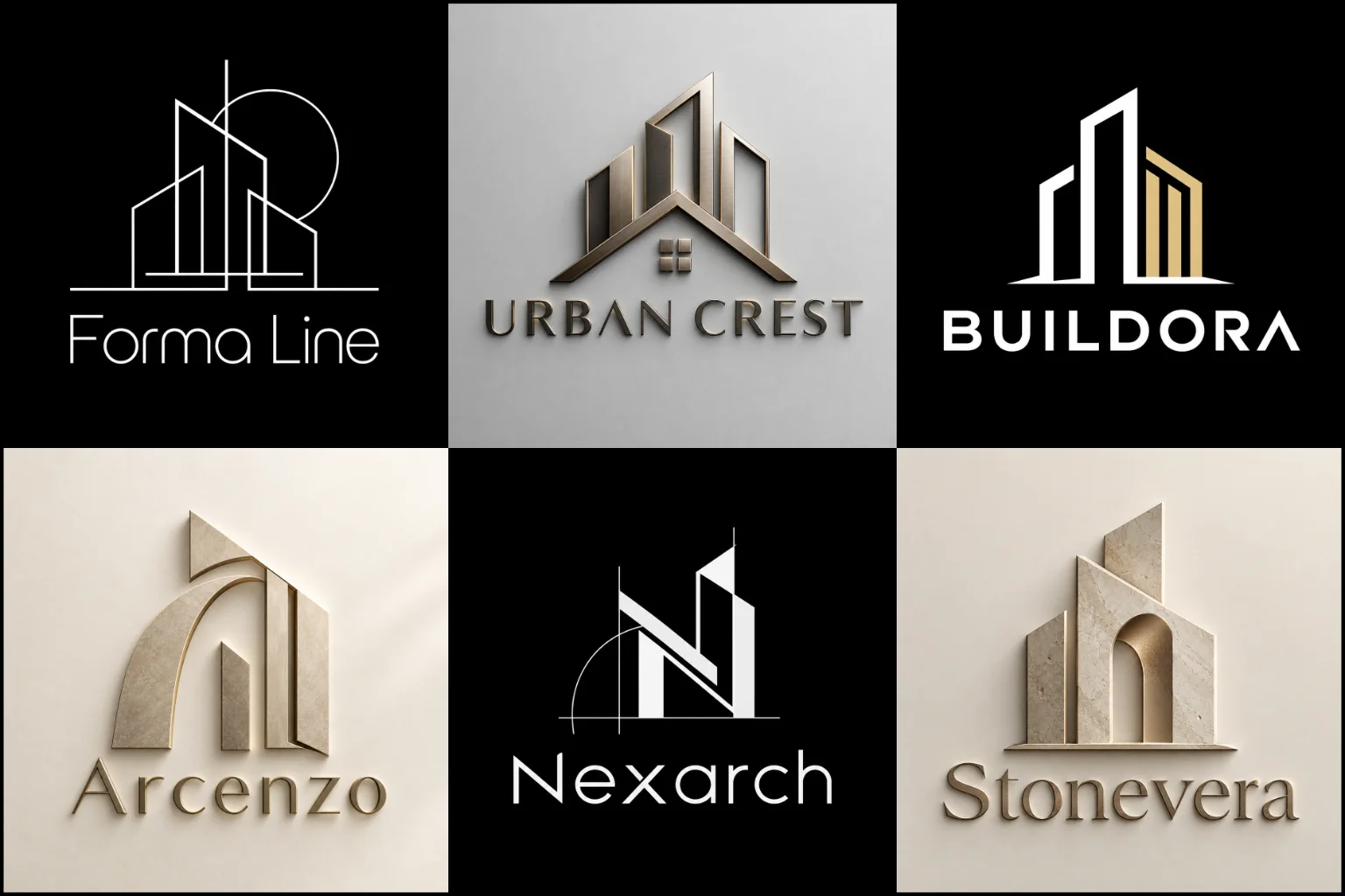
What Should an Architectural Brand Communicate?
Architecture is built around planning, proportion, structure, space, and purposeful decisions. A visual identity can reflect these qualities without literally drawing a house, roof, column, or skyline.
The right direction depends on the type of practice and the impression it wants to create. A contemporary residential studio may need something restrained and approachable, while a commercial architecture firm may prefer a more established and structured appearance. Interior architecture, urban planning, landscape architecture, sustainable design, and multidisciplinary studios can each require a different visual tone.
The logo should also support the firm’s positioning. Precision, creativity, technical expertise, innovation, sustainability, elegance, heritage, and simplicity can all influence the visual language, but trying to communicate every quality in one symbol often creates unnecessary complexity.
Structure and Geometry Can Create a Strong Foundation
Architectural branding has a natural connection with grids, angles, symmetry, modular forms, negative space, and controlled proportions. These elements can create a sense of order without making the identity feel mechanical.
A structured logo design can work particularly well when the practice wants a modern, precise, or design-led personality. Simple geometric relationships may reference space, perspective, construction, initials, or architectural forms without turning the logo into a detailed illustration.
Geometry still needs originality. Generic cubes, rooftops, floor-plan shapes, and building silhouettes are widely used throughout property and construction-related branding. Custom proportions, unexpected negative space, distinctive letter construction, or a concept connected to the firm’s name can help create a more individual result.
Line Work for a Refined Architectural Identity
Controlled outlines can connect naturally with architectural drawings, plans, elevations, and sketch-based thinking.
A clean line-based logo may suit studios that want a light, contemporary, or sophisticated identity. Lines can form abstract spaces, simplified structures, initials, frames, or continuous shapes while keeping the composition visually restrained.
There is an important limitation to consider. Extremely thin strokes and tightly spaced details can become difficult to reproduce when a logo is reduced, printed, engraved, embroidered, or displayed on smaller screens. A refined appearance should not come at the cost of practical visibility.
Good line work therefore depends on more than elegance. Stroke weight, spacing, silhouette, and negative space all need enough strength to survive real-world use.
Creating Meaning Without Drawing a Building
A strong architecture identity does not need to show exactly what the company does.
A conceptual logo mark can express ideas such as space, balance, connection, transformation, perspective, movement, or structural harmony through non-literal forms. This approach can be valuable for studios that want to separate themselves from familiar industry symbols.
The concept should still have a clear design logic. An abstract shape that looks interesting but has no relationship to the brand can quickly feel arbitrary.
Useful inspiration may come from the company name, initials, design philosophy, location, architectural approach, specialty, or a meaningful relationship between several ideas. The aim is not to make the viewer solve a puzzle. It is to create a distinctive visual form with enough meaning to support the identity.
Combining a Symbol With the Practice Name
Architecture businesses often need their full name to remain visible, especially while establishing recognition.
An icon with wordmark design can provide that balance by pairing a recognizable symbol with clear typography. The complete arrangement can appear on a website, proposal cover, office sign, or presentation, while the symbol may be useful in smaller applications where space is limited.
The relationship between the two parts matters. A large icon beside small lettering can make the company name feel secondary, while an oversized wordmark may weaken the symbol. Spacing, alignment, scale, and visual weight should make both elements feel like one identity rather than two unrelated pieces.
Not every firm requires a separate icon. A distinctive typographic identity may be enough when the company name itself offers a strong branding opportunity.
Typography Should Feel as Considered as the Architecture
Lettering can completely change how an architectural practice is perceived.
Clean sans-serif typography can support a contemporary or minimalist direction. Refined serif lettering may create a more established, editorial, or premium character. Condensed type can feel structured and efficient, while wider letter spacing may give the name more breathing room and visual calm.
The typeface itself is only the beginning. Letter spacing, weight, capitalization, alignment, custom modifications, and the relationship between different words all affect the finished result.
A long studio name may require a very different composition from a short one-word brand. Initials can also become useful when they are naturally recognizable and do not create confusing letterforms.
Readability should remain a priority. Architectural branding can be highly creative without making prospective clients struggle to identify the company name.
Choosing Colors That Support the Practice
Many architecture brands use neutral or restrained palettes because they pair naturally with drawings, photography, materials, and professional documents. Black, white, charcoal, grey, earthy neutrals, deep blue, and muted tones can all work effectively depending on the desired personality.
That does not mean architectural identities must look monochrome.
A carefully chosen accent color can make a studio feel more progressive, energetic, sustainable, approachable, or distinctive. The right choice depends on the company’s positioning rather than an industry rule.
It is also useful to evaluate the identity without color. A strong core mark should remain understandable when reproduced in black, white, or a single color. This becomes important for technical documents, stamps, signage, construction boards, engraving, and other restricted applications.
Designing for Proposals, Signage, Digital Use, and More
Architectural firms often use their identity across very different environments. A logo may appear on a large site board one day and in the corner of a digital presentation the next.
It should remain clear on websites, social profiles, business stationery, proposal documents, portfolios, drawing sheets, email signatures, office graphics, uniforms, vehicle branding, signage, and presentation materials where relevant.
Complex architectural illustrations may look impressive at a large scale but lose clarity when reduced. Very horizontal designs can be difficult to use in square profile images, while highly vertical marks may create awkward website headers.
This is why scalability and flexible composition matter. The visual system should be designed around actual brand use rather than only how impressive a logo looks on a mockup.
Avoiding Common Architecture Logo Clichés
Roofs, skyscrapers, houses, arches, columns, drafting tools, and building outlines can communicate the industry quickly. They can also make different architecture, construction, and real estate brands look similar when used without a distinctive idea.
These symbols are not automatically wrong. What matters is how these familiar symbols are interpreted and designed.
A familiar architectural reference can still work when it is transformed through custom geometry, meaningful negative space, unusual proportions, initials, or another brand-specific connection. On the other hand, adding several architectural symbols together usually makes the design harder to recognize.
The strongest direction often comes from deciding what the brand actually needs to express and then removing everything that does not support that idea.
What to Consider Before Starting Your Logo
It helps to define the character of the practice before focusing on individual shapes or colors.
Think about the architectural services you provide, the clients you want to attract, the scale of your projects, the personality of the firm, and the environments where the identity will appear most often. References can also help communicate whether you prefer something minimal, geometric, editorial, bold, technical, refined, or more expressive.
It is equally useful to mention what you want to avoid. If your local market is filled with similar rooftop icons or blue building symbols, that information can help guide the concept toward a more individual direction.
The goal is not to copy another architecture brand. References should clarify preferences while leaving room for an original solution.
Building a Practical Identity With LogoPixa
LogoPixa approaches architectural branding by looking at the company behind the logo rather than starting with a predetermined industry icon.
The design direction can be shaped around the practice name, initials, positioning, audience, specialty, personality, and practical applications. Typography, symbol construction, spacing, proportion, and color are then developed as parts of the same visual system.
A successful result should look professional in presentation while remaining useful outside it. That means paying attention to the flat design itself, not relying on realistic wall mockups, metallic effects, shadows, or dramatic lighting to make the concept appear stronger.
If you are preparing a new architecture studio or updating an existing visual identity, you can use the portfolio as a starting point for identifying the type of direction that fits your practice.
Explore More Logo Options
Browse more logo design by industry to explore branding options created for different types of businesses.
You may also be interested in:
- real estate branding
- landscape business identity
- plumbing logo
- interior brand identity
- construction logo
Frequently Asked Questions
What makes a good logo for an architecture firm?
A good identity should be distinctive, readable, well proportioned, and suitable for the personality of the practice. It should also remain clear across applications such as websites, proposals, signage, portfolios, and technical documents. Architectural imagery can be included, but it is not required.
Does an architecture logo need a building or house symbol?
No. A practice can be represented through typography, initials, geometric forms, negative space, abstract concepts, or other brand-specific ideas. Literal building imagery is useful only when it contributes something distinctive rather than repeating a common industry symbol.
Are minimalist logos suitable for architects?
They often work well because architecture already has strong connections with proportion, structure, and controlled visual systems. However, minimalism is not automatically suitable for every practice. A studio with a historic, artistic, highly expressive, or specialist character may benefit from another direction.
Should an architecture logo use the firm’s initials?
Initials can be effective when they are recognizable and create a strong compact mark. They are especially useful for longer company names, but forcing several letters into a complicated monogram can reduce clarity. The initials should support the brand rather than simply shorten the name.
What colors work well for architectural branding?
There is no single required palette. Neutral colors can create a restrained professional appearance, while stronger accents may support a more creative or contemporary personality. Color choices should reflect the studio’s positioning and still provide enough contrast for practical use.
Can an architecture logo be detailed?
It can contain detail when the concept genuinely benefits from it, but the design should still work at the sizes where it will actually appear. Fine lines and complicated structures may disappear when reduced, so detail needs to be controlled rather than added for decoration.
Should the logo match the firm’s architectural style?
It can take inspiration from the firm’s approach, but it does not need to reproduce a specific building style literally. A practice known for modern architecture might use clean geometry, while a heritage-focused studio may prefer a more classic visual character. The identity should represent the broader brand rather than one project.
How can an architecture firm avoid a generic-looking logo?
Start with something specific to the business instead of choosing a common architecture icon first. The name, initials, philosophy, specialization, location, spatial ideas, or unique positioning can provide stronger starting points for an original concept. Custom typography and carefully developed proportions can also make a simple identity more distinctive.