
Geometric Logo Design
The goal is a mark that looks distinctive at first glance and remains practical in real applications. Explore the portfolio to see directions, compositions, and levels of visual complexity.
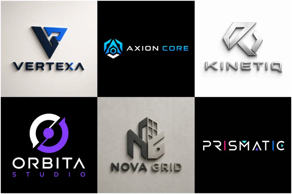
Explore Our Geometric Logo Portfolio
Our logo portfolio shows a range of clean, bold, minimal, technical, and refined concepts built around purposeful structure. Some designs rely on precise symmetry, while others use controlled asymmetry or negative space to create a stronger visual idea.
The collection demonstrates different ways geometric forms can support brand recognition, typography, and layout across websites, packaging, signage, social media, and print without suggesting that every displayed concept comes from a paid client project.
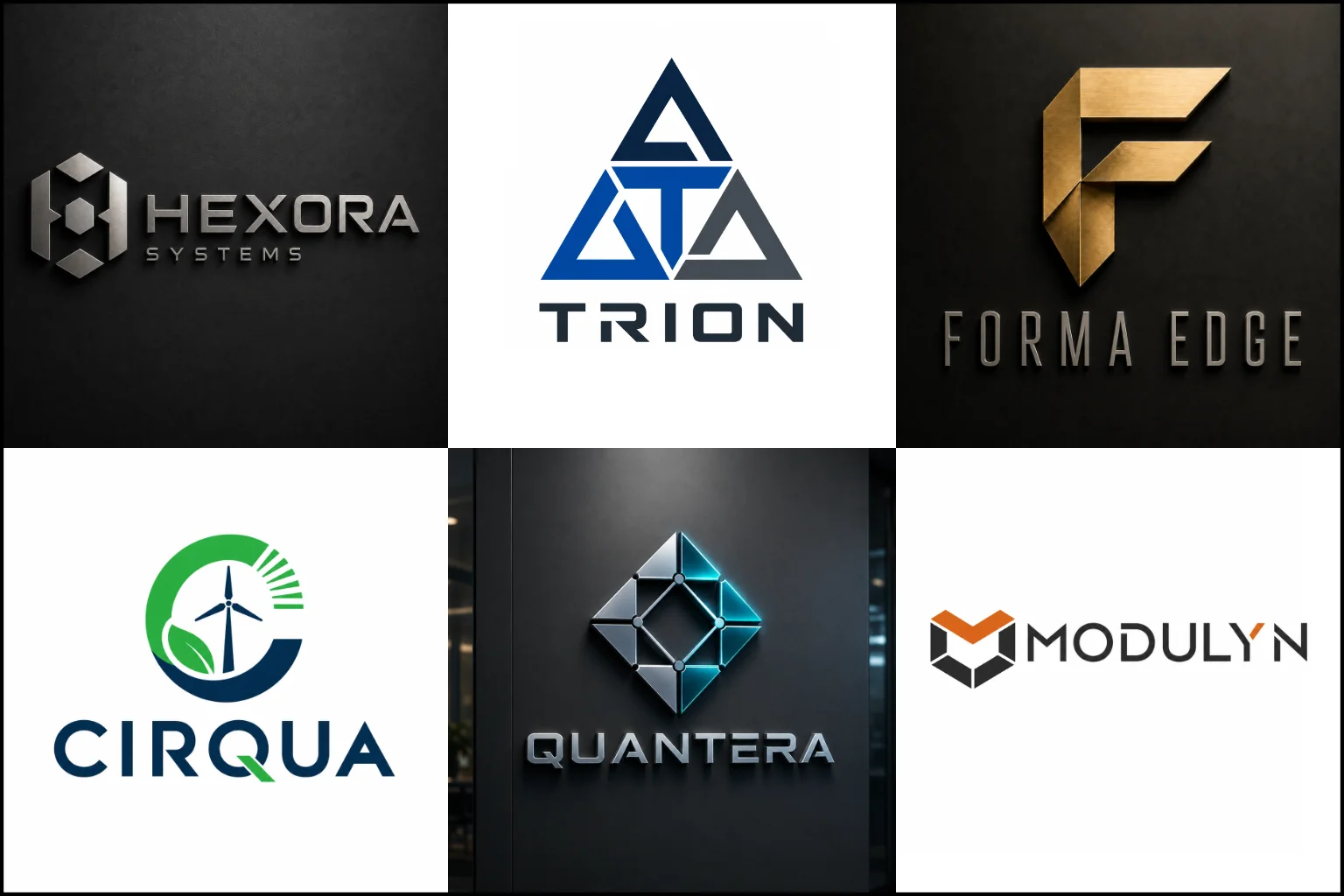
Built From Shape, Not Decoration
A logo uses intentional shapes and relationships rather than random patterns. Circles can suggest unity, continuity, or movement. Squares and rectangles often feel stable and organized. Triangles and sharp angles can create direction, energy, or a technical character.
Stable rectangular forms and strong angles can work well in construction logo, provided the arrangement reflects the individual brand instead of repeating a generic roof or building icon.
The real value comes from how those forms are combined. A strong mark may use repetition, proportion, alignment, rotation, symmetry, or negative space to create a recognizable idea from very few elements.
That simplicity can make the identity feel clear and controlled, but simple does not mean basic. Small changes in angle, spacing, line weight, and proportion can completely change the personality of the design.
Why Structured Marks Can Be So Effective
Geometric forms are easy for the eye to process when they are well organized. This can help a logo create a clear silhouette and remain recognizable without relying on many details.
They are also flexible. A carefully built symbol can work beside a company name, above it, inside a badge, or on its own once the brand has enough recognition. The same visual system can often extend naturally into icons, patterns, packaging elements, social graphics, and interface details.
Another advantage is consistency. Defined angles, curves, spacing, and proportions give the brand a visual framework that can be repeated across different applications without making every piece look identical.
Which Brands Suit This Style?
This direction is often a good fit for businesses that want a modern, organized, confident, or precise visual identity. Technology companies, architecture studios, property brands, finance businesses, engineering firms, creative agencies, fashion labels, wellness brands, and product companies can all use geometric forms in very different ways.
The industry alone should not decide the style. Brand personality matters more.
A software company may need a sharp modular symbol that feels efficient. A beauty brand might use soft circles and balanced curves. A premium property company could use restrained lines and architectural proportions. The same design language can communicate very different moods when the construction is handled carefully.
Choosing the Right Shape Language
The best direction depends on what your brand should feel like before anyone reads the name.
Circular systems can feel connected, soft, balanced, or continuous. Angular forms often feel faster, stronger, more technical, or more directional. Repeated modules can create a sense of order and system thinking. Interlocking forms can suggest partnership, connection, or integration.
Connected paths and controlled curves can also support plumbing service branding, suggesting flow, reliability, or joined systems without depending on another predictable tap or wrench symbol.
Negative space can add a second layer of meaning, but it should stay readable. If the hidden idea only works when someone explains it, the concept may be too complicated.
A useful geometric mark does not need to display every possible brand message. It needs one clear visual idea that is distinctive enough to own and simple enough to use.
Geometric Style Across Different Logo Types
This style is especially effective when the structure supports the chosen logo type rather than being added as decoration.
Initial-based identities can use custom angles, shared strokes, mirrored forms, or interlocking construction. A lettermark or monogram logo is often a strong option when a company has a long name, meaningful initials, or needs a compact brand symbol.
Brands that want a more conceptual identity may prefer an abstract logo. Geometry can turn movement, connection, growth, data, balance, or transformation into a non-literal symbol without using a common industry icon.
Non-literal geometric systems can be particularly effective in logos for technology companies, expressing ideas such as data, connection, integration, or progress without relying on generic circuit symbols.
For businesses that want a contained, formal mark, an emblem logo design can use circles, shields, grids, borders, and structured typography to create a unified badge. The challenge is keeping the emblem clear enough for smaller applications.
A combination mark logo works well when the business needs both a distinct symbol and a clearly readable name. It also gives the identity more layout flexibility because the icon and wordmark can be arranged differently for different spaces.
Symmetry, Asymmetry, and Visual Balance
Symmetry can create stability, order, formality, and a polished appearance. It works especially well for monograms, badges, architectural concepts, and brands that want a controlled visual tone.
Controlled asymmetry and angular cuts can add movement and energy to fitness and gym logo, helping the identity feel active while remaining clear on signs, clothing, equipment, and digital profiles.
Controlled symmetry can support architecture logo, using proportion, alignment, and spatial relationships to create a precise identity without simply illustrating a building.
Asymmetry can make a mark feel more active and distinctive. An offset shape, angled cut, open space, or uneven visual weight can create movement without making the design feel unbalanced.
The important point is optical balance. Two sides do not need to match mathematically, but the finished mark should still feel intentional. A designer may adjust shape size, spacing, line thickness, or position so the symbol looks balanced to the eye rather than simply following a perfect grid.
Typography Should Support the Symbol
A geometric icon can lose impact when paired with the wrong typeface.
Clean sans serif typography often works well with structured marks, but it is not the only option. A refined serif can create useful contrast, especially for premium, editorial, architectural, fashion, or hospitality brands.
Letter spacing also matters. Wide tracking can make a name feel calm and premium, while tighter spacing can create a more compact and direct look. Custom letterforms may be useful when the typography needs to share angles, cuts, curves, or proportions with the symbol.
The company name should remain easy to read. Visual cleverness should never make basic identification difficult.
Color Can Change the Entire Character
Geometry gives the structure, while color helps set the emotional tone.
Black and white can make a mark feel direct and graphic. Dark blue, charcoal, or deep green may create a more established or professional feel. Bright accents can make the same structure feel energetic, digital, or youthful. Warm neutrals and metallic-inspired tones can move the identity toward a more refined or premium direction.
A logo should still make sense in one color before depending on gradients or effects. This is especially important for stamps, engraving, embroidery, small print, and other situations where full-color reproduction may not be available.
Designed for Real Brand Use
A logo is not successful only because it looks attractive on a presentation mockup.
It should also remain clear in practical sizes and formats. Fine lines, tiny gaps, and overly complex intersections can disappear when the logo is reduced. Very wide or very tall constructions may also create problems in website headers, social profile images, packaging labels, app icons, or signage.
That is why proportion and simplification matter. A well-planned geometric identity should have a strong silhouette, controlled spacing, and enough visual separation between its parts to stay readable across common brand applications.
Mockups are useful for showing context, but the flat logo itself should carry the design.
When a Geometric Direction May Not Be Right
This style is not automatically the best choice for every brand.
A company that depends heavily on handmade character, loose illustration, childlike personality, rustic craft, or expressive brushwork may need a less rigid visual approach. Strict geometry can sometimes feel too technical, corporate, or controlled when the brand should feel spontaneous and personal.
It can also become generic when the concept relies only on common circles, cubes, hexagons, or letter combinations without a distinctive idea.
The right question is not whether logos look modern. It is whether structured form supports the personality, audience, positioning, and practical needs of your business.
How LogoPixa Approaches the Design
A strong concept starts with the brand, not with a shape library.
The business name, industry, audience, personality, positioning, preferred visual direction, and intended uses all help determine the right level of simplicity, sharpness, symmetry, and detail. From there, the design can explore relevant forms and relationships instead of forcing the brand into a familiar symbol.
LogoPixa focuses on creating a clear visual idea, refining the construction, and making sure the symbol and typography feel like one identity. The aim is an original mark that is visually strong without becoming difficult to understand or use.
What to Think About Before Ordering
You do not need to know exactly what shape your logo should use. It is more useful to know what the brand should communicate and where the identity will appear most often.
Think about whether you want the logo to feel minimal, bold, technical, premium, friendly, architectural, futuristic, or understated. Consider whether initials are important, whether you prefer a symbol or a full name-based identity, and whether there are industry clichés you want to avoid.
Sharing examples of styles you like can help communicate taste, but the final direction should be built around your own brand rather than copied from another identity.
Explore More Logo Options
Discover other logo styles and find the right visual direction for your brand.
Frequently Asked Questions
What makes a logo geometric?
A logo is geometric when its visual construction relies mainly on deliberate shapes, lines, angles, curves, grids, repeated modules, or measured relationships. It can be very simple or more detailed, as long as the structure is purposeful.
Are geometric logos only suitable for technology companies?
No. They can work for many industries, including property, finance, fashion, architecture, wellness, manufacturing, consulting, retail, and creative services. The shapes, typography, spacing, and color need to match the brand personality.
Can my initials be turned into a geometric symbol?
Yes. Initials can be built from shared strokes, mirrored forms, angular cuts, interlocking shapes, or negative space. The letters should still feel distinctive and readable enough for the intended use.
Does a geometric logo need to be symmetrical?
No. Symmetry can create order and stability, while controlled asymmetry can add movement and personality. What matters most is visual balance and a clear overall silhouette.
Will a detailed geometric logo work at small sizes?
It depends on the construction. Very thin lines, tiny gaps, and multiple intersections can lose clarity when reduced. Simpler forms with stronger spacing usually perform better on favicons, social icons, labels, and other small applications.
Can this style look premium instead of technical?
Yes. Softer proportions, restrained shapes, elegant typography, balanced spacing, and a refined color direction can make structured logos feel sophisticated rather than mechanical.
Should I choose a symbol, monogram, or combination mark?
Choose based on how your brand name, initials, and applications need to work. A monogram is compact, an abstract symbol can communicate a broader idea, and a combination mark keeps both the symbol and business name visible. The best format depends on the identity rather than the style alone.
What information is useful before starting the design?
Your business name, industry, audience, brand personality, preferred direction, main use cases, and any symbols or visual clichés you want to avoid are useful starting points. Reference images can also help explain your taste without requiring the final logo to copy them.