
Logo Design for Brands That Need a Clear Identity
Your logo is often one of the first visual elements people connect with your business. It should feel relevant to your brand, remain easy to recognize, and work naturally wherever your business appears.
LogoPixa creates original brand marks with careful attention to concept, typography, shape, proportion, spacing, color, and practical use.
Designed Around Your Brand
Every business has its own personality, audience, and purpose. LogoPixa creates original logos that reflect what your brand stands for while remaining clear, memorable, and practical. Each design is prepared for consistent use across websites, social media, packaging, stationery, and print.
15+ Years
Team Experience
1000+
Designed & Delivered
12–24 Hours
Fast Turnaround
Our Design Services
1. Custom Logo Design (New Brand)
Unique logo concepts crafted for your business style, minimalist, modern, luxury, or bold.
- 1–6 initial logo concepts (based on package)
- Typography + icon options
- Delivered with brand-ready files
2. Logo Changes & Variations
Need updates to your current logo? Get quick modifications without redesigning everything from scratch.
- Color, font, layout changes
- Add/remove icon elements
- Create alternate versions
3. Logo Refinement & Enhancement
Improve your existing logo with cleaner spacing, better typography, and a more premium look.
- Fix proportions and alignment
- Improve readability and balance
- Upgrade for web and print use
4. High-Quality Vector (SVG/AI) Conversion
Convert your logo into clean, scalable vector format for sharp printing and perfect resizing.
- PNG/JPG/PDF to SVG/AI/EPS
- Smooth curves, clean paths
- Print-ready + editable source files
Note: We do not design logos for adult/sexual content, nudity, explicit content, or illegal services. I also avoid alcohol/bar related branding and anything that promotes harmful or offensive content.
Featured Logo Designs
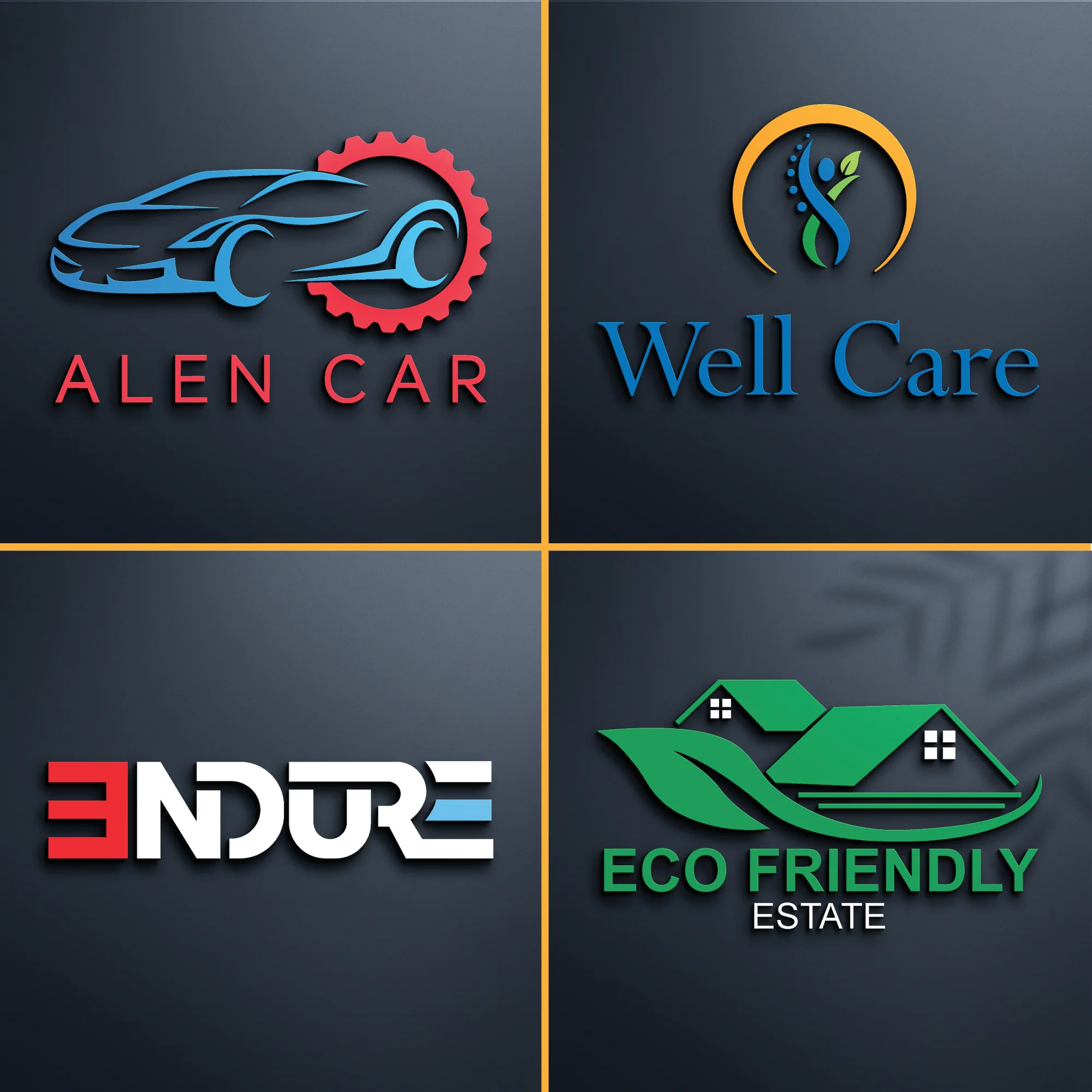
Multi-Industry Logo Design Collection
Automotive
Healthcare
Technology
Real Estate
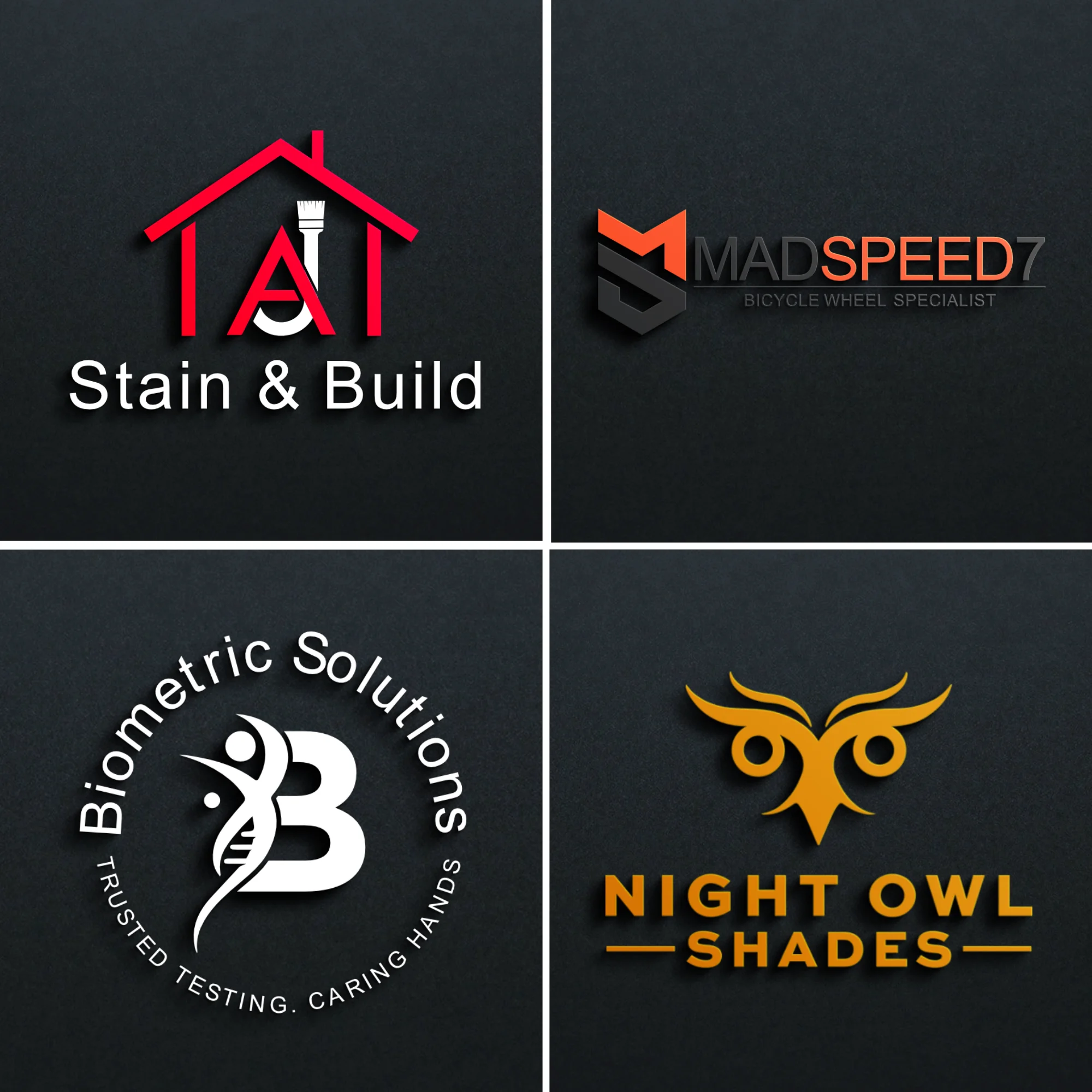
Logo Design Set (4 Brand Concepts)
Construction
Sports
Medical/Healthcare
Fashion
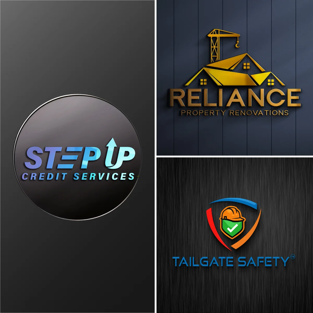
Business Logo Design Collection (3 Brands)
Finance
Real Estate
Industrial Safety
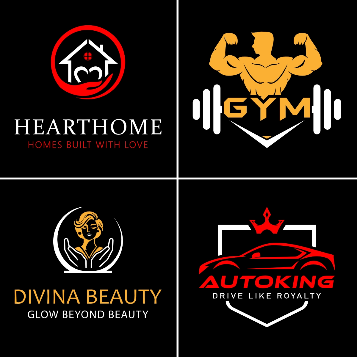
Logo Design Portfolio Set (4 Brands)
Real Estate
Fitness
Beauty
Automotive
A Logo Should Have a Reason Behind It
An attractive symbol is not enough on its own. A strong identity needs a clear connection to the business it represents.
That connection may come from the company name, initials, industry, product, brand personality, audience, history, or a more abstract idea. The right direction depends on what makes the business distinctive.
A financial company may need a very different visual tone from a gaming brand. A luxury label may rely on restrained typography and refined spacing, while a children’s business may benefit from a warmer and more expressive character.
Every company needs a different approach based on its brand, audience, and goals.
The aim is to find a visual idea that feels appropriate without becoming predictable.
Built Around Your Brand, Not a Random Symbol
Good creative work starts by understanding what the identity needs to communicate.
Before developing the visual direction, it helps to consider:
What the business offers
Who the main audience is
How the brand should feel
Where the identity will appear
Which competitors occupy the same space
What visual ideas should be avoided
Whether the brand should feel modern, established, playful, premium, bold, technical, friendly, minimal, or something else
These details help narrow the creative possibilities.
A construction company, for example, does not automatically need a roof or building symbol. A restaurant does not always need utensils. A technology brand does not have to use circuits.
Familiar industry references can work, but they need enough originality and relevance to avoid looking interchangeable with competing businesses.
Different Ways to Build a Brand Mark
There are several established approaches to logo structure. The best choice depends on the company name, audience, personality, and how the identity will be used.
You can explore our logo types to understand approaches such as wordmarks, monograms, pictorial marks, abstract symbols, mascots, emblems, and combination marks.
A short company name may work well as a wordmark. Initials can make sense when a business has a long name. A recognizable symbol may be useful when the brand needs a compact visual mark.
Combination marks offer additional flexibility because the name and symbol can work together as a complete identity.
None of these formats is automatically better than another. The structure should support the brand rather than being chosen only because it looks fashionable.
Choose a Visual Direction That Fits the Brand
The same business idea can be expressed in very different ways.
Minimal identities focus on simplicity and restraint. Geometric concepts often use controlled shapes and structure. Vintage approaches can communicate heritage or craftsmanship. Illustrative and cartoon directions allow more personality and character.
Other businesses may benefit from luxury, modern, line art, negative space, organic, signature, flat, or three-dimensional approaches.
Our logo styles section lets you explore these directions and understand how different visual treatments can change the personality of a brand.
Style should support positioning.
A design can look impressive on its own and still be wrong for the business. That is why the decision should consider the audience, market, product, tone, and long-term brand image rather than appearance alone.
Industry Context Matters
People develop visual expectations from the businesses they see every day. Real estate, healthcare, fashion, gaming, food, construction, law, beauty, technology, education, hospitality, and other sectors each have their own visual patterns.
Understanding those patterns is useful, but copying them too closely creates generic identities.
The stronger approach is usually to understand what customers expect from the category and then decide where the brand should follow or challenge those expectations.
Browse our logo industries to see creative considerations for different types of businesses.
This can be especially useful when you know what your company does but are still unsure which visual direction would represent it effectively.
Typography Is Part of the Identity
The company name should not feel like text placed beside an unrelated icon.
Typography has its own personality.
Serif lettering can feel established, elegant, editorial, or traditional depending on its construction. Sans serif typography can appear clean, contemporary, technical, approachable, or bold. Custom lettering can introduce characteristics that standard fonts cannot provide.
The details matter too.
Letter spacing, weight, width, capitalization, line structure, alignment, and the relationship between text and symbol can completely change how a brand feels.
Even a strong icon can lose impact when paired with unsuitable typography.
The symbol and name should look like parts of the same visual system.
Color Should Support the Concept
Color influences personality, contrast, visibility, and brand recognition, but there is no universal rule that assigns one color to one industry.
Trust does not come from using blue, luxury is not created simply by choosing black, and green alone cannot make a brand feel natural.
Context matters.
The selected palette should work with the concept, audience, positioning, and environments where the identity will be seen.
It is also useful to consider how the mark behaves without color. A concept that remains clear in a simple single-color presentation is often easier to use across different applications.
Designed for Real Business Use
A brand mark may appear much smaller or much larger than the version shown during the creative process.
It could be used on:
Websites
Social media profiles
Business cards
Packaging
Signage
Storefronts
Uniforms
Documents
Advertising
Product labels
Mobile interfaces
Printed materials
That makes scalability and clarity important.
Very fine details may disappear at small sizes. Complex shapes can be harder to use consistently across different sizes and formats. Extremely wide layouts may not fit naturally into profile images or compact spaces.
A practical identity considers these limitations instead of focusing only on how the artwork looks in one presentation.
Simple Does Not Mean Generic
Many businesses want a clean identity, but simplicity requires careful decisions.
Removing unnecessary detail can improve recognition and versatility. Removing too much can make a symbol ordinary or meaningless.
The objective is not to make every mark minimal. It is to include enough visual information to communicate the idea clearly without adding elements that do not contribute anything useful.
Some brands need a restrained mark.
Others genuinely benefit from illustration, texture, character, decorative typography, or a more detailed emblem.
The level of complexity should come from the brand itself.
Originality Comes From the Idea and Execution
Almost every basic shape has been used somewhere before. Circles, shields, arrows, leaves, crowns, letters, houses, animals, stars, and geometric forms are common building blocks.
Originality comes from how those elements are interpreted and combined.
Distinct proportions, negative space, letter construction, geometry, visual relationships, symbolism, and composition can turn familiar ingredients into a more individual identity.
At LogoPixa, the focus is on developing a concept that makes sense for the business instead of adding unrelated details simply to make the artwork look more complicated.
What to Consider Before Choosing a Direction
You do not need to know exactly what the finished identity should look like before starting.
It is often more useful to know what you want the business to communicate.
Think about the following:
Which brands visually appeal to you, and why?
Do you prefer a symbol, initials, company name, or combination?
Should the identity feel understated or expressive?
Are there colors you strongly prefer or dislike?
Are there industry symbols you want to avoid?
Will the mark frequently appear in very small spaces?
Does the business need to feel local, international, traditional, contemporary, premium, accessible, technical, or friendly?
References can help communicate your taste, but they should guide the direction rather than become something to copy.
When Your Existing Logo No Longer Fits
Not every business needs an entirely new identity.
Sometimes the core concept is still useful, but the execution feels dated, unbalanced, difficult to read, or inconsistent with the way the company has developed.
In those situations, refinement may be more appropriate than replacement.
Typography can be improved. Shapes can be corrected. Spacing and proportions can be rebuilt. An existing symbol can sometimes be simplified or made more usable while keeping its recognizable character.
The important question is whether the current identity still represents the business effectively.
Change should have a purpose.
A Clear Brief Leads to Better Creative Decisions
A clear brief can be short and still provide everything needed to guide the design.
Basic information about the company, audience, services, personality, preferences, competitors, intended usage, and unwanted directions can provide valuable guidance.
It is also fine if you are uncertain about style.
Instead of choosing a visual category immediately, describe how you want people to perceive the brand. That gives the creative direction a stronger foundation.
Specific feedback is equally valuable during development.
Comments such as “the lettering feels too formal” or “the symbol feels too aggressive” provide more direction than simply saying that something does not look right.
Frequently Asked Questions
What makes a good business logo?
A good mark should be relevant to the business, visually clear, recognizable, and practical across the places where the brand will appear. Strong typography, balanced proportions, appropriate color, and a meaningful concept all contribute to the result.
Should my logo include an icon?
Not necessarily. Some brands work effectively with typography alone, while others benefit from a symbol or combination of text and imagery. The decision depends on the company name, positioning, audience, and intended usage.
How do I choose the right style?
Start with your brand personality rather than a visual trend. Consider whether the business should feel modern, premium, energetic, approachable, traditional, technical, playful, or understated. From there, suitable visual directions become easier to identify.
Should I use my industry symbol?
You can, but it is not required. Familiar symbols help communicate what a business does quickly, although heavily used imagery can make different companies look similar. A more distinctive concept may use the industry reference in an unexpected way or avoid it entirely.
Is a simple logo always better?
No. Simplicity is useful when it improves clarity and usability, but some brands need more character or detail. The right level of complexity depends on the identity, audience, and application.
How many colors should a logo have?
There is no fixed number that suits every brand. A focused palette is often easier to manage, but the right choice depends on the concept and how the identity will be used.
Can I provide examples of logos I like?
Yes. References can help communicate preferences for typography, composition, mood, color, or overall direction. They are most useful as creative guidance rather than something to reproduce.
What information should I provide before the project starts?
Useful information includes the company name, business activity, target audience, preferred personality, color preferences, competitors, desired or unwanted symbols, and where the identity will mainly be used.
What if I do not know which type of logo I need?
You do not need to choose a format in advance. Understanding the business, name, audience, and brand personality can help determine whether a wordmark, monogram, symbol, emblem, combination mark, or another direction makes the most sense.
Can an existing logo be improved instead of completely replaced?
Yes. If the main concept still represents the brand, refinement may be enough. Typography, spacing, geometry, proportions, readability, and overall balance can sometimes be improved without abandoning the identity people already know.
Why does a logo need to work in different sizes?
Brand marks appear in very different environments, from small profile images and website headers to packaging and large signage. A design that remains recognizable across those situations is easier to use consistently.
How can I get started with LogoPixa?
Review the portfolio and the available type, style, and industry categories to identify directions that feel relevant to your brand. You can then share your business details, preferences, references, and any ideas you want the creative direction to consider.