
Restaurant Logo Design
The design can reflect your cuisine, atmosphere, price position, and personality without becoming complicated or predictable. Explore the portfolio to see different directions, from clean contemporary marks to character-led and traditional concepts suited to different dining experiences and audiences.
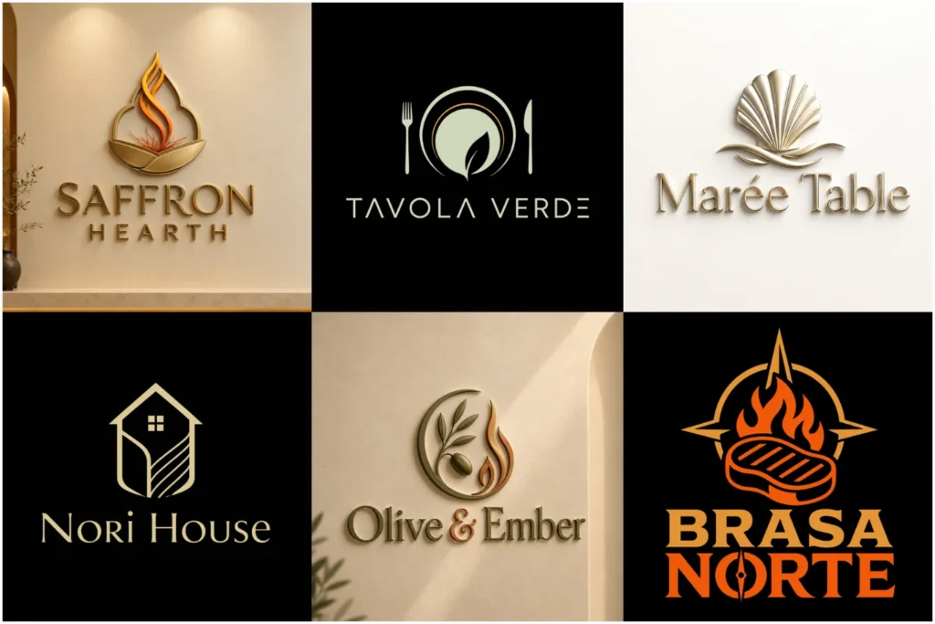
Explore Restaurant Logo Concepts
The portfolio shows a range of restaurant-focused logo ideas created with different visual approaches, typography styles, symbols, and brand moods. Some concepts are simple and understated, while others are bold, expressive, or heritage-inspired.
Each design is presented to demonstrate originality, professional execution, and practical use across menus, signage, packaging, social media, uniforms, and delivery materials. Browse the examples to identify the visual direction that feels closest to your business and customer experience.
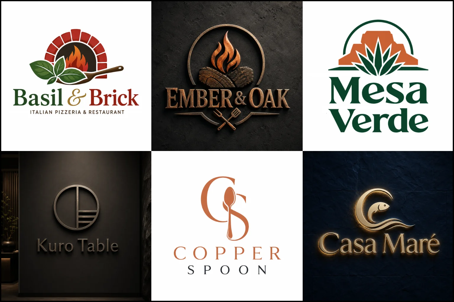
Your Logo Should Match the Dining Experience
A restaurant brand starts communicating long before someone tastes the food. The name, colors, typography, symbols, storefront, menu, and packaging all shape expectations.
A casual burger place may need something energetic and easy to notice from a distance. A fine-dining restaurant usually benefits from a more controlled and refined visual direction. A family restaurant may need a warmer identity, while a specialty café can often use something simple and distinctive.
The goal is not to make a logo look “food related” at any cost. It should feel appropriate for the actual experience your restaurant offers.
Cuisine also matters. Italian, Japanese, Mexican, Mediterranean, Indian, seafood, barbecue, dessert, vegan, and other concepts have different visual opportunities. However, relying too heavily on obvious cultural symbols can make a brand feel generic. A stronger approach often takes inspiration from the food, story, atmosphere, or personality of the business without copying familiar restaurant clichés.
Choosing the Right Logo Structure
Different restaurant brands need different logo structures depending on the name, concept, signage requirements, and desired personality.
A Combination Mark Logo is particularly useful for restaurants because it combines a business name with a symbol. The elements can work together on a storefront while also giving you the option to use the icon separately in smaller spaces.
A Pictorial Mark Logo can work well when a recognizable object has a genuine connection to the concept. This might involve an ingredient, cooking method, animal, utensil, plant, or another relevant visual idea. The symbol should still feel distinctive rather than like a stock food icon.
For restaurants with a strong name, a Wordmark Logo can put typography at the center of the identity. This approach often works well for cafés, contemporary eateries, bakeries, and premium dining brands where the name itself has enough character to carry the design.
An Emblem Logo can suit restaurants that want a more established, traditional, handcrafted, or heritage-oriented appearance. It can be effective for steakhouses, barbecue restaurants, pubs, pizzerias, bakeries, and other businesses where a badge-like identity fits the atmosphere.
The structure should be chosen for practical reasons, not simply because a particular format is popular.
Style Should Support the Concept
Restaurant branding can move in many visual directions, but the style needs to support the positioning of the business.
A Minimalist Logo can be a strong fit for modern cafés, healthy food brands, sushi restaurants, contemporary dining concepts, and businesses that want a clean appearance. Fewer details can also improve readability at small sizes. The limitation is that excessive simplicity can become generic if the typography or core idea lacks personality.
A Vintage Logo can suit diners, barbecue restaurants, pizzerias, coffee shops, pubs, traditional bakeries, and brands influenced by craftsmanship or heritage. It can communicate character effectively, but too much ornament or distressed detail may reduce clarity on small digital applications.
Neither approach is automatically better. The right choice depends on your restaurant concept, customer expectations, environment, and long-term brand direction.
Food Symbols Without Looking Generic
Chef hats, forks, spoons, knives, plates, flames, cups, wheat, burgers, pizza slices, and other food-related graphics are common because customers understand them quickly.
The problem is not the symbol itself. The problem is using it without a distinctive idea.
A fork can become part of a letter. Steam can create a recognizable shape. An ingredient can be simplified into a unique icon. Negative space may connect food with another part of the brand story. Even a familiar object can feel original when its form, proportions, and relationship with the typography are carefully developed.
In some cases, the better decision is to avoid food imagery completely. A strong name paired with custom typography or an abstract visual concept may create a more memorable identity, especially when the restaurant wants to move beyond predictable category signals.
Typography Has a Major Role in Restaurant Branding
Restaurant names appear on storefronts, menus, reservation platforms, delivery apps, packaging, receipts, advertisements, and social profiles. Typography therefore needs more attention than simply selecting an attractive font.
Letter shapes should reflect the restaurant’s personality while remaining readable. A refined serif can support an elegant dining concept, while a bold sans serif may suit a fast-casual restaurant. Handcrafted lettering can add personality to a bakery or café when used carefully.
Spacing also matters. Poor kerning can make an otherwise good mark feel unfinished. Very thin lettering may disappear on signs or packaging, while decorative scripts can become difficult to read at smaller sizes.
The design should balance personality with everyday usability.
Color Can Influence the Brand Mood
Restaurant logos do not have to use red, orange, or yellow simply because those colors are common in the food industry.
Color selection should come from the brand concept.
Warm colors can create an energetic or welcoming impression. Darker palettes may support a more refined atmosphere. Earthy tones can suit natural, organic, rustic, or ingredient-focused brands. Brighter combinations may make sense for casual restaurants, dessert shops, food trucks, or playful concepts.
It is also important to consider how the identity works without color. A strong logo should remain recognizable in a simple one-color version for applications such as stamps, engraving, receipts, packaging, and certain printed materials.
Design for Menus, Signs, Packaging, and Screens
A logo can look attractive on a presentation page and still become difficult to use in the real world.
Restaurant identities appear in very different spaces. A wide storefront gives the design room to breathe, while a delivery app may display the same brand inside a very small square icon.
A practical identity should therefore remain clear across common applications such as:
- Exterior and interior signage
- Printed and digital menus
- Food boxes and takeaway bags
- Cups, bottles, labels, and stickers
- Staff uniforms and aprons
- Social media profiles
- Websites and online ordering pages
- Delivery platform listings
- Business cards and promotional materials
Highly detailed designs can work in certain contexts, but they often need careful simplification for small applications. That limitation should be considered during the design process rather than discovered after the branding is already in use.
What to Include in Your Design Brief
You do not need to know professional design terminology before requesting a logo.
Start with information about the restaurant itself. Explain what food you serve, whether the experience is casual or premium, and who you expect to attract. Mention anything important about the location, concept, story, or atmosphere.
Useful details can include your restaurant name, cuisine, preferred style, color preferences, examples of visual directions you like, and anything you definitely want to avoid.
It also helps to explain where the logo will appear most often. A restaurant focused heavily on delivery may have different practical requirements from one whose large exterior sign is the main customer touchpoint.
Clear information gives the designer a stronger foundation without forcing you to make every creative decision yourself.
Originality Matters in a Crowded Food Market
Restaurants within the same category often use similar visual language. Pizza businesses repeat slices and ovens. Coffee brands use cups and beans. Barbecue restaurants frequently use flames, animals, and badges.
Those ideas are not automatically wrong, but repeating them without a fresh concept makes it harder for a brand to establish its own visual character.
LogoPixa approaches the identity around the individual restaurant rather than treating the cuisine as the entire concept. The aim is to create a clear and recognizable design that relates to the business while avoiding unnecessary visual imitation.
Originality does not always require a complicated symbol. Sometimes the strongest distinction comes from typography, composition, proportions, negative space, or an unexpected interpretation of a familiar idea.
When a Simple Logo Is Better
Detailed artwork can communicate atmosphere and personality, but more detail is not always an advantage.
If the restaurant relies heavily on mobile ordering, social media, small labels, or compact packaging, a simpler design may remain clearer. It can also make the brand easier to reproduce consistently.
On the other hand, a traditional restaurant, pub, artisan bakery, or specialty food concept may benefit from a richer visual identity when the additional detail has a purpose.
The question is not whether simple or detailed design is better. It is whether the level of detail supports the brand and still works wherever customers will encounter it.
Build an Identity Around More Than the Menu
Menus can change. New dishes can be added, concepts can develop, and restaurants may expand into catering, packaged products, additional locations, or new service formats.
A logo that depends too heavily on one specific dish can become restrictive.
For example, using a burger as the entire identity makes sense when burgers define the business. It becomes less useful if the restaurant later expands into a broader casual dining concept.
A stronger identity leaves enough room for the business to evolve while still communicating its current personality clearly.
Creating the Right Visual Direction With LogoPixa
The design process begins with understanding what the restaurant needs to communicate rather than choosing a symbol at random.
Cuisine, atmosphere, audience, name, positioning, and practical applications all influence the direction. From there, the identity can be developed around an appropriate combination of typography, imagery, color, composition, and visual style.
If you already have a clear idea, that direction can guide the work. If you only know the feeling you want the restaurant to create, your brief can start there. The objective is a visual identity that feels intentional, original, memorable, and usable across the places where customers interact with your brand.
Explore More Logo Options
Browse more logo industries to explore branding options created for different types of businesses.
You may also be interested in:
- logos for bakeries
- logos for coffee shops
- logos for food brands
- logos for gaming brands
- logos for hotels
- logos for travel companies
Frequently Asked Questions
What makes a good restaurant logo?
A good logo reflects the restaurant’s personality, remains easy to recognize, and works across signs, menus, packaging, websites, and small digital spaces. It should feel appropriate for the business without relying on unnecessary details or generic food symbols.
Does my logo need to include food?
No. Food imagery can be useful when it strengthens the concept, but it is not required. Typography, initials, abstract shapes, cultural influences, architectural details, or other ideas may represent the brand more effectively.
What colors work well for a restaurant brand?
There is no single correct restaurant color palette. The right colors depend on the cuisine, atmosphere, audience, and positioning. A fine-dining concept may need a very different palette from a children’s café or fast-casual food brand.
Should I choose a simple or detailed logo?
Choose the level of detail according to how and where the logo will be used. Simple designs generally reproduce well at small sizes, while detailed identities can add character when the application allows enough space. Clarity should remain a priority in either case.
Can a restaurant logo use only the business name?
Yes. A typography-based identity can be effective when the restaurant has a distinctive name and the lettering is developed with enough personality. An additional icon is useful only when it adds something meaningful.
How do I explain the style I want?
You can describe the atmosphere you want customers to feel, such as refined, casual, traditional, energetic, natural, elegant, playful, or contemporary. Sharing relevant visual references can also help communicate your preferences.
Should my cuisine be obvious from the logo?
Not necessarily. Making the cuisine immediately recognizable can be helpful for some businesses, but it should not force the design into obvious stereotypes. Sometimes a more subtle identity creates stronger long-term brand flexibility.
Can the same logo work on a storefront and social media?
It can, but the design needs to account for both formats. Storefronts provide more space, while social profiles and delivery apps often require a compact presentation. A well-planned identity should remain recognizable in both situations.