
Travel Logo Design
The design direction is shaped around your audience, personality, and real-world use rather than familiar travel graphics alone. Explore the portfolio to see different creative approaches and find a direction that fits your brand.
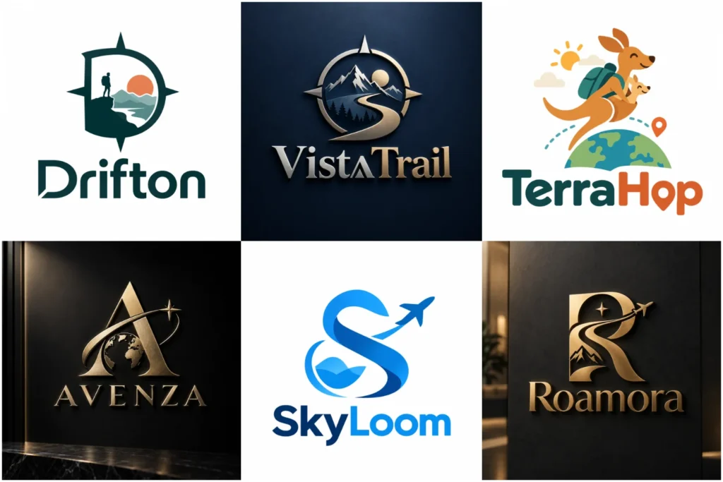
Explore Travel Brand Identity Ideas
Browse the portfolio to explore original travel-focused concepts with different symbols, typography, colors, compositions, and visual personalities. The collection includes clean, adventurous, premium, friendly, and destination-inspired directions created with practical branding in mind.
Each concept is developed to show how a distinctive identity can work across websites, social profiles, advertisements, signs, printed materials, and other applications, without suggesting that every design shown represents a completed paid client project.
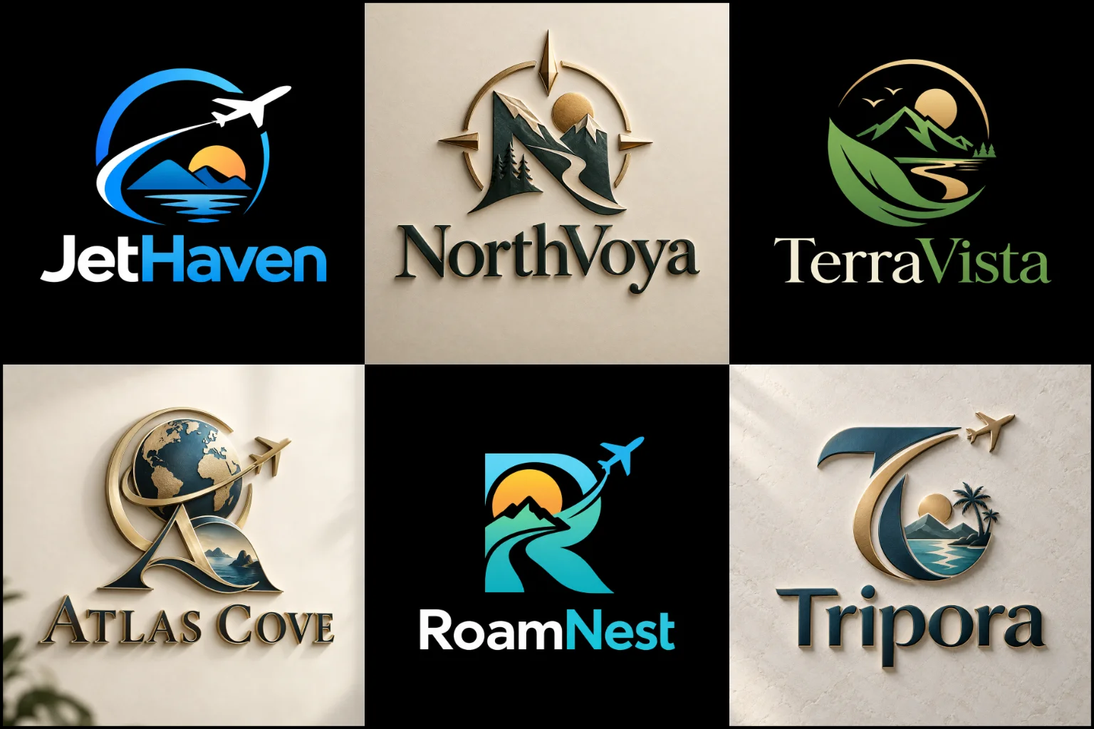
A Travel Brand Should Reflect the Experience You Offer
Travel businesses may operate in the same industry while offering completely different experiences. A luxury tour company, adventure operator, family holiday planner, city guide, cruise service, and backpacking brand should not automatically look alike.
Before deciding on colors or symbols, it helps to define the feeling customers should associate with the business.
A brand might need to communicate relaxation, exploration, excitement, organization, exclusivity, cultural discovery, freedom, convenience, or personal service. The strongest direction usually focuses on a few meaningful qualities instead of attempting to communicate everything inside one mark.
Your audience matters as well. A company arranging high-end private trips may need a restrained and refined identity, while an outdoor adventure business can support stronger shapes and a more energetic visual character.
The logo should represent the actual positioning of the business rather than simply looking “travel related.”
Avoiding Generic Airplanes, Globes, and Location Pins
Airplanes, globes, mountains, suitcases, compasses, maps, waves, roads, and location pins are immediately associated with travel. They can communicate the industry quickly, but they are also widely used.
That does not mean these ideas must always be avoided. The important question is whether the symbol has been developed in a way that feels specific to your brand.
A plane placed inside a generic circle may be understandable but difficult to distinguish from other travel businesses. A better concept might combine movement with an element connected to the business name, destination, specialty, or customer experience.
A carefully developed recognizable symbol logo can work particularly well when the business has one strong visual idea. A destination-focused company might use a simplified natural or architectural form, while an adventure brand could explore movement, terrain, or direction.
Literal imagery also has limitations. If your business plans to offer many different travel services, an extremely specific symbol may eventually feel restrictive. In that situation, a broader conceptual direction can provide more room for the identity to grow.
Combining the Business Name With a Distinctive Icon
Many travel businesses benefit from showing both their name and a recognizable visual element.
An icon with wordmark design allows the business name and symbol to support each other as one identity. This can be especially useful when a company is still building recognition because customers do not need to understand an unfamiliar icon by itself.
The complete arrangement might appear in a website header, brochure, vehicle graphic, or storefront, while a simplified icon can be more practical for a social profile, favicon, mobile interface, or small promotional item.
This flexibility depends on good construction. The symbol should not overpower the name, and the typography should not feel disconnected from the icon.
Spacing, scale, alignment, and visual weight all need to be controlled so the elements look intentional together.
A combination structure may be less useful when the business name is extremely long or when the symbol contains too much detail. In those situations, simplification or a more name-focused identity may produce a clearer result.
Simple Branding Can Make Travel Identities More Flexible
Travel businesses often need to display their branding in many different places, from a small mobile screen to a large sign or vehicle.
A clean and simple logo can make that easier by reducing unnecessary visual information and focusing attention on the strongest idea.
This direction can work well for modern travel agencies, digital booking services, destination planners, corporate travel businesses, and brands that want a polished appearance without decorative complexity.
Simplicity still requires character.
Removing details until a mark becomes a generic plane, pin, or circle does not automatically create a strong identity. Shape relationships, custom typography, negative space, proportions, and subtle visual ideas can give a simple design its own personality.
Minimal branding also has limitations. A business built around rich cultural storytelling, detailed illustration, or a highly expressive adventure personality may need more visual information than a very minimal identity can provide.
The style should support the brand rather than forcing the brand to follow a trend.
Line Work Can Create a Lighter Travel Identity
Some travel brands suit a more refined visual direction based on outlines and controlled strokes.
A clean line-based logo can represent landscapes, coastlines, mountains, architecture, roads, natural forms, transportation, or destination-inspired subjects without creating a heavy visual mark.
This approach may suit boutique travel planners, retreat brands, tourism businesses, destination services, or companies wanting a calm and sophisticated appearance.
Line weight needs careful consideration, however.
Extremely thin details can disappear when the artwork is reduced for social icons, embroidery, printed merchandise, or small advertisements. Too many lines can also turn a simple illustration into a complicated graphic.
A successful line-based identity keeps enough detail to create character while remaining clear at practical sizes.
Typography Helps Define the Personality of the Brand
The company name may occupy more visual space than the symbol, so typography should never be treated as an afterthought.
Clean sans-serif lettering can create a contemporary and organized appearance. Refined serif typography can support a more established or premium personality. Rounded letterforms may feel approachable, while stronger condensed lettering can create a more active visual presence.
The correct choice depends on the experience the business provides.
Readability is especially important for travel brands because people may encounter the name quickly while scrolling, searching, viewing signage, or comparing services online.
Decorative lettering can add personality, but excessive styling may make an unfamiliar business name difficult to understand.
Letter spacing, capitalization, font weight, line arrangement, and the relationship between the name and any tagline can significantly affect the finished identity.
A tagline should only be included in the primary mark when it remains useful and readable. Long supporting text often works better as separate brand messaging rather than being permanently attached to the logo.
Color Should Support the Destination and Brand Positioning
There is no single color palette that all travel businesses should use.
Blue can suggest water, sky, calmness, or an organized corporate character, but its popularity also means the design needs other distinctive qualities. Greens may connect naturally with outdoor, eco-focused, or nature-led experiences. Warmer colors can create energy, friendliness, or a stronger leisure feeling.
Neutral palettes can support premium positioning, while brighter combinations may suit lively tours, youth-focused experiences, or recreational travel brands.
These associations should be treated as starting points rather than fixed rules.
The surrounding market, destinations, target audience, and overall brand personality should influence the final palette.
The identity should also remain understandable without depending entirely on color. A strong black-and-white version can reveal whether the underlying shapes and typography are clear enough to function on their own.
Design for the Places Travelers Will Actually See It
A logo may look impressive in a large presentation and still become difficult to use in everyday branding.
Travel identities can appear across websites, booking pages, social media, email communication, printed itineraries, brochures, travel documents, uniforms, luggage tags, vehicle graphics, office signs, promotional items, mobile interfaces, and digital advertisements.
These placements can have very different dimensions.
A wide horizontal logo may work comfortably in a website header but become difficult to fit inside a square profile picture. A detailed illustration may look attractive on a brochure but lose clarity as a favicon.
For that reason, the main identity should be designed with flexibility in mind.
Horizontal, stacked, symbol-only, and simplified arrangements may be useful depending on the chosen concept. These variations should still look like parts of the same brand rather than separate designs.
Build the Concept Around Your Travel Specialty
A useful design brief explains more than the fact that the company operates in travel.
A destination management company may need a different visual language from a trekking business. A honeymoon planner should not automatically receive the same imagery as a corporate travel service. Local sightseeing, international tours, cruises, road trips, retreats, luxury holidays, and adventure experiences each create different branding possibilities.
Your business name can also provide stronger inspiration than the industry itself.
A geographic reference, meaningful word, founder-related name, cultural idea, natural feature, or unusual phrase can lead to a more distinctive concept than another generic travel icon.
Not every element needs to communicate tourism immediately. Sometimes the name provides the context while the symbol focuses on personality, movement, connection, discovery, or another idea that has greater long-term value.
What to Share Before the Design Starts
You do not need to arrive with a finished creative concept. Clear business information is more useful than trying to prescribe every visual detail.
Explain what type of travel service you provide, who you want to attract, where you operate, and how you want the business to feel.
It also helps to share your preferred and unwanted colors, visual styles you like, symbols you want considered or avoided, and the main places where the identity will appear.
If you already use branding, explain what should be retained and what needs to change.
Reference logos can help communicate your taste, but they should be used to explain direction rather than as designs to copy.
Competitor examples can also be useful because they reveal visual patterns that may be worth avoiding. If several competing travel companies already use nearly identical globe-and-airplane marks, developing another one may make differentiation more difficult.
Creating an Identity That Belongs to Your Travel Brand
LogoPixa approaches each project by connecting the visual direction with the business name, audience, service, positioning, and practical applications.
The aim is to develop a clear and original identity rather than adding travel symbols simply because they are familiar.
Concept, typography, spacing, proportion, color, and scalability all need to work together. A strong result should remain recognizable without becoming overly complicated and should feel appropriate when used outside a presentation mockup.
If you are preparing a new travel business or updating an existing identity, start with what makes the service different and the experience customers should expect. Those details provide a stronger creative foundation than choosing an icon first.
Explore More Logo Options
Browse more logo design by industry to explore branding options created for different types of businesses.
You may also be interested in:
- logos for restaurants
- photographer brand identity
- logos for jewelry brands
- logos for hotels
- education branding
Frequently Asked Questions
What makes a good travel logo?
A good travel identity reflects the type of experience the business provides while remaining clear, distinctive, and practical. Strong typography, a focused concept, suitable colors, recognizable shapes, and good scalability are more important than including a particular travel symbol.
Does a travel company logo need an airplane or globe?
No. Airplanes and globes can work when they support the concept, but they are not required. A design may instead draw from the business name, destination, landscape, specialty, movement, culture, typography, or a more conceptual idea.
What colors work well for a travel brand?
The right colors depend on the brand personality and audience. Coastal businesses, adventure companies, luxury planners, family travel services, and corporate agencies can all require different palettes. Color should support the intended feeling rather than follow an industry formula.
Should my logo show the destination I specialize in?
It can when the destination is an important and lasting part of the business. A recognizable landmark, natural feature, or regional idea may create useful context. If the company expects to expand into many destinations, a broader concept may provide greater flexibility.
Can a simple logo still look distinctive?
Yes, provided the simplicity is supported by an original idea. Custom shapes, typography, proportion, negative space, and thoughtful composition can create personality without adding unnecessary detail. A design that is merely basic or generic is different from one that has been intentionally simplified.
Should I include my tagline in the logo?
Only when the tagline adds useful information and remains readable at the sizes where the logo will normally appear. Longer taglines can make compact applications crowded, so they may work better as separate supporting text.
What information should I provide to a designer?
Useful information includes your exact business name, services, target audience, destinations or markets, preferred brand personality, main logo applications, color preferences, symbols you like or dislike, and relevant visual references. The clearer the business context is, the easier it becomes to explore appropriate concepts.
Can the same logo work on websites, social media, and printed materials?
A well-planned identity can be designed to adapt across these applications, although different layouts or simplified variations may be useful. Small digital spaces and large printed materials have different requirements, so scalability and layout flexibility should be considered during design.
Is a detailed logo better for an adventure travel company?
Not automatically. Detailed artwork can create character, but excessive detail may become difficult to reproduce at small sizes. Adventure brands can work with either simple or more expressive identities depending on their audience, personality, and intended applications.
How do I choose between a symbol-based and name-based identity?
Consider how distinctive your business name is, whether customers need an immediate visual clue about the service, and where the logo will appear. A symbol can create a compact visual identifier, while a name-focused approach puts greater emphasis on typography. Combining both can offer flexibility when both elements have a clear purpose.