
Minimalist Logo Design
The goal is to remove distractions without removing personality. Explore the portfolio to see how simple ideas can be shaped into practical identities for digital, print, packaging, social media, websites, signage, and everyday brand use with confidence.
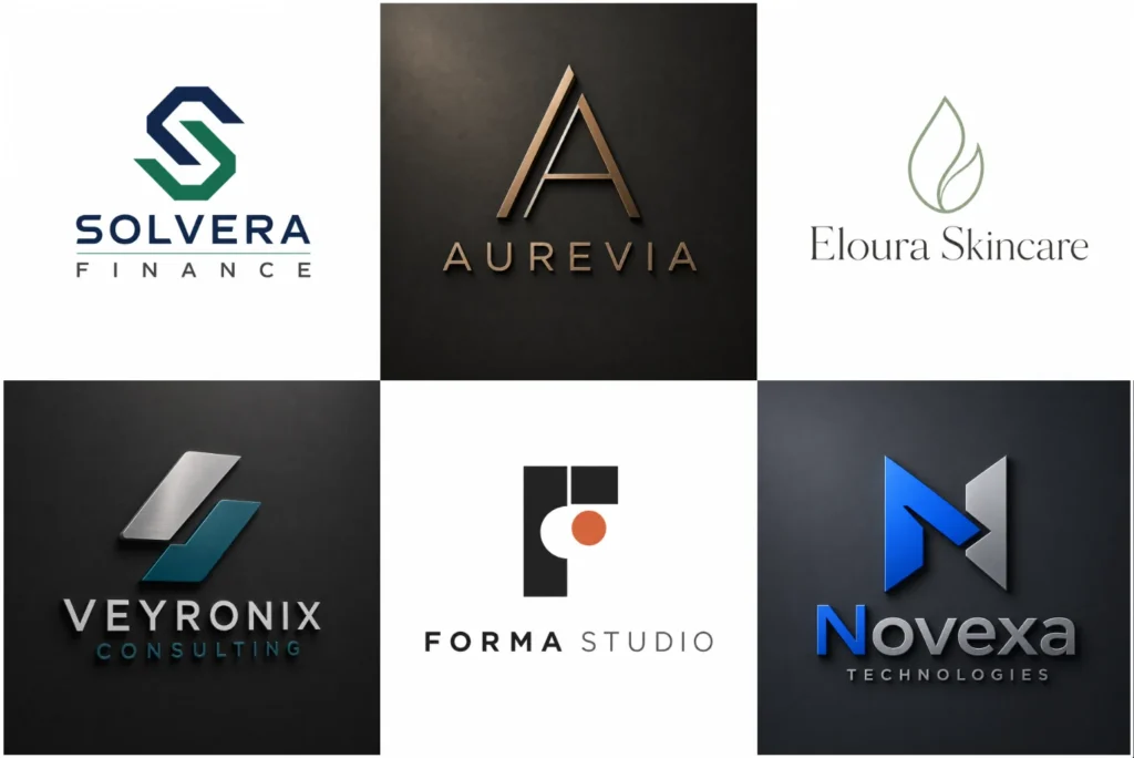
Explore Simple and Purposeful Logo Concepts
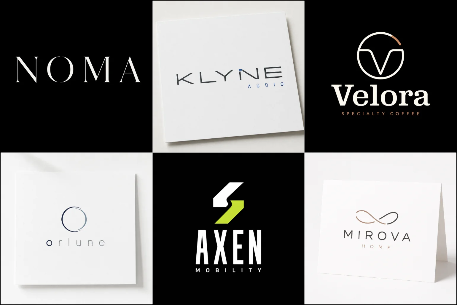
Our portfolio shows a range of simple visual directions built around different brand personalities, industries, and communication needs. Some concepts rely on clean lettering, while others use restrained symbols, geometric forms, or carefully balanced combinations.
Each example is presented to show originality, control, and practical application rather than unnecessary decoration. Browse the work to compare approaches and see how a focused identity can remain distinctive across different brand settings and touchpoints.
What Makes a Minimal Logo Effective?
Minimal design is not simply about using fewer elements. Every visible part needs a reason to exist. Shape, spacing, proportion, typography, and color must work together without relying on extra decoration to hide weak decisions.
A successful concept keeps the visual idea easy to understand while giving the brand enough character to feel individual. Simplicity should improve recognition, not make the identity generic.
The strongest designs usually have a clear focal point, controlled proportions, and enough visual distinction to remain memorable after someone looks away.
When a Simpler Identity Makes Sense
A reduced visual style can work especially well for businesses that want a clean, modern, professional, or refined appearance. Technology companies, consultants, architecture studios, fashion labels, digital businesses, professional services, and modern consumer brands can all benefit when the style matches their positioning.
It can also be useful when a logo needs to appear across many sizes and environments. A straightforward form is generally easier to adapt for websites, mobile interfaces, packaging, stationery, profile images, signage, and printed materials.
However, minimalism is a design direction rather than a rule. A business built around playful characters, detailed storytelling, heritage decoration, or highly expressive illustration may need another approach.
Simplicity Without Losing Brand Personality
Removing unnecessary elements does not mean removing character. A simple identity can still feel bold, elegant, friendly, technical, luxurious, energetic, or understated.
Personality can come from small decisions such as the shape of a letter, the curve of a symbol, the relationship between two forms, or the amount of space surrounding the design.
LogoPixa focuses on identifying which details carry meaning and which ones create unnecessary visual noise. This helps keep the identity clean without making it empty or interchangeable.
Using Shape With a Clear Purpose
Basic forms can communicate very differently depending on how they are constructed. Circles may create a softer or more unified impression, while angular structures can feel precise, progressive, or strong.
A designer may also develop a custom symbol using initials, geometric relationships, simplified objects, or abstract forms. The important part is not how few lines are used. It is whether those lines create a recognizable idea connected to the brand.
Negative space can also become part of the concept when it adds meaning naturally. It should support the design rather than exist simply as a visual trick.
Typography Can Carry the Entire Identity
Typography has greater importance when decorative elements are removed. Letter shape, weight, spacing, width, capitalization, and alignment can noticeably change how a simple identity feels.
Some brands work best with clean sans-serif lettering, while others benefit from a refined serif or customized type treatment. There is no single font category that automatically makes a logo minimal.
Carefully chosen lettering is especially important in law firm logo, where clarity, credibility, and a professional tone often matter more than decorative symbols.
For companies whose name is the main visual asset, a typography-based logo can be worth exploring. Businesses that want to build recognition around their initials may find custom monogram logos more appropriate.
Keeping the Color Palette Controlled
Minimal identities often use a restrained palette, but that does not mean every design must be black and white. One carefully selected color can create strong visual ownership, while two or three coordinated tones may provide useful flexibility.
Color choices should reflect the intended brand personality, industry context, and practical applications. Contrast also matters because the logo needs to remain visible against different backgrounds.
A controlled palette is particularly useful in a dental logo, where clean contrast and a calm visual tone can support a professional, reassuring identity.
A good concept should still make visual sense in a single-color version. This is especially useful for printing, engraving, stamps, embroidery, document use, and other situations where full color may not be available.
Minimal Does Not Mean Generic
One of the biggest risks with simple branding is reducing the idea so far that it starts looking like many other businesses.
Common circles, basic initials, generic arrows, stock icons, and familiar geometric arrangements can create a polished appearance without building a distinctive identity. The result may look clean but still be difficult to remember.
Originality becomes more important when fewer elements are present. Each shape, letter modification, proportion, and visual relationship needs careful consideration because there is little unnecessary detail to distract from weak choices.
Choosing the Right Type of Simple Logo
Minimalism can be applied to several logo structures rather than belonging to one format.
A business wanting a non-literal visual concept can explore an abstract brand symbol, where shape and form communicate an idea without directly illustrating a product. A company that needs both a symbol and a clearly visible name may prefer a combined brand mark.
The right structure depends on factors such as name length, brand recognition, industry, intended applications, and whether the symbol needs to work independently in the future.
Choosing the format first and simplifying it thoughtfully usually produces a more useful result than trying to force every business into the same visual formula.
Designing for Recognition at Small Sizes
A logo may appear large on a website header one day and inside a small social profile or mobile interface the next. Fine lines, crowded details, tight spacing, and overly complex shapes can lose clarity as the size decreases.
Minimal construction can help solve this problem when proportions are carefully controlled. Important features should remain understandable without relying on tiny decorative details.
Testing different sizes during development helps identify whether the symbol, lettering, and spacing remain balanced in realistic applications rather than looking good only on a large presentation.
This is especially important for photography logo, since the design may also appear as a small watermark and should support the image without distracting from it.
Building Flexibility Into the Layout
One fixed arrangement may not work across every brand touchpoint. Horizontal spaces, square profiles, narrow packaging, website headers, and printed materials can require different proportions.
A practical identity may therefore include arrangements suited to different spaces while keeping the same visual system. The relationship between the symbol and business name should remain consistent enough that each version clearly belongs to the same brand.
This flexibility is particularly valuable for modern businesses that communicate across both physical and digital environments.
Flexible layouts are also valuable in real estate branding, as the identity may need to work across listing photographs, sales boards, websites, stationery, and social media.
Where a Minimal Identity Can Be Used
A well-built simple logo can translate efficiently across websites, mobile apps, business cards, packaging, invoices, social media, uniforms, signage, product labels, presentation materials, and promotional graphics.
The same practicality matters in a cleaning company logo, which often need to stay clear on uniforms, vehicles, invoices, social profiles, and small printed materials.
The advantage comes from visual adaptability, not from simplicity alone. Strong contrast, sensible spacing, scalable shapes, and controlled typography help the identity remain usable when the medium changes.
Before approving a concept, it is useful to consider where your customers will actually encounter the brand rather than judging the design only on a blank presentation page.
When Minimalism May Not Be the Right Direction
Some businesses need more storytelling or visual expression than a highly reduced identity provides.
A children’s entertainment brand, character-driven business, traditional organization, or company whose personality depends on detailed illustration may benefit from a more expressive style. Certain heritage brands may also need decorative elements that communicate history or craftsmanship.
The goal should be to choose a visual direction that represents the business accurately. Following a minimal aesthetic simply because it appears modern can weaken the brand if the style conflicts with its personality.
Custom Design Versus Ready-Made Templates
Templates and automated logo generators can be useful for exploring broad visual directions, but they often depend on commonly available icons, fonts, layouts, and predictable combinations.
A custom process allows the visual idea to develop around the business itself. The designer can consider the name, audience, positioning, competitors, practical uses, and personality before deciding how much detail should remain.
For a minimal identity, this distinction matters because small design decisions carry more visual weight when there are fewer elements on the page.
How LogoPixa Approaches a Minimal Identity
The process begins with understanding what the business needs to communicate rather than immediately removing visual elements.
Brand characteristics, target audience, industry context, preferred personality, intended applications, and relevant visual references can help establish the right direction. From there, concepts can be developed around suitable typography, symbols, proportions, and layouts.
The design is then refined by removing anything that does not improve meaning, recognition, balance, or usability. The objective is a focused identity that feels intentional rather than unfinished.
Create a Clearer Visual Identity With LogoPixa
LogoPixa can help develop a focused identity around the elements your brand actually needs. The aim is not simply to make the logo smaller or plainer, but to create something original, recognizable, balanced, and practical enough to work across real brand applications. Explore the portfolio, consider the visual direction that fits your business, and use those ideas as a starting point for your project.
What to Share Before the Design Starts
Useful information at the beginning of a project helps prevent the design from becoming visually attractive but strategically disconnected from the business.
Consider providing:
Your business or brand name
Any tagline that needs to appear
A brief overview of the company’s services and activities.
Your main products or services
The audience you want to reach
The personality the identity should communicate
Preferred or unsuitable colors
Relevant competitors or market references
Examples of visual directions you like or dislike
Places where the logo will commonly appear
These details give the designer useful boundaries without forcing the final concept to copy an existing identity.
How to Review a Simple Logo Concept
Simple designs can sometimes look easy to create because there are fewer visible elements. A better evaluation looks beyond the number of shapes on the page.
Check whether the idea fits the business, remains recognizable at different sizes, has balanced spacing, works without unnecessary effects, and feels different enough from common industry symbols.
Also consider whether you can imagine using the identity consistently for several years. A strong logo should support the brand rather than depend entirely on a temporary design trend.
Practical Logo Variations and File Use
Different applications may require slightly different versions of the same identity. A full arrangement can work well on websites or stationery, while a compact symbol may be more useful for social profiles, app icons, or small branded areas.
Color, reversed, and single-color versions can also make the identity easier to use against light, dark, or limited-color backgrounds.
For professional brand use, scalable vector files are particularly useful because they can be resized without losing edge quality. Appropriate raster formats can then support everyday digital applications.
Explore More Logo Options
Discover other brand identity styles and find the right visual direction for your brand.
Frequently Asked Questions
What is a minimalist logo?
It is an identity built with carefully controlled visual elements rather than unnecessary decoration. It may use simple shapes, focused typography, limited colors, or negative space while still maintaining a distinct brand personality.
Does a simple logo have to be black and white?
No. Black and white can create a clean appearance, but a minimal identity can use color when it supports the brand. The palette is usually kept controlled so the design remains clear and consistent.
Are minimalist logos suitable for small businesses?
They can be, but the decision should depend on the brand rather than its size. A small business wanting a clean and professional identity may benefit, while another may require a more expressive visual style.
Can a minimal logo include a symbol?
Yes. The symbol can be geometric, abstract, letter-based, or a simplified representation of an idea. What matters is that the form remains clear, relevant, and distinctive.
How simple is too simple for a logo?
A design becomes too simple when important personality or recognition is lost. If the result resembles a generic icon or could easily belong to many unrelated companies, further concept development may be needed.
Can a minimalist identity look premium?
Yes. Controlled typography, proportion, spacing, and restrained details can create a refined appearance. Premium positioning depends on the complete visual execution rather than simply reducing the number of elements.
Will a simple logo work on social media?
A clearly constructed design can work very well in small digital spaces. Compact symbols or simplified variations are particularly useful for profile images, favicons, app icons, and other restricted areas.
Should my logo show exactly what my business sells?
Not necessarily. Some brands benefit from a recognizable object, while others build identity through initials, typography, abstract forms, or less literal concepts. The right choice depends on how you want the brand to communicate.
Can an existing logo be simplified?
Yes, when the recognizable parts of the existing identity can be retained while unnecessary complexity is reduced. Care should be taken not to remove elements that customers already associate strongly with the brand.
How do I know whether this style suits my business?
Consider your brand personality, audience, industry, competitors, and common logo applications. If clarity, versatility, and a controlled visual appearance support the way you want the business to be perceived, a minimal direction may be worth exploring.