
Fashion & Clothing Logo Design
Each direction is shaped around your audience, product range, personality, and market position, so the result feels relevant rather than decorative. Explore the portfolio to see how different visual approaches can give a brand a clear and memorable presence.
See Our Fashion Logo Portfolio
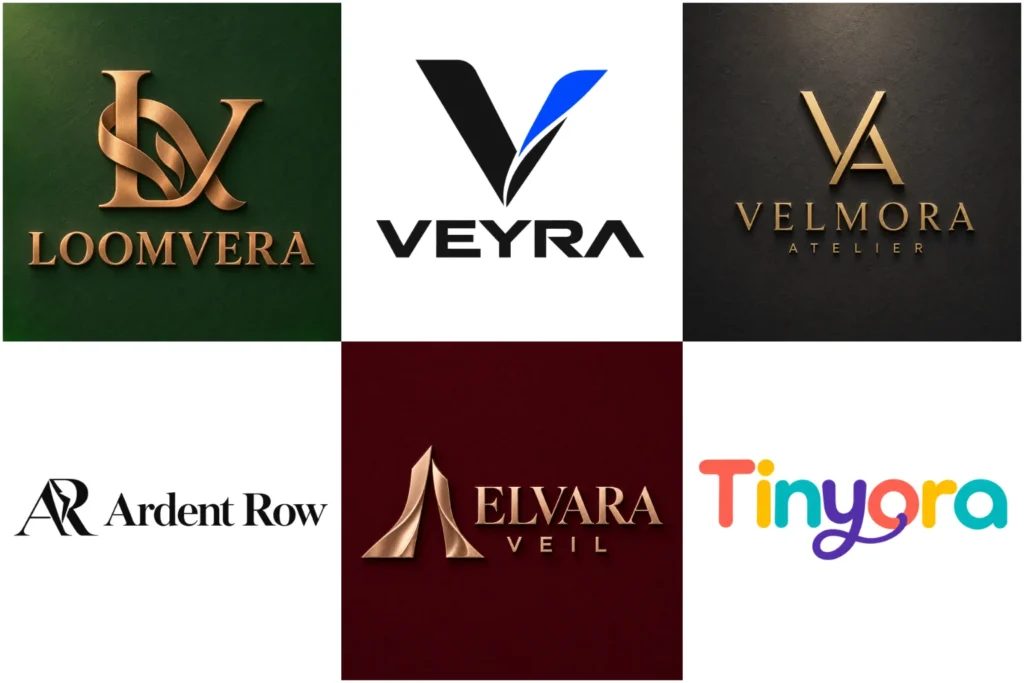
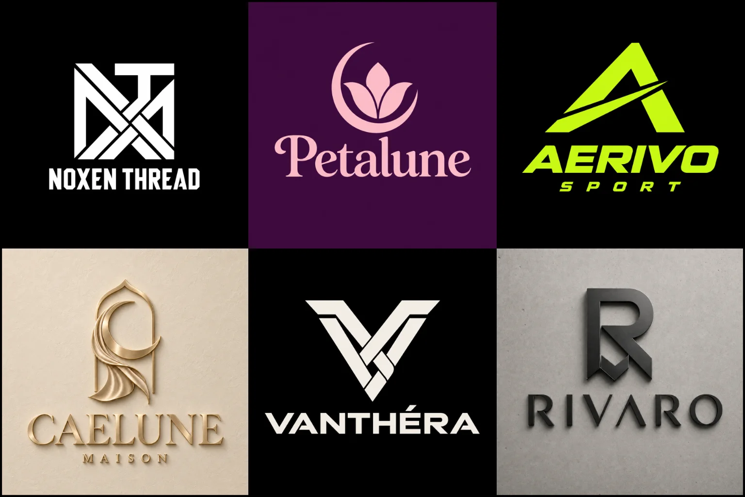
Our portfolio brings together original concepts across refined, expressive, understated, and bold directions. It shows how typography, symbols, spacing, and color can work together with professional control while still leaving room for a brand’s individual character.
Some pieces may be creative explorations rather than commissioned client work, but every design is presented to demonstrate practical brand use across hang tags, labels, packaging, storefronts, websites, digital campaigns, and retail displays of different sizes.
A Fashion Logo Has More Than One Job
A fashion logo needs to communicate the character of a brand before a customer touches the fabric or tries on a garment. Its typography, shape, color, and overall mood can suggest elegance, confidence, creativity, simplicity, exclusivity, or youthful energy.
It also needs to function in very different environments. A design that looks impressive on a website may become unclear when embroidered on a cap or printed inside a small neck label. Strong apparel branding considers appearance and practical use from the beginning.
Rather than chasing every new design trend, the identity should remain relevant as styles evolve. Fashion changes quickly, but a brand identity should remain useful as collections, campaigns, and customer preferences evolve.
Designed Around the Clothes You Sell
Different clothing businesses require different visual approaches. A logo should reflect the brand’s actual products, audience, positioning, and personality instead of relying on a generic fashion symbol.
A streetwear label may suit bold lettering, condensed typography, or a flexible symbol that works on garments. A luxury clothing brand often benefits from restraint, careful spacing, and refined letterforms. A children’s apparel business can use a warmer and more playful identity without making the design difficult to reproduce.
Boutiques may need a logo that feels personal and stylish across shopping bags, social media, and storefront signage. Sportswear and activewear brands usually require stronger forms that remain recognizable in motion and at small sizes.
Even businesses selling similar products should not automatically look alike. Price range, customer age, design philosophy, cultural influences, and retail environment can all change the right creative direction.
Choosing the Right Logo Structure and Style
The most suitable design format depends on the brand name, intended applications, and the impression you want to create. Each option offers useful advantages, but it also has limitations.
A Wordmark Logo makes the brand name the main visual feature. It can work especially well when the name is short, distinctive, and easy to pronounce. The typography must be carefully developed because ordinary font selection can make a wordmark feel generic.
A Monogram Logo uses initials to create a compact identity. This format is useful for woven labels, buttons, embroidery, profile images, and repeating fabric patterns. New brands may still need to display the full name nearby until customers become familiar with the initials.
A Combination Mark Logo brings a name and symbol together. It gives a clothing brand more flexibility across packaging, online stores, garment labels, and promotional material. However, the elements must also remain clear when space is limited.
A Minimalist Logo can create a clean and versatile appearance with fewer visual elements. Simplicity is valuable, but removing too much character can result in a mark that looks similar to other brands.
A Luxury Logo may use elegant typography, balanced proportions, controlled detail, and a restrained color palette. This direction suits premium positioning when it reflects the products and customer experience. It should not be used simply to make an ordinary brand appear expensive.
A Signature Logo can give a designer-led label or personal fashion brand an individual, handcrafted quality. The lettering needs to remain readable, particularly when reduced for garment tags, care labels, and mobile screens.
Details That Make the Identity Feel Original
Typography carries much of the personality in fashion branding. Serif letterforms can feel editorial, traditional, or sophisticated, while clean sans-serif lettering may appear contemporary and direct. Custom adjustments to spacing, proportions, terminals, and individual letters help prevent the design from looking like an unchanged font.
Symbols should have a clear connection to the brand idea. A needle, hanger, dress, crown, or sewing machine may describe the industry, but these familiar images are easily overused. A more distinctive concept can come from the brand name, garment construction, founder initials, cultural inspiration, fabric movement, or the philosophy behind a collection.
Negative space and visual balance are equally important. Every line and shape should contribute to the design. Unnecessary decoration can reduce clarity and make the logo harder to reproduce.
Color should support the intended mood without becoming the only recognizable feature. A successful mark should still communicate effectively in black, white, or a single production color.
Made to Work Beyond the Screen
Fashion identities appear on materials with different textures, printing methods, and size restrictions. The design should be evaluated for the places where customers will actually see it, including:
Neck labels and care labels
Hang tags and price tags
Embroidery and fabric patches
Buttons, zippers, and small accessories
Shopping bags, boxes, and tissue paper
Storefront signs and retail displays
E-commerce websites and mobile screens
Social media profiles and advertisements
Lookbooks, catalogs, and campaign graphics
Very thin lines may disappear during embroidery. Small details can fill in on woven labels, while gradients may not reproduce well through every printing or stamping method. A wide layout can also feel cramped on a narrow tag.
The primary design does not need to be forced into every space. A flexible identity may use a full name in one setting and a simplified initial or symbol in another, provided the variations remain visually connected.
What to Include in Your Design Brief
A useful brief gives the designer direction without prescribing every visual decision. Before the project begins, it helps to provide:
The exact brand name and preferred capitalization
A tagline, only if it must appear in the logo
The types of clothing or accessories you sell
Your target customer and intended price level
The personality you want the brand to express
Where the logo will be used most often
Color preferences or colors you want to avoid
Relevant competitors and how you want to differ
Visual references with an explanation of what you like
Any symbols, themes, or cultural details that should not be used
References should communicate taste rather than become designs to copy. Explaining why you like a particular example is more helpful than sending unrelated images without context.
How a Strong Visual Direction Is Developed
A thoughtful concept starts by identifying what the brand should communicate. The name, clothing category, audience, positioning, and practical applications provide the foundation for exploring suitable typography and symbols.
Early ideas should be judged by relevance, not decoration alone. A beautiful mark can still be the wrong choice if it feels too formal, too playful, too delicate, or disconnected from the garments.
Promising directions are then refined through spacing, alignment, proportions, shape quality, and small-size testing. This stage often makes the difference between an interesting idea and a professional identity.
LogoPixa focuses on building a clear visual direction around the individual brand rather than applying the same fashion template to every business.
What to Check Before Approving a Logo
A logo should be evaluated as a working brand asset, not only as a large presentation image. Before choosing a concept, consider these questions:
Is the brand name easy to read at a practical size?
Does the design suit the intended customer?
Can it work in one color?
Will important details survive embroidery or small printing?
Is the logo still easy to recognize when visual effects are removed?
Can it sit comfortably beside product photography and patterns?
Does it feel distinctive without becoming overly complicated?
Is it connected to the brand rather than a temporary trend?
Original artwork and trademark availability are separate matters. A visually distinctive design may still resemble an existing registered mark in a particular market. Appropriate name and trademark checks should be completed before investing heavily in labels, packaging, signage, or inventory.
Create a Brand That Belongs on the Label
Your clothing may attract attention first, but the identity helps customers connect those products to one consistent name. The right logo can bring structure to your labels, packaging, online store, social content, and future collections without competing with the garments themselves.
LogoPixa can help turn your brand positioning and creative direction into an original, memorable, and practical visual identity. Share your brand name, products, audience, and preferred direction to begin shaping a concept that fits both your style and real-world applications.
Explore More Logo Options
Browse more logo industries to explore branding options created for different types of businesses.
You may also be interested in:
- barber shop branding
- beauty brand identity
- hair salon branding
- jewelry brand identity
- photography branding
Frequently Asked Questions
What type of logo is best for a clothing brand?
There is no single format that suits every clothing business. Wordmarks work well for distinctive names, monograms suit compact applications, and combination marks provide more flexibility. The right choice depends on the audience, products, positioning, and where the design will appear.
Does a fashion logo need a clothing symbol?
No. A hanger, dress, needle, or sewing machine can communicate the industry, but it is not required. Typography, initials, abstract forms, or a symbol connected to the brand story can create a more distinctive identity.
Is a minimalist logo suitable for an apparel business?
It can be a strong choice when the brand needs a clean and adaptable appearance. However, minimalist does not mean plain or unfinished. The typography, spacing, and proportions still need enough character to separate the brand from competitors.
Should I choose a wordmark or monogram?
Choose a wordmark when displaying the full name is important and the name is visually manageable. A monogram is useful when initials create a stronger compact mark. Some brands use both formats as connected parts of the same identity.
Which colors work best for a fashion brand?
The best palette depends on the intended personality and customer. Black and neutral shades can feel refined, while brighter colors may support playful, youthful, or expressive positioning. The logo should also remain effective without color.
Can a detailed logo be embroidered on clothing?
Some detailed designs can be embroidered at larger sizes, but fine lines and small gaps may disappear when reduced. Simpler shapes and controlled spacing generally produce cleaner results on caps, chest marks, fabric patches, and labels.
Should the tagline be included in the logo?
Only when it adds useful information and remains readable. Long or very small taglines can create problems on labels and mobile screens. The main logo should not depend on a tagline to identify the brand.
Can the same logo be used on labels, packaging, and social media?
The identity should remain consistent, but one arrangement may not fit every space. A full logo can work on packaging and websites, while a compact initial or symbol may perform better on small labels and profile images.
How can I make my clothing logo look original?
Begin with the brand’s own name, values, audience, products, and design philosophy. Avoid copying popular labels or depending on common fashion icons. Custom typography, meaningful concepts, and carefully refined proportions can create a more individual result.
What information should I provide before the design starts?
Provide the exact brand name, clothing category, target audience, intended positioning, main logo applications, preferred visual mood, and useful references. Mention any colors, symbols, or themes that should be included or avoided.