
Hair Salon Logo Design That Fits Your Brand
Each concept is developed for clarity, recognition, and practical use across signs, social profiles, booking pages, uniforms, and product labels. Explore the portfolio to find a direction that feels right for your business.
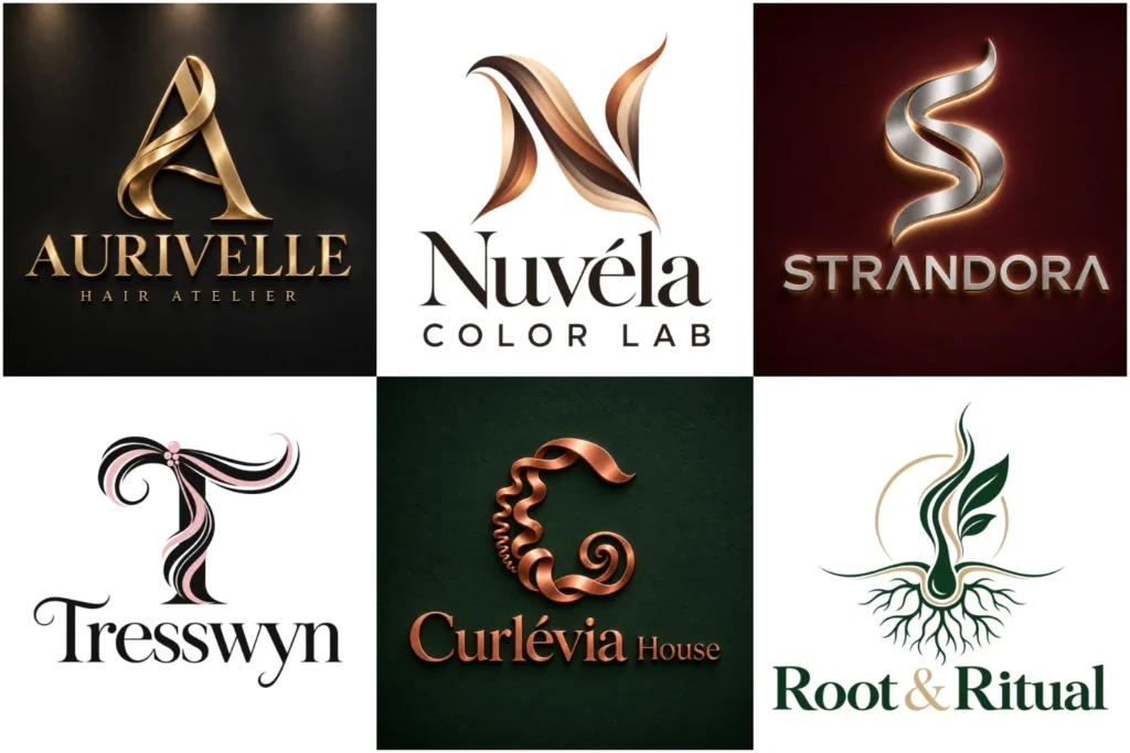
Explore Original Salon Branding Concepts
This collection shows a range of original ideas created to demonstrate how different salon personalities can be expressed visually. You will find refined wordmarks, expressive lettering, balanced icon combinations, and versatile marks suited to both digital and physical applications.
The work focuses on professional typography, thoughtful spacing, recognizable forms, and adaptable layouts. Some pieces may be concept work, but every example is presented to help you judge creative range, execution quality, and real-world usability.
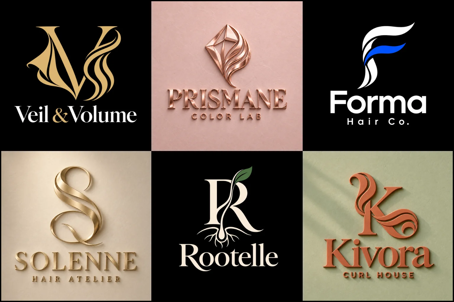
Your Identity Sets Expectations Before the Appointment
Clients often notice your branding before they see your work. It may appear on a storefront, Instagram profile, booking platform, business card, or product label. Those first visual details help people form an impression of your salon.
A polished boutique studio may need a refined and understated appearance. A creative color specialist can use a more expressive direction, while a family or unisex salon may benefit from something clean, welcoming, and broadly appealing.
The design should reflect what clients can expect when they arrive. It can communicate precision, creativity, relaxation, confidence, luxury, friendliness, or a fashion-led approach. The right message depends on your services and positioning, not on current beauty trends alone.
Building the Design Around Your Salon
Every salon has a different personality, even when the services appear similar. Before choosing fonts, colors, or symbols, it helps to define the character of the business.
Important considerations include:
The services that are most important to your business
- The type of clients your salon aims to reach
Whether the salon feels premium, relaxed, artistic, natural, or energetic
The interior style and customer experience
Whether the business is built around a salon name or an individual stylist
The places where the identity will appear most often
Any plans to introduce treatments, training, or retail products later
A clear direction prevents the design from becoming a random collection of beauty-related elements. It also makes it easier to create an identity that remains relevant as the business develops.
Visual Directions That Suit Salon Brands
There is no single format that works for every stylist or beauty studio. The most appropriate direction depends on the name, audience, services, and desired impression.
A typography-based logo places the salon name at the centre of the identity. Carefully chosen letterforms can create a clean, fashionable, luxurious, or approachable appearance without relying on an icon. This format is especially effective when the business name is short and distinctive. Long names may require additional layouts to remain readable in smaller spaces.
A custom signature logo can give an independent stylist, founder-led studio, or bridal hair specialist a more personal character. Custom lettering feels more considered than an ordinary script font. However, decorative strokes must be controlled because overly elaborate lettering can become difficult to read on signs and profile images.
A text and symbol logo combines the business name with a recognizable visual mark. It offers flexibility because the complete arrangement can support formal branding while the symbol may suit compact applications. The icon and typography must feel connected rather than appearing like two unrelated pieces.
An elegant brand logo can support a high-end studio, extension specialist, bridal salon, or premium treatment space. Refined serif lettering, balanced spacing, and restrained details often create the right tone. This approach is less suitable when the brand needs to feel highly playful, youthful, or budget-focused.
Moving Beyond Common Beauty Symbols
Scissors, combs, flowing hair, female profiles, mirrors, crowns, and strands of hair appear frequently in salon branding. These symbols are easy to understand, but using them without a fresh idea can make one business look similar to many others.
A familiar object does not always need to be rejected. It can still work when its shape is simplified, redrawn, combined with meaningful lettering, or used through negative space. The goal is to create a distinctive interpretation rather than selecting a ready-made icon.
Not every salon needs an obvious industry symbol. A strong name-led design, abstract form, or custom monogram can create a more individual identity. The connection to the industry can come from the typography, color palette, supporting imagery, and wider brand presentation.
A distinctive idea still needs to be clear and easy to understand. If an idea requires a long explanation before customers understand it, the concept may be too complicated for everyday use.
Typography That Matches the Client Experience
Typography carries much of the brand personality. A high-contrast serif can feel editorial and sophisticated. A clean sans serif may create a modern, inclusive appearance. Custom script lettering can communicate personal care, movement, or artistry.
Typeface selection is the first part of building the right visual character. Kerning, letter width, stroke weight, capitalization, and spacing all influence how professional the final design feels. Thin lettering may look refined on a screen but disappear on an illuminated sign, embroidered towel, or small appointment card.
Script styles need particular care. Letters should connect naturally, and the business name must remain easy to read without guesswork. If the salon has an unusual spelling, decorative handwriting should not make recognition more difficult.
Supporting words such as “Hair Studio,” “Salon,” “Colour Specialist,” or a location can provide useful context. They should remain secondary to the main name and should not make the composition crowded.
Choosing a Color Palette with Purpose
Salon branding is not limited to pink, black, or gold. Color should be selected according to the atmosphere, audience, and positioning of the business.
Black, ivory, warm white, and muted metallic tones can create a premium appearance. Soft neutrals, dusty rose, taupe, or earthy shades may suit calm and welcoming spaces. Brighter accents can support a creative color studio or youth-focused salon. Deep green, brown, and botanical tones may work for a business centred on natural products or sustainable care.
Color also has practical limitations. Metallic effects do not reproduce identically on websites, ordinary printers, vinyl signs, and uniforms. Pale shades can lose contrast, while complicated gradients may be difficult to use in embroidery or one-color printing.
A dependable identity should remain recognizable in full color, black, white, and other simplified applications. This keeps the brand consistent when production methods change.
Matching the Direction to the Business Model
Different salon models need different visual priorities.
| Salon type | Suitable direction | What to avoid |
|---|---|---|
| Premium boutique studio | Refined typography, restrained palette, subtle custom detail | Extremely thin lines that disappear on signs |
| Independent hairstylist | Personal lettering or a strong name-led mark | Complicated scripts that hide the name |
| Unisex salon | Balanced typography and a neutral visual language | Styling that feels unintentionally limited to one audience |
| Hair color specialist | Expressive forms with a controlled color accent | Depending entirely on a rainbow or gradient effect |
| Extension or bridal specialist | Graceful lettering and polished proportions | Generic crowns, faces, or beauty clip art |
| Natural hair studio | Confident type with authentic shapes or patterns | Symbols that do not represent the clients being served |
| Family salon | Friendly letterforms and clear, approachable composition | Childlike styling unless children are the main audience |
| Salon with retail products | Compact, scalable identity suitable for labels | Wide layouts that become unreadable on packaging |
These suggestions can be adapted to suit the individual business. A design should be shaped around the real personality of the business instead of forcing the salon into a category.
Making the Identity Work Beyond the Storefront
A salon mark has to perform in spaces with very different shapes and production requirements. A wide storefront sign offers room for detail, while a social media profile image may show the design inside a small circle.
Common applications include:
Exterior signs and window graphics
Websites and online booking pages
Instagram, Facebook, Pinterest, and other social profiles
Appointment cards and service menus
Staff uniforms, aprons, capes, and towels
Mirrors, reception desks, and salon stations
Gift cards and promotional materials
Shampoo bottles, treatment jars, and other retail packaging
The main composition should remain easy to identify from a distance. Smaller versions need enough weight and spacing to stay clear. Decorative details that work on a large sign may need to be reduced for profile images, embroidery, or product labels.
Planning for these uses early creates a more practical identity and reduces the need for inconsistent versions later.
The Role of a Tagline or Service Description
A tagline can clarify a specialised service or positioning statement, but it should earn its place in the design. Short descriptions such as “Hair and Beauty,” “Colour Studio,” or “Cuts and Styling” can help when the business name does not explain what the salon offers.
Long promotional sentences usually weaken the hierarchy and become unreadable at small sizes. A tagline can also create problems if the salon expands into services that the wording does not cover.
When supporting text is necessary, it should remain visually separate from the main name. This allows the primary identity to stand on its own when space is limited.
Signs That an Existing Salon Identity Needs Attention
A complete redesign is not always necessary. Sometimes the concept is still relevant, but the typography, spacing, proportions, or file quality needs improvement.
An update may be useful when:
Customers regularly misread the business name
The design looks unclear in profile images
Fine details disappear on signs or uniforms
Several inconsistent versions are being used
The identity no longer reflects the salon’s services or pricing position
The symbol came from a common template
The logo relies on effects that cannot be reproduced consistently
A business name or ownership structure has changed
If the current design already has recognition, retaining a familiar shape, letterform, or color can be valuable. Removing every established element without a clear reason may weaken continuity.
What to Share Before Design Work Begins
A useful brief does not need complicated design terminology. Clear information about the business is more valuable than asking for a particular font without explaining why.
Helpful details include:
How the business name should appear, including uppercase and lowercase letters.
Any essential supporting text
Core services and specialities
The audience the salon wants to reach
The intended price and experience level
Preferred brand qualities
Colors or symbols that should be used or avoided
Photographs of the interior or signage area
The main digital, print, and physical applications
Examples that show your taste, along with what you like about them
References should guide the mood rather than be copied. LogoPixa uses the brief to shape an original direction that fits the salon’s actual needs and remains practical across everyday applications.
Explore More Logo Options
Browse more industry-specific logos to explore branding options created for different types of businesses.
You may also be interested in:
- clothing brand identity
- spa brand identity
- dental branding
- beauty business branding
- barber brand identity
Frequently Asked Questions
What makes a strong salon identity?
It should be distinctive, readable, appropriate for the target audience, and flexible enough for both large and small applications. The typography, symbol, color, and spacing should express a consistent personality.
Does the design need scissors or a hair symbol?
No. Industry symbols can provide quick context, but they are not required. A name-led mark, custom lettering, or less literal symbol can create a more distinctive result when it suits the brand.
Is script lettering suitable for a salon?
Script lettering can feel personal, creative, or refined. It works best when the name remains easy to read. Very thin strokes, excessive flourishes, and tightly connected letters can create problems at small sizes.
Which colors work best for a salon brand?
The best colors depend on the salon’s audience and atmosphere. Premium studios may prefer restrained neutrals, while creative or youth-focused businesses may use stronger accents. Contrast and reproduction are more important than following a popular palette.
Should I include a tagline?
Include one only when it adds useful information. A short service description can clarify the business, but long wording can clutter the design and reduce readability.
Can the same design work on signage and social media?
The core identity can remain consistent, but different layouts may suit different spaces. A horizontal arrangement can work on a storefront, while a compact symbol or stacked version is easier to use in a profile image.
How can a unisex salon avoid looking too feminine or masculine?
Use balanced typography, neutral colors, and inclusive visual cues. Avoid relying heavily on stereotypical beauty imagery unless it genuinely reflects the salon’s intended audience.
Should an independent stylist use a personal name?
A personal name can support a founder-led service and make the brand feel individual. A separate business name may offer more flexibility if the salon is expected to add staff, locations, or services later.
Can a salon identity be updated without changing it completely?
Yes. Improving the lettering, spacing, proportions, colors, or layout can make an existing concept more professional while preserving familiar elements customers already recognize.