
Spa Logo Design
The aim is a mark that feels refined, readable, and practical across signs, booking pages, product labels, uniforms, and social profiles. Explore the portfolio to see different directions for modern, natural, elegant, and boutique spa brands.
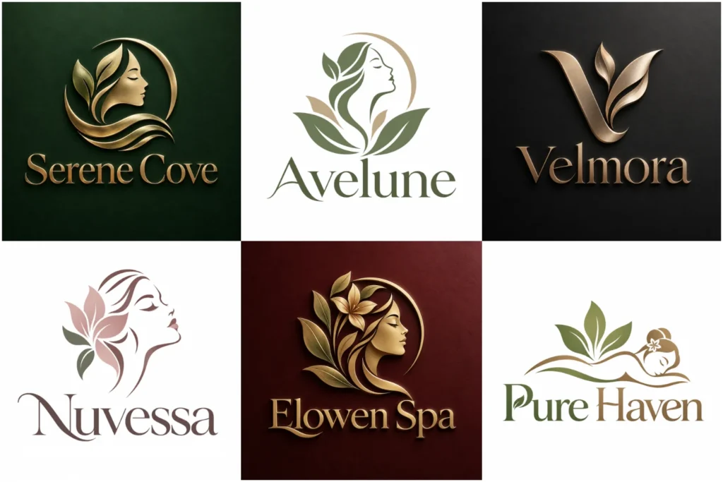
Explore Our Spa Branding Portfolio
Our portfolio presents a varied mix of original concepts built around different wellness personalities, from quiet minimalist marks to expressive botanical and premium directions. Each piece is developed with attention to typography, symbol choice, proportion, spacing, and real-world usability.
Some examples are exploratory concepts rather than paid client work, but every design is shown to demonstrate professional execution, visual variety, and how a spa identity can adapt across digital, print, packaging, and physical spaces.
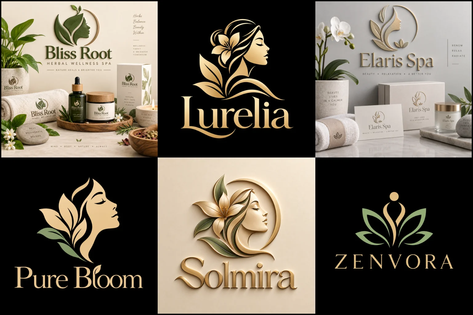
Creating the Right First Impression for a Spa Brand
A spa is often associated with relaxation, personal care, comfort, privacy, and a break from a busy routine. The visual identity should support that experience without making the business look identical to every other wellness brand.
The right direction depends on the type of spa you operate. A luxury day spa may need an elegant and restrained identity, while a natural wellness retreat might suit softer organic forms. A modern skincare studio may benefit from a cleaner, more clinical appearance, while a holistic spa can use warmer and more expressive visual elements.
The goal is not simply to make the logo look peaceful. It should represent the character of the business and help customers understand the kind of experience they can expect.
Moving Beyond the Usual Lotus and Leaf Symbols
Lotus flowers, leaves, water drops, hands, stones, candles, and facial silhouettes are closely connected with the wellness industry. They communicate the category quickly, but they are also widely used.
Using a familiar symbol is not automatically a problem. The issue is how it is handled.
A botanical element can become more distinctive through custom construction, negative space, unusual proportions, or a meaningful relationship with the business name. An abstract shape may communicate balance, renewal, flow, or calm without showing an obvious spa object.
Sometimes the strongest concept comes from the name itself rather than an industry symbol. A location, initial, natural reference, architectural detail, treatment philosophy, or meaningful word within the brand name can provide a more individual starting point.
Choosing a Visual Style That Matches the Experience
Different spa businesses need different visual personalities.
A contemporary skincare studio or urban wellness space may benefit from a clean and simple logo with restrained shapes, controlled spacing, and straightforward typography. This approach can feel calm and polished while remaining easy to use across booking platforms, social profiles, and product labels.
A premium retreat, hotel spa, or exclusive beauty destination may suit a high-end logo design direction. Refined typography, generous spacing, subtle symbolism, and carefully controlled details can support a more sophisticated position without depending on excessive decoration.
For botanical, holistic, massage, or nature-inspired brands, a clean line-based logo can create a softer visual character. Fine illustration can work beautifully, but line weight must remain strong enough to reproduce clearly at smaller sizes.
No style should be selected simply because it is popular. It needs to match the atmosphere, services, audience, price positioning, and physical environment of the business.
The Business Name and Symbol Need to Work Together
Many spa businesses benefit from keeping the name visible alongside the visual symbol, especially when the brand is still building recognition.
An icon with wordmark design can provide this balance. The complete arrangement may be used on storefront signage, websites, appointment materials, and packaging, while a simplified icon can support smaller applications when appropriate.
The relationship between the two elements matters. A delicate botanical symbol paired with overly heavy lettering can feel disconnected. Likewise, highly decorative typography may compete with an already detailed icon.
Good composition gives both elements enough space to feel connected without making the logo unnecessarily large or complicated.
Typography Can Change the Entire Mood
Typography plays a major role in wellness branding because small differences in letter shape and spacing can completely change the personality of the identity.
Elegant serif lettering can create a refined or established feel. Clean sans-serif typography may suit a contemporary spa, skincare clinic, or modern wellness studio. Softer rounded forms can make the identity feel more approachable, while carefully developed script lettering may add a personal or boutique character.
Decorative fonts need extra care. Thin strokes, complex flourishes, or tightly connected letters can become difficult to read on small product labels, appointment cards, mobile screens, or embroidered materials.
The business name should remain clear before decorative styling is considered.
Using Color Without Falling Into Wellness Clichés
Soft green, beige, cream, muted pink, blue, earth tones, and natural neutrals are commonly associated with wellness, but a spa is not limited to these choices.
Color should reflect the specific brand experience.
Warm neutrals can create an organic and grounded atmosphere. Dark tones paired with restrained accents can feel more premium. Fresh greens may support botanical positioning, while softer blues can create a quieter visual character. A skincare-focused business may choose an especially clean and restrained palette.
The important factor is consistency and contrast. The logo should remain understandable on light and dark backgrounds and should not depend entirely on color to communicate its idea.
A strong identity should also remain recognizable in a single-color version for applications where full color is not practical.
Designing for Real Spa Touchpoints
A logo will rarely appear only on a website.
Spa branding can be used on exterior signs, reception areas, booking pages, treatment menus, gift cards, towels, robes, uniforms, product bottles, packaging, appointment materials, social media, printed stationery, and promotional graphics.
Each environment creates different design requirements.
A complicated floral illustration might look impressive at a large size but lose important detail on a small bottle label. Extremely thin lettering may look elegant on screen yet become weak when embroidered onto fabric. A very wide layout may work on signage but become awkward inside a social media profile.
Considering these uses early helps create an identity that remains practical instead of looking attractive only in a presentation mockup.
Balancing Calmness With Memorability
Spa branding often aims for a peaceful appearance, but making everything extremely soft or minimal can create another problem: the identity may become difficult to distinguish from competing businesses.
Calm does not have to mean generic.
Distinctive letterforms, thoughtful negative space, an unusual symbol relationship, custom proportions, or a carefully developed visual detail can give the logo personality without making it loud.
The strongest direction usually communicates one clear idea rather than attempting to show relaxation, beauty, nature, water, wellness, luxury, massage, and skincare in the same symbol.
Restraint helps when it is used with purpose.
Different Spa Businesses Need Different Identities
A hotel spa, massage studio, beauty spa, medical spa, wellness retreat, facial studio, nail spa, holistic center, and mobile spa may all operate within a similar market, but customers can have very different expectations of each one.
A medical or advanced skincare business may require greater visual precision and clarity. A wellness retreat may benefit from more natural forms. A boutique facial studio might use sophisticated typography with a subtle symbol, while a family-oriented local spa may need something warmer and more approachable.
Understanding the actual service model helps prevent the identity from becoming a generic representation of the entire wellness industry.
It also helps avoid misleading visual cues. A business should not appear highly clinical if its experience is primarily natural and relaxing, just as a treatment-focused brand may not want an identity that feels like a beauty salon.
Building a Brand Identity Around the Right Idea
LogoPixa approaches the creative direction by considering the business name, spa category, customer profile, desired personality, positioning, and likely applications before deciding what the mark should look like.
This creates room to explore ideas that belong to the individual brand rather than beginning with a ready-made wellness icon.
The concept can then be refined through typography, proportions, spacing, symbol construction, and layout. Unnecessary detail should be removed where it weakens readability, while useful character should remain so the identity does not become overly generic.
The aim is a clear, original, memorable, and usable visual identity that feels connected to the business behind it.
What to Consider Before Starting Your Project
You do not need to decide exactly what the final logo should look like before working with a designer.
It is more useful to understand the impression you want customers to receive. Consider whether your brand should feel natural, luxurious, clinical, warm, modern, feminine, neutral, holistic, exclusive, understated, or approachable.
Your main services, customer type, business environment, preferred colors, unsuitable visual directions, and places where the identity will appear can also influence the design.
Examples of branding you like can help communicate your taste, but they should be used as visual references rather than copied. Your own identity needs a reason to exist independently.
Explore More Logo Options
Browse more industry-specific logos to explore branding options created for different types of businesses.
You may also be interested in:
- logos for jewelry brands
- logos for hair salons
- fitness brand identity
- barber logo
- beauty business branding
Frequently Asked Questions
What should a spa logo include?
It should include only the elements needed to identify and represent the brand clearly. This may be the business name, a distinctive symbol, custom typography, or a combination of these. Lotus flowers, leaves, hands, water, and other wellness imagery are optional rather than required.
Does a spa logo need a lotus flower?
No. A lotus can communicate wellness and relaxation, but it is extremely common. A custom botanical form, abstract symbol, meaningful initial, name-based idea, or another concept connected with the business may create a more individual identity.
Which colors work well for spa branding?
Natural neutrals, greens, blues, soft warm tones, and restrained dark palettes can all work. The right choice depends on the brand personality, services, interior environment, audience, and intended positioning rather than following one standard wellness palette.
Should my logo look luxurious?
Only if premium positioning accurately reflects the business. Elegant typography and restrained visual details can support an upscale spa, but forcing a luxury appearance onto every wellness business can create the wrong expectations.
Can a simple logo still feel unique?
Yes, but simplicity needs a distinctive idea behind it. Custom letterforms, thoughtful proportions, negative space, an original symbol, or an unusual visual relationship can create character without requiring excessive detail.
Is a detailed botanical logo practical?
It can be, depending on how it is constructed and where it will be used. Very fine leaves, tiny gaps, and thin strokes may disappear on small labels, embroidery, stamps, or digital icons. Botanical artwork should be simplified enough to remain recognizable.
Should the spa name always appear in the logo?
Not necessarily, but displaying the name is often useful for newer or less familiar businesses. A separate symbol may become useful for compact spaces, while the full identity keeps the business name visible where recognition matters.
What information should I provide before the design begins?
Useful details include your business name, main services, intended audience, desired brand personality, preferred or unsuitable colors, important visual ideas, competitors or market references, and the main places where the identity will appear. These details help establish a relevant creative direction without forcing the design into a predetermined template.