
Cartoon Logo Design
LogoPixa focuses on creating artwork that fits your audience, industry, and brand tone rather than relying on generic illustrations. Explore the portfolio to see different character styles, expressions, compositions, and creative directions.
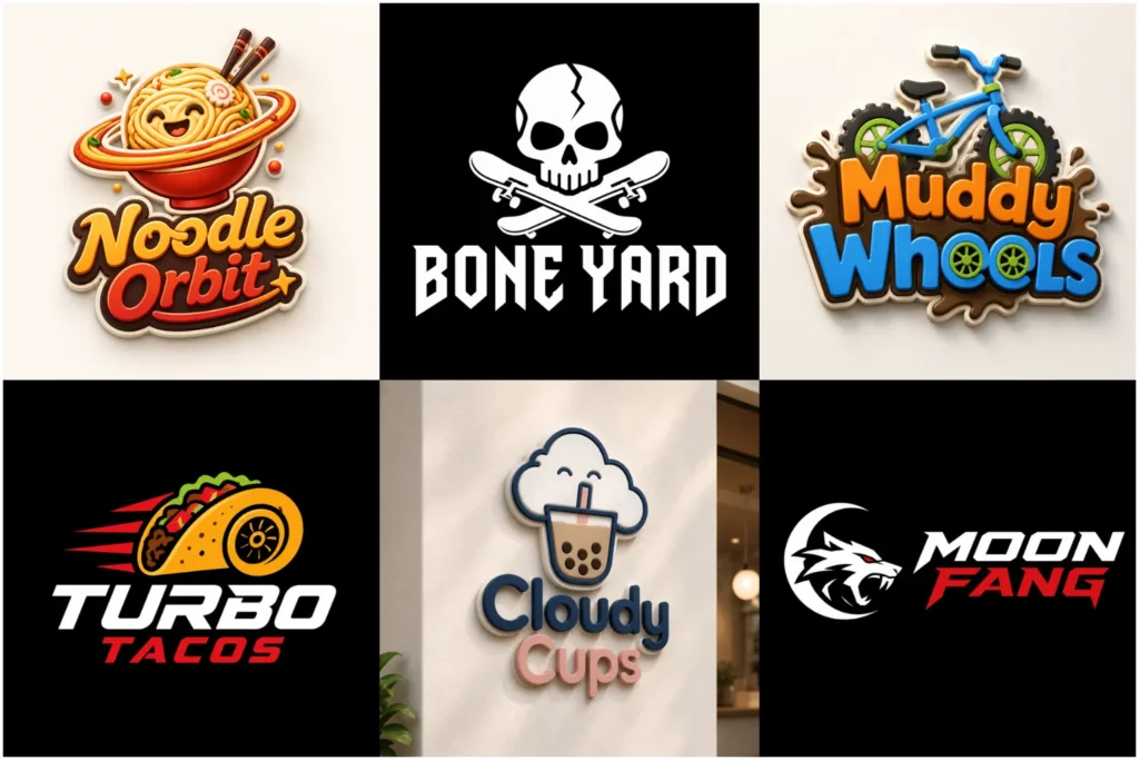
Explore Our Cartoonish Logo Portfolio
Browse a selection of playful, bold, friendly, and character-driven logo concepts created across different visual directions. The portfolio shows how illustrated branding can range from simple and clean to highly expressive while remaining suitable for practical business use.
Each concept is developed with attention to originality, typography, proportions, color balance, and readability. These examples can also help you identify the level of detail, personality, and overall style that fits your own brand.
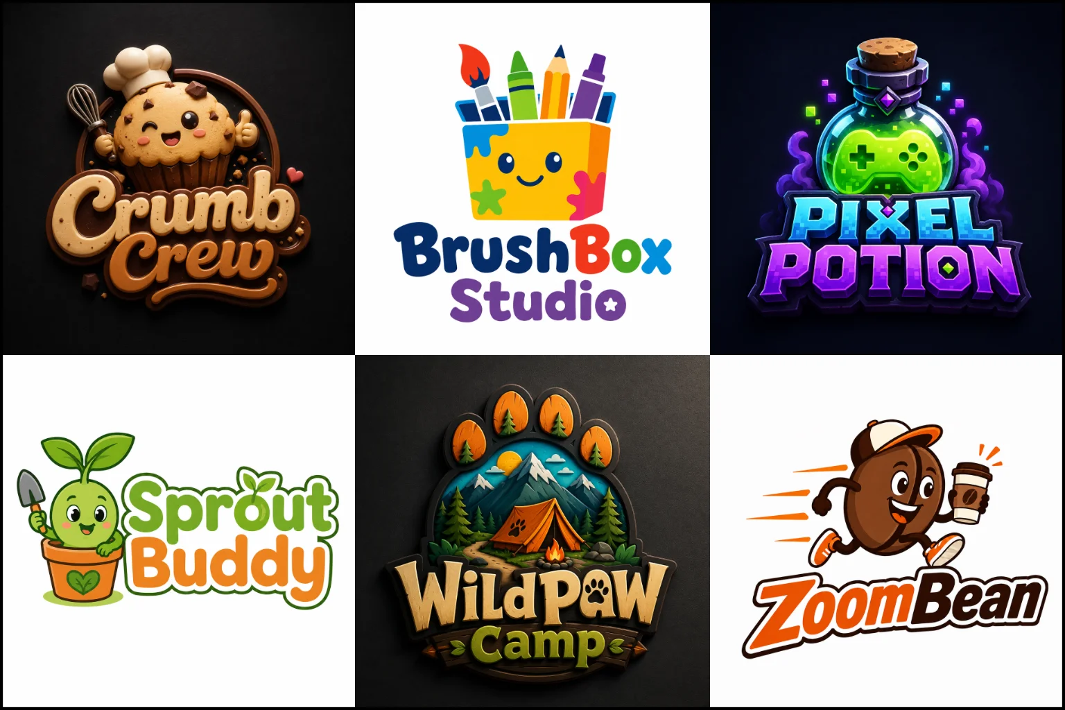
Turn a Brand Idea Into a Recognizable Character
Cartoon branding works differently from a simple symbol or text-based logo. Instead of relying only on shapes or lettering, it can give a brand a face, personality, attitude, or visual story.
The central element might be a person, animal, food item, object, fictional character, or imaginative figure. What matters is not simply making it look fun. The illustration should communicate something relevant about the business.
Logos for bakeries might feature a cheerful chef, an expressive baked product, or another friendly character connected to the brand’s specialty. A gaming brand could use an energetic fictional character. A pet business may choose an expressive animal. A children’s brand might need something softer and friendlier.
The character, facial expression, pose, colors, typography, and surrounding elements should all support the same brand personality.
Cartoon Logo vs. Mascot Logo
These two approaches often overlap, but they are not exactly the same.
A logo describes the visual style. The artwork uses illustrated, simplified, exaggerated, or character-like features.
A mascot logo, on the other hand, is built around a recognizable character that represents the brand. A mascot can be cartoon-styled, but cartoon artwork does not always need to function as a mascot.
For example, an illustrated coffee cup with a simple face can create a cartoon look without becoming a full brand character. A named bear character used repeatedly across packaging, social media, merchandise, and advertising would function much more clearly as a mascot.
Understanding this difference helps determine how much personality, detail, and long-term character development your brand actually needs.
Where This Style Works Especially Well
Illustrated identities tend to work best for brands that benefit from personality and emotional expression.
They are often a strong option for:
Food trucks, cafés, restaurants, and snack brands
Gaming, esports, and entertainment businesses
Children’s products and educational brands
Pet shops, grooming services, and animal-related businesses
Clothing and streetwear labels
YouTube channels, streamers, and content creators
Toy and hobby businesses
Sports clubs and community teams
Creative services and entertainment projects
Product packaging that needs a memorable visual character
The industry alone should not determine the style. Your audience and intended brand personality matter just as much.
A serious financial consultancy, legal practice, luxury architecture studio, or highly technical B2B company may usually benefit from a more restrained visual direction unless a playful identity is deliberately part of its positioning.
Choosing the Right Cartoon Direction
Not every illustrated logo needs oversized eyes, exaggerated expressions, or complex character artwork. There are several ways to approach the style.
A simple cartoon mark can use clean outlines, limited details, and basic shapes. This usually makes the design easier to recognize at smaller sizes.
A character-focused design can include facial expressions, clothing, props, poses, or gestures that communicate personality.
A bold comic-inspired direction may use thicker outlines, energetic forms, strong contrast, and more dramatic typography.
A softer illustrated approach can use rounded forms, friendly expressions, and calmer visual details for children, pets, food, or lifestyle brands.
This friendly direction can also work well in education branding, provided the character feels appropriate for the students’ age group and remains clear on uniforms, websites, signs, and learning materials.
The right direction depends on what people should feel when they first see the brand.
Building the Illustration Around Your Brand
An effective cartoon identity should not feel like an unrelated illustration with a business name added underneath.
The artwork needs to connect with the brand itself.
This may happen through the character choice, clothing, object, expression, pose, product reference, color palette, or typography.
If the business has an existing character idea, it can be developed into a cleaner and more recognizable visual mark. If there is no character yet, the concept can begin with the brand name, audience, product, service, or personality.
The aim is to remove unnecessary details while keeping the features that make the concept distinctive.
That balance is important because a logo must perform differently from a full illustration.
Character-Based and Object-Based Designs
Human and animal characters are common, but they are not the only option.
Everyday objects can also become memorable brand symbols when they are simplified and given personality. A slice of pizza, coffee mug, camera, tool, game controller, plant, vehicle, or product can be transformed into an expressive visual identity.
When the main idea works better as a recognizable object than a full character, a pictorial mark logo can provide useful inspiration. Pictorial marks focus on an identifiable visual object and can be adapted with illustrated characteristics when a more playful tone is needed.
The choice should depend on what communicates the business most clearly, not simply which option looks more decorative.
Combining Cartoon Artwork With Typography
For many businesses, the illustration is only part of the identity. The brand name still needs to be clear and visually connected to the artwork.
Typography can make the design feel energetic, friendly, retro, youthful, handmade, sporty, humorous, or professional.
A strong design should control:
Font personality
Letter weight
Spacing
Capitalization
Text hierarchy
Alignment
Character-to-text proportion
Overall logo silhouette
When both the illustrated symbol and business name need to work together as one primary identity, a combination mark logo structure is often practical.
It gives the character visual impact while keeping the brand name immediately visible.
Using Badges and Emblem-Style Layouts
Some cartoon concepts work particularly well inside circular, shield-shaped, stamp-style, or badge-like compositions.
This approach can suit cafés, food brands, sports teams, barbers, automotive businesses, outdoor brands, gaming communities, and businesses that want a more contained logo shape.
An emblem logo design integrates the visual elements and wording into a unified composition. When combined with cartoon artwork, the result can feel established and highly recognizable.
However, emblems can become crowded if too many words, decorative elements, and character details are added. Simplicity is still important, especially when the logo must appear at small sizes.
How Much Detail Should a Cartoon Logo Have?
More detail does not automatically produce a better result.
Detailed artwork can look impressive at a large size, but tiny facial features, textures, shadows, accessories, and decorative lines may disappear when the logo is reduced.
The right amount of detail depends on where the identity will be used.
A logo intended for storefront signs, packaging, apparel, or large merchandise can support more visual information than a small social profile image or website favicon.
For most brands, the strongest approach is to preserve the character’s most recognizable features while simplifying secondary details.
Good simplification makes the illustration easier to identify without removing its personality.
Color Choices and Brand Personality
Color plays a major role in illustrated branding because cartoon artwork can easily become visually busy.
A focused palette usually creates a stronger identity than using many unrelated colors.
Bright colors can support energetic, youthful, playful, or entertainment-focused brands. Warmer colors may work well for food and hospitality. Darker combinations can make a cartoon character feel stronger, more serious, competitive, or premium.
Controlled warm palettes can help a food logo feel inviting and appetizing, while strong contrast keeps the character and product idea easy to recognize.
Contrast also matters.
The character, outlines, text, and background should remain visually distinct so the logo does not lose clarity.
A design should also be considered beyond its main full-color version. The basic shapes need enough strength to remain recognizable when color options are limited.
Facial Expression Can Change the Entire Brand Tone
When the logo includes a face, expression becomes part of the branding.
A smile can feel welcoming. A determined expression can give gaming logo a competitive or energetic personality without making the character unnecessarily aggressive. A relaxed character can create a casual personality. A mischievous look might work for an entertainment or snack brand.
The expression should match the audience rather than simply making the character more dramatic.
Small changes to eyebrows, eyes, mouth shape, posture, and head angle can significantly change how a character is perceived.
That is why expression should be treated as a branding decision, not just an illustration detail.
Making the Logo Practical Beyond the Screen
A visually interesting concept still needs to function in everyday brand applications.
This flexibility is particularly important in logos for restaurants, which may need to work across storefront signs, menus, delivery packaging, uniforms, social profiles, and promotional graphics.
Before choosing a direction, consider where the logo is likely to appear:
Website headers
Social media profiles
Product packaging
Stickers
Clothing and merchandise
Storefront signs
Business cards
Delivery packaging
Menus
Promotional graphics
Vehicle graphics
Printed marketing materials
A complicated horizontal composition, for example, may be difficult to use as a small profile image. A highly detailed character may lose clarity when embroidered.
Planning for these applications early helps produce a more flexible identity.
Original Character Design Matters
Cartoon branding often involves familiar themes such as chefs, animals, gamers, superheroes, food characters, or smiling objects. The challenge is making the concept belong specifically to your brand rather than resembling a generic stock character.
Originality can come from the silhouette, expression, proportions, pose, clothing, hairstyle, accessories, shapes, typography, or the way multiple elements interact.
A strong logo does not need to look strange simply to appear different.
The goal is to create enough distinctive visual features that the identity feels intentional and recognizable while remaining easy to understand.
What to Prepare Before Starting Your Logo
You do not need to know exactly what the final design should look like, but a few details can make the creative direction much clearer.
Useful information includes your business name, industry, target audience, preferred personality, color preferences, and where the logo will be used.
If you already have a character idea, describe its appearance and role. Mention important clothing, objects, expressions, poses, or features that should be included.
References can also help communicate the type of visual energy you like, but they should guide the direction rather than become something to copy.
LogoPixa can use this information to develop a concept around the brand itself instead of relying on a generic cartoon formula.
When a Simpler Style May Be Better
Cartoon artwork is not always the right choice.
If your business needs a very formal, understated, corporate, architectural, legal, or luxury identity, detailed character artwork may conflict with the desired positioning.
A simpler symbol or typography-led identity may also work better when the logo must appear extremely small or when visual restraint is important.
There are ways to reduce this limitation. A cartoon concept can use fewer details, cleaner geometry, restrained expressions, or a more minimal illustration style.
The important question is not whether cartoon artwork looks attractive. It is whether the style communicates the right message for the business.
Explore More Logo Options
Discover other logo styles and find the right visual direction for your brand.
- classic vintage branding
- custom signature logo
- modern brand identity
- shape-based logo style
- realistic 3D logo
Frequently Asked Questions
What makes a good cartoon logo?
A good design combines a clear concept, distinctive character or object, readable typography, controlled detail, balanced colors, and a recognizable silhouette. The artwork should reflect the brand rather than looking like a generic illustration.
Do I need a mascot for this type of logo?
No. The design can feature a mascot, but it can also use an illustrated object, animal, symbol, product, or simple character without developing it into a full brand mascot.
Can a cartoon-style logo still look professional?
Yes. Professionalism depends on execution and suitability, not whether the artwork is illustrated. Clean proportions, thoughtful typography, consistent line work, controlled colors, and appropriate character styling can create a polished identity.
Are cartoon logos only for children’s businesses?
No. They are also widely suited to food, gaming, entertainment, sports, pets, apparel, content creation, hospitality, and other brands that benefit from an expressive visual personality.
Should my logo be highly detailed?
Usually only when those details remain useful at the sizes where the logo will appear. Too much detail can reduce clarity. A simpler character with strong defining features is often easier to recognize across different applications.
Can my own character idea be turned into a logo?
Yes. An existing character concept can serve as the starting point. Its important features can be refined and simplified so the character works more effectively as part of a brand identity.
Can an animal be used as the main character?
Yes. Animals can communicate many different personalities, from friendly and playful to strong, fast, clever, calm, or adventurous. The species, expression, pose, and illustration style should match the intended brand message.
Can the business name be included with the character?
Yes. Many illustrated identities combine a character with the company name. The important part is making sure the text and artwork feel visually connected and remain readable at practical sizes.
Will this style work for product packaging?
It can work especially well for packaging when personality and shelf recognition matter. The design should still remain clear around product information, labels, colors, and other packaging elements.
How do I choose the right character style?
Start with your audience and the personality you want the brand to communicate. Decide whether the character should feel friendly, bold, humorous, energetic, cute, serious, retro, rebellious, or refined. The illustration style can then be developed around that direction.