
Food Logo design
The aim is a clear mark with the right character, not a predictable food icon. View the portfolio to explore possible creative directions.
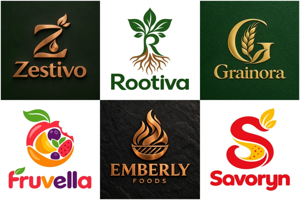
Explore Food Brand Logo Concepts
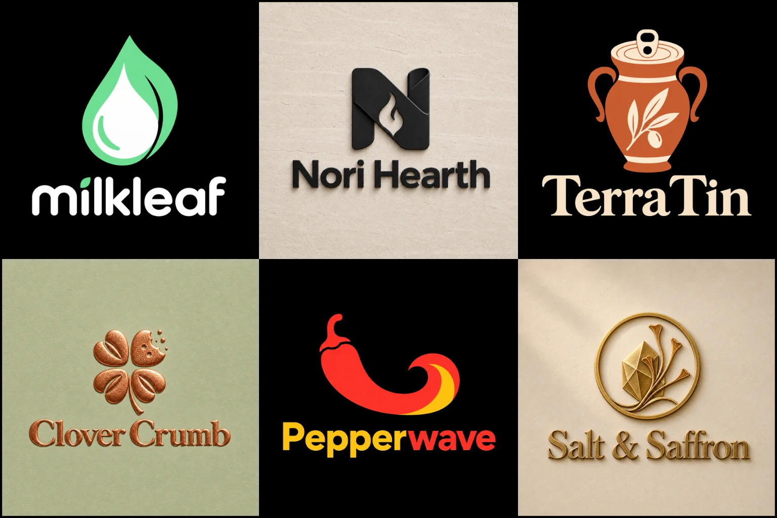
Explore a varied selection of food identity concepts built with different symbols, lettering styles, color moods, and brand personalities. The work shows how a logo can feel playful, fresh, premium, rustic, bold, or simple while remaining purposeful and well composed. Some pieces may be creative showcase projects rather than commissioned client work.
Each example is presented to demonstrate original thinking, professional execution, and practical potential across packaging, labels, menus, signs, uniforms, and digital platforms.
Make the Right Promise Before the First Bite
Customers cannot taste a product by looking at its logo, but they can form expectations about it. The visual identity may suggest freshness, warmth, convenience, craftsmanship, bold flavor, or premium quality before someone reads the product description.
Those expectations must match the actual offer. A playful snack brand should not look like a formal gourmet supplier. An artisan sauce may need more personality than a large-scale food manufacturer. A healthy meal service could benefit from a clean appearance, but an overly clinical identity might make the food feel less appealing.
The purpose is not to communicate every ingredient or benefit in one symbol. A strong mark gives customers the right first impression and makes the brand easier to identify when they encounter it again.
Build the Concept Around the Product
Every food business has a different reason for being chosen. Before exploring colors or icons, it helps to define what makes the offer relevant.
The creative direction should consider:
The food, product range, or service being offered
The people most likely to buy it
Whether the brand is casual, premium, traditional, energetic, or family-focused
Where customers will see and purchase the product
The main quality the identity should communicate
How the brand compares visually with nearby alternatives
A frozen meal range, organic tea company, hot sauce label, dessert shop, and wholesale ingredient supplier should not receive the same visual treatment. Even businesses selling similar products may need different identities because their prices, audiences, personalities, and sales environments are different.
Choose a Logo Structure That Fits
The structure affects how easily the identity can be recognized, reproduced, and adapted. The right choice depends on the length of the brand name, the available space, and whether customers already know the business.
A Combination Mark Logo brings the symbol and business name together. It is a practical option for new food brands because customers can see the name while gradually becoming familiar with the icon. The elements may also offer more flexibility across wide labels, square profiles, and compact packaging areas.
A Pictorial Mark Logo uses a recognizable visual symbol, such as an ingredient, utensil, plant, flame, or product shape. It can create quick category recognition, but the image needs enough originality to avoid looking like a generic stock icon.
A name-led identity can work when the business name is short, distinctive, and easy to read. This approach places greater importance on custom lettering, spacing, and typography because there is no separate symbol to carry the personality.
Match the Personality to the Market
Friendly character-based branding can help a casual food business feel approachable. A Mascot Logo may suit snack products, family brands, food trucks, sauces, cereals, or concepts built around humor and personality. However, detailed mascots can become difficult to reproduce at small sizes and may not fit a restrained luxury position.
A Vintage Logo can support a brand inspired by traditional recipes, smokehouses, handmade goods, local markets, classic diners, or old-fashioned baking. It works best when heritage is genuinely relevant to the intended character. Artificial dates, false establishment claims, and overcrowded decorative details should be avoided.
Clean contemporary styling is often useful for modern packaged foods, meal services, and products competing in visually busy spaces. Simplicity can improve recognition, but removing too much character may leave the brand looking interchangeable with its competitors.
Use Food Imagery With Restraint
A food-related symbol can explain what the business sells, but literal imagery is not always necessary. Some of the most suitable concepts communicate an experience or attitude instead of showing the exact product.
Common symbols such as chef hats, forks, leaves, plates, wheat, flames, and serving cloches are widely used. They are not automatically wrong, but they need a distinctive shape, composition, or conceptual connection to the brand.
An unusual ingredient, preparation method, product origin, name meaning, or customer ritual may provide a more memorable direction. For example, movement might communicate fast service, layered forms could reference a particular product, and carefully shaped negative space might connect the brand name with an ingredient.
The concept should remain understandable without requiring a long explanation.
Select Colors for Positioning and Practical Use
Red, orange, and yellow often appear in food branding because they can feel warm, active, and energetic. Green may suggest plants, freshness, or natural ingredients. Dark neutrals can create a more refined mood, while bright palettes may feel youthful and playful.
These associations are not fixed rules. Color meanings change with context, culture, typography, packaging materials, and competing brands. Choosing red simply because the business sells food can make the identity blend into an already crowded category.
A useful palette should provide:
Clear contrast between the logo and its background
Consistent reproduction on screens and printed materials
Enough flexibility for different product varieties
Readability at both large and small sizes
A workable single-color version when full color is unavailable
Color can strengthen a concept, but it should not be the only feature holding the identity together.
Give Typography a Clear Role
Lettering influences whether a brand feels handmade, traditional, bold, elegant, cheerful, or efficient. It also determines how quickly customers can read and remember the name.
Rounded type can feel friendly, while stronger condensed lettering may support bold flavors or energetic products. Serif styles can suggest tradition or refinement. Handwritten lettering may add warmth, but it can lose clarity when used for a long name or printed on a small label.
Decorative cuts, ingredient-shaped letters, and unusual ligatures should serve the idea rather than distract from it. If the customer struggles to read the name, the design is asking style to do too much.
Spacing also matters. Letters that look balanced on a large presentation may appear cramped on packaging, mobile screens, or small stickers. The wordmark must be judged at realistic sizes.
Design for Packaging, Signs, and Screens
Most logos need to work across many different applications. Food businesses may need it on jars, pouches, boxes, bottles, cartons, menus, delivery bags, uniforms, storefronts, social profiles, and ordering platforms.
Each application creates different challenges. A narrow bottle label offers less horizontal space than a shop sign. A delivery app may reduce the mark to a small square thumbnail. Printing on cardboard or stamping a paper bag can remove fine details and subtle color differences.
A practical identity should be tested for:
Small product labels
Light and dark backgrounds
Single-color printing
Square digital profiles
Horizontal packaging areas
Large signs and vehicle graphics
Embroidery, stamps, or simple merchandise
The logo should not carry information that belongs elsewhere on the package. Product names, flavors, weights, ingredients, certifications, and regulatory details need their own visual hierarchy.
Different Food Businesses Need Different Answers
Packaged food brands need strong shelf recognition and a system that can accommodate multiple flavors, sizes, or product ranges. The master identity should remain stable while supporting clear product differences.
Artisan producers may benefit from tactile, handcrafted character. However, handmade styling should still look controlled and readable rather than rough for its own sake.
Meal preparation and delivery brands are often discovered on phones. Their names and symbols need to remain clear in small listings where several competitors appear together.
Food trucks and casual concepts can use bolder colors, expressive lettering, or energetic characters. Their identity must also remain visible from a distance and work on a moving vehicle.
Manufacturers and wholesale suppliers usually require a more adaptable identity that looks credible on cartons, documents, uniforms, trade materials, and digital listings.
Premium food products often benefit from restraint, thoughtful typography, and controlled color. Decorative effects alone do not make a brand look premium. The underlying composition must already feel considered.
Avoid Common Food Branding Mistakes
A familiar symbol may seem like the safest option, but copying the visual habits of the category can make the business difficult to distinguish. Generic utensils, copied badge layouts, and predictable color combinations often create recognition of the industry without recognition of the brand.
Other common problems include:
Adding too many ingredients or product illustrations
Using several unrelated fonts
Making taglines unreadably small
Relying on gradients, shadows, or metallic effects
Choosing a style based only on a current trend
Ignoring how the mark looks in one color
Creating a symbol that does not match the brand name
Making every product variation look like a separate company
Originality does not require a complicated idea. A simple concept can be distinctive when its shapes, spacing, typography, and relationship to the business are carefully developed.
Judge the Logo Without the Mockup
A polished package or storefront mockup can make almost any mark appear impressive. The logo itself should also be reviewed as a flat design on a plain background.
Check whether the business name is readable, the symbol remains clear at a small size, and the composition feels balanced without lighting or texture. It should still communicate the intended personality when shadows, embossing, and realistic packaging effects are removed.
Mockups are useful for imagining applications, but they should support the design rather than hide its weaknesses.
Prepare a More Useful Creative Brief
Clear information helps the designer make decisions based on the business instead of assumptions. A useful brief does not need complicated design terminology.
Before starting, consider providing:
The exact business or product name
Any required tagline
The food products or services your business offers
The intended customer
The desired brand personality
Primary sales channels
Main packaging or display requirements
Relevant competitors
Colors or visual approaches to avoid
Examples you like, with reasons
Existing brand elements that must remain
References should communicate preferences, not invite imitation. Explaining why you like a particular design is more useful than asking for a copy of it.
Create an Identity Ready for Real Use
LogoPixa can develop a visual direction around your product, audience, market position, and practical applications. The focus is on creating an original identity that remains clear across the places customers actually encounter the brand.
If you are preparing to launch, update, or reposition a food business, share the brand name, product details, intended audience, and preferred character. These details provide a stronger foundation for a relevant concept than selecting an icon or color without context.
Explore More Logo Options
Browse more logo industries to explore branding options created for different types of businesses.
You may also be interested in:
- logos for bakeries
- logos for coffee shops
- logos for hotels
- logos for restaurants
- logos for trucking companies
Frequently Asked Questions
What makes a good logo for a food brand?
It should be distinctive, readable, relevant to the intended audience, and practical across packaging and digital platforms. It should also create expectations that match the actual product and brand position.
Does the logo need to show the food being sold?
No. Literal product imagery can improve category recognition, but it is not required. A distinctive name, character, abstract idea, or symbol connected to the brand story may create a stronger identity.
Which colors work best for food branding?
There is no universal best palette. The colors should support the desired personality, remain readable, reproduce consistently, and help the brand stand apart from close competitors.
Should a food business use a mascot?
A mascot can work well for playful, casual, family-oriented, or character-driven brands. It may be less suitable for businesses seeking a restrained, clinical, or highly sophisticated appearance.
What is the difference between a product logo and a restaurant logo?
A product identity must work across packaging sizes, flavors, labels, and retail displays. A restaurant identity places greater emphasis on the dining concept, location signage, menus, atmosphere, and service experience.
Can one logo support several flavors or products?
Yes. The main brand identity can remain consistent while colors, supporting graphics, product names, and label details distinguish each variety. The variations should feel related rather than appearing to come from different companies.
Is a simple logo always better?
Simplicity usually improves flexibility and small-size clarity, but oversimplification can remove personality. The right amount of detail depends on the concept, audience, applications, and intended brand character.
How can I tell if a detailed logo will work on packaging?
Reduce it to the smallest size expected on the label. If important shapes merge, text becomes unreadable, or the concept disappears, the design needs simplification or a compact alternative.
Should the tagline be included in the main logo?
Only when it remains readable and adds useful context. A long tagline can make the primary lockup crowded, so it may work better as an optional supporting version.
When should an existing food brand consider a redesign?
A redesign may be useful when the identity is difficult to read, looks inconsistent across applications, no longer reflects the product, resembles competitors too closely, or cannot be reproduced effectively. Following a temporary trend is not a strong reason by itself.