
Fitness & Gym Logo Design
Whether you run a local gym, personal training service, yoga studio, functional training gym, or online coaching brand, LogoPixa can create a distinctive visual direction built around your business. Browse the portfolio below to explore different approaches and find inspiration for your own brand.
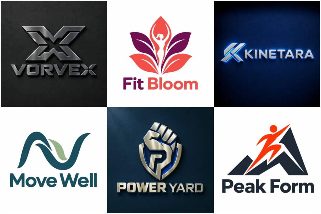
Explore Identity Ideas for Active Brands
This portfolio presents original concepts across a range of fitness personalities, from bold strength-focused marks to calm studio identities and clean coaching brands. Each design reflects professional execution through considered typography, balance, scalability, and practical brand use, not just visual impact on a screen.
The collection shows varied approaches without suggesting that every concept displayed was created for a paid client. Review the work to see which qualities feel right for your audience and offer.
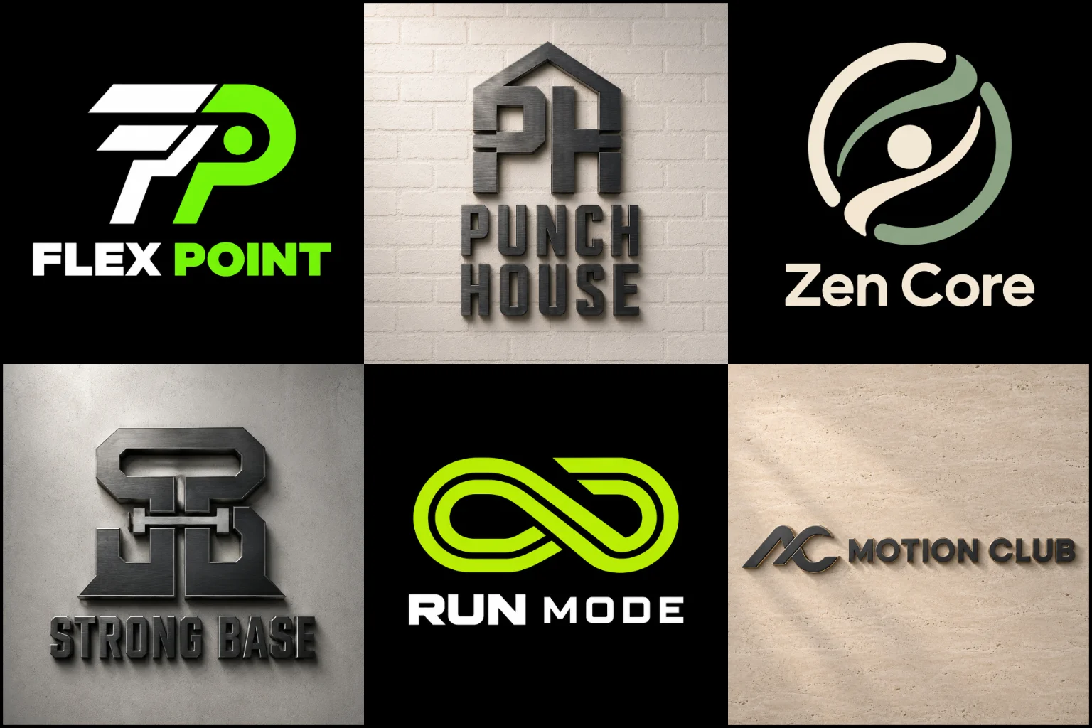
Your Identity Should Match the Experience You Sell
A logo creates expectations before someone visits your facility, joins a class, or contacts a trainer. It can suggest intensity, discipline, movement, confidence, balance, community, or personal support. The right message depends on the experience your business provides.
A bodybuilding gym may need a powerful and structured identity. A Pilates studio usually benefits from a lighter, more controlled visual tone. Personal trainers often need a flexible identity that builds recognition around their name, while large fitness centers may require a broader design that represents several services.
Trying to communicate every machine, class, and benefit in one symbol usually creates clutter. A stronger approach is to identify the central promise of the brand and build the design around it.
Find the Right Direction for Your Fitness Business
Different fitness businesses need different visual personalities. Before selecting a style, consider your audience, training environment, pricing position, and competitive market.
Strength and bodybuilding gyms may suit bold lettering, compact shapes, strong contrast, and controlled references to weights or physical power.
Personal trainers and coaches often benefit from a name-led design, initials, or a versatile symbol that supports an individual professional identity.
Functional and performance training brands can use forward movement, angular forms, speed cues, or dynamic negative space.
Yoga, Pilates, and wellness studios usually need a calmer visual language based on balance, flexibility, breathing, or natural movement.
Boutique fitness studios may require a polished, fashion-aware appearance that works well on interiors, clothing, social media, and merchandise.
Community gyms and fitness clubs can use a welcoming identity that represents belonging without appearing too aggressive or exclusive.
Gender stereotypes should not control the creative direction. A women-focused brand does not automatically need pink, delicate lettering, or a feminine figure. The design should reflect the actual audience and positioning rather than rely on predictable assumptions.
Choosing a Practical Logo Format and Style
Where and how the logo will be used should guide its overall structure. Some approaches provide flexibility, while others create a more specific personality.
A Combination Mark Logo brings the business name and symbol together. It is particularly useful for a new gym or coaching brand because the name remains visible while the icon develops recognition. However, both elements must also remain clear when the design is reduced.
An Emblem Logo can create the feeling of a club, team, or established training community. Badge-style designs often work well on gym walls, uniforms, and apparel, but excessive text or fine detail can become difficult to reproduce at small sizes.
A Geometric Logo can express control, precision, structure, and movement. This direction suits performance centers and disciplined training programs, although random polygons and unrelated shapes can make the identity feel generic.
A Modern Logo uses clean typography and simplified forms to create a current, adaptable appearance. It can work well for digital coaching, fitness apps, and contemporary studios. Extreme minimalism, however, may remove too much personality if the concept is not distinctive.
Build Recognition Without Relying on Clichés
Dumbbells, barbells, flexed arms, shields, flames, heartbeats, and muscular figures appear frequently in fitness branding. These symbols are not automatically wrong, but using them without an original idea can make one business look like many others.
A familiar symbol becomes more effective when it connects directly to the brand. It might be integrated into a letter, simplified into a distinctive silhouette, or combined with negative space in an unexpected way. The concept can also come from movement, progress, focus, endurance, community, or the architecture of the training space.
The goal is not to make the design unusual at any cost. It should remain relevant and easy to understand while giving people a clear reason to associate it with one particular brand.
Original design work also does not replace a legal trademark search. Business owners planning to register a name or symbol should check availability through the appropriate trademark authority or a qualified professional.
Typography That Carries the Right Energy
Lettering has a major influence on how a fitness business is perceived. Heavy condensed type can communicate strength and intensity, while a wider geometric typeface may feel stable and performance-focused. Rounded lettering can make a community studio appear more approachable. Refined serif or custom lettering may suit a premium wellness concept.
Readability matters more than visual aggression. Overly stretched letters, sharp decorative cuts, and tightly compressed spacing can make a name difficult to recognize, especially on mobile screens or exterior signs.
The length of the business name also affects the design. A short name can support a compact wordmark, while a longer name may need a carefully arranged lockup or a shortened icon based on its initials.
Colour Should Support Positioning, Not Control It
Red and orange can suggest heat, action, and intensity. Blue may communicate reliability and control, while green often connects with health, recovery, and wellbeing. Black, white, and dark grey can create a strong or premium appearance.
These associations are useful starting points, not fixed rules. Competitor colours, interior design, target audience, and brand personality should also influence the palette. A colour may fit the industry but still be a poor choice if every nearby competitor already uses it.
The design should also remain recognizable in one colour. This is important for embroidery, stamps, equipment markings, window vinyl, uniforms, and situations where full-colour reproduction is not practical.
Make Sure the Logo Works Beyond the Website
A fitness identity may appear on an exterior sign, reception wall, social profile, mobile app, staff shirt, membership card, water bottle, exercise mat, equipment sticker, or printed training plan. Each application creates different size and production limits.
A detailed mark that looks impressive on a large screen may become unreadable in a social media avatar. Thin lines can disappear during embroidery, while a very wide layout may be difficult to place on clothing or square digital spaces.
A useful identity system considers these situations early. The main arrangement can carry the complete name, while a compact symbol or initial-based variation can serve smaller spaces. Each version should still feel like part of the same brand rather than an unrelated design.
Plan for the Business You Are Building
A logo should represent the current offer without making future growth unnecessarily difficult. A symbol based entirely on a single piece of gym equipment may become restrictive if the business later introduces mobility classes, nutrition coaching, rehabilitation, or online programs.
The opposite problem is also possible. A mark can become so broad and neutral that it says nothing meaningful about the business. The best direction finds a practical balance between immediate relevance and reasonable flexibility.
Location can influence this decision as well. A neighborhood gym may want to highlight community and accessibility. A multi-service fitness center may need a broader identity, while a specialist coach can use a more focused concept connected to a particular training method.
What to Prepare Before Requesting a Design
A clear brief helps turn personal preferences into a design direction that supports the business. Useful information includes:
The exact business name and spelling
Whether the logo should include a tagline
Your main training services
The type of members you want to attract
How you want customers to perceive the brand
The main places where the identity will be used
Colours or visual themes you prefer or want to avoid
Nearby or direct competitors that should not look similar
Plans that could change how the brand is positioned
Reference images can help explain a preferred mood, but they should be treated as visual guidance rather than designs to copy.
Create an Identity People Can Use and Remember
LogoPixa can help translate your training concept, audience, and brand character into a clear visual identity. The focus is on creating an original mark that feels relevant to the business and remains practical across physical and digital applications.
Whether you are opening a new facility, developing a personal coaching brand, or replacing an identity that no longer fits, begin with the experience you want members to expect. From there, the visual direction can be shaped around the qualities that make the business distinct.
Explore More Logo Options
Browse more logo industries to explore branding options created for different types of businesses.
You may also be interested in:
- logos for gaming brands
- logos for healthcare organizations
- logos for spa businesses
- logos for sports teams
- logos for technology companies
Frequently Asked Questions
What makes a good fitness logo?
A good design is relevant to the training offer, easy to recognize, readable at different sizes, and distinct from nearby competitors. It should also work in colour and in a simple one-colour version.
Does a gym logo need a dumbbell or muscular figure?
No. These symbols can work when they support the concept, but they are not required. Typography, initials, motion, negative space, or abstract forms can communicate strength and fitness without using an obvious gym icon.
Which colours are best for a gym brand?
There is no single best colour. Energetic colours may suit an intense training environment, while softer or more restrained palettes can work for wellness and boutique studios. The choice should reflect the audience, atmosphere, and market position.
Should the business name include “gym” or “fitness”?
Include a descriptive word when it helps people understand an unfamiliar name. It may be unnecessary if the name, tagline, imagery, and wider branding already make the service clear.
Can one logo work for a gym sign and social media?
It can, provided the design is planned for both large and small applications. A full arrangement may suit signage, while a simplified symbol or initial-based variation is often more practical for profile images and app icons.
How detailed should a fitness logo be?
It should contain enough character to be distinctive without relying on tiny details. Fine lines, long text, and complex illustrations can lose clarity on clothing, mobile screens, and small printed materials.
Is an aggressive design suitable for every gym?
No. It may fit bodybuilding, powerlifting, or high-intensity training, but it can discourage beginners or members looking for a supportive environment. The visual tone should match the people the business wants to welcome.
What information is useful before the design begins?
Prepare the business name, services, target audience, desired personality, preferred colours, main logo applications, and competitor references. Clear information makes it easier to choose a relevant creative direction.