
Abstract Logo Design
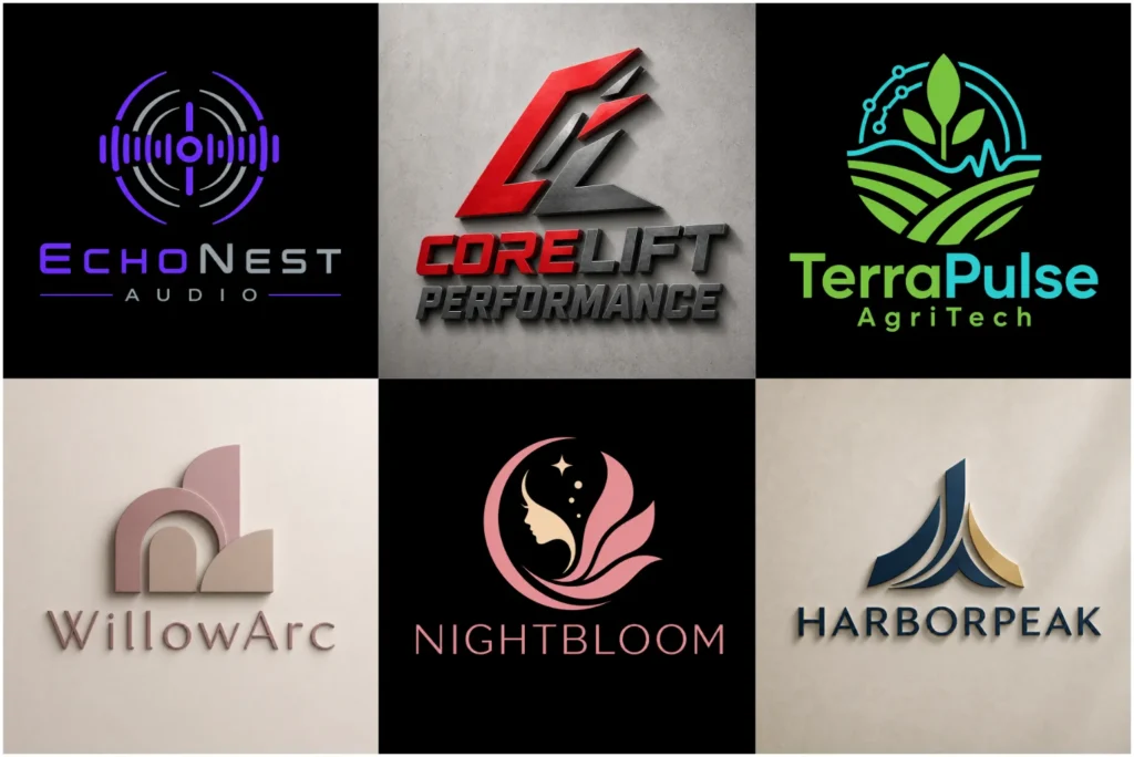
Original Visual Marks Created For Real Brands
Our portfolio presents original visual marks designed for real brands, where every professionally created abstract symbol builds a distinctive identity rather than following a familiar template. From experience, effective business representation depends on how carefully shape, movement, balance, and colour support clear communication. Each concept is developed around innovation, growth, connection, trust, and progress, giving the finished mark a purpose that extends beyond appearance.
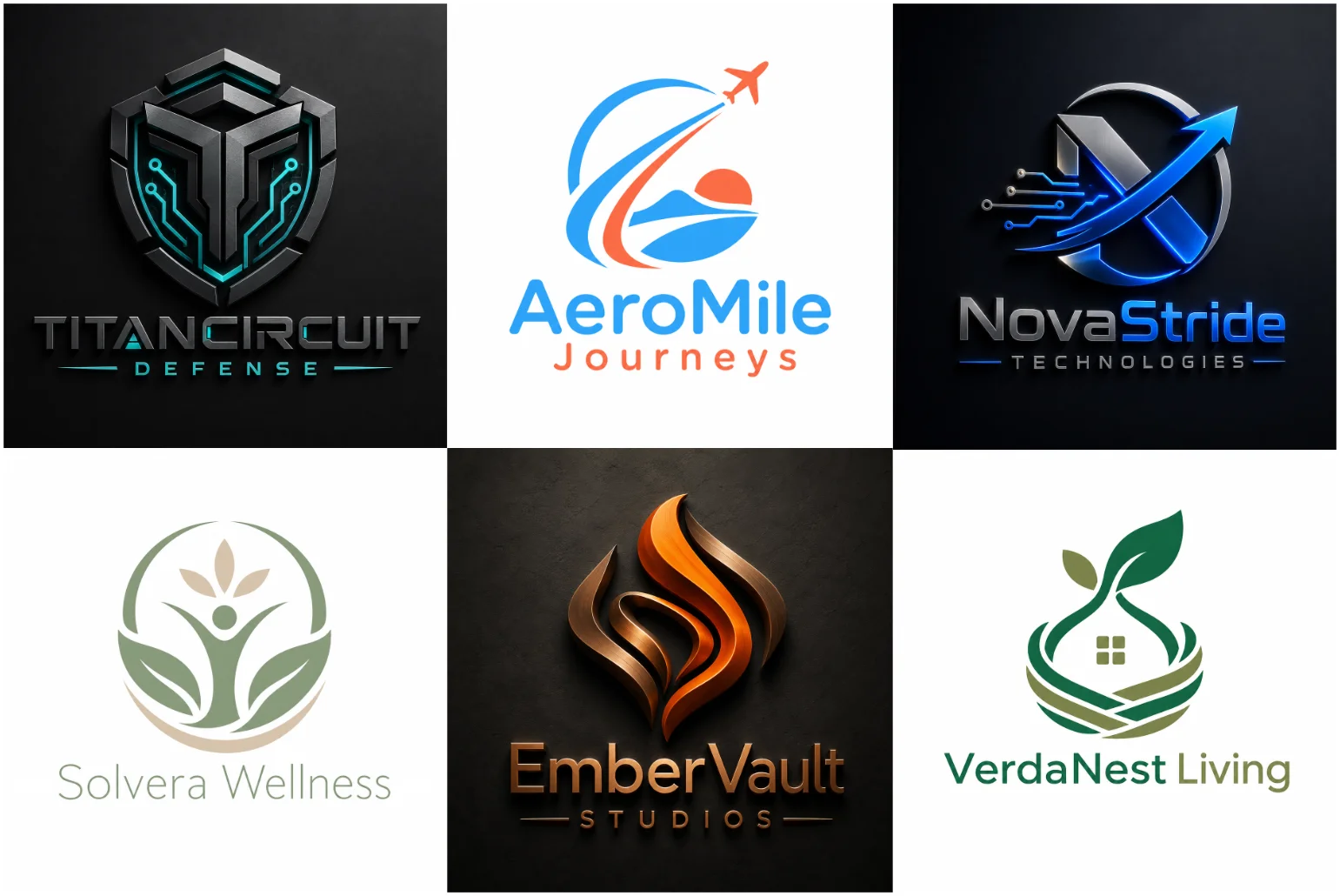
What Is An Abstract Mark?
Unlike a normal icon, a non-literal form does not copy a real item. In practice, I build each custom visual form around symbol communication, allowing shape, rhythm, and spacing to establish an immediate, lasting brand connection.
Its value appears over time: an independent symbol gains meaning through consistent use, supports wider business goals, and preserves creative freedom. I judge success through scalability, recognizable identity, and honest brand reflection across varied applications.
How A Non-Literal Symbol Represents A Business
From experience, an abstract mark works best when visual communication expresses core values before viewers study the company name. Carefully shaped balanced forms create recognition, while avoiding literal imagery that may restrict interpretation across markets.
A flexible abstract identity can help travel brand identity companies communicate movement, discovery, or connection without limiting the brand to airplanes, maps, or location pins.
I build a flexible symbol around brand personality, target audience, and clear purpose. This approach supports practical applications, strengthens business identity, and allows future expansion without forcing the company into one product category too narrowly.
Custom Artwork Made For Your Brand
From my experience, effective custom artwork begins by rejecting generic templates and studying the company’s brand values, audience, and project requirements. This creates a distinctive brand mark with visual balance, practical purpose, and authentic character.
Contrary to common practice, I shape an original identity around business nature, customer expectations, and intended applications before choosing form. The resulting commercially practical artwork supports digital applications, printed applications, and sustained, measurable company growth.
A Style That Matches Your Brand
A fitting abstract identity starts with purpose, not decoration. I assess company relevance, audience expectations, and industry appearance first, then establish the right direction through deliberate choices that strengthen brand perception consistently across customer interaction.
Abstract logos for technology companies may feel technical, bold, or refined without relying on predictable circuit patterns. I compare visual styles, refine a simple geometric direction, and keep every creative decision useful for current products and future services.
Shape, Movement, And Visual Balance
Strong visual impact rarely comes from adding more design elements. A Minimalist Logo approach can be especially effective when an abstract idea needs to be reduced to a simple and recognizable form. I refine line, curve, angle, gap, and proportion until the overall composition gains visual stability, clear appearance, and controlled movement without sacrificing personality or recognition.
For customers, directional shapes can suggest speed, development, and a progressive identity. Careful symbol construction prevents weak proportions, protects balanced appearance at smaller sizes, and helps the final mark retain reliability, control, and memorable identity.
Controlled movement, sharp angles, and a strong silhouette can give a gaming logo the energy needed for digital platforms, merchandise, and competitive environments.
Colour And Brand Personality
Effective palettes create perception before explanation. I test neutral tones, bright colours, and blue against light backgrounds and dark backgrounds, judging whether each option communicates strength, confidence, energy, or restrained professionalism across practical customer touchpoints.
Bold contrast and an energetic palette can help fitness brand identity communicate movement and strength while remaining clear on signage, clothing, and social media.
For production, I compare colour variations with embroidery, engraving, stamping, and documents. A selected palette should preserve simplicity through a single-colour version, support practical use, and maintain a controlled appearance across changing production methods consistently.
Who Should Choose This Logo Style?
From client work, I find startups, technology companies, and creative agencies benefit most when they need an expressive visual form without a specific product image. Businesses looking for a more contemporary identity can also explore a Modern Logo direction. This approach supports new services, different markets, and business expansion.
Abstract forms can also support healthcare branding when the identity needs to express care, connection, or progress without relying on a cross or another familiar medical icon.
For established companies, corporate organizations, and international businesses, an outdated symbol can restrict a wider brand. A flexible identity offers stability, a professional identity, and practical direction across connected systems and financial services with confidence.
Abstract Mark Or Pictorial Mark?
When a brand depends on a recognizable image, a real object such as a leaf, house, book, shield, or animal may communicate quickly. This approach suits companies serving a defined industry, service, or general subject.
However, a pictorial symbol is not always the best choice for several services. I first study customers, brand direction, and whether a product-related image would restrict the wider visual form as the business gradually expands.
Explore Other Logo Design Types
Explore connected identity options through our Mascot logo, Lettermark logo, and Wordmark Logo pages. Each type offers a different balance of personality, readability, and recognition, helping you compare approaches before choosing the best direction confidently.
You can also review Emblem Logo, Pictorial Mark Logo, and Combination Mark Logo services for structured, image-led, or blended solutions. These internal links make navigation easier while showing how each format supports different branding needs.
Suitable For New And Existing Businesses
At an early branding stage, I recommend building a consistent visual foundation before adding unnecessary complexity. An original symbol can guide customers, strengthen recognition, and remain clear across profile images, app icons, and compact spaces.
For an older identity, an updated direction may preserve familiar colours while removing an outdated symbol. Careful identity improvement simplifies structural details, creates an independent mark, and adapts to product labels, favicons, and promotional items.
Designed For Digital And Printed Use
Across websites, mobile applications, and social media profiles, I test artwork at different sizes, from app icons to a large screen size. Clear fine details, controlled thin lines, and open narrow gaps protect recognition everywhere.
When the concept relies more heavily on clean strokes and controlled outlines, a Line Art Logo can offer a lighter and more detailed visual approach.
For physical production, I prepare versions for business cards, letterheads, product packaging, presentation folders, uniforms, vehicle graphics, shop signs, and large signs. Production methods preserve full colour, black, white, engraving, embroidery, stamping, and single-colour applications.
Our Design Process
Our design process uses careful project organization from the project beginning, giving every creative decision a clear direction and keeping development focused, consistent, and easy to review.
1. Information Review
We review the business name, industry, services, audience, and brand values, along with the preferred style, colour ideas, and planned applications, to understand the project accurately.
2. Creative Direction
The project details help us define a focused message and establish a suitable visual direction that guides the overall creative direction without restricting original thinking.
3. Concept Development
During concept development, we create an original logo concept based on the project requirements, shaping it into a relevant visual mark according to the selected package.
4. Presentation And Feedback
The concept presentation allows a clear review of the proposed direction. Client feedback, requested changes, and available revisions are then managed according to the order.
5. Design Refinement
During design refinement, we improve the overall composition, spacing, and line thickness, applying all requested adjustments while protecting the approved visual direction.
6. Final File Preparation
After approval, the completed artwork enters final file preparation, where the required versions and file formats are organized according to the selected package.
What You Receive
Clients receive design files prepared for websites, online branding, and digital presentation, including transparent PNG files, JPG files, profile images, and social media-ready files that support smooth resizing, reliable general sharing, and everyday brand management.
For production, the package can include vector source files, high-resolution artwork, black and white versions, colour variations, and files for printing, embroidery, engraving, stamps, or single-colour printing, according to the selected package and package details.
Why Choose LogoPixa?
LogoPixa combines clear communication, revision support, and a focused design service so every project develops with fewer misunderstandings. Each concept follows an original design direction instead of relying on unrelated symbols or recycled visual ideas.
Deliverables include useful file formats for common business use, while careful professional presentation gives the identity a consistent professional appearance. The exact materials and production-ready assets are supplied clearly according to the selected package details.
Information Needed To Start Your Project
A detailed brief should include the business name, brand name, industry, main services, and desired qualities. Clear expectations, relevant examples, and honest ideas help me understand the identity before selecting any visual route with confidence.
List preferred direction, preferred visual style, colour preferences, brand colours, shapes, and symbols. Add general design references, included elements, avoided elements, intended artwork use, and enough details to support an accurate concept and final artwork.
Order Your Custom Brand Symbol
A strong order begins with a clear design brief covering business details, practical needs, and the preferred direction. This gives every decision purpose and helps translate the client’s provided information into a focused starting point.
After package selection, I shape a distinctive mark for different platforms, balancing consistency with practical flexibility. A professional presentation then shows how the system builds customer recognition and establishes a clear visual identity across applications.
Explore More Logo Options
Discover other logo types and find the right visual direction for your brand.
- typography-based logo
- lettermark logo style
- mascot brand identity
- custom pictorial logos
- custom combination logos
Frequently Asked Questions
What Makes An Abstract Mark Different From A Normal Icon?
The key difference lies in interpretation: a normal icon names something immediately, while an abstract mark builds meaning through shape, rhythm, and proportion. Its purpose is not literal description, but a distinctive visual direction system.
Unlike familiar symbols, abstract artwork allows the business to shape recognition over time. Customers connect the form with repeated experiences, making the identity more ownable, adaptable, and less dependent on obvious industry imagery or trends.
Can Customers Understand A Non-Literal Symbol?
A non-literal symbol can communicate quickly when its structure feels intentional. Clear proportions and controlled movement help customers notice its personality, while repeated use gives the mark meaning without lengthy explanations about subtle supporting details.
Understanding develops through time, not lengthy explanation. Consistent placement increases recognition speed, especially when colour, typography, and tone remain stable. The symbol becomes familiar because every brand interaction reinforces the same visual character and promise.
Is This Style Suitable For A New Business?
For a new business, this is a suitable style when flexibility matters. At the early branding stage, an adaptable symbol can support recognition growth without locking the company into one product, service, or narrow category.
A new company may initially pair the symbol with its complete business name for clarity. Later, stronger recognition allows independent use in smaller spaces, giving the identity room to mature as the business gains visibility.
Can The Symbol And Company Name Be Used Separately?
Yes. The full version can combine the symbol and name as the primary identity, while separate use creates flexible layouts. This approach keeps branding consistent across wide banners, square placements, documents, and compact digital interfaces.
The symbol becomes a compact brand element for a profile image, app icon, or favicon where text becomes unreadable. Consistent proportions, colour, and spacing help every reduced application remain clearly connected to the complete identity.
Which Industries Can Use An Abstract Mark?
This approach works across many industries, including technology companies, financial services, creative agencies, and corporate organizations. It is especially useful where a literal object cannot accurately represent the full offer, expertise, or future business scope.
It also supports startups, multi-service companies, and international businesses needing broad recognition. The final direction should still reflect the specific business, because abstract design succeeds through relevance, not simply through fashionable geometry or visual complexity.
Will The Artwork Work At Small Sizes?
Well-prepared artwork remains a recognizable mark at small sizes. I simplify shapes, control spacing, and remove unnecessary details so the identity stays clear across websites, profile images, and other small applications without losing immediate recognition.
The same testing supports product labels, business cards, and everyday practical use. Each version is checked at dimensions rather than enlarged previews, helping elements remain visible and preventing the symbol from becoming crowded or unclear.
Can The Artwork Be Used For Printing?
Yes. Final artwork can support printing on business cards, packaging, uniforms, promotional items, and signs. Clean vector source files allow accurate scaling for both standard production and large-format printing without quality loss during production runs.
The available final files depend on the selected package, but included assets are prepared for professional production. Printers can adjust dimensions while preserving clean edges, consistent proportions, and reliable reproduction across physical materials and applications.
Will I Receive A Transparent Background File?
A transparent background file is commonly supplied through transparent PNG files, allowing the logo to sit cleanly over photographs, colours, and layouts. Availability depends on the selected package, included services, and the confirmed order details.
The provided file formats are organized for straightforward use, so clients can identify transparent, coloured, and alternate versions quickly. This prevents accidental white boxes and makes placement easier across websites, presentations, social content, and documents.
Can I Request Changes To The Concept?
Yes. You can request changes by providing clear feedback after reviewing the concept. The available number of revisions depends on the selected package, so all comments should be carefully organized before submitting each revision round.
Specific concept changes and requested adjustments are evaluated against the brief. Consolidated notes reduce conflicting edits, protect the strongest parts of the idea, and help each revision move the artwork closer to the intended result.
Can You Use My Existing Brand Colours?
Yes. Share your existing brand colours, current colour values, and any formal brand guidelines within the project brief. This allows the new symbol to remain familiar while improving structure, recognition, and visual consistency across applications.
I evaluate the current palette before defining a new visual direction. Existing tones may remain unchanged, receive production adjustments, or gain supporting colours when contrast and usability require improvement across different backgrounds and practical applications.
Can An Existing Identity Be Improved?
Yes. Identity improvement may retain existing colours and familiar visual details while replacing an outdated symbol. This approach protects recognition while creating a clearer visual mark that better reflects the current company direction and growth.
A limiting symbol can become a flexible visual mark through simplified construction, stronger proportions, and a more focused idea. The replaced symbol becomes a refined symbol suited to modern platforms without discarding valuable brand familiarity.
What Information Should I Provide Before Ordering?
Provide the business name, industry, main services, desired qualities, and honest ordering information. Add your preferred style, useful colour ideas, and intended planned applications so the brief reflects practical needs rather than vague preferences alone.
Clear project information helps define a relevant design direction and appropriate visual form. Mention required uses, audience expectations, restrictions, and references, allowing the designer to plan and avoid concepts that conflict with your business goals.