
Lettermark and Monogram Logo Design
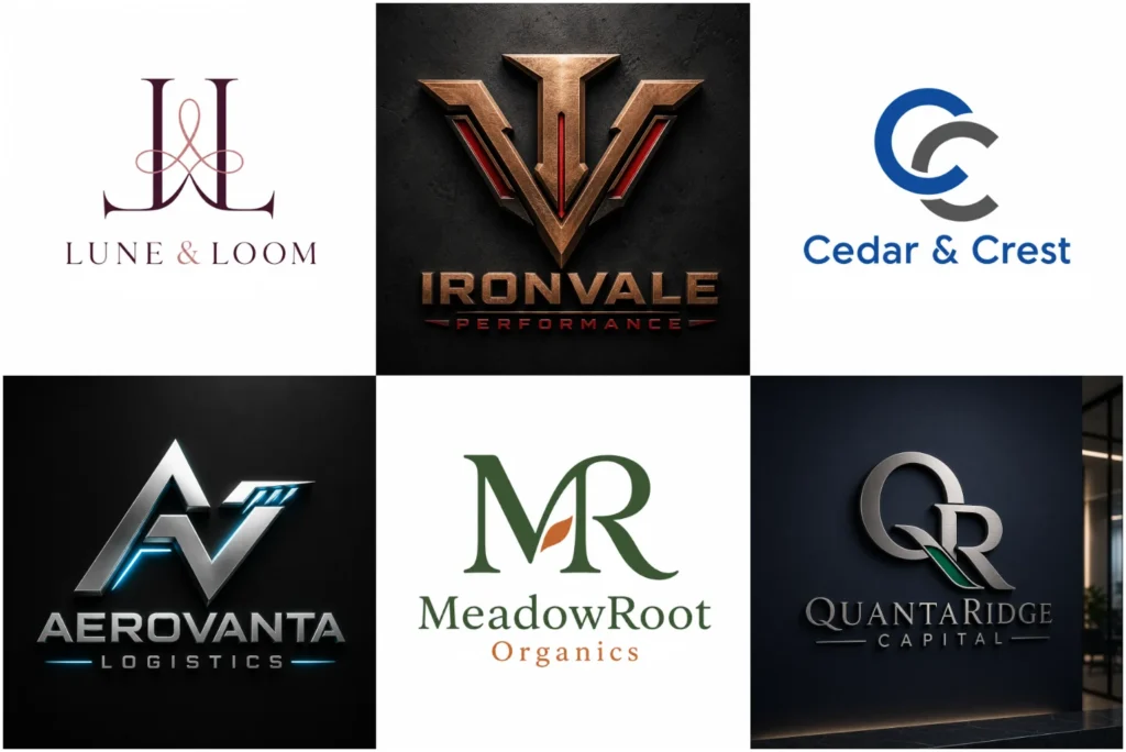
Turn Your Initials Into a Strong Brand Identity
A long business name can become a clear, visually appealing design when the right business initials and selected letters are shaped into an intentional mark. Our designers study your company name, complete name, business character, font selection, letter structure, character combination, spacing, balance, and visual hierarchy to create an initials logo with a simple form, organised form, professional appearance, established identity, and strong brand identity that remains clear in small spaces.
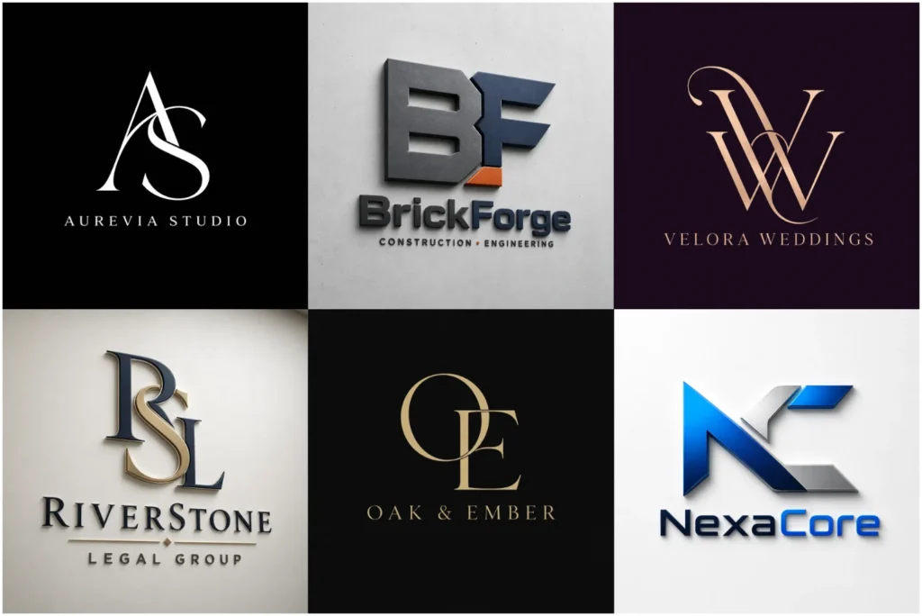
What Is a Lettermark Logo?
A lettermark logo uses the first letters of a business name as the main visual element. It is often a readable abbreviation formed from two characters, three characters, several characters, or separate letters. Through clear typography, overlapping letters, or a custom typographic arrangement, the resulting letter-based mark gives a business abbreviation a unique personality while supporting customer recall and everyday branding.
Compact initials help real estate branding remain clear and recognizable across property signs, documents, websites, and social profiles.
This compact symbol works especially well for organisations with full names that are difficult to display. It is commonly used by law offices, financial firms, construction companies, agencies, corporate companies, educational institutions, technology businesses, media organisations, and professional service providers that want their initials to represent the business name clearly.
What Is a Monogram Logo?
A monogram logo creates one distinctive symbol by merging two or more initials. Rather than presenting the letters as a simple abbreviation, the design can feature overlapping, connected, mirrored, layered, or interlocking characters. When arranged carefully, these initials form a unified visual identity with decorative appeal, geometric balance, symbolic meaning, and a more exclusive appearance.
This approach can follow a minimal style, modern style, bold style, or technology-focused style, depending on the brand. For brands that prefer clean letterforms and reduced detail, a Minimalist Logo can provide a simpler visual direction. It is suitable for personal brands, creative studios, consultants, architects, photographers, restaurants, beauty companies, property firms, fashion labels, wedding businesses, jewellery brands, fashion, and luxury products where heritage, craftsmanship, personal identity, or premium branding matters.
Lettermark and Monogram Logos Are Not the Same
A lettermark represents a business name in a shortened form by using clear and easily readable initials. A monogram turns a letter combination into a more unified symbol through shared strokes, overlapping letters, a customised typeface, or an abstract shape. Both design approaches use initials, but the character presentation and visual style are different.
The right design direction depends on your business name, industry, target audience, and the type of strong concept you want customers to remember. We compare clarity, structure, and brand use before recommending either a lettermark or monogram.
Why Initials-Based Branding Works
Initials-based branding gives an established business or organised business a focused symbol without relying on the full business name in every placement. A compact mark creates easy recognition, supports customer recall, and improves brand recognition through a simple mark that is easier to repeat as part of consistent branding.
The same constructed mark can work in large areas and small areas, giving it long-term usability across digital platforms, printed materials, an app icon, website icon, social media avatar, profile image, watermark, packaging detail, clothing badge, and product stamp. Good custom typography, compact artwork, professional presentation, flexible placement, and a stable visual identity also help the design stay useful beyond short-lived design trends and in small spaces.
Custom Typography Created for Your Business
Custom typography is developed around your brand personality rather than taken from a random font. We consider serif lettering, sans-serif lettering, script-inspired characters, structured characters, elegant characters, confident characters, refined characters, geometric forms, and other letter shapes. Careful font adjustment, alignment, spacing, proportion, and typography choices give the final design its uniqueness and a more controlled identity.
Strong, carefully structured typography helps law firm branding communicate trust and authority without relying on predictable legal symbols.
A legal firm or corporate business may need a trusted and traditional appearance, while technology, engineering, construction, architecture, sports, fitness, and other competitive industries may suit bold lettering and a Modern Logo style. Beauty businesses, weddings, personal brands, a fashion label, and creative services may need a clean identity, approachable identity, or premium appearance instead.
A Style That Matches Your Brand
Your brand style should reflect your business nature, industry, audience, brand values, and intended applications. We define the creative direction before choosing letter arrangements, customised connections, accurate angles, grids, clean lines, structured forms, strong shapes, simple forms, confident typography, refined lettering, and balanced details.
The visual identity may follow a minimal style, modern style, classic style, traditional style, geometric style, technical style, creative style, artistic style, elegant style, luxurious style, bold style, or powerful style. We avoid copying a temporary visual trend and instead build around your brand initials, heritage, and the character expected from established brands.
Geometric letterforms, controlled spacing, and negative space can help logos for technology companies feel current without resembling generic technology marks.
Creative Ways to Combine Initials
Initial combinations can be developed through interlocked initials, shared lines, letter connections, negative space, a hidden character, or an intentional character arrangement. Organised letters may use a vertical arrangement, enclosed circle, shield, symmetrical symbol, or other shapes to support stronger symbol construction and visual creativity.
Precise grids, measured angles, and balanced forms allow architectural brand identity to reflect structure without depending on an obvious building outline.
When initials are built around precise angles, symmetry, grids, and structured shapes, a Geometric Logo approach can also be a natural fit.
Every practical design is reduced to what the business use requires. By removing unnecessary details and controlling the balanced design, we create reduced artwork, scalable artwork, and a recognisable mark that stays clear.
Colour Selection and Brand Personality
Colour selection affects customer perception and helps communicate brand personality. Blue can support trust and a dependable corporate identity, black can express confidence and simplicity, gold can suggest elegance and a premium appearance, and bright colours can show energy, creativity, or the character of energetic businesses and creative businesses.
Restrained colours, refined contrast, and elegant initials can help logos for jewelry brands maintain a premium appearance across packaging, engraving, and small product applications.
We match colour psychology to the industry, intended message, and brand identity, then prepare the printed artwork for different backgrounds. A single-colour version also supports professional services and production needs such as engraving, embroidery, and stamping, while neutral tones provide a controlled alternative.
Designed for Digital and Printed Use
The final identity is planned for both digital use and printed use. Common applications include websites, a website header, digital platforms, mobile applications, social media profiles, business cards, letterheads, invoices, presentation folders, product labels, packaging, shop signs, vehicle graphics, uniforms, advertising material, and promotional items.
We test design placements at different sizes and review readability, visual balance, clear artwork, fine details, thin lines, and narrow gaps. This helps the artwork respond properly to different production methods, print production, and real digital and printed use.
Our Design Process
Our design process begins with an information review covering the business name, initials, industry, business use, project requirements, preferred style, design references, colour ideas, font style, and selected package. This gives the project organisation a clear design direction before we explore shape, colour, spacing, thickness, letter placement, typographic arrangements, and overall composition.
We then develop an initial concept and professional concept for presentation. Client feedback and requested changes guide the next stage until design approval, after which the final files are prepared.
What You Receive
Your deliverables depend on the selected package, but may include high-resolution artwork, vector source files, transparent PNG files, JPG files, black and white versions, colour variations, previews, social media-ready files, and profile images. Useful file formats support websites, online branding, digital presentation, general sharing, printed presentation, resizing, and editing.
We also consider light backgrounds, dark backgrounds, different backgrounds, stamps, engraving, embroidery, printing, single-colour printing, and other professional production needs. The selected package and order review determine which revisions, services, and design files will be provided.
Who Should Choose This Logo Style?
This logo style suits a business identity built around a company name, personal name, full name, or several words that can be reduced to an initials-based identity. It is useful when a compact symbol, professional emblem, established appearance, premium appearance, strong typography, and brand recognition are more important than showing the full wording in small spaces. Brands seeking a more refined and exclusive identity can also explore a premium logo style direction.
A wordmark, combination logo, pictorial mark, abstract symbol, illustrated icons, or mascot characters may offer a clearer direction when the initials are difficult initials, create an unwanted word, or cause brand similarity. We review these limits before recommending the most suitable shortened name treatment.
Suitable for New and Existing Businesses
A new business or newly launched company can use a custom initials logo as a clear visual foundation for its website, social profiles, documents, and marketing materials. This supports clarity and consistent branding from the beginning, especially when the company has a long brand name and needs an identity that can support business growth.
For an established company, a logo redesign can improve an outdated symbol while protecting familiar elements from the existing identity. Better balance, modern usability, and thoughtful brand improvement can refresh the mark without making it feel unrelated.
Why Choose LogoPixa?
LogoPixa creates practical identities through custom design rather than applying your initials to a random template. We study the business name, industry, audience, project details, visual preferences, business relevance, and branding applications to develop an original design direction with a distinctive identity.
Our design process combines professional presentation, clear communication, spacing, proportion, revision support, useful file formats, and practical artwork suitable for commercial artwork and brand growth. The selected package and service option define the included support.
Information Needed to Start Your Project
A useful creative brief should include your business name or personal brand name, initials, industry, main services, target audience, preferred visual style, colour preferences, brand requirements, project information, and design direction. You can also share general inspiration, design examples, shapes, symbols, included elements, avoided elements, creative preferences, design details, and personal taste.
These details help us create an original identity and guide the final concept without copying another brand.
Order Your Custom Initials Logo
Choose the selected package and submit your logo order with the business identity, brand details, preferred style, project requirements, design brief, and project information. A clear brief helps the design process move toward a distinctive brand mark, focused symbol, professional presentation, and stronger customer recognition.
The finished custom initials logo is prepared for use across different platforms according to the package.
Explore More Logo Options
Discover other logo structure options and find the right visual direction for your brand.
Frequently Asked Questions
How many initials can be included?
Most designs use two initials or three initials because this character count supports logo readability and a readable arrangement. Longer abbreviations and additional characters can also work, but the initial combinations may be better as a lettermark than a tightly interlocked symbol.
Can you combine two names in one design?
Yes. Two names can be represented through combined initials, connected initials, or a unified mark. This name combination is useful for business partnerships, family-owned companies, law firms, photography studios, wedding brands, and any monogram design that needs to connect two identities.
Will my logo be original?
Yes. Each original logo begins with your design brief and business information. We develop a project-specific design and custom concept instead of relying only on common fonts, then create the shapes, industry symbols, final arrangement, custom development, and visual originality around your needs.
Can I request a minimal design?
Yes. A minimal design can use clean letterforms, controlled spacing, limited detail, and strong visual clarity. We assess brand suitability before creating minimal concepts so the simple logo remains a flexible identity and supports a modern identity.
Can you create a luxury monogram?
Yes. A luxury monogram can combine elegant typography, symmetrical arrangements, fine details, a refined colour palette, and a clear premium direction. We balance luxury branding with practical artwork and scalable design so the premium identity remains effective at different sizes.
Can the full business name appear with the initials?
Yes. The brand initials can remain the main symbol while the full business name or complete brand name appears in a logo lockup. Depending on the layout, name placement may use an underneath placement or side placement to help new customers connect the business abbreviation with the brand recognition.
Can I use the design on social media?
Yes. A compact initials symbol can support your online identity across social media profiles, profile images, page icons, video watermarks, social media content, and other digital branding. The selected package determines which file formats and social media-ready files are included for each social media design use.
Will the design work on a dark background?
Yes. We can prepare colour variations for a light background and dark background. A white version, reversed version, or alternative-colour version improves visual contrast, logo visibility, background compatibility, and colour adaptation.
Can the artwork be printed on clothing?
Yes. Apparel branding may be prepared for printed clothing, shirts, caps, uniforms, and other fabric products. A clean version with simplified details and suitable production files improves embroidery and other textile application results.
What is a vector file?
A vector file uses scalable paths rather than fixed pixels. This gives the logo resolution independence, allowing logo enlargement for signs, vehicles, packaging, and professional printing without reducing image quality. It is the preferred format for scalable artwork.
Can I request revisions?
Yes. Revision availability and revision terms depend on the selected package. Design revisions can cover colour, thickness, font direction, letter arrangement, and other design adjustment needs based on client feedback and requested changes.
What should I provide before ordering?
Please provide the full brand name, required initials, industry, target audience, preferred style, colour choices, design examples, creative preferences, unwanted elements, project concept, order information, and any other design requirements.
How do I choose between a lettermark and a monogram?
Choose a lettermark when your main priorities are logo readability, a clear abbreviation, and a direct typographic mark. Choose a monogram when connected initials, a decorative emblem, symbolic emblem, or more expressive brand style better fits the identity. We can support the logo selection by comparing the initials and intended use.
Can an existing initials logo be redesigned?
Yes. An existing initials logo can receive a brand refresh while keeping recognisable elements from the existing identity. A logo redesign can correct an unbalanced design, outdated design, or weak visual balance through design improvement and refined artwork based on the current artwork.
Can I use the final design for commercial purposes?
Commercial rights and commercial usage depend on the selected package, service terms, licensing conditions, usage terms, and package details. We clarify whether the final design can be used for business use and other commercial purposes, including any conditions connected to third-party fonts or third-party assets.
No database terms were omitted, so there is no unused-word or oversight list.