
Jewelry Logo Design
The aim is a refined, recognizable logo that remains clear on packaging, social profiles, product cards, and small labels. Explore the portfolio below to see different creative directions and find a visual approach that matches your market, personality, and product range.
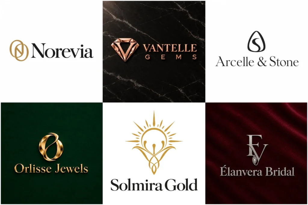
Explore Distinctive Jewelry Brand Marks
This collection presents varied approaches to jewelry branding, from graceful wordmarks and compact monograms to restrained symbols and expressive combinations. Each concept is developed with attention to proportion, typography, spacing, and real-world readability.
The examples demonstrate original creative thinking and professional execution across moods and audiences. They also show how a mark can translate across boxes, pouches, care cards, storefronts, websites, and social media without implying that every piece shown was commissioned by a client.
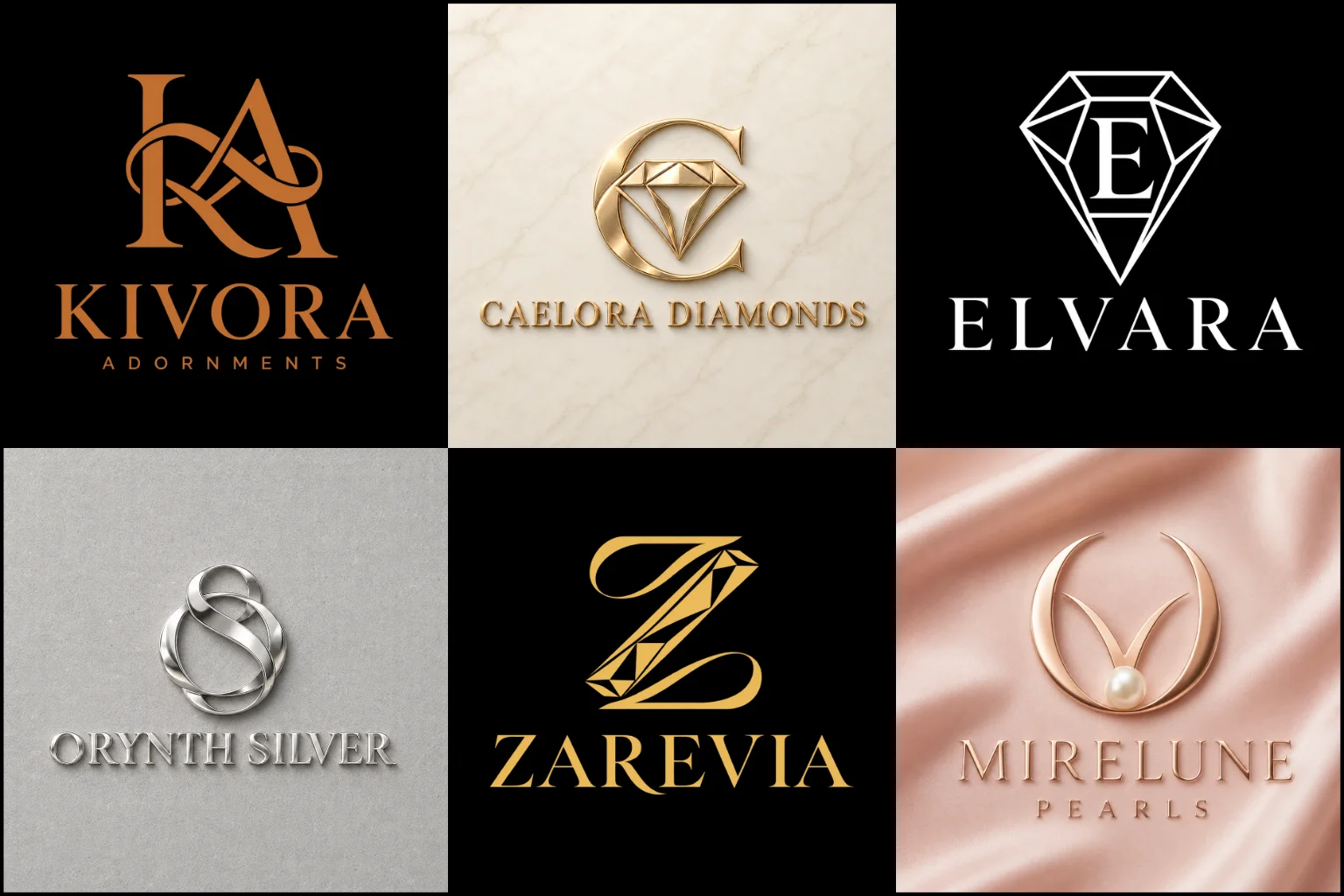
A Small Mark With an Important Role
Jewelry branding often appears in limited spaces. A logo may be printed inside a ring box, engraved on a tag, stamped onto a pouch, or displayed as a small social profile image. It must retain its character even when there is little room for detail.
The identity also needs to support the value and personality of the products. Fine jewelry may require restraint and precision, while an artisan collection might benefit from warmer, more individual forms. Fashion accessories can use bolder ideas, and bridal brands may need a softer or more romantic tone.
Delicate does not always mean effective. Extremely thin strokes, tight lettering, or intricate ornament can disappear when reduced. The strongest solution balances elegance with enough visual strength for practical use.
Begin With the Brand, Not the Ornament
A diamond, ring, crown, or gemstone can immediately suggest the industry, but it does not explain what makes one business different from another. Before choosing a symbol, it helps to define what the brand is actually offering and how it should be perceived.
Useful questions include:
What types of jewelry form the main collection?
Are the pieces fine, handmade, custom, affordable, contemporary, traditional, or fashion-led?
Which materials, techniques, or design influences matter to the brand?
Is the business focused on gifts, weddings, personal expression, daily wear, or collectible pieces?
Who is the intended customer?
Will sales happen mainly online, through a boutique, at exhibitions, or across several channels?
Could the product range expand later?
These details create a clearer foundation than simply requesting an elegant symbol. They help the designer make purposeful decisions about structure, typography, color, and visual tone.
Match the Logo Structure to the Brand Name
The length and character of the business name can influence which logo format works best.
Custom monogram logos are particularly relevant when meaningful initials can form a compact, distinctive mark. A well-constructed monogram can work effectively on clasps, packaging seals, profile images, engraving, and other restricted spaces. Its limitation is that new customers may not immediately know the full business name, so it often needs to appear alongside clear supporting typography.
Custom wordmark logos place the complete name at the center of the identity. This approach can be effective for a short, memorable brand name or a name with interesting letter shapes. Since there is no separate icon to carry the design, spacing, letter construction, capitalization, and proportion must provide enough individuality.
A symbol paired with the name offers more flexibility when the business needs both immediate name visibility and a compact icon. However, the symbol and lettering should feel like parts of the same visual system. Placing an unrelated gemstone graphic beside a standard font rarely creates a convincing identity.
Choose a Style That Supports the Collection
A visual style should reflect the products, customer expectations, and price position rather than imitate whichever look is currently popular.
Clean minimalist logos can suit contemporary jewelers, refined online stores, and brands that want the products to remain the main visual focus. Reduced shapes and controlled typography also adapt well to small packaging. The risk is removing so much personality that the result resembles other minimal brands.
A premium logo style may use elegant lettering, spacious layouts, restrained details, and carefully balanced proportions. It can support fine jewelry, bespoke services, bridal collections, or high-end boutiques when the complete customer experience matches that position. Decorative flourishes, crowns, and gold effects alone do not make an identity feel exclusive.
Some handmade or artist-led businesses may need a more personal direction. Organic lines, custom lettering, or subtle irregularity can communicate craftsmanship, but the artwork still needs controlled spacing and reliable readability.
No single style fits every jeweler. A youthful charm brand, heritage gold shop, independent silversmith, and diamond boutique should not be forced into the same visual formula.
Create Meaning Beyond Familiar Symbols
Industry imagery can be useful when it is interpreted in a specific way. Gem cuts, settings, chains, clasps, pendants, metalwork, and facets all provide possible starting points. The business name, initials, signature products, cultural influences, or design philosophy may offer more distinctive ideas.
A geometric stone shape could be combined with a letter. Negative space might reveal a clasp or setting. A meaningful botanical, celestial, architectural, or regional detail could influence the symbol when it has a genuine connection to the collection.
The objective is not to make the concept difficult to understand. Originality can come from the relationship between familiar elements, custom proportions, tailored lettering, or an unexpected but relevant detail.
Visual originality and legal availability are separate matters. A custom concept can reduce similarity, but businesses should still complete appropriate name and trademark checks before relying on any identity commercially.
Typography Shapes the Brand Personality
Typography often carries more personality than the symbol itself. Small changes in letter width, contrast, spacing, terminals, and capitalization can make a brand appear traditional, modern, delicate, artistic, or confident.
High-contrast serif lettering can create an editorial or refined mood, but very fine sections may become weak at small sizes. A cleaner serif can preserve sophistication with better visibility.
Sans-serif lettering may suit modern, gender-neutral, or fashion-led collections. It needs distinctive spacing or customized characters to avoid looking like plain text.
Script-inspired lettering can support personal, romantic, or handmade branding. Highly decorative scripts require caution because similar letter shapes, long flourishes, and narrow strokes can make the name difficult to read.
The chosen typeface should also handle the exact business name naturally. A style that looks attractive with one short word may become crowded or unbalanced with a longer name and tagline.
Color and Finish Need Separate Decisions
Black, ivory, charcoal, deep green, burgundy, navy, warm neutrals, and metallic-inspired tones can all work within jewelry branding. The best palette depends on the brand personality and the colors already present in its products, photography, packaging, and retail environment.
Gold is common, but it is not automatically the right choice. A gold-colored screen graphic, metallic foil, polished metal sign, and embossed stamp all produce different results. The core artwork should remain understandable without depending on shine, gradients, shadows, or realistic material effects.
A strong single-color version is especially useful for engraving, stamping, small labels, tissue paper, care cards, and economical printing. Dimensional mockups can help buyers imagine the logo in context, but the clean, flat artwork should be evaluated first.
Design for the Places Customers Will See It
The ideal presentation image should not be the only test. Jewelry brands use their identities across physical and digital touchpoints that place different demands on the design.
Important applications may include:
Ring boxes and presentation cases
Pouches, ribbons, tissue paper, and shopping bags
Product tags, care cards, certificates, and thank-you cards
Engraving, stamping, embossing, and foil printing
Storefront signs and display materials
Website headers, favicons, and online shop pages
Social profile images, posts, and advertisements
Invoices, email signatures, and customer documents
A wide layout may suit a website header, while a compact mark is more practical for a profile image or small box. Thinking about these placements early helps establish whether the brand needs horizontal, stacked, or icon-led arrangements.
Line thickness also matters. Details that look refined on a large screen can merge, break, or disappear when stamped into a small surface.
Different Jewelry Businesses Need Different Signals
Fine jewelry brands often benefit from controlled typography, balanced spacing, and a sense of permanence. Excess decoration can compete with the products or make the identity feel less assured.
Bridal jewelers may use graceful forms, softer details, or subtle romantic references. The design should avoid becoming so delicate that it loses visibility on boxes and digital screens.
Handmade jewelry businesses can communicate craft through organic shapes, custom lettering, or symbols connected to the maker’s process. A rough appearance should still feel intentional rather than unfinished.
Fashion jewelry labels have more room for bold lettering, energetic compositions, and expressive color. Trends can influence the direction, but the identity should not depend entirely on a short-lived visual effect.
Men’s jewelry brands may prefer stronger structure, darker palettes, or more substantial typography. That does not mean the mark must look aggressive or rely on predictable shields and sharp symbols.
Repair shops and multi-brand jewelers generally need clarity and trust more than an artistic concept tied to one collection. The business name, service focus, and storefront readability may carry greater importance.
What to Prepare Before the Project Begins
You do not need to decide the final appearance yourself. A focused brief should explain the business clearly while leaving room for professional creative judgment.
Helpful information includes:
How the business name should appear, including capitalization
Any initials or shortened name customers already use
A tagline only if it genuinely needs to appear
The main product categories and materials
The intended customer and approximate market position
The personality the identity should communicate
The main places where the logo will be used
Preferred colors and colors that should be avoided
Relevant visual references with an explanation of what you like
Symbols, themes, or competitor similarities you do not want
Any planned expansion into new collections or related products
References are most useful when they communicate mood, structure, or typography preferences. They should guide the direction without becoming designs to copy.
Avoid Attractive but Impractical Choices
A realistic mockup can make almost any mark look impressive. Always consider whether the same design remains strong as plain artwork on a white background.
Overly thin lines may fail in stamping and engraving. Long taglines can become unreadable. Complicated gemstone illustrations may lose their structure at small sizes. Too many symbols can also make the identity feel more like a decorative badge than a clear brand mark.
Generic diamonds, crowns, rings, and initials are not automatically wrong. The problem is using them without a distinctive connection to the business.
Copying the appearance of an established luxury label can also weaken credibility. A new identity should fit its market while building its own recognizable character.
Develop a Focused Visual Direction
LogoPixa can shape the identity around your brand name, products, audience, positioning, and practical applications. The goal is to create a clear and memorable mark with enough personality to feel original and enough control to work beyond a portfolio presentation.
Share what the business sells, how it should feel, where the identity will appear, and anything that should be included or avoided. This gives the creative direction a useful starting point without limiting it to a predictable industry symbol.
Explore More Logo Options
Browse more logos for different industries to explore branding options created for different types of businesses.
You may also be interested in:
- travel business branding
- technology logo
- spa branding
- photographer brand identity
- clothing brand identity
Jewelry Brand FAQs
What type of logo works best for a jewelry business?
There is no universal format. A wordmark may suit a distinctive name, a monogram can provide a compact mark, and a combination design can offer both name visibility and a separate symbol. The right choice depends on the name, audience, positioning, and intended applications.
Does the logo need a diamond or gemstone symbol?
No. A gemstone can communicate the industry quickly, but it is not required. Initials, custom typography, abstract forms, meaningful objects, or ideas connected to the brand name may create a more individual identity.
Is a monogram suitable for a new jewelry brand?
Yes, particularly when the initials form a strong compact symbol. However, new customers may not recognize what the letters represent, so the complete business name should remain visible in important applications.
Can a minimalist identity still look luxurious?
Yes. Refinement can come from proportion, typography, spacing, restraint, and material application. Minimal work still needs a distinctive idea; using fewer elements does not automatically make a brand feel premium.
Which colors are suitable for jewelry branding?
The palette should reflect the products and intended audience. Black, ivory, deep neutrals, jewel tones, muted colors, and metallic-inspired shades are common options, but the design should also remain clear in black and white.
Will very thin lettering work on jewelry packaging?
It depends on the size and production method. Fine lettering may look elegant on screen but become weak when stamped, engraved, or printed small. Testing realistic sizes helps determine whether the strokes need more weight or spacing.
Should a tagline be included?
Only when it adds necessary information and remains readable. Long or descriptive taglines can overcrowd small packaging. In many cases, the main brand name should lead while supporting wording appears separately.
What is the difference between a logo and a 3D mockup?
The logo is the underlying flat artwork. A mockup shows how that artwork might appear on a box, sign, card, metal surface, or other material. Buyers should judge the clarity and construction of the flat mark before focusing on presentation effects.
Can the identity work if the product range expands?
It can if the concept represents the wider brand rather than one narrow product. A business planning to move from rings into watches, accessories, or other collections should mention that direction before development begins.
What information should I provide before ordering?
Provide the exact name, product range, intended audience, preferred personality, common logo applications, color direction, useful references, and anything you want included or avoided. Clear information helps establish a more relevant creative direction.