
Vintage Logo Design
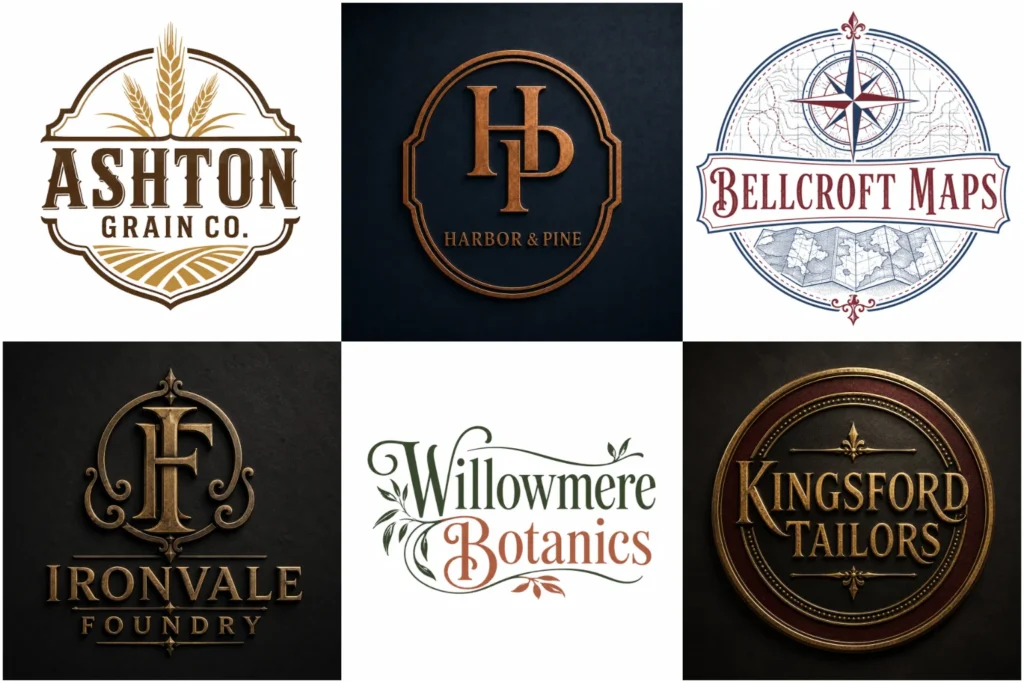
The goal is to create something distinctive, readable, and useful across real brand applications. Explore our portfolio to see different directions, from refined heritage marks to bold retro concepts built for modern businesses across print and digital touchpoints.
Explore Our Vintage Logo Portfolio
Our portfolio explores a wide range of vintage-inspired approaches, including badges, hand-drawn symbols, traditional lettering, decorative frames, and simplified retro marks.
Each concept is developed with attention to balance, legibility, and brand use, not just appearance. Some designs are experimental portfolio concepts, while others reflect practical identity directions for different industries. The variety helps you compare styles and understand what type of vintage look may suit your business best and audience expectations.
What Makes a Logo Feel Vintage?
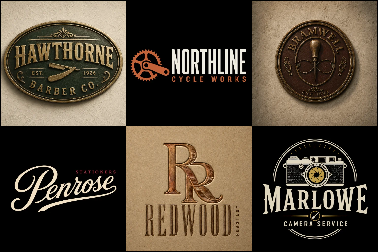
A vintage identity takes inspiration from visual styles associated with earlier decades, but good design involves more than adding an old texture or decorative font.
Typography, composition, line work, borders, symbols, color choices, and proportions all contribute to the final character. A design might reference traditional craftsmanship, old storefront signage, classic packaging, industrial labels, mid-century graphics, or another historical influence.
The strongest direction depends on what your brand needs to communicate. Restaurant logo with heritage positioning may benefit from bold lettering and a badge structure, while premium clothing labels may need a cleaner interpretation with elegant type and restrained details.
Vintage does not have to mean worn, distressed, or complicated. A polished design can still have a strong historical character while remaining suitable for current branding.
Building the Right Visual Character
Before choosing decorative elements, it is important to define the mood the logo should create.
Some businesses need a rugged, handcrafted appearance. Others are better suited to a refined heritage look, nostalgic mid-century styling, classic Americana, traditional European influence, or a simple retro identity.
Important design elements may include:
Serif, slab serif, script, or custom display lettering
Decorative borders and frames
Shields, circles, crests, ribbons, or stamp-inspired layouts
Hand-drawn illustrations and symbols
Limited, muted, or historically influenced color palettes
Strong symmetry and structured composition
Subtle decorative details that support the main mark
Clean simplified versions for smaller applications
These elements should support the brand rather than compete for attention. Too many ornaments, textures, and type styles can make a logo difficult to understand.
Typography Has a Major Role
Lettering often carries much of the personality in a vintage identity.
Traditional serif fonts can create an established or heritage-oriented appearance. Slab serifs feel stronger and more industrial, while scripts may create a handcrafted, hospitality, fashion, or old-signage character.
Strong slab-serif or custom script lettering can add an established character to barber shop branding while remaining clear on storefront signs, product labels, uniforms, and appointment platforms.
Typography should still be easy to read. Decorative letters can look impressive at a large size but become unclear on a social media profile, product label, or small printed item.
Brands that want the name itself to remain the main visual feature may benefit from a typography-based logo. This approach can combine historically influenced lettering with a relatively simple structure, making it useful when an elaborate badge or illustration is unnecessary.
Custom spacing, letter shapes, ligatures, strokes, and small ornamental details can further distinguish the identity without relying on excessive decoration.
Badge and Emblem-Based Vintage Logos
Badges are strongly associated with traditional branding because they bring text and symbols together inside one structured shape.
Circles, shields, seals, and crests can work particularly well for breweries, cafés, barbershops, workshops, outdoor brands, restaurants, automotive businesses, clothing labels, and companies that want an established appearance.
Badge structures are also practical in coffee brand identity, where the identity may appear on cups, packaging, menus, storefronts, merchandise, and social content.
An custom emblem logos is especially useful when the brand name, symbol, date, location, or supporting text needs to feel like one unified mark.
The limitation is scale. A detailed emblem may lose clarity when displayed very small. For that reason, decorative elements should be controlled and unnecessary text should be avoided. A simplified secondary variation may also be useful for compact digital applications.
When Symbols and Typography Need to Work Together
Not every business needs its wording enclosed inside a badge. Sometimes a separate symbol paired with a strong name creates more flexibility.
A combination mark logo can work well for vintage branding because the symbol and typography can support each other while remaining adaptable. Depending on the design, the complete mark may appear on packaging or signage, while the symbol can be used separately in smaller spaces.
Flexible combination marks can be useful in hotel logo, allowing the complete identity to appear on exterior signage while a compact symbol is used on room amenities, stationery, and digital profiles.
Possible imagery can include tools, plants, animals, architecture, food-related objects, transport-inspired forms, outdoor symbols, or industry-specific illustrations. The subject should have a genuine connection to the business instead of being selected only because it looks old-fashioned.
Character-Led Retro Branding
Some vintage identities are built around personality rather than traditional badges or elegant lettering.
A mascot logo can suit businesses that want a friendly, expressive, or nostalgic character. Retro mascots are often effective for food brands, cafés, entertainment businesses, sports-related concepts, apparel, and brands influenced by classic advertising or packaging illustration.
Friendly retro mascots can work especially well in bakery branding, giving the brand a warm personality across packaging, storefront signs, menus, labels, and social media.
The illustration still needs to function as a logo rather than a detailed piece of artwork. Strong silhouettes, controlled facial details, recognizable shapes, and clear typography help the character remain usable across different sizes.
This approach is less suitable when the brand needs a highly restrained, formal, or minimalist identity.
Choosing Colors for a Classic Look
Vintage-inspired color palettes often use fewer colors than highly modern or energetic visual identities.
Depending on the desired period and personality, suitable combinations might involve cream, burgundy, forest green, navy, mustard, brown, muted red, charcoal, faded blue, warm beige, or metallic-inspired tones.
That does not mean every vintage design needs faded colors. Black and white can create a strong traditional appearance, while carefully selected modern colors can make an older visual style feel more current.
Contrast matters more than simply choosing nostalgic shades. Text and important shapes should remain visible against the background, especially when the logo is used on packaging, websites, signs, clothing, or printed materials.
Texture, Distressing, and Aged Effects
Rough textures and distressed finishes can create an aged appearance, but they should be treated as optional styling rather than the foundation of the logo.
Too much distressing can weaken edges, reduce readability, and create problems at small sizes. It can also make a brand appear artificially old when a cleaner heritage direction would feel more believable.
A practical approach is to build a strong clean logo first. Texture can then be used selectively for posters, packaging, merchandise, social graphics, or other applications where an aged finish adds value.
This keeps the core identity flexible.
Which Businesses Can Use a Vintage Style?
This direction works best when there is a natural connection between the desired brand personality and the visual character of the past.
It may suit:
Restaurants, cafés, bakeries, and food brands
Barbershops and grooming brands
Craft and handmade businesses
Clothing and apparel labels
Automotive and motorcycle-related brands
Breweries and beverage brands
Outdoor and adventure businesses
Workshops and artisan brands
Hotels and hospitality businesses
Music, entertainment, and lifestyle brands
Businesses with a genuine heritage story
The style should not be selected simply because it looks attractive. A highly futuristic software company, for example, may find that an elaborate heritage badge sends the wrong message unless the contrast is intentional and supports its positioning.
Making a Vintage Identity Work in Modern Branding
A classic appearance still needs to work in modern environments.
Your logo may appear as a website header, social profile image, mobile graphic, product label, business card, storefront sign, packaging mark, uniform print, merchandise graphic, or advertisement.
Fine lines, tiny supporting words, complex illustrations, and narrow gaps can disappear when reduced. The main shape and brand name should therefore remain understandable before smaller decorative details are considered.
A well-planned identity can preserve its historical personality while using cleaner spacing, better contrast, and simplified forms where necessary.
This balance is important. The goal is not to reproduce an old label exactly, but to take useful visual influences from the past and adapt them for a present-day brand.
Custom Vintage Logo Design at LogoPixa
LogoPixa can develop a vintage-inspired identity around your business name, industry, audience, and preferred visual direction.
The process can explore typography, badge structures, symbols, illustrations, decorative elements, and different levels of historical influence. Some brands need a detailed heritage mark, while others benefit from a much simpler retro interpretation.
Providing references can help communicate the period, mood, or general character you prefer. They can be used as direction without copying another brand’s identity.
The aim is to create an original logo that feels connected to your business and remains practical across the places where customers will actually see it.
What to Consider Before Choosing This Style
Think about how you want your business to be perceived before committing to a vintage direction.
Ask whether you want the brand to feel established, handcrafted, nostalgic, rugged, traditional, premium, friendly, or culturally connected to a particular era. These qualities lead to very different design choices.
Also consider where the logo will appear most often. A detailed badge may look excellent on packaging and signage but require simplification for a small app icon. A typography-led mark may be more flexible but provide less visual storytelling than an illustrated emblem.
Choosing the right level of detail is just as important as choosing the style itself.
Explore More Logo Options
Discover other brand identity styles and find the right visual direction for your brand.
Frequently Asked Questions
What is a vintage logo?
A vintage logo uses visual influences associated with earlier periods, such as traditional lettering, badges, decorative borders, classic illustrations, or historically influenced colors. The design can still be clean and suitable for modern brand applications.
Does a vintage logo have to look distressed?
No. Distressing is only one possible effect. Many effective heritage and retro identities use clean lines, polished typography, and traditional compositions without scratches, fading, or rough textures.
Is this style suitable for every business?
No. It works best when a classic, nostalgic, handcrafted, or heritage personality supports the brand’s positioning. Businesses that need a strongly futuristic or ultra-minimal appearance may benefit from another direction.
Can a vintage logo still look modern?
Yes. Traditional influences can be combined with cleaner spacing, simplified details, contemporary color choices, and practical layouts. This can preserve vintage character without making the business appear outdated.
Are detailed vintage logos difficult to use at small sizes?
They can be. Fine lines, small text, and complex illustrations may lose clarity when reduced. A strong design should control unnecessary detail and prioritize the most recognizable elements.
Which logo format works best for a vintage style?
There is no single best format. Emblems work well for traditional badge identities, wordmarks emphasize distinctive lettering, combination marks provide flexibility, and mascots can create a more expressive retro personality. Choosing the most suitable format comes down to your brand’s identity and visual needs.
Can I provide examples of vintage styles I like?
Yes. References can help communicate preferences such as typography, historical period, layout, mood, color direction, or level of detail. They should be treated as visual guidance rather than designs to copy.
Should I choose a specific historical era?
Only if that era supports the brand. Some businesses benefit from a clear 1920s, mid-century, industrial, Western, or retro advertising influence. Others need a broader classic feel rather than a strict historical reference.
Can a classic logo work for both packaging and websites?
Yes, provided the design is created with scale and readability in mind. Clear typography, strong shapes, controlled detail, and adaptable layouts help the identity work across both physical and digital applications.