
Gaming Logo Design
The focus is not simply on making a logo look aggressive or colorful. It should match your identity, stay readable at different sizes, and feel original. Explore the portfolio below for different creative directions.
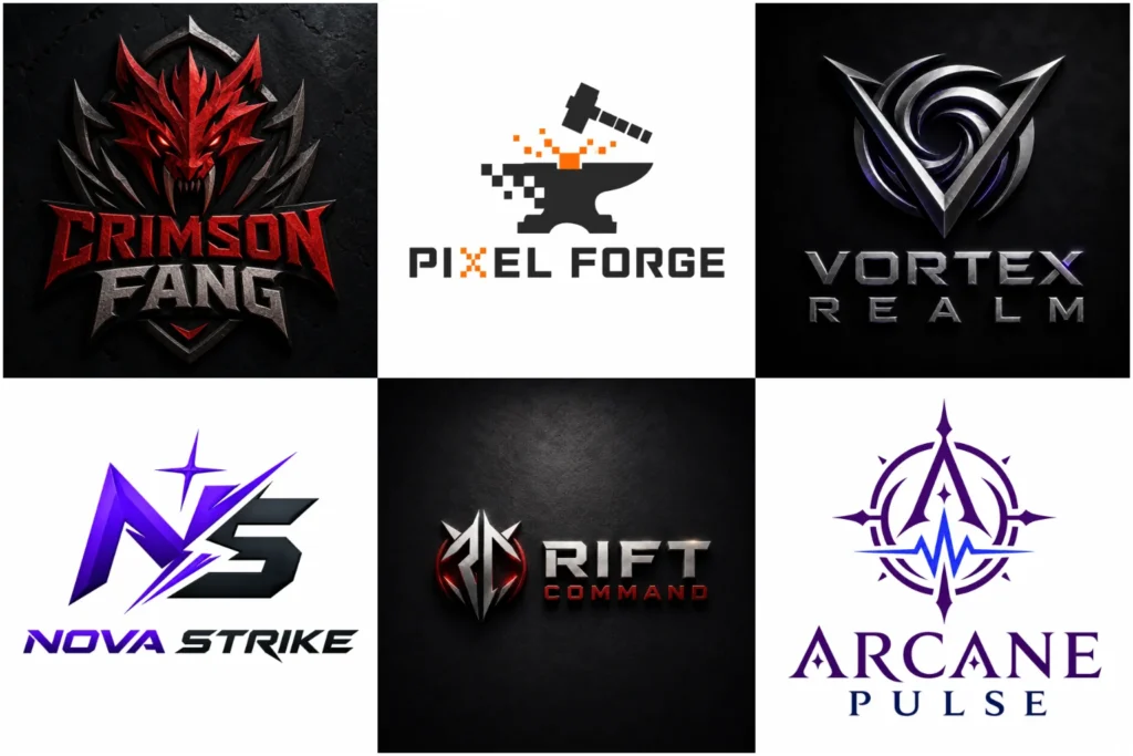
Gaming Logo Portfolio
Browse a selection of gaming-focused concepts created to show different approaches to symbols, typography, characters, badges, and visual styles. The portfolio includes bold, simple, detailed, and competitive directions so you can see how different identities can be developed.
Each concept is designed with practical use in mind, including profile images, streaming graphics, social platforms, jerseys, merchandise, and digital branding. The goal is originality, clear execution, and a professional overall appearance.
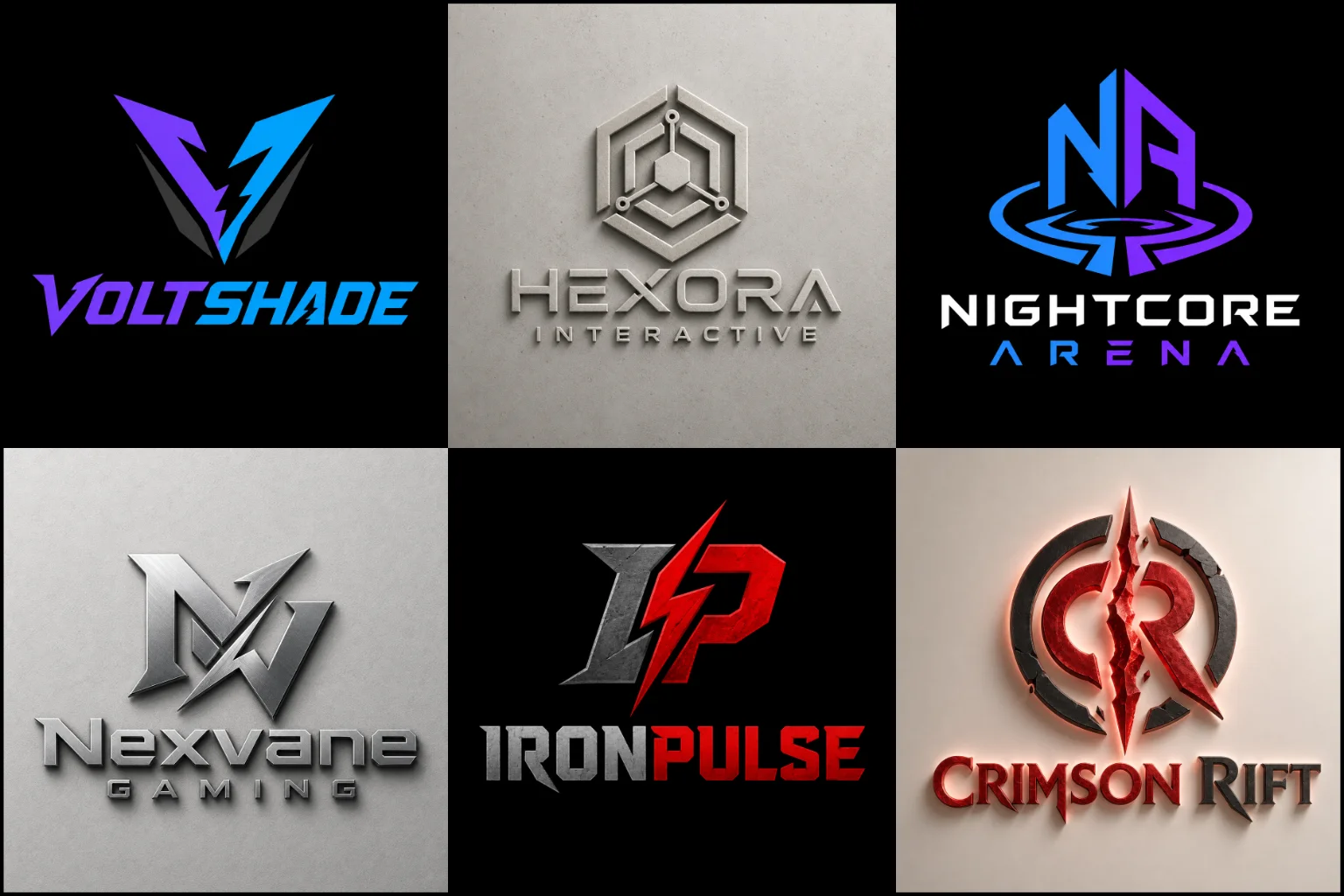
A Gaming Logo Should Match the Identity Behind It
Gaming brands do not all need the same visual language. An esports organization competing in tournaments may need something structured and authoritative, while a streamer can use a more expressive or personality-driven identity.
A gaming community may want a recognizable symbol that members can identify quickly. A gaming content channel may benefit from a cleaner mark that works beside thumbnails, overlays, and social media graphics.
Before choosing a direction, think about how you want the brand to feel. Competitive, tactical, futuristic, playful, mysterious, energetic, premium, or technical are very different starting points.
The design should communicate the right personality without adding visual effects simply because they are common in gaming.
Choosing the Right Logo Structure
The structure of the logo affects where and how easily it can be used.
A Mascot Logo can work well for teams and creators that want a recognizable character at the center of their identity. Animals, warriors, creatures, robots, and fictional characters can create personality, but the artwork still needs a clear silhouette and controlled detail.
An Emblem Logo is useful when you want the name, initials, and symbol combined into a compact badge. This direction often fits esports teams, gaming clubs, competitive groups, and merchandise.
A Combination Mark Logo gives more flexibility by pairing a separate symbol with the brand name. The icon can later be used independently for avatars or profile pictures while the full version handles wider branding placements.
The right structure depends on your name, audience, platform, and how often the symbol will need to appear without text.
Strong Symbols Without Generic Gaming Clichés
Controllers, joysticks, shields, helmets, swords, lightning bolts, skulls, and flames are easy to associate with gaming. That does not automatically make them the right solution.
When familiar symbols are used without a clear idea behind them, different brands can start looking almost identical.
A stronger approach is to look at the meaning behind the name or identity. Initials can become part of a symbol. An animal can be simplified into a distinctive silhouette. A fictional theme can influence the geometry without becoming a literal illustration.
A Geometric Logo can be especially useful when a gaming brand needs a sharp, controlled icon rather than a detailed character.
The goal is to create something recognizable enough to stand on its own instead of depending entirely on familiar gaming imagery.
Typography Matters as Much as the Icon
Gaming logos often use bold lettering, but bold does not mean the text should become difficult to read.
Letter width, spacing, angles, cuts, outlines, and proportions all affect the personality of the wordmark. Small adjustments can make typography feel futuristic, competitive, mechanical, energetic, or clean.
Highly decorative lettering may look impressive at a large size but become difficult to understand when used as a small profile image or social graphic.
For many brands, a Modern Logo direction works better because it keeps the typography controlled while still allowing distinctive details.
The company, channel, or team name should remain clear enough that viewers do not have to study the design to understand it.
Color Should Support the Brand, Not Overpower It
Gaming identities often use bright colors and strong contrast, but more color does not necessarily create more impact.
Two or three well-chosen colors can be easier to manage across streaming graphics, websites, social profiles, jerseys, and merchandise. A limited palette can also help keep the logo recognizable when displayed beside visually busy game content.
Dark backgrounds are common in gaming, so contrast needs careful attention. Thin dark details can disappear, while very bright effects may become distracting.
It is also useful to consider how the logo looks in a simple single-color version. If the basic shape remains clear without gradients or lighting effects, the identity is usually easier to use across different applications.
Flat, Dimensional, and 3D Directions
A flat logo is generally easier to reproduce and remains consistent across many sizes. It can work especially well for avatars, embroidered apparel, printed merchandise, social media, and interface elements.
Dimensional styling can create more visual depth when the brand needs an energetic presentation. A 3D Logo approach may suit promotional graphics, streaming visuals, gaming events, or digital-first identities where lighting and depth support the overall theme.
However, effects should not hide a weak underlying design.
A practical identity should still have a solid core shape that works when shadows, highlights, textures, or dimensional treatments are removed.
Designing for Avatars, Streams, Social Media, and Merchandise
A gaming logo is rarely used in only one place.
On Twitch, YouTube, Discord, Kick, social media, and gaming profiles, the logo may appear inside a small square or circular area. Long names and tiny details can become difficult to see.
Streaming overlays and banners usually provide more horizontal space. Jerseys and merchandise create another set of requirements because printing and embroidery may simplify small details.
This is why a useful logo system often needs a clear primary mark with a recognizable icon or compact version.
The main design should be planned with these different environments in mind instead of being created only for one large presentation image.
Esports Teams and Competitive Gaming Brands
Competitive organizations often need an identity that feels organized rather than casual.
Team names are frequently combined with animals, fictional characters, initials, shields, or abstract symbols. These ideas can work, but the icon should be distinctive enough that it does not feel like a variation of another esports logo.
Visual balance is particularly important when the mark will appear on jerseys, tournament graphics, scoreboards, profile images, and sponsor layouts.
A complex illustration can have personality, while a simpler symbol can offer better flexibility. Neither approach is automatically better.
The right choice depends on the team’s name, personality, competitive positioning, and preferred brand style.
Logos for Streamers and Gaming Content Creators
Creators often have more freedom than formal esports organizations.
Your identity may be connected to a username, personality, game genre, character, nickname, or recurring visual theme. That can support a more personal logo direction.
The challenge is keeping the design useful as your content changes. Building the entire identity around one game may become limiting if you later move into different games or broader entertainment content.
When possible, the core logo should represent the creator rather than depend completely on a particular title.
This creates more room for the channel, community, and visual branding to develop over time.
When a Mascot Is Not the Right Choice
Mascot identities are strongly associated with gaming, but they are not required.
Detailed characters can be effective for brands that want personality, aggression, humor, or storytelling. They may be less suitable when the goal is a clean technology-inspired identity or a compact mark that needs to remain extremely simple.
Initial-based symbols, abstract icons, geometric shapes, and clean wordmarks can sometimes provide a more flexible solution.
Choosing a style based only on what other gaming brands are using can make the identity feel predictable. The brand name and intended personality should guide the decision first.
What to Include in Your Design Brief
You do not need to describe every visual detail before starting.
A useful brief should explain the brand or channel name, what type of gaming activity it represents, who the intended audience is, and where the logo will mainly be used.
You can also share preferred colors, themes, symbols, characters, or visual directions. If there are specific ideas you dislike, mentioning them can prevent the design from moving in an unsuitable direction.
References can help explain your taste, but they should be treated as visual guidance rather than designs to copy.
LogoPixa can use this information to develop an original direction that fits the identity instead of forcing the brand into a generic gaming template.
Explore More Logo Options
Browse more logo industries to explore branding options created for different types of businesses.
You may also be interested in:
Frequently Asked Questions
What makes a good gaming logo?
A good logo has a clear concept, recognizable shape, readable typography, and a style that matches the identity behind the brand. It should also remain understandable when displayed at smaller sizes.
Do I need a mascot for my gaming brand?
No. Mascots are popular for esports and gaming identities, but they are only one option. Initials, abstract symbols, badges, wordmarks, and geometric icons may work better depending on your brand.
Can my gamer tag be used as the main logo name?
Yes. A gamer tag, channel name, team name, or community name can become the main branding element. The typography and symbol should be developed around its length, pronunciation, personality, and intended use.
Should a gaming logo have a dark background?
Not necessarily. Dark backgrounds can create strong contrast and suit many gaming environments, but the logo should ideally remain usable on both dark and light surfaces when the brand requires that flexibility.
How many colors should I use?
There is no fixed number, but a controlled color palette is usually easier to manage. Too many colors, gradients, and effects can make a small logo harder to recognize.
Should the logo include a controller or gaming symbol?
Only when it adds something meaningful to the concept. A controller immediately communicates gaming, but it is also widely used. A more distinctive symbol can make the identity less predictable.
Is a detailed logo suitable for a profile picture?
It can be, but very fine details may disappear at small sizes. A compact icon or simplified version is often more practical for avatars and profile images.
Can the logo work for both esports and streaming?
Yes, if the visual identity matches both uses. A flexible symbol with readable typography can work across team graphics, streams, social media, merchandise, and community platforms without being tied too closely to one format.
Should I choose a flat or 3D style?
Choose based on where the identity will be used. Flat designs are usually easier to reproduce consistently, while dimensional styling can add depth to digital presentations. A strong base design should remain recognizable either way.
How can I make my gaming brand look original?
Start with the meaning of your name, personality, audience, and positioning rather than copying common esports symbols. A distinctive concept, custom shape treatment, controlled typography, and thoughtful color choices can create a more individual identity.