
Barber Logo Design
The aim is a clear design that looks confident on signage, social profiles, appointment pages, uniforms, and printed materials. Explore the portfolio to see different creative directions and find inspiration for your own brand.
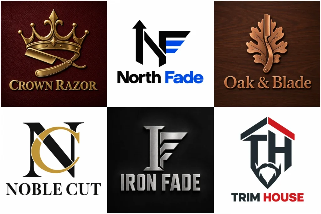
Original Barber Branding in Our Portfolio
This portfolio brings together a varied selection of barbershop identity concepts, from crisp lettering and compact badges to distinctive symbols and classic-inspired compositions.
Each example is presented to show thoughtful typography, balanced shapes, and professional execution, without suggesting that every piece was commissioned by a client. Look beyond appearance and consider how each idea could perform on a storefront, mirror decal, barber cape, product label, business card, or digital booking profile.
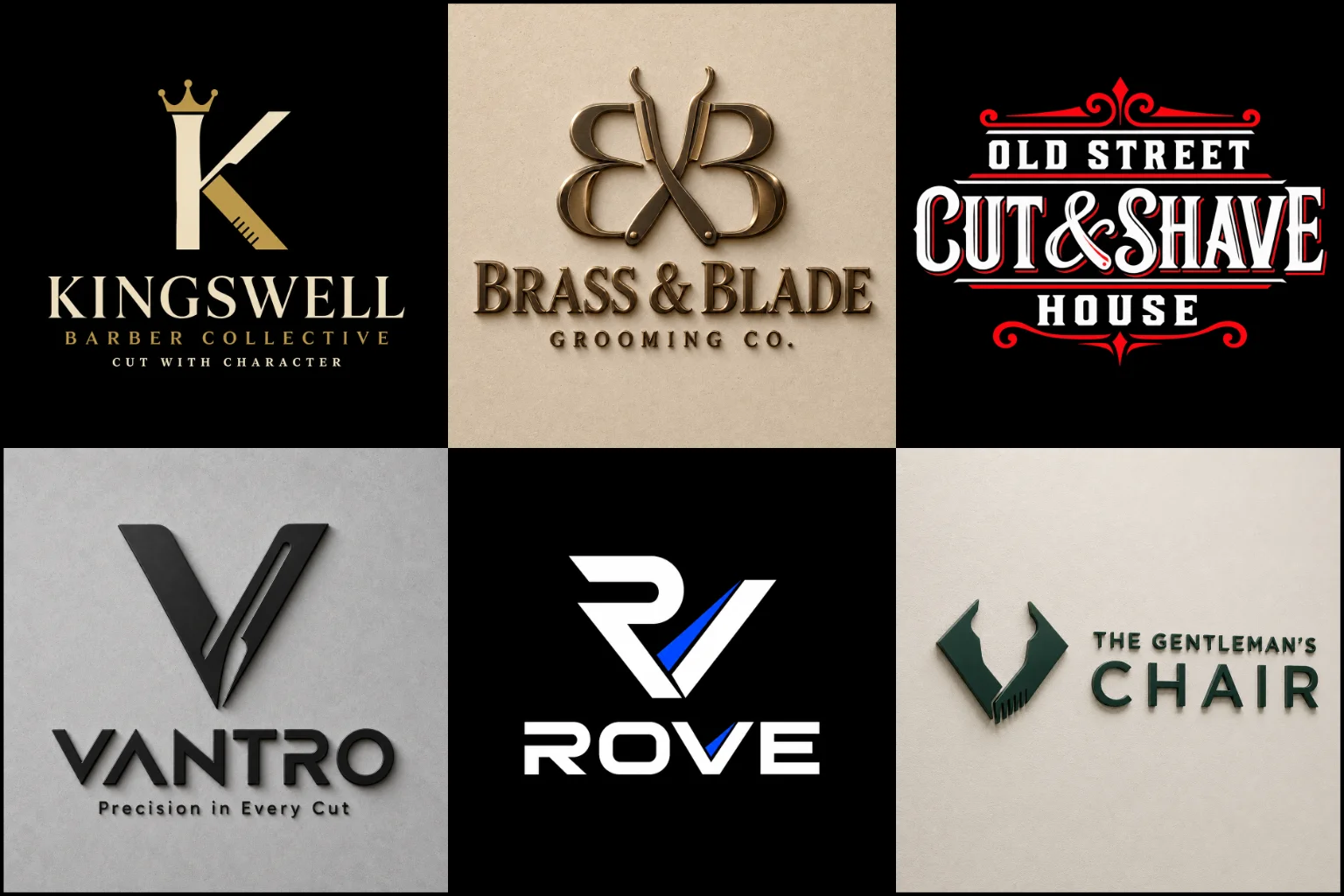
A First Impression Before the First Cut
People may notice your branding while passing the shop, searching on Google Maps, or viewing your social profile. In each situation, the logo has only a short moment to introduce the business.
A strong identity can suggest craftsmanship, cleanliness, confidence, tradition, creativity, or premium service. It should also make the shop name easy to identify. If the symbol dominates while the name becomes difficult to read, the design may look interesting without doing its main job.
The mark does not need to explain every service you provide. Its purpose is to give your business a distinct and consistent face that clients can connect with the shop.
Match the Design to the Shop You Run
Barbershops do not all serve the same audience or offer the same experience. The visual direction should reflect the actual business rather than following whichever trend currently appears popular.
A traditional neighbourhood shop may suit structured lettering, restrained colours, and established craft references. A contemporary grooming studio can take a cleaner approach with open spacing, simple shapes, and confident typography.
Carefully balanced proportions and refined details can give a premium barbershop a more polished appearance. Gold effects, crowns, and ornate scripts can appear luxurious, but they can also feel predictable when used without a meaningful concept.
An urban barbershop may want bolder lettering and more expressive graphics. These features can create energy, although highly aggressive imagery may limit the brand if the shop also wants to attract families, professionals, or a broader mix of clients.
Familiar Barber Symbols Need an Original Treatment
Scissors, clippers, combs, straight razors, moustaches, chairs, and barber poles provide immediate industry recognition. The challenge is that these elements appear in thousands of existing identities.
Instead of placing a common icon above the business name, the symbol can be redrawn around the shop’s initials, history, location, speciality, or personality. Negative space, custom line work, unusual proportions, or an unexpected visual connection can make a familiar object feel more distinctive.
Detail should remain controlled. A complex illustration might look impressive at a large size but become unclear on an appointment app, social profile, embroidered towel, or small product label. The best level of detail depends on where the identity will be used most often.
Choose a Structure That Supports the Style
A badge-style logo naturally suits established, craft-focused barbershops because it can hold the name and symbol within one compact shape. It works well on windows, uniforms, stickers, and signage. However, small wording and decorative lines may disappear when the badge is reduced, so the composition needs careful control.
An initials-based logo design can turn a long shop name into a compact and recognizable mark. It is useful for social icons, cape embroidery, product lids, and smaller applications. The initials still need a custom structure, as simply overlapping standard letters can produce a generic result.
A text and symbol logo keeps the business name visible while adding an identifiable graphic element. This format offers useful layout options, but the icon and typography must feel connected rather than competing for attention.
A heritage-inspired logo can support a traditional atmosphere through classic lettering, frames, engraving influences, or handcrafted details. It should be used because it matches the shop, not simply because retro barber branding is familiar. For a highly contemporary studio, a heavily aged appearance may send the wrong message.
Typography Carries the Shop’s Personality
Lettering often has more influence than the icon. A slab serif can feel sturdy and established. A clean sans serif may communicate a current, straightforward approach. Custom script can introduce personality and craftsmanship, while bold display lettering can create a strong storefront presence.
Readability remains essential. Highly decorative scripts, extreme letter spacing, and distressed effects can make a name difficult to understand, especially from a distance. This becomes more important when the business name is unfamiliar or contains several words.
Using too many fonts also weakens the hierarchy. The shop name should lead, while any location, founding date, or tagline remains secondary. Supporting text should only appear when it adds useful information and can stay readable in the intended application.
Build a Colour Palette for Practical Use
Red, white, and blue are closely associated with the traditional barber pole, but a shop does not have to follow that palette. Black, cream, deep green, navy, burgundy, warm brown, or muted neutral colours can create very different impressions.
Colour should suit the interior, signage materials, audience, and overall position of the business. Strong contrast helps the name remain visible from the street and on smaller screens.
The identity should also remain understandable in one colour. This matters for stamps, embroidery, engraving, vinyl cutting, receipts, and simple printing. Gradients and metallic effects may look appealing in a digital mockup, but their appearance can change across physical materials. A solid underlying design provides greater reliability.
Make It Work Wherever Clients See the Brand
A barbershop identity may appear on a wide storefront sign, a square booking profile, a narrow product label, or a small embroidered area. One rigid composition rarely fits every space equally well.
The design should have a clear central idea that can support horizontal, stacked, and compact arrangements without losing its character. The full name may work best on the fascia, while a simplified symbol or initials can suit profile images and smaller items.
Common applications include:
Exterior signs and illuminated displays
Glass doors, windows, and mirror decals
Social profiles and appointment platforms
Barber capes, aprons, towels, and uniforms
Business cards, loyalty cards, and gift vouchers
Pomade tins, beard oil bottles, and product packaging
Posters, price lists, and promotional material
Very thin lines, narrow gaps, tiny wording, and heavy texture can create production problems. Considering these limitations during design helps prevent a logo that only looks good in one digital presentation.
Originality Without Unnecessary Complexity
An original identity does not have to be visually complicated. Distinction can come from the shape of one letter, the relationship between the name and symbol, a controlled silhouette, or a detail connected to the shop’s story.
Stock icons and ready-made templates may offer a quick result, but they can make different businesses appear interchangeable. LogoPixa develops the concept around the individual shop, its audience, and its intended character so the design has a more relevant foundation.
Visual originality and legal availability are separate matters. A custom concept can reduce obvious similarity, but business owners should still consider an appropriate trademark search before relying on a name or mark for long-term commercial use.
Know What to Share Before the Project Begins
Clear information leads to a more focused creative direction. Before starting, it helps to prepare:
The exact business name and preferred capitalization
Any tagline that genuinely needs to appear
Your main services and specialities
The type of clients your barbershop aims to serve
The atmosphere of the shop
How and where you plan to display the logo
Preferred colours, symbols, or visual references
Any imagery or styles you want to avoid
Nearby competitors from whom the brand should look different
Reference images can be useful, but explain what you like about them. It may be the lettering, colour balance, simplicity, shape, or overall mood. This provides direction without asking for another business’s identity to be copied.
From a Clear Brief to a Focused Identity
The creative process should begin with the business rather than an isolated symbol. The shop name, audience, services, environment, and intended applications help establish the right direction.
Once the core idea is selected, the typography, icon, spacing, proportions, and colour relationships need to work as one composition. The design should then be checked at small sizes, in one colour, and against realistic uses such as signage and embroidery.
Feedback is most useful when it explains the business reason behind a requested change. Saying that a concept feels too traditional for a young audience gives clearer direction than simply asking to make it more attractive.
If you are opening a new shop or replacing an identity that no longer represents the business, LogoPixa can help shape a clear and practical direction around your actual branding needs.
When an Existing Logo Needs Refinement
Starting again is not always necessary. If clients already recognize the existing mark, careful refinement may preserve its familiar character while improving weak typography, uneven spacing, poor alignment, or excessive detail.
A larger redesign may be more appropriate when the current logo uses a common template, no longer matches the shop, contains an outdated business name, or fails across important applications.
Changing a familiar identity too drastically can remove useful recognition. The decision should depend on what is genuinely wrong with the current design and how much value its existing visual features still hold.
Explore More Logo Options
Browse more industry-specific logos to explore branding options created for different types of businesses.
You may also be interested in:
Frequently Asked Questions
What makes a good logo for a barbershop?
It should be easy to identify, appropriate for the shop’s audience, readable from a distance, and clear at small sizes. Strong typography, a distinctive concept, balanced spacing, and practical reproduction are more important than adding several barber-related objects.
Does my logo need scissors or a barber pole?
No. These symbols provide quick industry recognition, but they are not required. Initials, custom lettering, an abstracted tool, a local reference, or another meaningful idea may give the shop a more individual identity.
Should I choose a classic or contemporary appearance?
Choose the direction that reflects the real shop experience. Traditional styling can support an established craft atmosphere, while a cleaner contemporary approach may suit a modern grooming studio. Mixing both can work when the typography, details, and proportions are carefully balanced.
Which colours work best for barber branding?
There is no single required palette. Black and cream can feel timeless, while navy, green, burgundy, or brown may add character. Brighter colours can suit a more energetic shop. The final choice should provide good contrast and work with the interior and signage.
Should the full business name appear in the logo?
The full name is usually helpful when the business is new or not yet widely recognized. Initials can support smaller applications, especially when the name is long. The main version should still make it easy for new clients to understand which business they have found.
Can a detailed retro logo work on social media and uniforms?
It can, but fine lines, textures, and small wording may need simplification. The central shape should remain recognizable when reduced, embroidered, printed in one colour, or placed inside a small profile image.
Should I include a tagline?
Include one only when it adds important information and remains readable. Long taglines can overcrowd the composition and become illegible at smaller sizes. The shop name should always remain the main focus.
Can my current barbershop logo be improved without replacing it?
Yes. Typography, spacing, proportions, colour, and icon construction can often be refined while preserving recognizable features. If the existing concept is too generic or no longer matches the business, a broader redesign may provide a stronger long-term direction.