
Logo Style: Find the Right Look for Your Brand
At LogoPixa, the focus is on building distinctive identities around the character of each business. Whether you prefer something clean and modern, elegant and refined, bold and energetic, or timeless and traditional, the design should support how you want customers to see your brand.
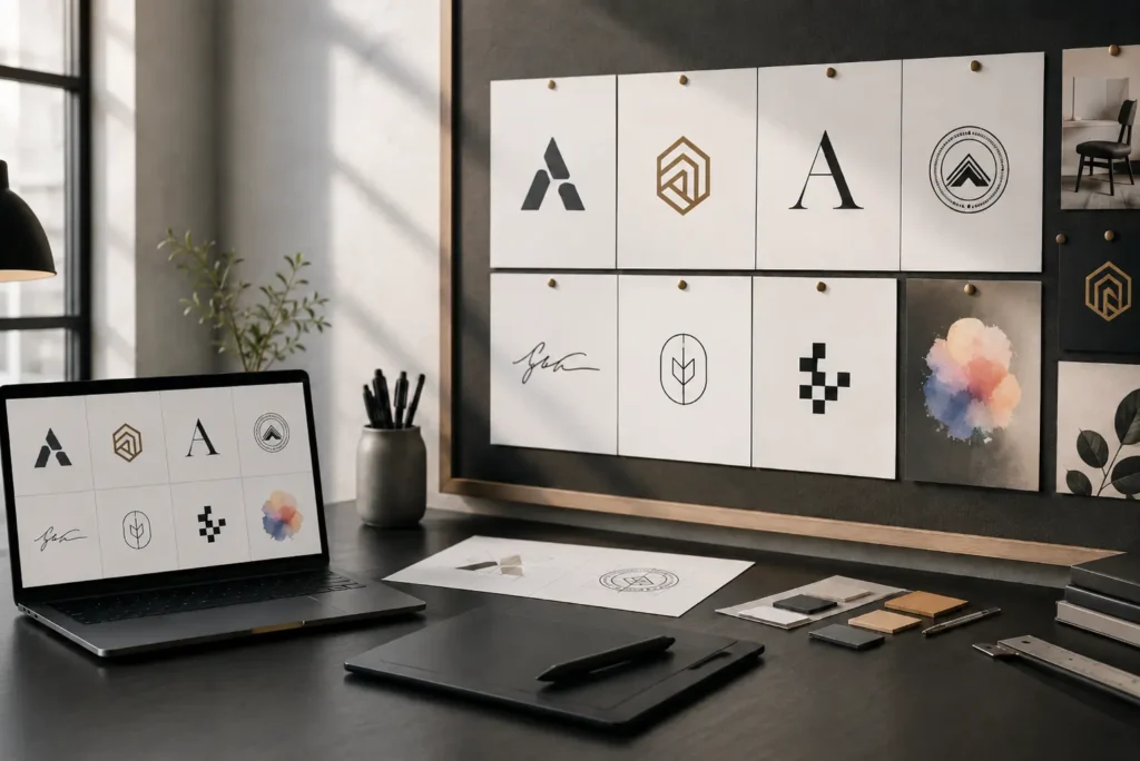
Explore Different Logo Styles
Different businesses require different design approaches. A technology company may need a sharp, minimal identity, while a luxury brand could benefit from refined typography and carefully controlled details.
Exploring different design styles helps you understand how typography, shapes, symbols, colors, spacing, and composition can change the personality of a logo. It also makes it easier to communicate the visual direction you want before the design process begins.
Our portfolio includes a variety of creative approaches so you can compare ideas, discover what fits your business, and identify the qualities you want in your own identity.
What Does Logo Style Mean?
A logo’s style is the overall visual character created by its typography, colors, shapes, symbols, spacing, and layout. These elements work together to make the identity feel modern, playful, premium, corporate, handmade, futuristic, traditional, or something completely different.
Style is different from logo type. A logo type describes its basic structure, such as a wordmark, emblem, monogram, pictorial mark, or combination mark. The same structure can be designed in several visual directions.
For example, two businesses may both use wordmarks. One could feature a minimal geometric typeface, while another uses elegant serif lettering. The structure is similar, but the personality and audience perception can be completely different.
Why the Visual Direction Matters
People often form an impression of a business before reading its website or understanding its services. The logo is one of the first brand identity elements they notice.
The right direction can help communicate qualities such as reliability, creativity, energy, precision, luxury, friendliness, or professionalism. Poor visual choices can create the opposite impression, even when the business itself offers excellent products or services.
A good design should therefore match the company rather than simply follow a popular trend. Decisions about color, lettering, icon shapes, proportions, and visual weight should support the position the brand wants to build.
Modern and Minimal Design
Modern logos usually rely on simple forms, clean typography, balanced spacing, and limited visual detail. They are especially useful for brands that want to appear current, organized, efficient, and easy to understand.
Minimal does not mean empty or unfinished. A successful minimal identity requires careful decisions because there are fewer decorative elements available to hide weak typography or poor proportions.
This direction can work well for technology companies, digital services, consulting firms, architecture studios, startups, and businesses that need an identity that remains clear across websites, apps, social media, and printed materials.
Luxury and Elegant Design
Luxury branding often depends on restraint rather than excessive decoration. High-contrast serif fonts, refined lettering, careful spacing, subtle symbols, and controlled color palettes can create a sophisticated appearance.
Black, ivory, deep navy, muted gold, warm neutrals, and similar tones are commonly associated with premium branding, although the right choice depends on the business.
This approach can suit jewelry companies, beauty brands, hotels, fashion businesses, premium property services, interior studios, and other businesses where presentation and perceived quality are important.
Bold and Strong Design
Some brands need more visual weight. Strong lettering, confident shapes, solid symbols, and noticeable contrast can make an identity feel powerful and established.
A bold approach is often useful where the logo needs to remain noticeable on signage, packaging, uniforms, vehicles, merchandise, storefronts, and promotional materials.
Construction companies, fitness brands, automotive businesses, sports organizations, security services, and industrial companies are common examples, but the final direction should still reflect the individual business rather than an industry stereotype.
Classic and Timeless Design
A classic identity avoids relying heavily on short-term graphic trends. Instead, it uses strong typography, balanced proportions, controlled details, and familiar visual principles.
Traditional serif lettering, symmetrical compositions, crests, badges, frames, and carefully simplified symbols can create a sense of heritage, credibility, and stability when used properly.
This direction may suit law firms, financial businesses, educational organizations, established retailers, hospitality brands, and companies that want an identity capable of staying relevant for many years.
Creative and Playful Design
Not every business needs a serious corporate appearance. Some brands benefit from a more expressive personality.
Playful identities may use rounded typography, unexpected shapes, friendly illustrations, energetic colors, or imaginative symbols. The challenge is keeping the design recognizable and professionally structured while allowing more personality.
Children’s brands, entertainment companies, creative studios, cafés, pet businesses, lifestyle products, and some consumer brands can benefit from this type of visual language.
Vintage and Retro Design
Vintage design uses references from earlier periods while adapting them for modern applications. Common features can include badge layouts, decorative lettering, illustrated symbols, traditional color combinations, and handcrafted details.
The strongest retro identities do not simply copy old artwork. They take inspiration from historical design while keeping the logo functional for current digital and print use.
This direction can be effective for barbershops, cafés, clothing brands, restaurants, craft businesses, workshops, outdoor companies, and businesses that want a sense of heritage or character.
Geometric and Futuristic Design
Geometric identities use controlled shapes, mathematical forms, sharp angles, grids, and structured typography. A futuristic direction may take these ideas further through abstract symbols, unusual letter construction, and technology-inspired forms.
These approaches can communicate innovation, precision, movement, connectivity, and advanced technology when the design remains clear.
They are frequently considered for software businesses, artificial intelligence companies, cybersecurity firms, engineering brands, fintech services, gaming companies, and other technology-led businesses.
Signature Logo Design
Signature logos use flowing or handwritten-style lettering to create a personal and distinctive appearance. They are often suitable for personal brands, photographers, fashion labels, beauty businesses, consultants, creators, and premium services where the name itself should become the main visual feature.
Line Art Logo Design
Line art uses controlled strokes and simplified outlines to create clean, elegant imagery. This approach can work particularly well for beauty, wellness, architecture, interiors, fashion, cafés, botanical brands, and creative businesses that need a light and refined identity.
3D Logo Design
Three-dimensional presentation adds depth, dimension, lighting, and realistic surface effects to a logo. It can create an impressive visual appearance for digital displays, presentations, signage concepts, gaming brands, entertainment businesses, and promotional graphics while keeping the underlying identity recognizable.
Cartoon Logo Design
Cartoon logos use expressive characters, playful shapes, and personality-driven artwork to make a brand feel approachable and memorable. They can suit children’s businesses, food brands, gaming projects, entertainment companies, pet services, and casual consumer products.
Illustrative Logo Design
Illustrative logos use more detailed custom artwork to communicate a story, subject, character, product, or brand personality. They offer greater creative freedom and can be effective for businesses that need a distinctive visual narrative rather than a highly simplified symbol.
Pixel Art Logo Design
Pixel art uses block-based graphics inspired by early digital games and computer interfaces. Its recognizable visual language can suit gaming brands, software projects, retro technology businesses, digital communities, creative studios, and entertainment concepts seeking a nostalgic digital character.
Feminine Logo Design
Feminine branding often uses graceful typography, delicate shapes, softer visual proportions, and carefully selected palettes. Rather than following one fixed appearance, the design should reflect the specific brand and can range from minimal and elegant to expressive and luxurious.
Boho Logo Design
Boho identities often combine relaxed typography with natural forms, celestial details, botanical elements, earthy tones, and handcrafted influences. They can work well for lifestyle brands, boutiques, wellness businesses, handmade products, décor companies, and creative services.
Organic Logo Design
Organic identities draw inspiration from nature through flowing forms, leaves, plants, natural textures, irregular shapes, and earthy visual language. They are commonly considered for sustainable brands, food products, farms, wellness companies, skincare, environmental businesses, and handmade goods.
Negative Space Logo Design
Negative space uses the empty areas within or around shapes to reveal an additional image, letter, or meaning. When handled carefully, this technique can create a clever, memorable, and compact symbol without adding unnecessary visual complexity.
Watercolor Logo Design
Watercolor identities use soft washes, painted textures, blended tones, and artistic imperfections to create an expressive appearance. They can suit creative studios, wedding businesses, beauty brands, handmade products, florists, artists, and lifestyle companies where a softer visual personality is appropriate.
Flat Logo Design
Flat logos use solid colors and simplified two-dimensional forms without relying on realistic depth, lighting, or heavy effects. Their clarity, scalability, and flexibility make them practical for websites, mobile interfaces, social media, packaging, printing, signage, and everyday brand applications.
Typography Can Change the Entire Personality
Typography is one of the strongest parts of an identity. Even when a logo contains an icon, the lettering often determines whether the brand feels serious, luxurious, casual, technical, traditional, or energetic.
Serif fonts can communicate heritage or refinement. Sans-serif fonts often feel clean and contemporary. Condensed lettering can appear strong and efficient, while rounded forms may feel more approachable.
Beyond choosing a font, professional typography requires attention to letter spacing, proportion, hierarchy, readability, and custom adjustments. Small changes can make the difference between lettering that looks generic and lettering that feels intentionally designed.
Color Should Support the Brand
Color influences both visibility and personality. It can help a brand appear energetic, calm, premium, trustworthy, natural, youthful, or sophisticated.
The strongest palette is not always the most colorful one. Many successful identities rely on two or three carefully selected colors supported by neutral tones.
Color should also be tested in practical situations. A logo should continue to work in full color, black, white, and single-color applications when required. This makes the identity easier to use across different materials and backgrounds.
Symbols Need a Clear Purpose
Symbols can improve recognition, but they should not be added simply because a logo feels empty without one.
A useful icon can reference the company name, service, idea, personality, history, product, initials, or a more abstract concept. The connection does not always need to be literal.
In professional identity work, the goal is usually to find a distinctive visual idea that belongs naturally with the brand while remaining simple enough to recognize at different sizes.
Matching the Design to Your Industry
Industry is useful when developing a visual direction, but it should not control every decision.
If every law firm used scales, every property company used rooftops, and every technology company used circuit patterns, brands would quickly become difficult to distinguish.
Industry expectations can provide context, but originality comes from combining that context with the company’s name, personality, audience, positioning, values, and practical requirements.
A professional design should feel appropriate for the market without looking like another version of every competitor.
To explore ideas suited to specific business sectors, see our logo design by industry options.
Consider Your Target Audience
A design should appeal to the people the business wants to reach, not only the person who owns the company.
Age group, buying behavior, price position, location, product category, and customer expectations can all affect design decisions.
A premium service targeting corporate buyers may need a different visual tone from a playful consumer product aimed at families. Understanding the audience helps turn visual preferences into a more useful brand communication system.
Think About Where the Logo Will Be Used
A logo may appear on a website today and on packaging, business cards, social profiles, advertising, signage, clothing, mobile applications, or vehicles later.
This is why practical performance matters alongside appearance.
A design should remain recognizable when it is small, avoid unnecessary detail, and have suitable variations for different layouts. Horizontal, stacked, icon-only, monochrome, and reversed versions may be useful depending on the identity.
Planning these applications early creates a more flexible brand asset.
Trends Can Help, but They Should Not Control the Design
Design trends can introduce fresh ideas, but copying whatever is currently popular can make an identity age quickly.
Gradient effects, highly simplified symbols, unusual typography, 3D presentation, retro lettering, and other visual approaches regularly move in and out of popularity.
A better approach is to use trends selectively when they genuinely fit the brand. The core identity should still be based on recognition, clarity, relevance, and long-term usability.
Custom Design Versus Ready-Made Templates
Logo templates and automated generators can be useful for exploring general ideas, especially at the earliest stage of a project. Their limitation is that the same structures, icons, and layouts can appear repeatedly across unrelated businesses.
Custom design starts with the individual company. The name, audience, market, competitors, personality, and intended applications can influence the creative direction.
This allows typography, symbols, spacing, and composition to be developed as a connected identity system rather than assembled from unrelated ready-made parts.
How to Choose the Right Direction
Start by considering how you want people to describe your business. Words such as trustworthy, energetic, elegant, approachable, innovative, traditional, premium, or playful can provide useful direction.
Next, look at competitors and identify patterns. The goal is not to copy them. It is to understand what customers already expect and where there may be room to create something more distinctive.
Then consider practical use. A beautiful idea that becomes unreadable on a mobile screen or difficult to print is not a strong long-term solution.
The best direction usually balances brand personality, audience expectations, originality, readability, and flexibility.
What to Share With Your Designer
Clear information at the beginning of a project leads to more focused concepts.
Useful details include the company name, industry, products or services, target audience, competitors, preferred colors, unwanted colors, design references, and where the identity will be used.
It also helps to explain what you want the business to communicate. Describing the desired personality often provides more useful information than simply requesting something to “look professional.”
References can help show preferences, but they should be treated as visual guidance rather than designs to reproduce.
Reviewing a Design Properly
A logo should be judged as a brand asset rather than only as a large image on a presentation screen.
Check whether the name is easy to read, the main idea is recognizable, the proportions feel balanced, and the symbol works with the typography. Look at the design in both small and large sizes.
It is also useful to view it without presentation effects. Mockups, shadows, lighting, textures, and 3D surfaces can make almost any design appear more impressive. The core identity should still look strong as a simple flat graphic.
Building a Flexible Brand Identity With LogoPixa
LogoPixa develops visual identities around the needs and character of each business rather than forcing every company into the same design formula.
The process can explore typography, symbols, composition, visual balance, color direction, and practical variations while keeping the final identity focused and usable.
Want to know more about the team and approach behind the work? Learn more about LogoPixa
Whether your business needs a clean modern appearance, a premium feel, a strong industrial presence, a friendly personality, or something more distinctive, the goal is to create a professional visual identity that can work confidently across real brand applications.
If you already have a style in mind and are ready to get started, you can view our logo design pricing to choose the option that fits your project.
Frequently Asked Questions
How do I know which design direction suits my business?
Start with the personality you want your company to communicate and the customers you want to attract. Your industry provides useful context, but audience, positioning, competition, and practical applications should also influence the final choice.
Should my logo follow current design trends?
Not necessarily. Trends can provide inspiration, but your identity should remain useful after a trend becomes less popular. Choose visual ideas that support your brand instead of using fashionable effects simply because they are currently common.
Can a simple logo still look professional?
Yes. Simplicity can improve recognition, readability, and flexibility. Professional simplicity depends on thoughtful typography, spacing, proportions, color, and concept rather than the number of elements included in the design.
Which colors should I use for my brand?
There is no universal best palette. Colors should support your brand personality, audience, market, and practical needs. They should also provide enough contrast and remain effective across both digital and printed applications.
Does every logo need a symbol?
No. Some businesses are better represented through distinctive typography alone. A symbol should be included when it adds useful meaning, recognition, or flexibility rather than simply filling space.
Can I combine two different visual approaches?
Yes, when they work naturally together. A designer might combine modern typography with a classic symbol or minimal construction with a slightly handcrafted detail. The important point is maintaining a consistent overall identity.
Should I choose a different design for social media?
The main identity should remain consistent, but you may need an adapted version. An icon, monogram, compact symbol, or simplified mark can work better in profile pictures and other small digital spaces.
What makes a logo look outdated?
Overused effects, dated typography, excessive detail, weak spacing, poor proportions, and visual trends strongly linked to a particular period can make an identity feel old. Careful simplification or refinement can often improve it without removing the brand’s established character.
Is a custom logo better than a template?
A custom identity offers more opportunity to develop a distinctive concept around your actual business. Templates can be useful for basic needs or inspiration, but they offer less control over originality, typography, brand meaning, and practical variations.
What files should I receive after the design is finished?
Professional delivery normally includes suitable vector and raster formats for different applications. Depending on the project, variations may include full color, black, white, transparent-background, horizontal, stacked, or symbol-only versions.