
Interior Design Logo for a Distinctive Studio Identity
The focus is on clear typography, purposeful symbols, balanced proportions, and a look that reflects your positioning rather than a generic furniture icon. Browse the portfolio to compare visual directions and see what could suit your brand.
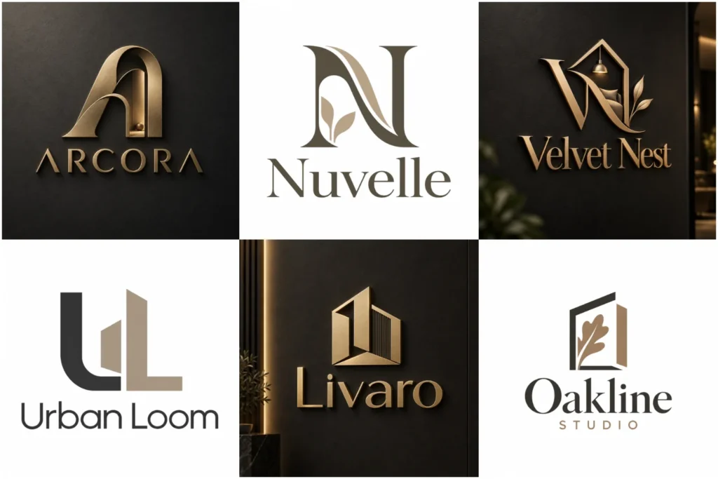
Explore Branding Ideas for Interior Professionals
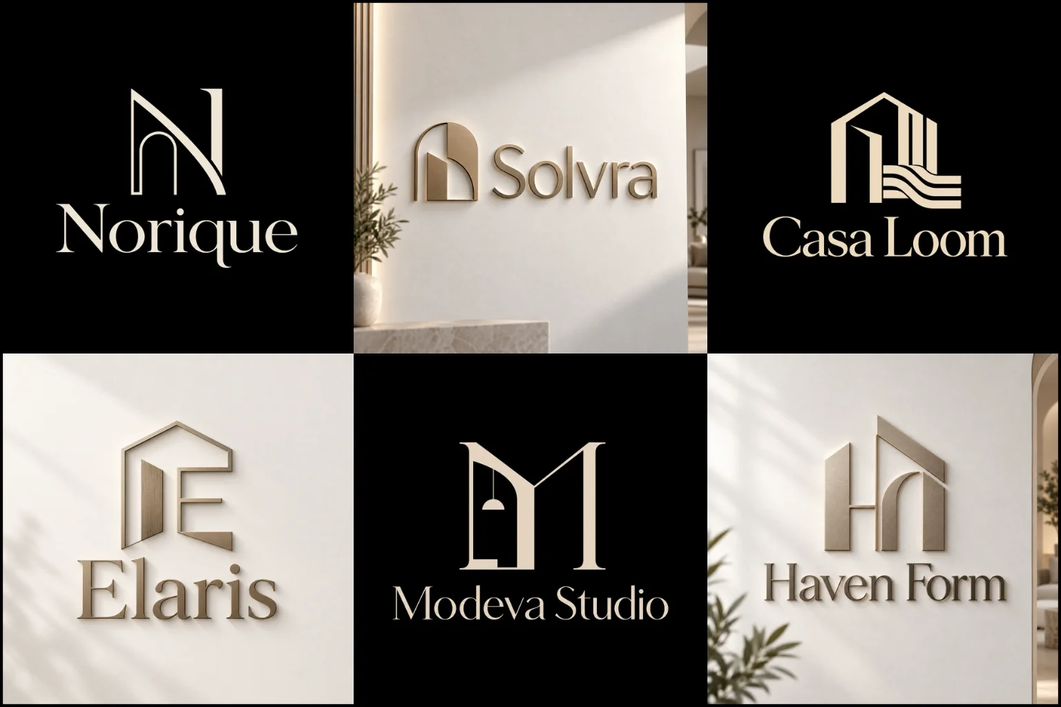
Explore a varied collection of refined, minimal, geometric, typographic, and symbol-led concepts created to show different branding possibilities for design-focused businesses.
Each example is presented with attention to originality, composition, readability, and practical use across websites, social profiles, stationery, proposals, presentation covers, signage, and printed materials. The portfolio is intended to demonstrate creative range and professional execution, without implying that every displayed concept was produced for a paid client project.
Your Identity Should Reflect More Than Good Taste
Interior businesses are often judged visually before a potential client reads about services, experience, or design philosophy. Your branding therefore needs to communicate the right kind of character quickly.
A residential decorator may want an inviting and refined identity. A commercial studio could need something more structured and architectural. A luxury interiors company may benefit from restrained typography and sophisticated proportions, while a creative styling business might want a more expressive personality.
The logo should not try to show every service you provide. Its role is to establish a recognizable visual identity that supports the overall brand.
That means considering your audience, design approach, project type, price positioning, business name, and the impression you want to create before deciding on fonts, symbols, or colors.
Find a Visual Direction That Fits Your Studio
Interior brands naturally connect with clean composition, proportion, form, material, and visual balance, but that does not mean every studio should look the same.
A modern brand identity can suit contemporary studios, space-planning firms, commercial designers, and businesses that favor clean layouts and current aesthetics. Simple geometry and controlled typography can make the identity feel organized without making it cold or impersonal.
A geometric brand mark has a particularly strong connection with interior and spatial work. Grids, architectural forms, angles, negative space, and measured relationships can reference structure and planning without using an obvious room or building illustration.
An outline logo design can create a lighter, more artistic character. Carefully drawn curves or structural lines may work well for boutique studios and décor brands, although very thin details need to be controlled so they remain visible at smaller sizes.
For studios with a distinctive business name, a typography-based logo can place the name at the center of the identity. This approach depends heavily on lettering quality, spacing, and custom details because ordinary text in a fashionable font can easily feel generic.
The right direction comes from the brand itself rather than choosing a style simply because it is popular in the design industry.
Use Interior Symbols Without Looking Predictable
Furniture, rooms, houses, floor plans, lamps, chairs, doors, windows, arches, and architectural lines can all communicate the industry quickly. The problem is that these ideas are also widely used.
A recognizable industry reference is not automatically a bad choice. It becomes weak when the symbol feels interchangeable with dozens of competing businesses.
More individual ideas can come from:
The shape or meaning of the company name
Founder or business initials
Spatial relationships and negative space
Architectural proportions
Materials, surfaces, or patterns
A signature design philosophy
Custom letterforms
Abstract interpretations of rooms or structures
Symmetry, grids, curves, or modular forms
A symbol does not need to explain interior design literally. Sometimes a distinctive abstract idea paired with suitable typography creates a stronger identity than another sofa, roof, or floor-plan icon.
Typography Sets the Personality of the Brand
For an interior business, lettering often carries as much visual weight as the symbol.
High-contrast serif lettering can create an editorial or sophisticated character. A clean sans serif may feel contemporary, organized, and architectural. Softer letterforms can make a residential brand feel approachable, while carefully customized characters can give a studio a more individual identity.
The business name also affects the decision.
A short name can support wider letter spacing or more distinctive custom lettering. Longer studio names usually need tighter control over width, hierarchy, and readability.
Decorative fonts require particular care. A typeface may look attractive at presentation size but become difficult to read on an Instagram profile, property sign, material sample, or email signature.
Good typography should support the studio’s personality while keeping the name clear.
Choose Colors Around Positioning, Not Trends
Interior brands have access to a much wider palette than beige, black, white, and gold.
Neutral colors can create a calm and refined image, but they are not mandatory. Deep green, terracotta, navy, muted blue, burgundy, charcoal, warm brown, soft pastels, and stronger contemporary colors can all work when they support the character of the business.
Consider how the palette relates to the spaces you typically create.
A studio specializing in natural, warm residential interiors might need a different visual mood from a firm designing modern offices or hospitality spaces.
Color should also work practically. The identity needs enough contrast to remain visible across digital and printed environments.
It is useful to judge the core mark without relying entirely on color. If the design loses its identity as soon as it appears in one color, the underlying concept may need more work.
Match the Logo Structure to How Clients See Your Business
Not every interiors company needs the same structure.
A studio with a short, memorable name may work successfully with custom lettering alone. A longer business name can benefit from a separate compact mark for profile images and other restricted spaces.
Combining a business name with a distinctive symbol can provide useful flexibility. The complete arrangement can appear on a website or proposal cover, while a simplified visual element may be better suited to smaller placements.
Initials can also work when they are naturally connected to the business name. They should be designed as an intentional mark rather than simply placing two standard letters together.
Before choosing a structure, think about recognition. A new studio may need its full name to remain prominent, while a symbol-only approach gives customers less information when they first encounter the business.
Make the Identity Work Beyond the Website
Interior designers use branding in environments where presentation quality matters.
Your identity may appear on:
Portfolio websites
Social media profiles
Design proposals
Client presentations
Mood boards
Business cards
Email signatures
Studio signage
Project documentation
Floor-plan title blocks
Material folders
Sample packaging
Vehicle graphics
Site boards
Printed brochures
A detailed design may look impressive when shown large but become unclear on a small social icon. Very fine lettering can also disappear in small-format printing.
The opposite problem happens when a mark is simplified too aggressively. It may reproduce well but lack enough personality to distinguish the business.
The aim is to find a balance between visual character and practical reproduction.
Think About Your Clients Before Choosing a Style
Personal taste matters, but the identity represents the business rather than an individual mood board.
Consider who hires you.
Homeowners looking for warm, livable interiors may respond differently from property developers seeking a commercial design partner. Hospitality clients may expect another visual character entirely.
Your branding should also reflect where you want the business to sit in the market.
Ask whether the studio should feel:
Contemporary or traditional
Premium or accessible
Artistic or structured
Warm or highly minimal
Residential or corporate
Bold or understated
Established or progressive
These qualities provide much better creative direction than asking for something that simply looks “nice” or “professional.”
Avoid Common Interior Branding Mistakes
One of the most common problems is trying to place an entire room inside a small logo.
Multiple pieces of furniture, walls, lamps, plants, windows, decorative objects, and lettering may communicate interiors clearly when viewed large, but the design can quickly lose clarity when reduced.
Another problem is following luxury branding conventions too closely. Thin serif fonts, wide letter spacing, black backgrounds, and gold effects can create an elegant presentation, but using the same formula as many other businesses makes differentiation difficult.
Mockups also need perspective. Metallic signs, embossed paper, shadows, and realistic wall presentations can help visualize a brand, but they can make an ordinary mark look more impressive than it really is.
The core design should still feel balanced and recognizable when shown as a simple flat graphic.
What to Prepare Before Starting the Design
A useful creative brief helps the designer understand the business before exploring visual ideas.
You do not need to write a complicated branding document. Start with the information that influences the design most:
Business or studio name
Main services
Typical clients
Residential, commercial, hospitality, retail, or other project focus
Desired brand personality
Main competitors
Preferred colors, if any
Colors you want to avoid
Visual styles you are attracted to
Symbols or clichés you do not want
Where the branding will be used most often
Reference images can also help, but explain what you like about them. It might be the typography, spacing, simplicity, color mood, layout, or level of detail rather than the logo itself.
That gives the designer useful direction without turning another company’s identity into something to copy.
Build Recognition Through Consistency
A logo is only one part of the visual identity.
Once the core direction is established, consistency in typography, colors, imagery, spacing, and presentation helps the brand feel connected across different touchpoints.
This matters particularly for an interiors business because clients may move between your social media, website, portfolio, proposal documents, and physical materials before making contact.
A sophisticated logo cannot compensate for inconsistent visual presentation everywhere else. Likewise, branding does not need excessive decoration to feel professional. Clear visual rules and careful application often create a stronger impression.
Creating a Focused Identity With LogoPixa
LogoPixa approaches each project around the character and practical needs of the business rather than forcing interior brands into one visual formula.
The creative direction can be shaped around your studio name, audience, services, preferred personality, and intended applications. Typography, symbols, geometry, color, spacing, and composition can then be developed around one coherent idea.
The goal is an original, memorable identity that looks appropriate for your design practice while remaining clear enough for everyday professional use.
Explore More Logo Options
Browse more business logo categories to explore branding options created for different types of businesses.
You may also be interested in:
- real estate branding
- coffee brand identity
- cleaning service branding
- bakery branding
- architecture branding
Frequently Asked Questions
What type of logo works best for an interior design business?
There is no single best type. A studio may benefit from custom typography, a geometric symbol, initials, or a combined name-and-icon structure. The best option depends on the business name, audience, positioning, and where the branding will be used.
Does my logo need a furniture or house symbol?
No. Familiar symbols can communicate the industry quickly, but they are optional. Abstract forms, custom lettering, initials, negative space, or architectural geometry can create a relevant identity without using literal furniture or house graphics.
What colors are suitable for an interior design brand?
Neutral palettes are common, but they are not the only choice. The palette should reflect the studio’s personality and target market. Warm natural tones, dark sophisticated colors, muted shades, or stronger contemporary colors may all be appropriate.
Should the logo match my personal interior style?
It should relate to the type of work and experience your business offers, but it does not need to copy a specific room aesthetic. A logo usually needs to last across many projects, materials, and changing design trends.
Is a minimalist design a good choice for an interior studio?
It can be, particularly when the brand values restraint, clarity, and contemporary aesthetics. The limitation is that extreme simplicity can become generic. Distinctive typography, proportions, or a meaningful concept are still needed.
Can thin-line logos work for interior businesses?
Yes, especially for brands seeking a refined or architectural appearance. However, extremely fine lines may become difficult to reproduce at small sizes or on certain printed materials, so line weight needs to be considered carefully.
Should I use my initials or full studio name?
Initials can create a compact mark, particularly for long business names, but new customers may not know what the letters mean. Keeping the full name visible somewhere in the primary identity can make the brand easier to understand while recognition is being built.
How can I make my branding look different from other interior studios?
Start with the individual qualities of your business instead of common industry graphics. Your name, audience, design philosophy, project focus, personality, and approach can provide more original creative directions than relying on familiar furniture or building icons.
Where should the logo be tested before choosing a design?
Review it at both large and small sizes and consider real applications such as your website header, social profile, proposal cover, business card, signage, email signature, presentation, and printed documents. A strong presentation mockup should not be the only basis for judging the design.
What information should I give LogoPixa before the project begins?
Share your business name, services, target clients, preferred brand personality, main applications, color preferences, visual references, competitors, and anything you specifically want to avoid. Clear information helps establish a more relevant creative direction without restricting originality.