
Beauty Logo Design
Each concept is shaped around your audience, services, and preferred market position. Explore the portfolio to see different creative directions and find inspiration for a visual identity that feels genuinely yours.
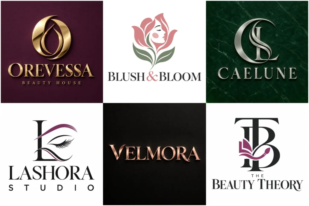
Explore Original Identity Concepts
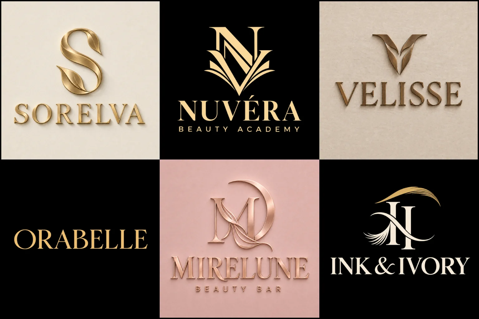
Our beauty identity portfolio explores refined wordmarks, expressive lettering, elegant symbols, balanced combinations, and flexible marks created for different brand personalities. The work demonstrates original thinking, visual variety, careful spacing, and professional presentation across realistic applications.
Some pieces may be concept work rather than commissioned projects, but each shows how a strong identity can function on packaging, signs, websites, social media, appointment cards, product labels, and other customer touchpoints with clarity.
Make the Right First Impression
Beauty customers often notice visual details before reading about services, ingredients, or qualifications. Typography, colour, spacing, and imagery can immediately suggest whether a business feels luxurious, clinical, natural, artistic, youthful, or approachable.
A skincare clinic may need a calm and precise identity, while a nail studio can support brighter colours and more expressive shapes. A personal makeup artist may benefit from a name-led mark, whereas a cosmetics range usually needs an identity that remains readable across different packaging sizes.
The aim is not to include every service in the logo. It is to establish a clear personality that customers can connect with the business.
Designed for Different Beauty Businesses
The beauty industry includes businesses with very different audiences and customer experiences. A useful design direction must consider the specific service rather than relying on a generic face, flower, or eyelash symbol.
LogoPixa can develop visual identities for businesses such as:
Beauty salons and independent studios
Makeup artists and bridal makeup services
Skincare and personal care brands
Cosmetic and makeup product lines
Nail bars and nail technicians
Lash and brow specialists
Hair and beauty professionals
Spas and wellness centres
Aesthetic and beauty clinics
Organic and clean beauty brands
Mobile beauticians and home-based services
Beauty educators and training academies
Each business needs its own balance of professionalism, personality, readability, and practical use.
Choose a Direction That Fits Your Brand
A successful identity should match the way the business wants to be perceived. Following a popular trend without considering the audience can make the brand feel temporary or disconnected.
Clean minimalist logos can work well for modern skincare, beauty clinics, natural product lines, and salons that want a calm, polished appearance. Simple forms also reproduce clearly at small sizes. However, minimal design requires careful spacing and distinctive details to avoid looking plain or similar to competitors.
More expressive identities may use bold lettering, energetic colour, or an unusual symbol. This can suit nail artists, makeup studios, younger cosmetic brands, and businesses built around a strong creative personality.
Natural beauty brands often benefit from softer shapes, botanical references, earthy colours, and open layouts. These elements should be handled with restraint because leaves and flowers are already common within the industry.
Create a Premium Feel Without Looking Generic
Luxury is not created by adding gold to an ordinary logo. It comes from controlled proportions, confident typography, balanced spacing, and a clear sense of restraint.
A premium logo style may suit an upscale salon, specialist skincare range, private beauty studio, or high-end cosmetics brand. Refined serif lettering, subtle monograms, and carefully simplified symbols can communicate exclusivity without making the identity difficult to use.
Very thin lettering and complex decorative details can appear elegant on a large display but disappear on product labels or social media profiles. The design must preserve its character when reproduced at smaller sizes or in one colour.
Typography That Supports the Brand Personality
The company name is often the most important part of a beauty identity. Letter shapes, spacing, weight, and capitalisation influence how the name feels before the customer reads any supporting message.
Serif typefaces can create a refined or established impression. Clean sans serif lettering often feels modern, approachable, or clinical. Softly rounded characters may suit friendly personal care brands, while high-contrast letterforms can give cosmetics packaging a more editorial appearance.
A handwritten logo style can be effective for makeup artists, beauty professionals, and founder-led studios because it adds a personal quality. It should still remain readable. Overly complicated scripts, extreme flourishes, and tightly connected letters may cause problems on signs, labels, and small digital screens.
Typography can also be customised through adjusted letterforms, ligatures, initials, or subtle negative space. These details help a name-led identity feel owned rather than typed from a standard font.
Symbols With a Clear Purpose
An icon can help customers recognise a business when the full name is not visible. It may be based on an initial, an abstract shape, a product-related detail, or a carefully simplified beauty reference.
Faces, lips, eyes, eyelashes, crowns, mirrors, and flowers are familiar choices, but familiarity alone does not create distinction. The symbol needs a specific relationship with the brand name, service, personality, or positioning.
Abstract marks offer more freedom and can support a wider range of services. Monograms are useful when the business has strong initials or a long name. Pictorial symbols can communicate the category quickly, but they should avoid making the business appear limited to one service if expansion is planned.
The strongest choice depends on what customers need to understand and remember.
Colour That Works Beyond the Screen
Pink, black, white, gold, beige, and soft neutral tones are common in beauty branding, but they are not compulsory. The right palette should support the intended experience rather than follow an industry stereotype.
Muted neutrals can feel calm and sophisticated. Deep colours may create a richer, more exclusive mood. Brighter shades can express creativity and energy, while greens and earth tones often support natural or botanical positioning. Clinical beauty businesses may prefer cooler, cleaner colour combinations.
Colour also needs practical control. Metallic gold seen on packaging is different from a flat digital gold displayed on a website. Pale colours may lose contrast, and large palettes can become difficult to apply consistently. A strong identity should remain recognisable in full colour, black, and white.
Built for Packaging, Signs, and Digital Use
A beauty logo may appear on a storefront one day and a tiny product label the next. It should remain clear across booking platforms, social profiles, websites, uniforms, appointment cards, shopping bags, cosmetic containers, and promotional materials.
Horizontal layouts are often useful for website headers and signage. Compact arrangements fit social media profiles, stickers, jar lids, and favicons more comfortably. Long business names may need a carefully structured lockup rather than being squeezed into a small space.
Custom combination logos are especially practical when a business needs both a readable name and a recognisable symbol. The complete arrangement can represent the brand in formal settings, while the icon may support smaller applications. Both elements still need to feel connected when used together.
Common Problems to Avoid
Many beauty identities appear attractive at first glance but become difficult to use in real situations. Common issues include:
Script lettering that customers cannot read
Hair-thin lines that disappear when printed small
Generic faces, lashes, flowers, or crowns
Too many decorative details competing with the name
Poor contrast between the logo and its background
A symbol that represents only one service
Trend-driven styling that does not match the actual business
A wide layout that cannot fit product labels or profile images
Multiple fonts and colours without a clear hierarchy
Removing unnecessary elements usually improves clarity. The goal is not to make the identity empty, but to ensure every visible detail serves a purpose.
Information That Helps Shape the Concept
A clear creative brief helps establish the right direction before visual decisions are made. Useful information includes:
The exact business name and preferred capitalisation
Any tagline that genuinely needs to appear
The main services or products offered
The type of customers you want to reach
The intended market position and price perception
The personality the brand should communicate
Colours, symbols, or styles that should be avoided
The main places where the identity will be used
Future services or product categories being considered
Relevant visual references and what you like about them
References are helpful for communicating taste, but the final concept should not imitate another beauty brand. Originality comes from understanding the business and developing a visual solution around its own characteristics.
A Practical Identity, Not Just an Attractive Image
A well-planned logo makes it easier to present the business consistently across physical and digital touchpoints. It gives packaging, social posts, signs, and marketing materials a recognisable visual centre.
It cannot replace service quality, customer experience, or a clear business message. It also does not need to explain every treatment or product. Its role is to identify the brand, support its positioning, and create a suitable foundation for the wider visual identity.
LogoPixa focuses on creating an original mark that feels relevant to the business and remains practical wherever customers encounter it. Share your brand name, audience, services, preferred direction, and intended applications to begin shaping a concept around your needs.
Explore More Logo Options
Browse more logo design by industry to explore branding options created for different types of businesses.
You may also be interested in:
- photography branding
- spa branding
- clothing brand identity
- hair salon brand identity
- barber shop branding
Frequently Asked Questions
What makes a good logo for a beauty business?
It should be distinctive, readable, relevant to the target customer, and suitable for real applications. Strong typography, controlled details, and a clear brand personality are more valuable than adding several obvious beauty symbols.
Does a beauty brand logo have to look feminine?
No. The visual direction should reflect the audience and positioning. A brand can feel neutral, clinical, bold, natural, artistic, luxurious, or gender-inclusive without relying on traditionally feminine colours and imagery.
Which colours work best for beauty brands?
There is no single best palette. Soft neutrals can feel refined, bright colours may express creativity, darker tones can create depth, and natural colours may support organic positioning. Contrast and consistent application are as important as the colour choice itself.
Should the logo include a face, flower, or eyelash?
Only when the symbol has a meaningful connection to the business and can be made distinctive. These elements are common in the industry, so using one without a clear idea may result in an identity that feels familiar rather than memorable.
Is a wordmark or symbol better?
A wordmark gives direct attention to the business name, while a symbol can improve recognition in compact spaces. A combined arrangement may be more flexible for businesses that need both. The best option depends on the name, services, and intended uses.
Can one logo represent several beauty services?
Yes, provided it is not built around one narrow treatment. A salon offering hair, nails, makeup, and skincare may benefit from a broader abstract symbol, monogram, or name-led identity rather than an icon representing only lashes or hair.
Are script fonts suitable for beauty brands?
They can add elegance or personality, particularly for personal brands and boutique studios. The lettering must remain readable at small sizes. Complicated strokes and excessive flourishes can create problems on websites, signs, and product packaging.
What should I provide before the design begins?
Provide the exact business name, services or products, target audience, preferred brand personality, intended uses, and any colours or ideas to consider or avoid. Visual references can also help explain the overall mood you want.