
Photography Logo Design
The aim is a clear, memorable mark that works across websites, social profiles, watermarks, packaging, and print. Explore the portfolio to see which visual direction feels right for your brand, audience, and creative approach.
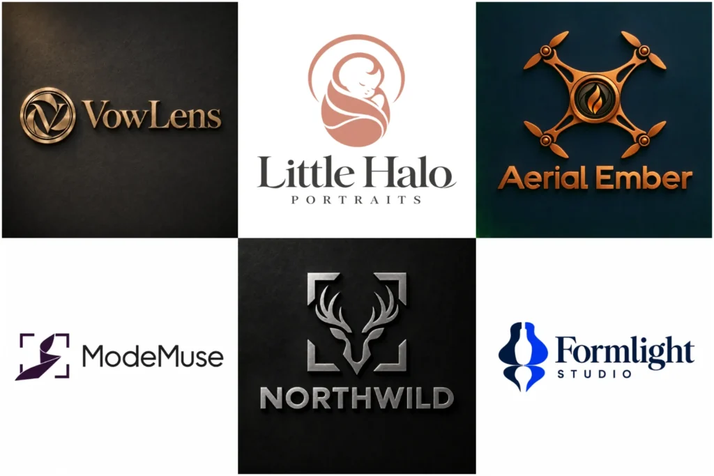
Explore Original Logo Concepts for Photographers
A photography portfolio can span refined wedding identities, bold studio marks, elegant signatures, documentary-inspired symbols, and clean commercial systems. The examples below demonstrate different creative directions, each developed with attention to concept, typography, proportion, and finish.
They are presented as design examples and should not be read as a claim that every piece came from a paid client. Use them to judge originality, versatility, and real-world usability across brand platforms.

Your Identity Should Reflect Your Positioning
Photography covers many different markets, so the right identity depends on what you photograph and whom you want to attract. A wedding photographer may need something warm, refined, and personal. A commercial studio may benefit from a structured identity that feels dependable and adaptable. A sports or wildlife photographer might prefer a stronger sense of movement and energy.
Before choosing a visual direction, consider the qualities clients should associate with your work. These could include elegance, creativity, confidence, authenticity, adventure, precision, or simplicity. This positioning gives the design a clear purpose and prevents it from becoming a generic decoration.
Your identity should also fit the way you present your portfolio. Bright editorial images may suit a clean and restrained mark, while dramatic cinematic work can support a bolder visual approach.
Choosing a Suitable Logo Structure
Different logo structures solve different branding needs. The best option depends on your business name, preferred style, and where the identity will appear.
A Pictorial Mark Logo uses a recognizable symbol. For a photographer, that symbol might be based on a lens, frame, shutter, aperture, light source, subject, or a more original idea connected to the specialty.
A Combination Mark Logo brings the symbol and business name together. It is a flexible choice because the full arrangement can support brand recognition, while the icon may work independently in smaller spaces when the design system allows it.
A Wordmark Logo gives the business name full attention. This can work well for a studio with a short, distinctive name. However, very long names may become difficult to read when reduced to a small watermark or profile image.
The structure should be chosen for practical reasons, not simply because it looks attractive in a large presentation.
When Simple, Personal, or Classic Styles Work
A Minimalist Logo can complement photographers who want their images to remain the main focus. Clean shapes, controlled spacing, and restrained typography can create a polished identity without competing with the portfolio. Simplicity still requires originality, as an overly basic symbol may look similar to many existing brands.
A Signature Logo can add a personal feel for portrait, wedding, family, fashion, or fine-art photographers. It may resemble an artist’s signature while remaining professionally constructed. Legibility is important because highly decorative lettering can become unclear at small sizes.
A Vintage Logo may suit film photographers, heritage studios, analogue specialists, travel storytellers, or businesses influenced by classic camera culture. Vintage details can add character, but too many lines and decorative elements may reduce clarity on digital platforms.
Moving Beyond the Obvious Camera Symbol
Cameras, apertures, lenses, and shutters are familiar industry symbols. They communicate the service quickly, but they are also widely used. Adding a standard camera outline beside a business name rarely creates a distinctive identity on its own.
A more thoughtful concept can still reference photography without repeating the most predictable imagery. Negative space, framing, light, focus, perspective, initials, motion, or a meaningful subject can provide a stronger starting point.
The concept can also come from the photographer’s specialty. Architectural work may inspire geometric forms. Nature photography can support an organic symbol. Fashion imagery may call for editorial typography. Aerial work could use height, landscape, or viewpoint as part of the visual idea.
Originality does not require making the mark complicated. It comes from connecting a clear idea with the character of the business.
Typography Shapes the Brand’s Personality
The typeface influences how the business is perceived before a client views the portfolio. Serif lettering can feel established, editorial, or refined. A clean sans serif may appear modern and direct. Custom lettering can add individuality when it remains readable.
Letter spacing, line breaks, weight, and proportion matter as much as the font category. The name should not feel cramped, stretched, or disconnected from the symbol. Supporting words such as “Photography,” “Studio,” or a specialist descriptor need enough clarity without competing with the main name.
If the business name contains unusual spelling, initials, or multiple words, the arrangement should make it easy to understand at a glance.
Using Color With Purpose
Color should support the mood of the photography rather than follow a trend without reason. Black and white can create a confident, timeless appearance and work naturally with many image styles. Neutral palettes may suit wedding, lifestyle, interior, or fine-art brands. Stronger colors can bring energy to event, youth, sports, or creative studio identities.
The logo must also remain clear when color is unavailable. A design that relies entirely on gradients, shadows, or photographic effects may lose its character in a single-color application.
Contrast is equally important. Fine lines or pale lettering can disappear over detailed photographs, especially when used as a watermark. Testing the design on both light and dark backgrounds helps reveal these problems early.
Designed for Every Place Clients See Your Brand
A photographer’s identity appears in more places than a website header. It may be used on:
- Portfolio websites and gallery pages
- Social media profiles and posts
- Image watermarks
- Business cards and stationery
- Client guides and presentation documents
- Packaging, albums, and print materials
- Studio signs, banners, or exhibition displays
- Email signatures and digital invoices
One arrangement may not perform equally well in every setting. A horizontal layout can suit a website header, while a compact icon may be more useful for a profile image. Detailed lettering that looks elegant on an album cover may need a simpler alternative for small digital use.
Good design anticipates these situations so the identity remains recognizable and readable without unnecessary visual changes.
Building a Clear Creative Brief
A useful brief does not need to be long, but it should explain what makes the business different. Start with the photography specialty, target client, brand personality, and preferred visual tone.
It also helps to provide:
- The exact business name and any required descriptor
- The main photography services offered
- The audience you want to attract
- Where the logo will be used most often
- Colors or styles you prefer
- Visual directions you want to avoid
- Competitors or similar brands that should not be imitated
- Examples of your own photography
Reference images can communicate taste, but they should guide the mood rather than be copied. Sharing both likes and dislikes gives the designer a clearer understanding of your expectations.
Creating a Distinctive Identity With LogoPixa
LogoPixa can help translate the character of your photography into a clear and practical visual identity. The creative direction should connect with your specialty, fit your audience, and remain usable across the platforms that support your business.
The goal is not to add unnecessary effects or force a camera into every concept. It is to develop an original mark with considered typography, balanced proportions, and a visual idea that belongs to your brand. Review the portfolio, identify the directions that appeal to you, and share the details of your business when you are ready to discuss a custom concept.
Explore More Logo Options
Browse more logo industries to explore branding options created for different types of businesses.
You may also be interested in:
- barber brand identity
- beauty business branding
- fashion branding
- jewelry branding
- travel business branding
Frequently Asked Questions
Should a photographer’s logo include a camera?
No. A camera can communicate the industry quickly, but it is not required. Initials, custom typography, framing, light, negative space, or imagery connected to your specialty may create a more distinctive result.
Can my logo be used as a watermark?
Yes, provided it remains readable at a small size and works over different photographs. A simplified, single-color version is often more practical than a detailed primary arrangement.
Which style is suitable for a wedding photographer?
Wedding photographers often choose refined typography, signature lettering, restrained symbols, or soft minimalist forms. The right choice still depends on the mood of the images and the type of clients the business wants to attract.
What works well for a commercial photography studio?
Commercial studios generally benefit from clear typography, strong proportions, and a flexible identity that can sit beside many types of client imagery. A wordmark or combination structure may be suitable, depending on the business name.
How many colors should the identity use?
There is no fixed number. A focused palette is usually easier to apply consistently, but the decision should reflect the brand’s personality and intended uses. The design should also work in black and white.
Can my personal name be used as the brand name?
Yes. Many photographers build their identity around their own name. The design can emphasize the full name, initials, or a distinctive typographic treatment, depending on its length and readability.
What information should I provide before design begins?
Provide the exact business name, photography specialty, target audience, preferred tone, intended uses, and any visual directions you want to include or avoid. Examples of your work are also helpful for understanding your style.
Which file formats are useful for a photographer’s logo?
Vector formats are valuable for scaling and professional printing, while transparent PNG files are practical for websites, social media, and watermarks. Confirm the included formats and usage terms before the project begins.
When should an existing photography brand be updated?
An update may be useful when the current identity is difficult to read, looks outdated, no longer reflects the photography style, or performs poorly on digital platforms. A complete replacement is not always necessary if the core concept remains effective.