
Signature Logo Design
The design must stay readable, balanced, and useful across real brand applications. Explore the portfolio to see how different lettering directions can create a strong identity without making the name difficult to recognize.
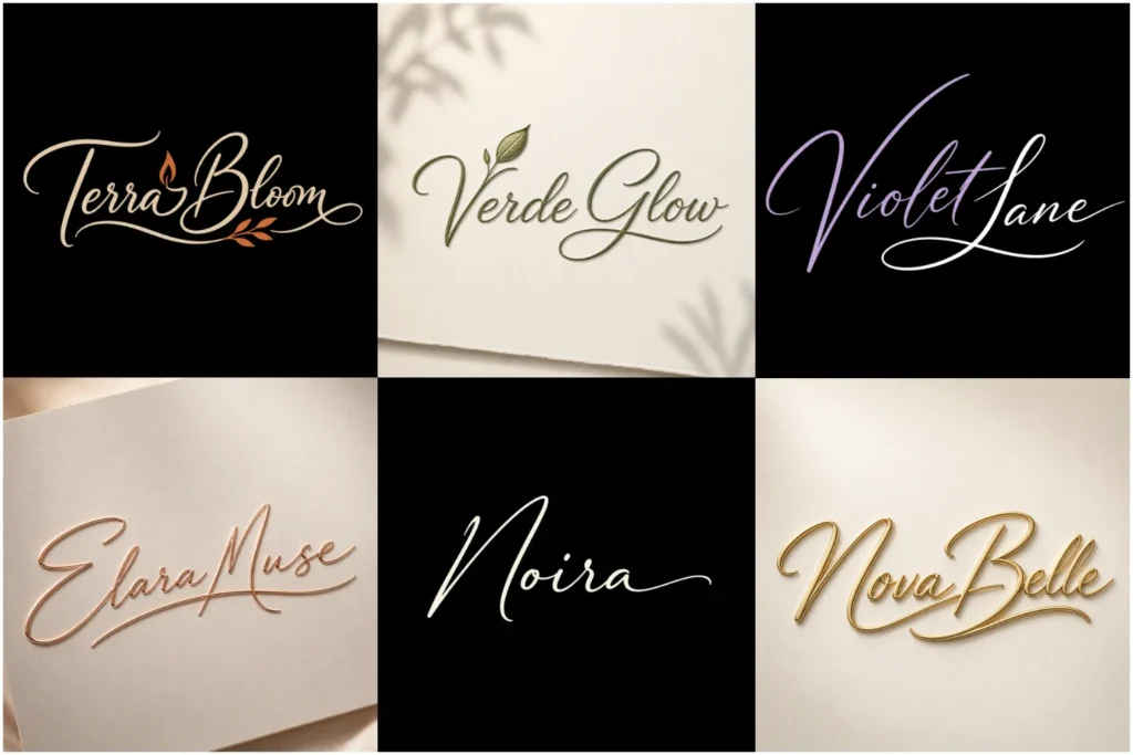
Explore Signature-Style Logo Concepts
The portfolio shows a range of signature-inspired concepts, from clean flowing scripts to restrained handwritten marks with modern spacing. Each example focuses on originality, letterform quality, proportion, and practical use rather than copying a stock font.
Some concepts are minimal, while others use supporting initials or small graphic details. This variety helps you compare different visual directions and understand how a handwritten identity can work across websites, packaging, social media, signage, and printed materials.
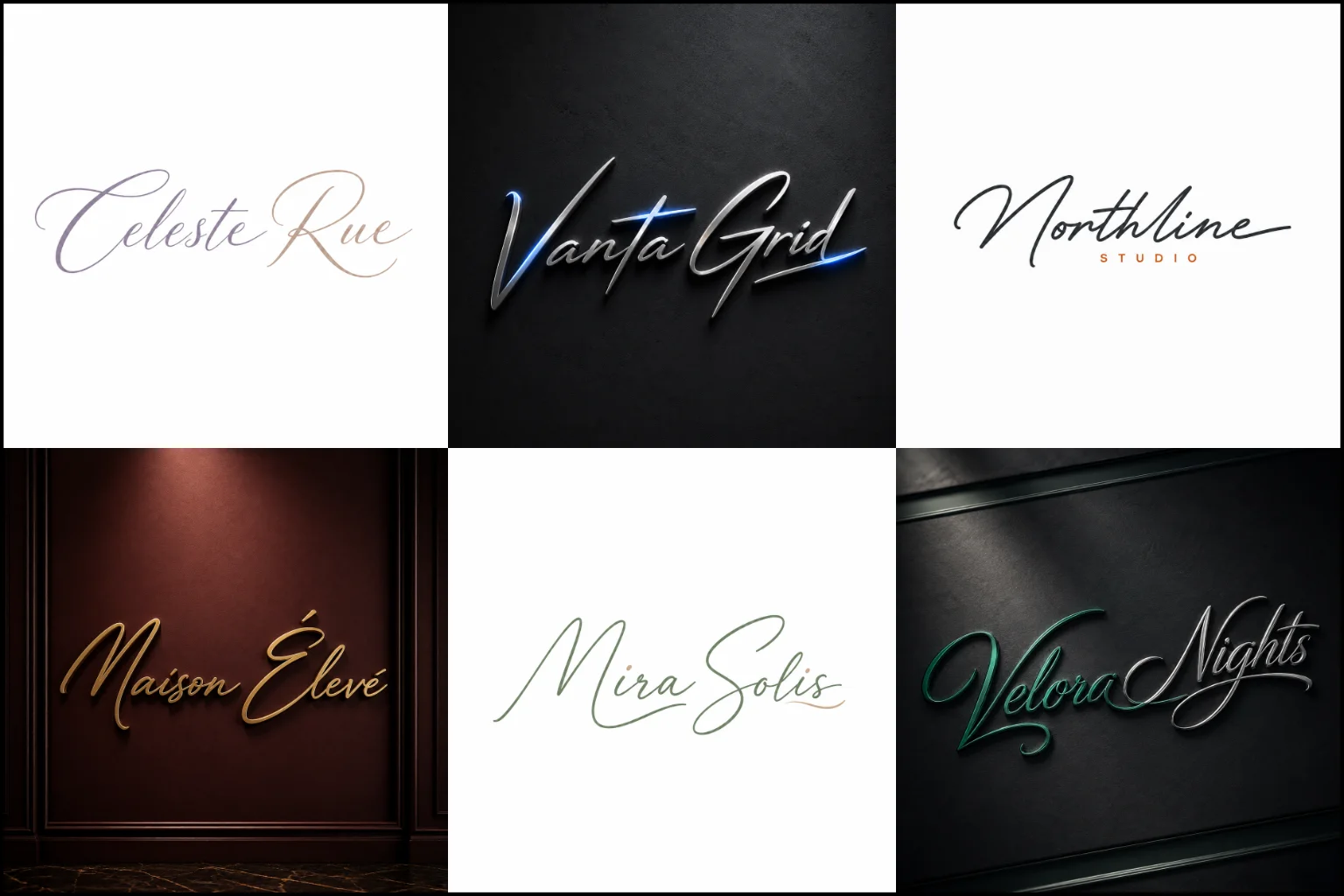
What Makes a Signature Logo Distinctive?
A logo uses handwritten or script-inspired lettering as the main visual identity. Instead of relying on a separate symbol, the personality of the brand comes largely from the way its name is written.
The lettering may be smooth and flowing, sharp and confident, soft and elegant, or clean and restrained. Some designs resemble a natural personal signature, while others use carefully constructed letterforms that simply borrow the character of handwriting.
A strong design should still function as a logo rather than looking like ordinary handwriting. Stroke weight, letter connections, spacing, proportions, and overall silhouette need deliberate control.
The result should feel distinctive without becoming difficult to read.
Is This Style Right for Your Brand?
Signature-style branding works particularly well when personality, craftsmanship, elegance, creativity, or a personal connection is important to the business.
It can be a suitable direction for fashion labels, beauty brands, photographers, designers, salons, consultants, personal brands, boutiques, artists, wedding businesses, premium products, and creative studios.
That does not mean it suits every company.
Businesses that need a highly technical, institutional, industrial, or extremely formal appearance may benefit from a more structured visual direction. Very long company names can also be challenging because flowing lettering may become crowded or difficult to reproduce at smaller sizes.
The right choice depends on the brand name, audience, industry, and the impression you want to create.
Custom Lettering Matters More Than Decoration
A signature mark should not depend on random swashes, exaggerated loops, or decorative strokes simply to appear luxurious.
Every curve should support the name.
Good custom lettering considers how one character flows into another, where strokes begin and finish, how uppercase and lowercase forms interact, and whether the word remains recognizable at a quick glance.
Small adjustments to letter width, slant, spacing, terminals, and connections can completely change the personality of the mark.
This is also why simply selecting a script font and typing a company name often produces a generic result. Customization helps the identity feel intentional rather than like standard text available to many other businesses.
Different Directions a Signature Mark Can Take
Not every handwritten identity needs to look like traditional calligraphy.
A refined script can create a graceful, premium appearance, while a cleaner monoline approach can feel more modern and minimal. Bold brush-inspired lettering can add energy, while restrained custom handwriting can create a softer and more personal impression.
A refined script or restrained monoline treatment can suit clothing brand identity, giving labels, garments, packaging, and editorial materials an individual character without overwhelming the collection.
Some brands benefit from a name-only treatment. In those cases, a text-only logo style approach keeps attention completely on the custom lettering.
A business may also use distinctive initials alongside the handwritten name. When initials need to work independently as a compact brand element, a custom monogram logo can provide a useful secondary direction.
The style should be chosen around the brand rather than around whichever script looks most decorative.
Readability Comes Before Fancy Lettering
One of the biggest challenges with handwritten logos is maintaining character without sacrificing clarity.
Too many loops, overlapping strokes, unusual connections, or exaggerated flourishes can make letters difficult to identify. This becomes an even bigger problem when the logo appears small on a website header, social profile, label, or business card.
Careful simplification is especially important in jewelry logo, since the lettering may need to remain clear on small boxes, product tags, authenticity cards, and delicate branded details.
A good design keeps the distinctive features that give the mark personality while simplifying anything that interferes with recognition.
Letter spacing also needs careful attention. Script letters often connect naturally, but connected lettering should not create accidental shapes or make two characters appear to be one.
The brand name should not require effort to understand.
Building a Balanced Handwritten Identity
Natural handwriting can be irregular. A professional logo can keep some of that character while correcting visual problems that make the composition feel unfinished.
The height of capital letters, length of finishing strokes, angle of the lettering, spacing between words, and overall width all affect balance.
A long underline may look attractive but can make the logo unnecessarily wide. A large capital letter may add personality but overwhelm the rest of the name. Very thin strokes may appear elegant at a large size but lose definition when reduced.
These decisions should be judged as part of one complete mark.
At LogoPixa, the focus is on creating lettering that feels expressive while remaining controlled enough for practical brand use.
Using Initials With a Signature Logo
Initials can be useful when the full handwritten name is too wide for certain spaces.
For example, a compact monogram can work alongside the main identity for profile images, small packaging areas, watermarks, or other applications where the complete name has limited room.
A compact secondary mark can be especially helpful in photographer brand identity, allowing the identity to work as a watermark without forcing the complete handwritten name into a small image area.
The initials should share the same visual language as the main mark. If the signature is elegant and fluid, a heavy geometric monogram may feel disconnected unless that contrast is intentional.
The two elements do not have to look identical, but they should clearly belong to the same brand system.
When a Symbol Can Support the Lettering
A handwritten name does not always need an icon.
In many cases, adding a separate symbol creates unnecessary complexity. The lettering itself may already be distinctive enough to carry the identity.
However, a simple supporting element can make sense when the business needs stronger visual flexibility. A small icon, meaningful shape, or set of initials may be combined with the name through a combination mark logo.
The supporting element should have a real purpose. It should not compete with the signature or look like an unrelated stock graphic attached to the lettering.
Where Signature Logos Work in Practice
A logo must work beyond a large presentation image.
Handwritten identities may appear on website headers, social media profiles, packaging, labels, appointment cards, product tags, uniforms, menus, stationery, signage, promotional materials, and digital graphics.
Different applications create different challenges.
Signature lettering can be particularly effective in logos for hair salons, creating a personal identity across storefronts, booking profiles, appointment cards, product packaging, and social media.
A highly detailed signature may look impressive on packaging but become unclear as a small profile image. Fine strokes may need enough visual weight to remain visible in print. Very wide lettering can be difficult to place inside narrow layouts.
Thinking about real usage during the design stage helps create a more practical identity.
Benefits of a Signature-Style Identity
The strongest advantage is personality. Custom handwritten lettering can make a business name feel more individual than standard typography.
It can also create a close connection between the brand name and the visual identity because the name itself becomes the recognizable mark.
This approach can work particularly well for founder-led businesses and creative brands where a human touch supports the overall positioning.
Another benefit is simplicity. When the lettering is distinctive enough, the brand may not need a complicated icon or multiple decorative elements.
Limitations to Consider Before Choosing This Style
Handwritten logos require careful control because readability can quickly become a problem.
Very elaborate lettering may not reproduce well at small sizes. Long names can create wide compositions. Extremely thin strokes can lose clarity. Decorative flourishes may also become distracting when the identity is used in compact spaces.
The style can sometimes communicate elegance, creativity, or personality more strongly than authority, technology, or corporate structure. That can be useful for one business and unsuitable for another.
A professional design decision should consider what the brand needs to communicate, not simply whether the lettering looks attractive.
What to Consider Before Starting Your Logo
Think first about the personality you want the name to express.
Should it feel sophisticated, feminine, bold, artistic, relaxed, modern, personal, luxurious, or minimal? Those choices affect everything from stroke thickness to letter slant and spacing.
It also helps to consider where the logo will appear most often. A brand that relies heavily on product labels may need different proportions from one that mainly uses its identity on a website or storefront.
Reference images can communicate preferences, but the final mark should develop its own visual character rather than copying another brand’s signature.
Creating a More Practical Brand System
A main handwritten logo does not always need to solve every branding situation by itself.
The full name can serve as the primary identity, while simplified initials or a compact supporting mark can handle smaller spaces. This creates flexibility without changing the personality of the brand.
Typography used around the logo also matters. Website headings, packaging text, and supporting information usually need cleaner typefaces so they do not compete with expressive lettering.
The signature should remain the distinctive element while supporting typography provides clarity.
Explore More Logo Options
Discover other different logo styles and find the right visual direction for your brand.
Frequently Asked Questions
What is a signature logo?
It is a logo built around handwritten, script, or signature-inspired lettering. The business name usually becomes the main visual mark rather than relying primarily on a separate icon.
Does a signature logo need to look like real handwriting?
No. It can resemble natural handwriting, but it can also use polished custom lettering with smoother proportions, cleaner curves, and more controlled spacing.
Are signature logos only suitable for personal brands?
No. They can also work for fashion, beauty, hospitality, photography, creative businesses, boutiques, premium products, and other brands that benefit from a personal or expressive identity.
Can a long business name use this style?
It can, but length needs careful consideration. Long names may require simpler letterforms, tighter proportions, fewer flourishes, or a secondary compact version to remain practical.
Should a signature logo include an icon?
Not necessarily. If the lettering is distinctive enough, adding an icon may be unnecessary. A supporting symbol makes more sense when it improves usability or adds meaningful brand information.
How readable should handwritten lettering be?
The company name should remain easy to identify. Some character and artistic detail are useful, but they should not make visitors guess what the letters say.
Can initials be used separately from the full signature?
Yes. Initials can provide a compact option for spaces where the complete brand name is too wide or detailed, provided both elements follow a consistent visual style.
Is a script font enough to create this type of logo?
A script font can be a starting point, but using it without thoughtful customization may produce a generic appearance. Adjusting letterforms, connections, spacing, proportions, and distinctive details can create a more individual identity.
Does this style work in black and white?
A well-constructed mark should remain understandable without depending entirely on color. Simple color treatment can also make the identity easier to reproduce across different applications.
What should I provide when requesting a custom design?
Useful information includes your exact business name, industry, target audience, preferred visual direction, examples of styles you like, colors you want considered, and where you expect to use the logo most often.