
Luxury Logo Design
Whether you are building a fashion label, beauty brand, property company, hospitality business, or high-end service, LogoPixa develops a visual direction around your audience and market. Explore the portfolio to see how different luxury identities can be approached.
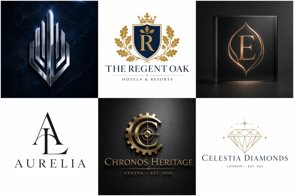
Explore Our Luxury Logo Portfolio
Luxury branding can look classic, modern, minimal, bold, or highly editorial, so the portfolio is built to show variety rather than one repeated formula. You will find original concepts with different type treatments, symbols, spacing systems, and presentation styles.
Each example is created with professional execution and practical brand use in mind, including websites, packaging, signage, social profiles, stationery, and other places where a premium identity needs to remain clear and consistent.
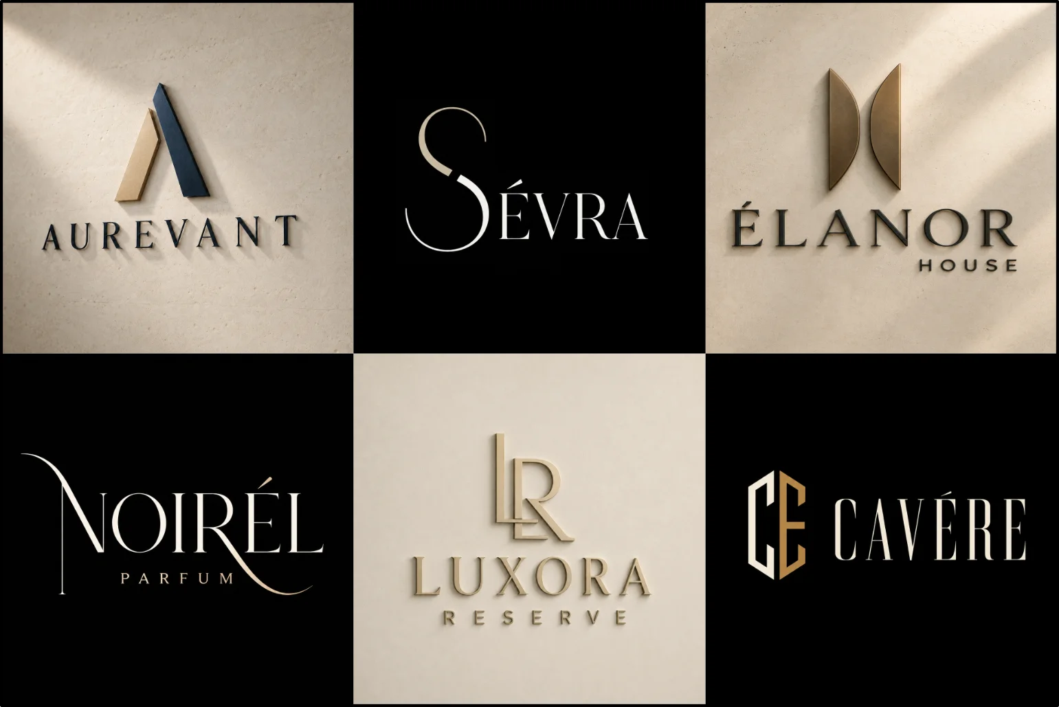
What Gives a Logo a Luxury Feel?
A premium identity usually feels controlled rather than crowded. Every part of the design has a purpose, from the proportions of the symbol to the spacing between individual letters.
Typography plays an especially important role. Refined serif fonts, clean modern typefaces, custom lettering, thin contrasts, extended characters, and carefully adjusted spacing can all create an upscale appearance. The right choice depends on the personality of the brand rather than following one fixed luxury formula.
Balance, restraint, proportion, and detail often matter more than adding decorative elements. A simple wordmark with excellent typography may feel more sophisticated than a complicated crest filled with unnecessary details.
Color also influences perception. Black, ivory, charcoal, deep green, burgundy, navy, champagne, bronze, and other restrained palettes are common choices, but premium branding is not limited to dark or metallic colors. The palette should support the personality and positioning of the business.
A calm and restrained approach can be especially effective in logos for spa businesses, where balanced typography, gentle spacing, and thoughtful color choices can support a relaxing premium experience.
Luxury Branding Is More Than Gold and Elegant Fonts
Gold lettering can create a premium impression in the right setting, but using gold alone does not make an identity luxurious. The same applies to crowns, diamonds, ornate initials, and decorative serif fonts.
Strong upscale branding should feel distinctive even when shown in one solid color. This helps confirm that the design works because of its structure rather than relying entirely on effects, textures, or metallic presentation.
A premium logo should also fit the business behind it. A contemporary architecture studio may need precise geometry and restrained typography, while a boutique fashion label might benefit from expressive lettering and a more editorial character.
LogoPixa approaches the visual direction around the brand itself instead of adding stereotypical luxury elements to every concept.
Businesses That Can Benefit From a Premium Identity
This style works particularly well for businesses that want to communicate refinement, exclusivity, craftsmanship, quality, or a more elevated customer experience.
It can be suitable for fashion labels, jewelry businesses, beauty and skincare brands, boutique hotels, premium restaurants, interior studios, architecture firms, property companies, consultants, private services, automotive brands, and selected financial or professional businesses.
However, it is not automatically the right direction for every company. A playful children’s brand, highly casual product, community organization, or value-focused service may benefit from a friendlier or more accessible visual style instead.
The strongest direction is the one that matches how the business wants to be perceived by its actual audience.
Choosing the Right Logo Structure
Luxury styling can be applied to several logo types. The best structure depends on the company name, where the identity will appear, and how much emphasis should be placed on typography or symbolism.
Compact monograms are especially useful in jewelry logo, where the mark may need to remain recognizable on boxes, tags, product details, and other small applications.
A lettermark logo style can work well for brands with long names or businesses that want a compact set of initials. Carefully constructed monograms are particularly useful for packaging, labels, social icons, product details, and small branded applications.
A text-only logo style places the company name at the center of the identity. Custom letterforms, spacing, proportions, and subtle typographic modifications can give the brand a distinctive personality without requiring a separate symbol.
A badge-style logo Design may suit heritage-inspired businesses, hospitality brands, private clubs, specialist makers, or companies that want a more established and formal appearance. Emblems need careful simplification so they remain usable at smaller sizes.
This established structure can also work effectively in hospitality branding, particularly when the identity must remain consistent across exterior signage, room amenities, stationery, websites, and guest materials.
A text and symbol logo brings a symbol and company name together. It can provide more flexibility when a business needs a recognizable icon as well as clear brand-name visibility.
Creating an Identity That Feels Premium Without Feeling Generic
Many premium brands use similar visual ingredients, which makes originality especially important. Simply combining thin serif lettering with black and gold can easily result in an identity that looks familiar rather than distinctive.
A stronger approach starts by defining the visual character of the business. The brand might need to feel architectural, exclusive, artistic, contemporary, understated, fashion-led, traditional, or highly polished.
From there, details such as letter construction, symbol geometry, spacing, alignment, negative space, contrast, and proportions can be developed around that direction.
The objective is to create recognizable visual character without unnecessary decoration. Small custom details often have greater impact than adding more elements.
Typography Matters in High-End Branding
Typography can completely change the way a premium brand is perceived.
Typography often becomes the main visual asset in fashion and clothing logo, where a distinctive wordmark can create an editorial character across labels, garments, packaging, and advertising.
High-contrast serif lettering may create an editorial or fashion-oriented character. A clean geometric sans-serif can make the same brand feel more contemporary and architectural. Custom letterforms can introduce personality while avoiding the appearance of a standard typed company name.
Spacing is equally important. Wider tracking may create an elegant, composed appearance, while tighter spacing can feel stronger and more confident. Neither approach is universally correct.
Good typography should remain readable while giving the brand a distinctive visual voice.
Symbols Should Support the Brand, Not Distract From It
A symbol can make a premium identity more recognizable, but it should not be added simply because a logo feels incomplete without one.
Abstract geometry, custom initials, negative-space forms, monograms, simplified motifs, or carefully constructed marks can provide a strong visual signature.
The symbol should also remain understandable when reduced in size. Overly thin lines, excessive detail, and complicated ornamentation may look attractive in a large presentation but become difficult to reproduce on smaller applications.
Scalability is especially important when the mark may appear on product labels, packaging details, website icons, social profiles, embroidery, signage, or printed material.
Building a Practical Brand Identity
A logo may look impressive in a presentation, but its real value appears when it works consistently across everyday brand applications.
The main version should remain clear on websites, business cards, packaging, stationery, marketing material, signage, and digital platforms. A strong design should also maintain its character when used without realistic mockup effects.
Simple versions are particularly useful when printing options are limited or when the logo needs to appear very small.
This practical thinking helps create an identity that can move between digital and physical brand touchpoints without losing its visual character.
Color Choices for an Upscale Brand
Premium color palettes are often controlled and intentional rather than overly complex.
Black and ivory can create strong contrast. Deep green or burgundy may introduce richness. Neutral gray, cream, beige, and warm white can create a softer premium character. Metallic-inspired tones such as champagne or bronze can also support certain industries.
Softer, carefully controlled palettes can work well in beauty logo, helping the identity feel polished and distinctive across packaging, websites, and promotional materials.
The color choice should still make sense for the market. A luxury technology company may need a completely different palette from a bridal boutique or a premium property developer.
It is also useful for the core logo structure to work independently from color. A strong mark should remain recognizable in a simple monochrome version.
Details to Consider Before Choosing This Direction
Think about how you want customers to describe your brand. Words such as refined, exclusive, sophisticated, elegant, established, contemporary, or crafted can point toward an upscale identity, but they do not all lead to the same visual solution.
Consider your industry and competitors as well. Looking premium should not mean visually copying the conventions used by every competing company.
You should also think about where the logo will appear most often. Fine typography that looks excellent on large packaging may require adjustment if the main use is a small mobile interface.
Finally, avoid choosing a style only because it currently looks fashionable. Long-term usability and brand relevance are more valuable than short-lived visual trends.
A Refined Logo Built Around Your Brand
LogoPixa can develop a premium identity around your business name, industry, audience, and preferred visual direction. The goal is to create something clear and distinctive while keeping the design practical enough for real branding applications.
Whether the right approach is a custom wordmark, structured monogram, refined emblem, or symbol-and-type combination, the visual choices should support the personality you want customers to associate with your business.
Explore More Logo Options
Discover other logo design styles and find the right visual direction for your brand.
- three-dimensional logo
- simple logo style
- modern brand identity
- custom signature logo
- heritage-inspired logo
FAQS
What makes a logo look luxurious?
A luxury appearance usually comes from controlled typography, balanced spacing, strong proportions, thoughtful color choices, and carefully refined details. The design does not need to be complicated or heavily decorated.
Does a luxury logo need to use gold?
No. Gold can suit some premium brands, but black, ivory, burgundy, navy, green, neutral tones, and many other palettes can work just as well. The right color depends on the personality and industry of the brand.
Can a luxury logo also look modern?
Yes. Premium branding does not have to look traditional. Modern luxury identities often use clean typography, geometric forms, generous spacing, restrained colors, and simplified symbols.
Which logo type works best for a luxury brand?
There is no single best type. Wordmarks are useful when typography should lead the identity, while monograms can create a compact signature. Emblems may suit more formal brands, and combination marks can provide greater flexibility across different applications.
Are detailed luxury logos difficult to use at small sizes?
They can be. Very thin lines, small decorative details, and complex ornamentation may lose clarity when reduced. Keeping the core structure simple helps the identity work across small digital and printed applications.
Is this style suitable for a new business?
Yes, if premium positioning genuinely matches the business, product, audience, and customer experience. A new company does not need to be established for years to use a refined identity, but the visual direction should still feel believable for the brand.
Should my logo include a symbol?
Not necessarily. Some premium brands are better served by distinctive typography alone. A symbol is useful when it adds recognition, flexibility, or meaning rather than simply filling space.
Can a premium logo work on packaging and signage?
Yes, provided the design is created with scalability and reproduction in mind. Clear forms, readable typography, and simplified versions help maintain consistency across packaging, signage, websites, stationery, and other brand materials.