
Modern Logo Design for Clear, Current Brands
Whether you are launching something new or refreshing an existing identity, the goal is a logo that feels current and practical. Explore the portfolio to see different creative directions and visual approaches.
Explore Our Best Modern Logo Portfolio
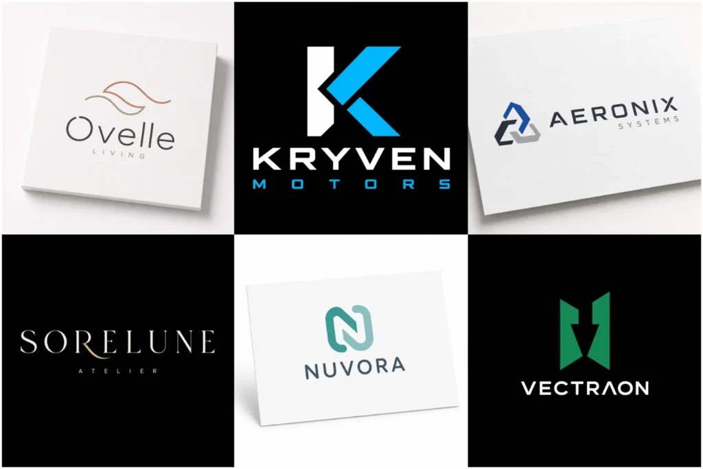
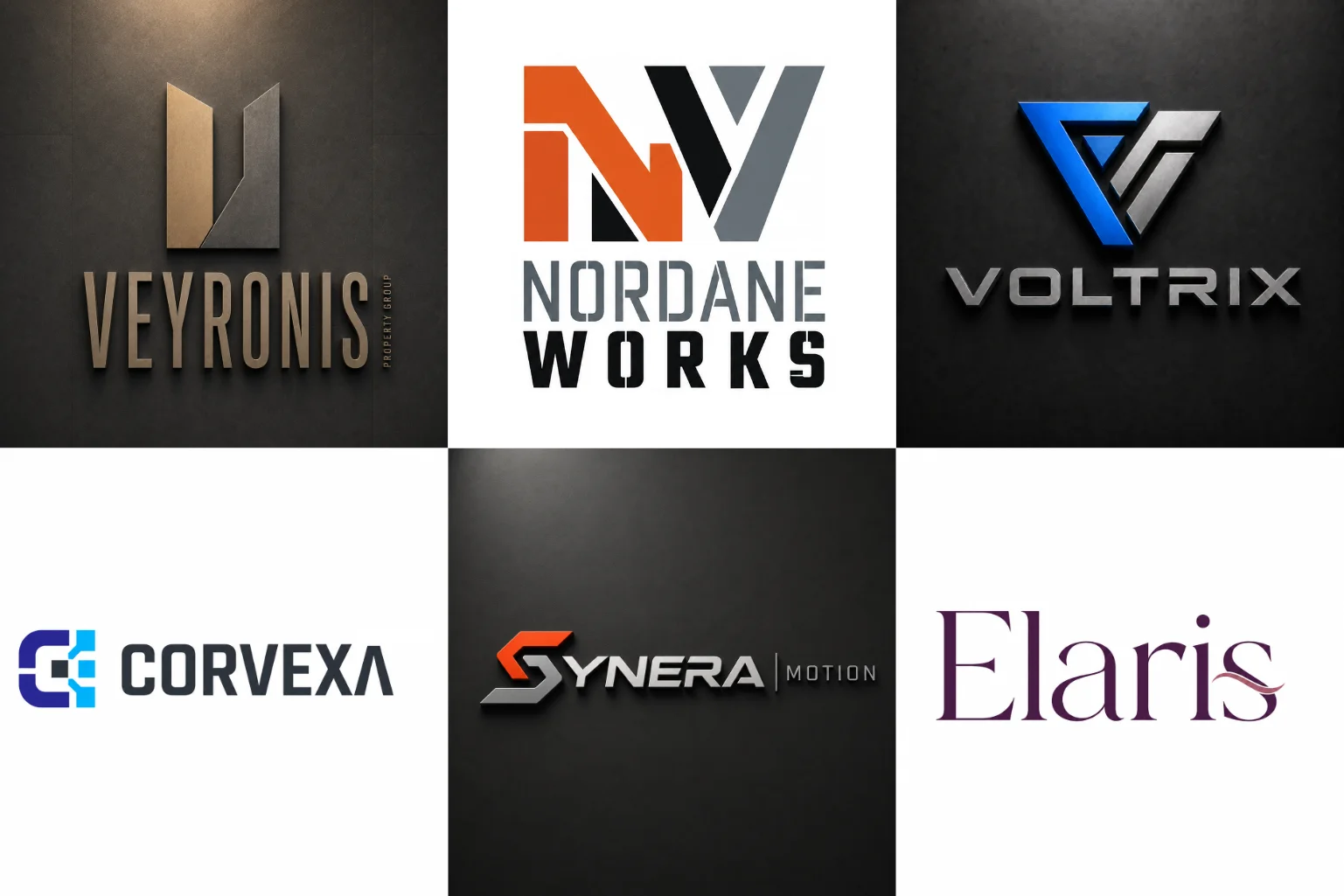
Browse a selection of logo concepts created around different industries, brand personalities, and visual needs. The portfolio includes clean wordmarks, geometric symbols, custom letterforms, abstract ideas, and flexible combination layouts.
Each concept focuses on originality, visual balance, and professional presentation rather than unnecessary decoration. These examples also show how different identities can remain clear across websites, social profiles, packaging, stationery, signage, and other everyday branding applications.
What Makes a Logo Feel Modern?
Modern branding is not simply about following the latest visual trend. A logo feels current when its shapes, typography, spacing, and overall structure work together without unnecessary visual noise.
Many contemporary identities use simple geometry, controlled details, strong proportions, and purposeful negative space. Others rely almost entirely on customized typography. The exact approach depends on the personality and positioning of the business.
Clean design does not mean every logo must be extremely minimal. A company can still use a distinctive symbol, bold lettering, unusual composition, or expressive color while maintaining a polished contemporary appearance.
The strongest direction is usually the one that removes elements that do not add meaning while keeping enough personality to make the identity recognizable.
A Modern Identity Should Still Be Distinctive
One risk with contemporary branding is making a logo so simple that it starts looking similar to dozens of other businesses.
Using a standard sans-serif font beside a random geometric shape may look clean, but cleanliness alone does not create an identifiable brand.
A stronger identity usually includes at least one distinctive feature. That could be a customized letter, unusual proportion, carefully constructed symbol, negative-space detail, specific shape relationship, or recognizable typography treatment.
The goal is to create simplicity with character, rather than simplicity without personality.
At LogoPixa, the visual direction can be shaped around your brand name, industry, audience, positioning, and preferred personality instead of forcing every business into the same aesthetic.
When Does This Style Work Best?
A contemporary visual identity can work particularly well for technology companies, startups, professional services, digital businesses, fashion brands, architecture studios, creative companies, finance businesses, SaaS products, wellness brands, and many other modern-facing organizations.
A clear contemporary approach can also work well in healthcare branding, where readability, professionalism, and an approachable visual tone are especially important.
It can also help an established company that has an outdated identity and wants a cleaner visual system.
However, this style is not automatically the right choice for every business.
A traditional law firm may want more heritage and authority. A handmade craft brand may benefit from warmer and more organic details. A children-focused company may need something more expressive and playful.
Your logo should reflect how the business needs to communicate, not simply which design style is currently popular.
Choosing the Right Logo Type
Modern styling can be applied to several logo structures. The most suitable format depends on the brand name, desired recognition, available space, and how the identity will normally be used.
A custom wordmark logo can be effective when the business name itself should become the main visual identifier. Custom spacing, letter modifications, and typography can create a recognizable identity without a separate symbol.
A lettermark logo style may suit brands with long names, initials, or a need for a compact visual mark. Carefully constructed initials can work especially well for profile images, app icons, packaging marks, and small branding spaces.
Abstract forms can be effective intravel business branding, where ideas such as movement, direction, discovery, or place can be suggested without using a generic airplane or globe.
A non-literal logo design gives more creative freedom. Instead of showing a literal product or object, geometric forms and visual relationships can represent ideas such as movement, connection, structure, flexibility, or progress.
A text and symbol logo brings typography and a separate symbol together. This can give a business flexibility when it needs both a recognizable name and an independent visual mark.
The type should support the brand rather than being selected simply because a particular format looks attractive.
Typography Plays a Major Role
Typography often carries much of the personality in a contemporary logo.
Geometric sans-serif fonts can create a structured and technical appearance. Humanist sans-serif styles may feel warmer and more approachable. Refined serif typography can produce a modern identity while still communicating sophistication.
Font selection is only the starting point.
Letter spacing, capitalization, width, weight, line arrangement, and small custom modifications can significantly change how a wordmark feels.
Even a simple company name can become more distinctive when the typography is carefully adjusted rather than left in its default form.
Distinctive lettering can work particularly well in hair salon logo, helping the identity feel current and personal without relying on familiar scissors or hair silhouettes.
Readability should remain a priority. A logo may look impressive at a large size, but it still needs to remain understandable when used in smaller spaces.
Using Geometric Shapes Without Looking Generic
Circles, squares, lines, angles, and other basic shapes appear frequently in contemporary identity systems because they provide clarity and structure.
The challenge is using them with purpose.
A few random geometric elements can quickly create an identity that looks like stock artwork. Instead, shapes should have a clear visual relationship and contribute to the personality of the brand.
For example, connected forms may communicate collaboration or integration. Repeated shapes can suggest systems and consistency. Open forms can create a lighter and more accessible feeling.
Carefully balanced geometry can also suit logos for interior studios, where proportion, space, and structure can connect the identity to the work without relying on obvious furniture symbols.
Negative space can also introduce a secondary idea without adding more visual elements.
The best geometric identities often look simple at first glance while revealing thoughtful construction when examined more closely.
Color Should Support the Brand Personality
There is no single color palette that defines contemporary branding.
Black, white, navy, blue, green, neutrals, muted tones, and bright accents can all work depending on the identity.
tech brand identity may use cooler colors and higher contrast to communicate clarity, innovation, and a confident digital presence.
A logo should also remain understandable when color is limited.
If the identity only works because of several colors, gradients, or effects, it may become difficult to use consistently in practical situations.
A strong concept should maintain its basic recognition through shape, typography, and composition, with color adding another layer of personality.
Simple Does Not Mean Empty
There is an important difference between a clean logo and an unfinished-looking logo.
Removing unnecessary decoration can improve clarity, but removing too much can weaken the identity.
A useful design still needs intentional proportions, spacing, hierarchy, and visual character.
This is particularly important with wordmarks. A plain business name typed in a common font might technically look simple, but it may not create enough distinction for a serious brand identity.
Effective simplicity comes from careful decisions rather than fewer decisions.
Building a Logo Around the Brand Name
The name itself often influences the strongest creative direction.
A short name may work well as a custom wordmark because it can remain compact and memorable. Longer names may benefit from a symbol, monogram, shortened visual arrangement, or stronger hierarchy between primary and secondary text.
Letter shapes can also inspire the symbol.
Initials may be connected, mirrored, divided, or simplified into geometric forms. Negative space between letters may reveal another shape. A distinctive character can become a recognizable detail throughout the identity.
This approach helps the visual idea feel connected to the business instead of appearing like an unrelated icon placed beside the name.
Designing for Real Brand Applications
A logo should not be judged only while displayed in the center of a large presentation.
Businesses use identities in many different situations. A design may appear in a website header, browser icon, social profile, invoice, packaging label, business card, advertisement, presentation, storefront, uniform, or printed material.
These applications create different size and layout requirements.
Wide horizontal logos may work well in website headers but become difficult inside square profile pictures. Very detailed symbols may lose clarity when reduced. Extremely thin typography can become difficult to reproduce in certain printing situations.
Considering these practical limitations during the design stage can create a much more usable identity.
Scalability Matters More Than Extra Detail
A recognizable logo should maintain its main idea when its size changes.
Small details that look attractive at presentation size can disappear when the mark is reduced. Thin gaps may close visually, while complicated illustrations can become difficult to understand.
This is one reason contemporary identities often use controlled shapes and simplified forms.
Simplification should protect the central idea rather than remove personality.
A useful test is whether the primary symbol and business name remain recognizable without depending on tiny decorative features.
Clear silhouettes, readable typography, and balanced spacing generally make a logo easier to use across different applications.
Flat Logos and Dimensional Presentations
A logo concept and its presentation style are two separate things.
A flat identity shows the actual structure clearly without relying on lighting, shadows, textures, or physical materials. This makes it easier to judge proportions, typography, color, and symbol construction.
Mockups can then help visualize how the identity might appear on signage, packaging, stationery, walls, or other surfaces.
A polished mockup can make a logo look impressive, but it should never hide weaknesses in the underlying design.
Buyers should pay attention to the actual flat logo first, then consider how it performs in realistic presentations.
Avoiding Short-Lived Design Trends
Some visual trends can be useful sources of inspiration, but copying them too closely can shorten the useful life of an identity.
A particular gradient treatment, font style, symbol pattern, or visual effect may become popular quickly because many brands begin using it at the same time.
That can also make businesses look similar.
A more sustainable approach is to understand what makes a visual direction feel contemporary, then adapt those principles to the specific brand.
Strong spacing, clean composition, readable typography, purposeful simplicity, and recognizable forms are generally more useful than copying whatever is currently appearing most often in design galleries.
Modern and Minimalist Are Not the Same
These terms are often used together, but they describe different ideas.
Minimalism focuses heavily on reducing a design to its essential elements. Contemporary branding can be simple, but it does not always need to be extremely minimal.
A modern identity might use bold typography, layered geometric forms, unusual color combinations, or a distinctive abstract symbol while still feeling clean and current.
The important question is not how few elements the logo contains.
It is whether every element has a purpose and whether the overall identity feels controlled, relevant, and visually coherent.
What to Consider Before Ordering
Before starting a logo project, it helps to define what the business should communicate visually.
Think about your industry, audience, competitors, brand personality, and where the identity will appear most often.
You can also decide whether the brand should feel professional, approachable, technical, premium, energetic, calm, creative, or somewhere between these qualities.
Visual references can be useful, but they should communicate direction rather than become designs to copy.
It is also helpful to identify what you want to avoid. Knowing that you do not want common industry symbols, certain colors, overly thin fonts, complicated illustrations, or trendy effects can narrow the creative direction.
A clearer brief makes it easier to build an identity around the actual business rather than relying on assumptions.
Creating a More Recognizable Visual System
A logo is the central identifier, but consistency gives it strength across different brand touchpoints.
Typography, supporting colors, spacing, icon style, photography, packaging, and layout choices can either support the logo or make the identity feel disconnected.
This does not mean every visual element must look identical.
Instead, they should feel as though they belong to the same brand.
Starting with a clear logo structure makes it easier to build that consistency later. A carefully selected symbol, wordmark treatment, and color direction can provide a visual foundation for websites, marketing materials, social content, and printed applications.
Refreshing an Existing Logo
A business does not always need a completely different identity.
Sometimes the main concept is still recognizable, but the typography, spacing, proportions, colors, or symbol construction feel outdated.
In that situation, refinement may be more appropriate than replacing everything.
A redesign can preserve recognizable characteristics while simplifying unnecessary details and improving practical usability.
However, keeping old elements simply because they already exist can also limit the result. Each part should be evaluated based on whether it still contributes to the brand.
The right balance depends on how much recognition the existing identity already carries and how significant the visual problems are.
Common Mistakes to Avoid
One common mistake is choosing a design because it looks impressive on a mockup without checking the actual flat identity.
Another is requesting too many ideas inside one mark. Trying to represent the company name, industry, values, products, location, history, and slogan through separate visual elements often creates unnecessary complexity.
Following trends too closely can also make an identity feel interchangeable with competitors.
Businesses should also be careful with generic icons commonly associated with their industry. A technology company does not automatically need circuits, and a finance brand does not automatically need charts or currency symbols.
The strongest direction is usually clear enough to understand and distinctive enough to own visually.
Working With LogoPixa
LogoPixa can help turn your business information and visual preferences into a focused logo direction.
The process begins with understanding what the brand needs to communicate rather than selecting decorative elements first. From there, typography, symbols, spacing, proportions, and colors can be developed around a clear visual idea.
Providing your business name, industry, audience, preferred personality, visual references, and anything you want to avoid can help establish a more useful creative direction.
Explore More Logo Options
Discover different logo styles and find the right visual direction for your brand.
- illustrated cartoon logo
- shape-based logo style
- single-line logo style
- premium logo style
- clean minimalist logos
FAQ
What makes a logo look modern?
Clean composition, thoughtful typography, controlled shapes, useful negative space, balanced proportions, and limited unnecessary detail can all contribute to a current appearance. The exact combination should depend on the personality of the brand.
Does a modern logo have to be minimalist?
No. Minimalist logos remove as much unnecessary detail as possible, while contemporary identities can still use bold typography, stronger colors, geometric structures, or expressive symbols. The design simply needs to remain visually controlled and relevant.
Which businesses suit this logo style?
It is commonly suitable for technology, professional services, fashion, architecture, finance, SaaS, digital brands, creative companies, and many startups. However, businesses wanting a strongly traditional, handcrafted, playful, or heritage-focused appearance may benefit from another direction.
Should I choose a symbol or a wordmark?
It depends on the brand name and how the logo will be used. A distinctive short name may work well as a wordmark, while a symbol can provide a compact identifier for places where the complete name does not fit comfortably.
Can initials be used in a contemporary identity?
Yes. Initials can form a clean monogram or geometric symbol, particularly for businesses with long names. The letters should still be constructed distinctively enough to avoid looking like generic typography.
Are abstract symbols suitable for modern brands?
They can be very effective when the concept has a clear visual logic. Abstract forms allow designers to represent ideas such as connection, structure, movement, or balance without relying on obvious industry icons.
How many colors should a logo use?
There is no fixed number. A single-color identity can work well, while some brands benefit from two or more carefully selected colors. The important factor is whether the design remains clear and usable without becoming dependent on unnecessary effects.
Should my logo follow current design trends?
Trends can provide inspiration, but they should not control the whole identity. A logo built too closely around a temporary visual trend may become dated or resemble competitors using the same style.
Can an existing logo be made more modern?
Yes. Typography, spacing, proportions, colors, and symbol construction can often be refined without completely abandoning the existing identity. Whether a refresh or full redesign is more suitable depends on the quality and recognition of the current logo.
What information should I provide before the project starts?
Useful information includes your business name, industry, target audience, brand personality, preferred visual direction, competitors, common logo applications, and anything you specifically want included or avoided. Clear references can also help communicate the type of visual approach you prefer.