
Wordmark Logo Design
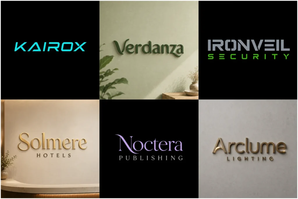
Original Wordmark Logos Created for Real Brands
Our portfolio shows how an original concept is shaped for each real business. We begin with the client’s business name, industry, and brand personality, not passing trends. Then we create custom typography with readable letterforms, balanced spacing, and original details. This gives the lettering a clear, professional, and distinctive character while the design remains simple. The result helps the brand name stand out as a memorable visual identity across websites, packaging, and signage. Every wordmark is tested on social media and business cards so the identity remains practical.
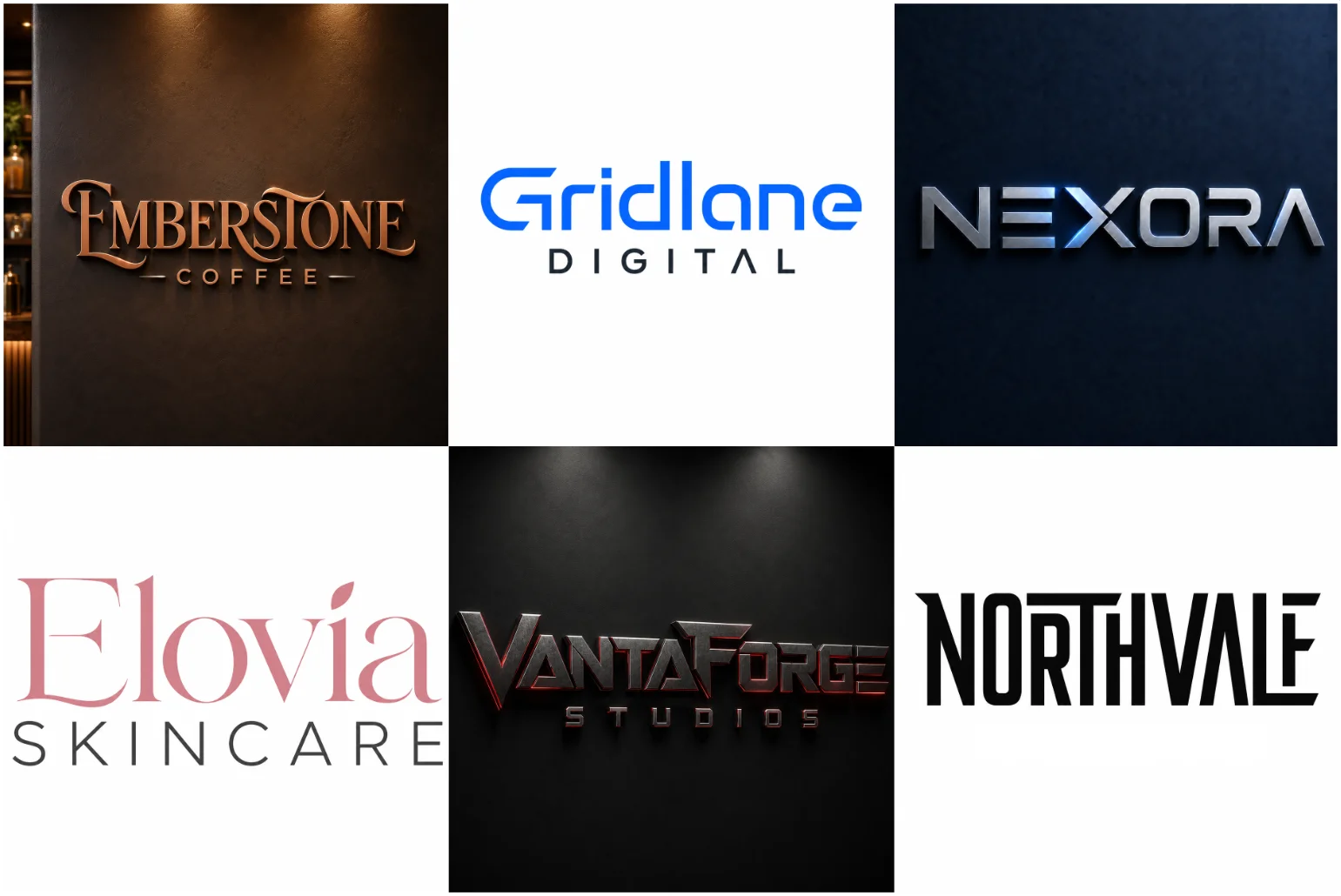
What Is a Wordmark Logo?
Wordmarks turn a business name into a memorable visual identity through typography. Developed letterforms, balanced spacing, and original details make the name readable; simple design, clear lettering, and visual consistency shape a business brand identity.
Custom concept choices create custom typography that reflects brand personality. Original, distinctive details, readable letterforms, strong lettering, balanced spacing, and professional personality suit the industry; design remains simple, looking consistent across media, social, and cards.
Explore a portfolio; see strong wordmarks used across websites, packaging, signage, business cards, and social media. Placements create memorable presence, helping the brand name stand out; it remains looking distinctive and able to stand confidently.
Why Use Your Business Name as the Logo?
From client projects, I have learned that a complete business name often earns recognition faster than an unfamiliar symbol. When custom typography gives the wording personality, customers connect pronunciation, appearance, and service through repeated encounters.
The practical advantage appears on packaging, websites, invoices, and storefront signs: buyers repeatedly meet the same name; balanced letter spacing helps preserve clarity, while a unique visual rhythm keeps the identity distinctive without requiring explanation.
A name-led identity is especially useful for unusual spellings, because every impression teaches accuracy. It also helps a new company build name recognition, strengthens audience familiarity, and adapts through future applications without losing visual ownership.
The Main Features of an Effective Wordmark
From client work, I have learned that an effective wordmark succeeds before colour enters discussion: careful spacing, visual balance, and a unique letter connection should make the company name instantly recognisable across small, real applications.
Contrary to common advice, memorability usually comes from restraint, not excessive decoration. A Minimalist Logo approach can work especially well when clean typography and carefully controlled spacing are enough to give the brand a distinctive identity. I test customised characters, unusual proportion, and negative space until one detail feels original, remains readable, and supports consistent recognition without visual noise.
Practically, the mark must survive beyond presentation screens. I review vector outlines, responsive variations, black and white reproduction, different sizes, and professional printing, because dependable brand identity depends on clarity wherever the final artwork appears.
Custom Lettering Versus a Standard Font
A font can provide a useful starting point, but selecting it unchanged rarely creates a distinctive identity. In practice, I assess whether its letter shapes, strong proportions, and rhythm already effectively support the brand’s personality.
When an existing typeface feels structurally appropriate, careful changes often outperform unnecessary reinvention. Selected characters may be adjusted, terminals redrawn, spacing corrected, and awkward joins refined until the appearance feels recognisable rather than merely typeset.
By contrast, fully custom lettering becomes valuable when fonts restrict expression. Completely original lettering, modified letterforms, custom ligatures, or connected characters can build individuality, provided every intervention remains readable, relevant, and controlled across practical applications.
The common mistake is assuming customization automatically improves quality. Over-customising, adding decorative tricks, or forcing unusual forms can weaken clarity. A good typeface with one meaningful adjustment may communicate more confidently than complicated, unstable construction.
My decision usually follows usage, audience, and visual direction rather than preference. Whether carefully selected typeface or custom construction wins, brand-appropriate styling, readable letterforms, practical design decisions, and detailed refinement determine the final logo’s dependability.
Choosing the Right Typography Style
From client work, I have learned that the right choice depends less on personal taste than on company personality, market position, and target audience. Typography succeeds when every letter supports the intended commercial impression clearly.
A financial company often bene
fits from structured lettering and a dependable appearance, while expressive typography can help fashion branding communicate a more distinctive personality. Applying the same fashionable typeface to both usually weakens credibility rather than creating consistency.
Style categories should guide, not dictate. Serif construction can signal heritage, while a Geometric Logo approach can use structured letterforms and precise shapes to create a more controlled visual identity. Rounded forms can add warmth, while proportion, weight, and letter spacing determine whether the personality feels convincing commercially.
The strongest selection process tests character relationships, not isolated alphabet samples. I inspect joins, counters, widths, and a possible customised terminal, because inconsistencies become obvious across packaging, small printed materials, and applications including website headers.
Before approval, I test the chosen direction on mobile screens, embroidery, and monochrome layouts. A typeface that looks refined at display size can develop poor spacing or lose clarity when reduced, exposing an unsuitable decision.
How Letter Spacing Shapes The Identity
Designers blame a standard font when a wordmark feels forgettable, yet weak spacing causes the problem. Balance between letters controls visual personality, establishes proportions, and makes the complete name feel connected rather than merely typed.
From client work, I test character widths before choosing decorative details. Widened gaps can calm bold forms, while tighter joins create urgency. The goal is not equal measurement, but visually stable rhythm across the name.
Digital use exposes mistakes during reduction. Spacing may collapse on screens, small labels, or a website header. Responsive decisions should preserve available space without letting spacing make letters appear separated or forcing one crowded design.
Psychologically, open spacing suggests confidence, refinement, and control; compressed spacing can communicate strength or technical efficiency. Neither approach is automatically better. Market position, audience, and preferred visual direction determine whether the identity feels appropriate today.
Historically, metal type encouraged practical limits, but vector artwork removed those restrictions. I still refine poor alignment through small changes, checking negative space, awkward spaces, and relationships until lettering communicates clearly at different screen sizes.
When Is This Logo Style A Good Choice?
A wordmark becomes the right choice when recognition must begin before symbolism. In my client work, a name-focused identity gives direct visibility, helping new businesses improve name recognition while presenting a confident appearance from launch.
Contrary to common advice, a short one-word name is not mandatory. A full business name can succeed without a separate icon when suitable typography organizes length, hierarchy, and recall consistently across packaging, signage, and websites.
Historically, names carried authority before adaptable symbols became fashionable. Today, wordmarks remain especially effective for legal firms, publishing companies, and technology businesses, where a brand-appropriate voice matters more than decorative imagery or fleeting visual trends.
A restrained name-led identity can help photographer brand identity remain recognizable on websites and watermarks without competing with the photographs themselves.
For digital-first brands, I examine constrained placements first. Narrow letterforms and a space-efficient appearance help names fit website menus, while disciplined spacing ensures the mark remains clear inside small apps, labels, headers, and profile images.
A wordmark also suits businesses expecting expansion across different layouts. When an initial-based secondary mark supports the main name, responsive variations solve space limitations without weakening familiarity, allowing the identity to remain memorable everywhere consistently.
Industries That Benefit From Name-Based Logos
Technology companies and professional services benefit when the correct name becomes the central identity. This name-focused approach helps customers understand unfamiliar services quickly, while careful work ensures companies communicate technology, trust, and relevance without decoration.
Beauty businesses, fashion labels, and online stores often gain more from typography than a separate visual symbol. Premium fashion, beauty, and lifestyle brands may also benefit from a more refined Luxury Logo direction when the typography needs to communicate elegance and exclusivity. Labels and packaging reinforce a memorable name, helping customers remember brands across fashion, beauty, online retail, and stores.
Clear typography and distinctive name presentation help beauty brand identity remain recognizable across product packaging, online stores, social media, and retail displays.
Creative studios, media brands, restaurants, and personal brands all benefit differently. Studios require unusual lettering; restaurants need warmth. For newly created brand names, distinctive presentation helps audiences learn the identity before reputation becomes locally established.
Long business names do not automatically fail. A line arrangement can organise names, while abbreviations or a separate symbol should remain secondary. Requiring customers to learn both elements may weaken recognition and complicate correct spellings.
Approach works especially well and allows businesses to use a line, short or long, in central arrangement. Newly created creative identities, especially name-focused identities, each works well without separate symbol, requiring audience understand all choices.
Explore More Logo Design Options
A project becomes easier when businesses compare different creative directions before choosing an identity. LogoPixa offers dedicated services covering monogram logo, abstract logo design, and combination mark logo projects, allowing clients to compare several available design options and select an approach that matches their practical business needs.
A monogram may be suitable for compact applications, while a combination design can connect typography with a recognizable visual element. Businesses can also view portfolio examples featuring pictorial mark logo, emblem logo, and mascot logo work to understand which different styles, structures, and creative solutions support their brand goals.
Each relevant service page explains the service, expected project details, and the directions available for development. Clients may explore a pictorial mark, emblem, mascot, or abstract concept alongside typography-led options. Reviewing these examples provides useful details and makes the selection process more focused.
LogoPixa offers dedicated support for businesses with specific needs, whether they require a compact suitable identity or broader visual systems for multiple projects. Exploring every page, reviewing the available services, and comparing each logo approach helps clients choose the option most relevant to their objectives.
Wordmark And Lettermark Are Not The Same
Unlike a combination mark, a wordmark presents business wording, while an initials-led identity compresses it. This distinction affects improve recognition, customers see, and whether the design functions as a complete logo across everyday brand communication.
A type-based brand symbol created mainly from lettering can express personality through font style, ligatures, and positioning. An initials-led alternative needs stronger customisation, because fewer characters must communicate comparable brand relevance clearly across public-facing applications.
In practical use, a wordmark suits a website, product packaging, and email signatures where the full identity remains clearly visible. Compact initials perform more effectively within favicons, app icons, profile avatars, and other small spaces.
The choice should reflect market, target audiences, and application rather than fashion. A clear visual system can support both formats, using the written identity for primary communication and secondary marks for limited brand placements daily.
From my design experience, businesses often confuse these formats because both rely on typography. Testing different spaces, sizes, and materials quickly reveals whether full name feels consistent or an initial-based variation provides stronger everyday usability.
Our Creative Design Process
A strong process begins with competitor research, brand direction, and a different visual approach. I first identify market patterns, then carefully test whether the identity should feel modern, traditional, premium, friendly, industrial, or naturally minimal.
During development, initial concepts explore different ways to build recognition through custom elements, unusual, decorative trick, or meaningful structure. The goal is not novelty alone, but relevance, clarity, and a direction that remains genuinely useful.
Refinement usually involve typography weight, curves, angles, and selected design details. I apply feedback carefully, because combine unrelated ideas can make the concept crowded, while focused adjustments improve consistency, accuracy, balance, precision, and long-term usability.
Colour decisions examine customers perceive, communicate stability, suggest energy, and whether softer colours or brighter combinations suit the audience. A practical identity must also remain consistently fully effective in printing, engraving, stamps, and limited-colour applications.
Final preparation includes EPS files provide editable vector artwork, PNG files support transparent backgrounds, and SVG files that remain sharp. I also check production review, document sharing, digital platforms, future design work, sizes, and delivery.
Brand Research And Direction
Research starts by clarifying business needs, brand goals, and the correct business name before visual work begins. I compare different formats, study competitor information, and review examples to establish a practical, defensible direction for development.
Next, I test personal font preference alone against realities, target expectations, and preferred visual style. A sans-serif typeface can help create a cleaner and more contemporary identity, especially when the brand calls for a Modern Logo direction. Other businesses may need a more corporate, artistic, or refined treatment depending on their positioning.
Strong research also examines support recognition, enough individuality, and whether a concept could brand appear generic. I avoid any popular font, temporary design trend, or complicated decorative details that may weaken long-term recognition across industries.
Direction becomes clearer when line structure, short names, and longer names are tested across website, product boxes, mobile, uniforms, and storefront applications, revealing which arrangement remains readable, balanced, and commercially useful in actual daily practice.
Before approval, I review colour choices, communicate, trust, right impression, complete name feel connected, and improves readability. This evidence-led approach supports successful name-based logo decisions and reduces avoidable changes during later refinement improves project stages.
Concept Development
Concept development starts after clear strategy, understanding, and brand goals define what the identity must achieve. I carefully review strongest concepts, structural ideas, possible custom details, and practical use before any route advances toward refinement.
A viable route may use name look original, individual, character unusual, and thoughtful adjustments rather than a random typeface. These choices help the mark avoid a generic result while preserving legibility reliably across subsequent applications.
Exploration also considers full horizontal version, square, profile, stacked, and simplified arrangements. Testing spaces, sizes, website, app, and printed use reveals whether one route can support both primary communication and compact brand placements with confidence.
Colour exploration tests red, blue, dark blue, softer, brighter, and single treatments against customers, trust, energy, and stability. The aim is a flexible appearance that supports recognition without making the identity feel temporary or weak.
Before approval, I compare chosen concept, feedback, chosen concept spacing, design details, and production requirements. I reject routes that create problems, appear unprofessional, or rely on thin lines, ensuring the approved route supports long-term deployment.
Refinement And Revisions
Refinement begins by checking letter combinations naturally create unwanted gaps, kerning, distance, and technical spacing. I compare wide spacing, tighter spacing, close together, and reviewed visually outcomes until the lettering feels balanced across real applications.
Next, I inspect curves, inconsistent curves, thin, lines, and visible detail becomes obvious at reduced scale. Any awkward, crowded, or unclear construction is corrected so the mark remains precise, readable, consistently balanced, and controlled.
Feedback is evaluated against brand goals, business needs, right impression, and support recognition rather than personal taste. This prevents different designers from introducing random, decorative, or complicated alterations that weaken the identity’s original visual direction.
Practical testing covers website, mobile, labels, invoices, signs, uniforms, shop signs, and social media pages. I also inspect vehicle graphics, presentation documents, online advertisements, and physical materials to confirm dependable performance without losing character daily.
Before approval, I verify final approved artwork, professional files, editable, transparent, remain sharp, and complete brand use. The final review checks order details, delivery period depends, licensing questions, and production consistency across every supplied asset.
Colour Selection
Colour decisions begin with goals, needs, preferred style, and purpose. I review competitor, position, qualities guide, and research before choosing a palette that supports recognition, readability, and the intended audience response across varied practical applications.
A strong palette must create clarity across website, product, promotional products, pages, and shop environments. I test each route against customers, background, and printed use before approval for consistent rollout across multiple everyday brand touchpoints.
Soft, restrained palettes can help spa brand identity businesses communicate calm and care, but the lettering must still maintain sufficient contrast across signs, printed materials, websites, and product packaging.
Practical testing compares single image format, solid background, PNG, SVG, EPS, and JPG outputs. I also inspect backgrounds, screen, printing, presentations, and platforms so every selected treatment performs reliably across varied production and display contexts.
Colour refinement should avoid a popular, generic, or weak appearance. I reject choices that become unclear, represent a common mistake, or may disappear, then preserve a meaningful, good identity that can look several years later.
Before delivery, I review background rules, incorrect colours, unreadable background combinations, guidelines, and usage. This final check protects consistent identity, main logo, marketing materials, professional identity, and supporting assets across every approved commercial application consistently.
Responsive Logo Variations
Responsive systems begin with logo, businesses preparing, design requirements, and professionally prepared identity priorities. I test full business, short, symbol, and initials structures so each treatment remains recognizable without creating confusion across layouts and placements.
A practical set covers website, profile images, app screens, labels, and social profile images. I compare wide, compact, equal, and close arrangements to preserve readability while adapting the identity for smaller digital environments and interfaces.
Production testing checks PNG, SVG, PDF, AI, and EPS outputs alongside JPG files, background, format, file, and sharp rendering. Each asset must preserve proportions, spacing, clarity, and recognition across varied everyday brand application reliably consistently.
I also review marketing materials, product, vehicle, email, advertisements, and documents. These placements reveal whether the design needs marks, icon, or initial-based treatment while keeping the core identity visually connected, practical, and dependable everywhere daily.
Before delivery, every treatment is checked against guidelines, usage, background rules, sizes, materials, and platforms. This final review prevents stretched logos, incorrect colours, or an unreadable result from weakening the system across future commercial applications.
Where The Final Logo Can Be Used
Final deployment starts with website, social profile images, advertisements, app, and stores. I compare profile, website visit, and product label contexts, ensuring the identity remains readable, recognizable, balanced, and relevant wherever customers encounter it daily.
Readable typography helps hair salon brand identity work consistently across storefront signs, appointment pages, mirrors, product labels, and social media profiles.
For production, I review AI, PDF, PDF files, JPG, general previews, and document handoffs. Because different applications require different file types, the exact files supplied depend on the selected service package, reproduction, and handoff requirements.
A broader brand rollout needs palette, icon style, rules, secondary elements, and a consistent identity. These controls help designers maintain cohesion across departments, while supporting elements help the central mark remain recognizable in varied settings.
Real placement testing shows whether adapting the mark becomes difficult. A horizontal version, stacked variation, or compact arrangement should feel connected, solve spatial constraints, and improve recognition without making several disconnected arrangements across brand touchpoints.
Before handoff, I confirm specific ownership, business applications covered, order terms, licensing, and project completion. Any questions are resolved before delivery, ensuring the approved identity supports commercial activity without ambiguity, missing permissions, or avoidable disputes.
Professional Logo File Formats
Professional handoff starts when final deliverables depend on the package selected, intended uses, and production setting. I organise common formats, include AI, and document the order process so every asset reaches printers and teams correctly.
For large reproduction, scalable artwork protects quality when enlarged across physical displays, promotional items, packaging, and signage. Properly prepared assets avoid losing quality, while clear naming helps operators identify each approved version quickly during output.
Digital delivery supports online publishing, common uses include websites, social profiles, presentations, and signatures. Each variation is applied according to platform dimensions, ensuring graphics, typography, spacing, and contrast stay consistent across customer-facing channels everywhere daily.
Before release, I inspect stretched logos, incorrect proportions, poor contrast, and disconnected elements. A controlled brand system prevents common problems, protects the main logo, and keeps supporting assets aligned across departments and marketing activity daily.
The final record confirms ownership, commercial activity covered, project terms, and completion status. Any questions are resolved, approvals are confirmed, and deliverables are linked to the correct project, helping clients manage later production confidently securely.
Common Mistakes To Avoid
Mistakes often begin when random font selection, unnecessary details, and copy existing identities replace strategy. I reject any trend that ignores businesses or makes the identity feel disconnected from its audience, purpose, and commercial context.
Another common issue is forcing decorative, subtle, or initial features without purpose. When elements do not remain meaningful, the result can feel poor, overly styled, and harder to recognise across online, platforms, and physical placements.
Spacing errors also create problems. I review automatic font settings, gaps, pair, length, and final mark appears behaviour, because careless spacing can reduce memorability, weaken connection, and make a supposedly unique identity feel visually unstable.
Technical mistakes happen when teams overlook package, formats, supplied, previews, and selected assets. A logo may be suitable on screen yet fail when prepared, created, or reproduced through different production methods and material constraints entirely.
Brand misuse grows when decisions are not carefully controlled or reviewed. Without a clear order process, requirements, and right direction, brands may apply versions across online platforms, weakening recognition for professional services and established companies.
What Makes A Name-Based Logo Memorable?
Memorability starts when name and typographic choices create a unique structure. I test short, one-word, and main identity forms, ensuring pronunciation, readability, and relevance work together so audiences can remember the identity naturally over time.
Strong recall often comes from custom, modified, or curved lettering rather than a generic typeface. Thoughtful styling, characters, and original appearance help the mark avoid sameness while preserving clarity across repeated customer encounters and applications.
A memorable mark must remain effective on online platforms, online stores, label, and product settings. I compare small, large, and narrow presentations, checking whether every version retains visual connection without unnecessary complexity or inconsistent details.
Spacing contributes heavily to recall. I review automatic, major effect, mark feel stronger, technical, and premium feeling outcomes, then adjust combinations, elegant, and shape until the name appears intentional, balanced, and distinctive in repeated viewing.
Colour and application also shape recognition. I evaluate timeless, flexible, full colour, dark, and single treatments against beauty, wellness, energetic identities, and corporate contexts, ensuring the final identity remains appropriate, consistent, and commercially recognisable everywhere.
Why Minimal Design Requires Careful Work?
Minimal work succeeds only when minimal typography requires control, careful research, and detailed refinement. I test every composition, structural choice, and existing detail because fewer elements leave no room for weak proportions or careless decisions.
A restrained mark must remain visible across sizes, formats, and printed applications. I compare single, full, and space-efficient treatments, checking whether each image preserves legibility, balance, and a clear visual hierarchy without unnecessary visual decoration.
Small adjustments often decide the outcome. I review rounded, adjusted until, selected, and applied details, then strengthen weak areas. Even minor changes can improve rhythm, spacing, and the final complete appearance across practical brand uses.
Minimal does not mean plain. A plain text placed approach can feel unfinished unless concepts, qualities, colours, and combinations are carefully controlled. I study how customers perceive each choice before approving a purposeful, distinctive result.
Before delivery, I confirm prepared, tested, reviewed, and professionally executed assets. I also check materials, details, types, and useful variations, ensuring the identity does not suffer from losing clarity, excessive simplicity, or inconsistent production methods.
Building A Complete Brand Identity
A complete identity begins with strategy, a well-developed typographic identity, and defined main identity roles. I establish secondary, icon, and initial-based versions early, which prevents disconnected assets from weakening recognition across customer-facing applications commercially later.
The system should support online stores, social, products, and profiles. I organise formats, spaces, and each version, ensuring every arrangement stays readable, relevant, and practical wherever the business appears to customers across digital channels consistently.
Typography needs a selected direction before expansion. I compare full, shortened, symbol, lettermark, and form treatments, then document which option should lead, support, or simplify communication across different brand touchpoints without creating visual competition unnecessarily.
Colour and layout decisions must reflect position, customers, style, and right direction. I test dark, full colour, and flexible treatments, making sure each application preserves contrast, consistency, and recognizable character across varied environments and materials.
Before delivery, I prepare files, confirm the order, and explain use. I also record revisions, the selected package, requirements, and specific terms, helping teams apply the identity correctly without confusion, misuse, or uncontrolled future changes.
Why Choose LogoPixa?
LogoPixa’s wordmark logo design service begins with project details, correct information, competitor context, and examples. We study the client’s preferred direction, expectations, and choices, then shape an identity around commercial priorities and audience recognition effectively.
LogoPixa creates original logo concepts by exploring styles, concepts, ideas, different ways, and the strongest direction. Each route is studied, developed, and checked for unnecessary details, preventing copied thinking, weak construction, or confusing visual decisions.
Our process supports startups, personal brands, and established companies through selected revisions, clear feedback, and an expected turnaround. We explain each stage, compare changes, and identify which adjustments improve consistency without weakening the chosen identity.
Final preparation organises files, formats, and every selected variation according to its intended use. We check whether each asset is complete, suitable, and easy to provide across different production, presentation, and publishing requirements reliably today.
Before completion, we confirm the order, project requirements, and future application needs. Clients receive information, help, and practical instructions that explain correct handling, making the approved identity easier to maintain across changing business environments consistently.
Start Your Custom Logo Project
Starting a custom project begins with company, requirements, businesses, and direction. I review values, audience become, help explain, and service priorities so the brief reflects commercial goals rather than vague preferences or disconnected visual assumptions.
Clients should share the business context, slogan, and intended position before design begins. I use first stage involves reviewing, approach, focus, research, and preference to establish a practical foundation for informed creative decisions with confidence.
Development explores concepts, different ways, created, modification, unusual, and thoughtful lettering choices. Each route must read clearly, remain distinctive, and support future use without depending on decorative complexity, borrowed styling, or temporary visual fashion reliably.
Revisions follow feedback, selected, refine, chosen package, and revisions allow feedback boundaries. I compare changes, suitable concept, and improves outcomes carefully, ensuring every adjustment strengthens consistency instead of combining unrelated ideas or weakening recognition overall.
Before handoff, I confirm provided assets, formats, order, package, turnaround, and service details. Clients receive confident guidance and realistic expectations, helping them apply the approved identity correctly across websites, packaging, documents, and future marketing campaigns.
Explore More Logo Options
Discover other logo types and find the right visual direction for your brand.
Frequently Asked Questions
Can A Logo Contain Only The Business Name?
Yes. A professionally developed wordmark can act as the complete identity without a separate symbol. Careful styling, spacing, and structure help the business name remain clear, distinctive, and suitable across practical commercial brand applications.
Is This Style Suitable For A New Business?
Yes. This approach suits a new company because it builds recognition around the actual name. A clear wordmark can help customers connect the business with its services while supporting sustainable long-term growth and consistent branding.
Does A Short Company Name Work Better?
Not always. Short names are often easier to arrange, but longer names can also work with the right line structure, spacing, and proportion. The best result depends on readability, balance, and practical application needs overall.
Will You Use An Existing Font?
An existing font may provide a starting point, but the final design should not feel generic. We can modify characters, spacing, and proportions so the result becomes distinctive, balanced, and suitable for your specific brand.
Can Initials Be Created From The Main Design?
Yes. Initials can be developed as a secondary variation for icons, favicons, social profiles, and other compact spaces. This version should remain connected to the main wordmark rather than appearing like an entirely unrelated identity.
Can The Logo Include A Small Symbol?
Yes, when it improves the concept. A separate symbol or small graphic can be added, but the best structure depends on the business name, intended use, and whether the symbol supports recognition without creating clutter.
Will The Design Work In Black And White?
Yes. A strong wordmark should remain clear in black and white, one colour, or limited-colour applications. This makes it suitable for invoices, engraving, stamps, printing, uniforms, packaging, and situations where full colour is unavailable.
Which File Formats Will I Receive?
Common deliverables may include AI, EPS, SVG, PDF, PNG, and JPG formats. The exact files depend on the selected package, intended applications, and whether you need editable, transparent, print-ready, scalable, or digital versions.
Can I Request Revisions?
Yes. Revisions are available according to the selected package. They help refine spacing, proportions, typography, and other design details while keeping changes focused on the chosen concept rather than creating an entirely unrelated visual direction.
Can The Logo Be Used For Commercial Purposes?
Yes. The final approved logo can generally be used for commercial purposes after project completion. Ownership, licensing, and permitted business use should be confirmed through the specific order terms supplied with the completed design project.
How Long Does The Design Process Take?
The delivery period depends on project complexity, selected package, revision requirements, and feedback speed. A clear brief and timely responses usually improve the turnaround, while additional changes may extend the expected final completion period.
What Information Should I Provide Before Ordering?
Provide the correct business name, slogan if required, preferred style, colour direction, competitor information, target audience, and useful examples. Clear details help explain your expectations and allow the project to begin with a stronger direction.