
Hotel Logo Design
The design is shaped around your name, audience, location, atmosphere, and real-world applications. Browse the portfolio to compare different creative directions and see how a thoughtful identity can support a more consistent guest-facing brand across every important touchpoint.
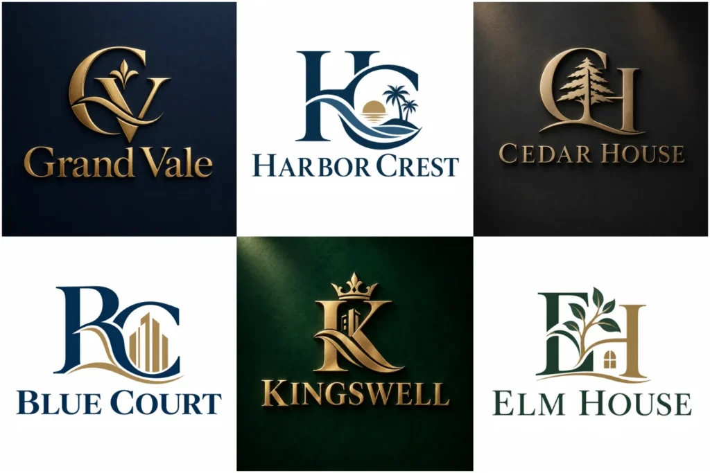
Explore Hospitality Logo Concepts
Explore a varied selection of hospitality identity concepts created with attention to originality, proportion, typography, symbolism, and practical use. The portfolio includes refined word-led marks, compact initials, custom icons, elegant combinations, and simpler contemporary directions.
Some displayed pieces may be creative concepts rather than commissioned client work, but each demonstrates how a professional logo can be presented across signage, room materials, websites, booking platforms, stationery, uniforms, and other hotel touchpoints.
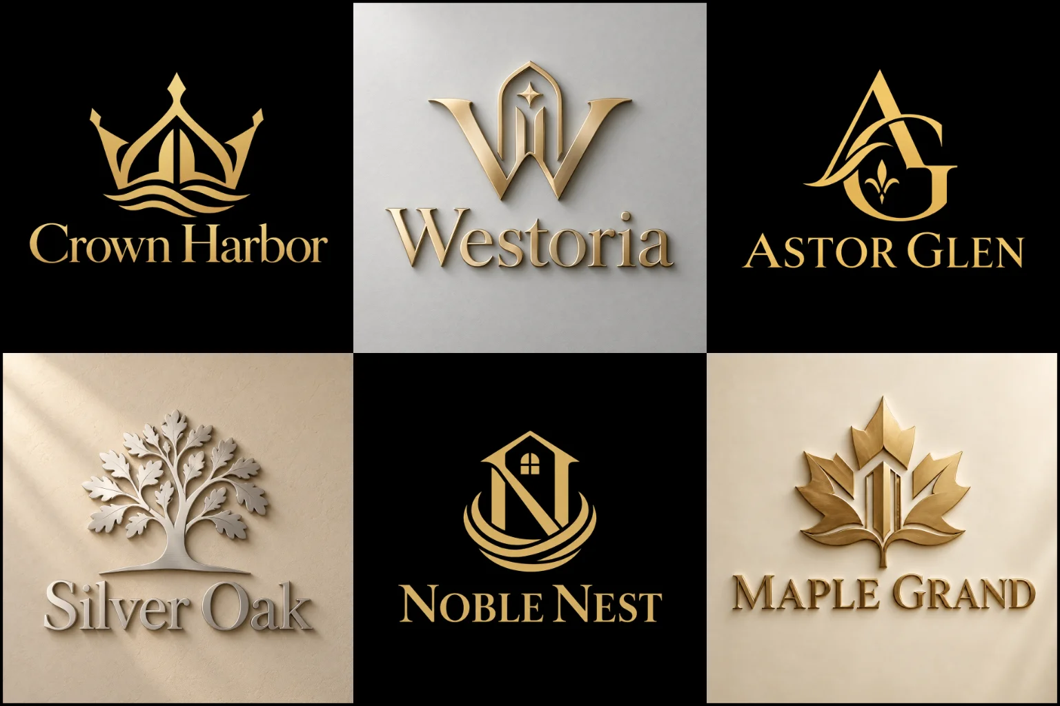
Your Identity Should Match the Guest Experience
A hotel logo creates expectations before a guest walks through the door. Its visual character should make sense beside the property, service level, location, interior atmosphere, and type of customer you want to attract.
A boutique property may need something individual and design-led. A city business hotel can benefit from a clean, confident identity that feels efficient and established. Resorts often have more room for expressive symbols connected to landscape, leisure, or the destination, while an upscale property may depend more heavily on typography, spacing, and restrained details.
The important point is consistency. A highly formal mark can feel disconnected from a casual guest house, just as a playful identity may not support a property positioned around privacy, fine dining, or premium service.
LogoPixa approaches the visual direction around the character of the property rather than applying one hospitality look to every hotel.
Choosing a Logo Structure That Works in Real Life
Hotels use their identity in very different spaces, so structure matters as much as appearance.
A short, distinctive property name may work with typography as the main feature. Longer names often need a more considered arrangement so they remain readable on signs, websites, key cards, and smaller digital placements.
Properties with useful initials can explore custom monogram logos. A carefully built letter-based symbol can create a compact identity for entrance details, amenities, social profile images, embroidery, and other limited spaces. The full hotel name may still need to appear nearby, particularly while the brand is new or the initials are unfamiliar.
For many hospitality businesses, custom combination logos provide useful flexibility because the property name and a distinctive symbol can appear together. The complete arrangement can lead on signage and marketing, while a simplified icon may support smaller applications when the design system allows it.
The right structure depends on the name, property positioning, and where guests will actually see the mark.
Building a Sense of Place Without Using Clichés
Mountains, palm trees, buildings, roofs, waves, crowns, stars, keys, doorways, beds, and location-related graphics are familiar in hospitality branding. They can communicate the category quickly, but they can also make different properties look surprisingly similar.
A stronger concept does not have to avoid familiar imagery completely. It needs to use it with a reason.
A coastal resort might draw from a specific natural form, architectural detail, or local atmosphere rather than another generic palm tree. A heritage hotel could reference a meaningful structural feature without illustrating the entire building. An urban property might use typography, initials, negative space, or an abstract form instead of a literal hotel symbol.
The objective is to create a visual connection that belongs to the property rather than simply announcing that accommodation is available.
Different Hotel Categories Need Different Visual Personalities
Hospitality includes businesses with very different audiences and expectations.
Luxury hotels often benefit from controlled spacing, confident typography, and carefully limited details. Boutique properties can support more personality, unusual letterforms, artistic symbols, or concepts influenced by the building and neighborhood.
Resorts may use a warmer or more relaxed visual language, especially when nature, wellness, recreation, or a destination experience is important. Business hotels generally need clarity and professionalism, while family-focused properties can use a more welcoming and approachable character without making the identity feel childish.
Heritage hotels may draw from traditional architecture, history, decorative details, or established typography. New contemporary properties can move in a cleaner direction, but being modern does not require copying fashionable symbols or fonts.
The strongest direction comes from positioning first and visual style second.
When a Minimal or Premium Direction Makes Sense
Hospitality brands often consider either simplicity or elegance, but those ideas need to be used carefully.
Clean minimalist logos can work well for modern hotels, urban properties, design-focused stays, and brands that want an uncluttered identity. Reduced forms also tend to translate well across websites and smaller applications. The limitation is that extreme simplicity can remove too much character, leaving the identity dependent on ordinary typography or familiar shapes.
A premium logo style may suit high-end hotels, exclusive resorts, private retreats, and properties where refinement is part of the complete guest experience. Elegant serif lettering, custom initials, restrained symbols, and balanced spacing can support that positioning.
Decorative flourishes, gold effects, or thin lettering alone do not automatically make a hotel look luxurious. The identity still needs strong proportions, readability, and a clear relationship with the actual property.
Typography Does More Than Display the Hotel Name
In hospitality branding, type can communicate almost as much as the symbol.
Serif letterforms can create a refined, established, editorial, or heritage-focused impression depending on their construction. Sans-serif typography may feel contemporary, direct, relaxed, architectural, or highly minimal.
Custom lettering can introduce details that make the property name more recognizable without reducing readability. Small adjustments to proportions, spacing, terminals, character shapes, or selected letters may be enough to create individuality.
Script and handwritten lettering can suit certain boutique, romantic, artistic, or destination properties, but readability needs close attention. Guests should not struggle to understand the name on a booking page, entrance sign, or mobile screen.
Typography should also work with the length of the property name. A wide name needs different spacing and composition from a short one-word brand.
Color Should Support the Atmosphere
There is no required color palette for hotel branding.
Deep neutrals, muted tones, warm earth colors, dark blue, cream, black, and metallic-inspired accents are often associated with refined hospitality, while brighter palettes can suit resorts, family destinations, coastal properties, or more energetic travel brands.
The better question is what the color should communicate.
A nature retreat may need a calm connection to its surroundings. An urban boutique hotel could use stronger contrast or a distinctive accent. A heritage property may benefit from colors influenced by architecture or interiors.
Practical reproduction matters too. A strong identity should not depend entirely on a gradient, metallic effect, or specific background to remain recognizable. The underlying mark needs enough structure to work when color options are limited.
A Hotel Logo Has to Work Beyond the Website
Hospitality identities appear in more places than many business logos.
Guests may encounter the mark on the exterior sign before check-in, then see it again on reception materials, key cards, room information, menus, Wi-Fi cards, bathroom amenities, staff clothing, digital screens, social media, confirmation messages, booking listings, vehicles, event materials, and printed stationery.
These applications can range from very large signs to tiny printed details.
Fine lines that look elegant on a presentation screen may disappear when reproduced small. Complex architectural illustrations can become unclear on key cards. Extremely wide arrangements may be difficult to fit into profile images or compact signage.
Thinking about these uses early helps keep the design practical rather than discovering limitations after the identity is already in use.
Creating an Identity for One Property or a Hotel Group
A single independent hotel usually has more freedom to build its identity closely around its location, atmosphere, building, and name.
A hotel group has another challenge. The identity may need to support multiple locations, property names, service levels, or future developments without becoming inconsistent.
In that situation, the parent brand and individual properties need a clear relationship. This could come through shared typography, symbol construction, spacing, color logic, or naming structure.
Trying to place every destination or property feature inside one logo can make expansion difficult. A flexible visual system gives the business room to introduce new locations without redesigning the central identity each time.
Details Worth Sharing Before the Design Starts
A useful creative brief explains more than a preferred color or an example logo.
Information about the property type, hotel name, location, target guests, architecture, interior character, price positioning, amenities, brand personality, and main applications gives the designer a much clearer starting point.
It also helps to describe the impression you want to avoid. A boutique hotel may not want to look corporate. A premium resort may want to avoid obvious tropical imagery. A historic property may need traditional character without appearing old-fashioned.
Visual references can communicate taste, but they should guide the direction rather than become designs to imitate.
The clearer the positioning is, the easier it becomes to develop an original identity around the property itself.
Common Problems That Weaken Hospitality Branding
Hotel identities often become less effective when too many ideas compete inside the same mark.
A building, location pin, star, initials, tagline, destination name, establishment date, decorative frame, and multiple colors rarely need to appear together. Adding more information does not automatically make the identity more meaningful.
Generic hotel icons are another issue. A stock roof, crown, key, or palm tree may communicate hospitality, but it does little to distinguish one property from another unless the idea has been developed specifically for the brand.
Readability can also suffer when elegance is pushed too far. Very thin type, excessive letter spacing, elaborate scripts, and delicate details may create an attractive large preview but fail in normal use.
Good refinement is often about deciding what the identity can remove while keeping its character.
Develop a Brand Mark Around Your Property
LogoPixa can develop a visual direction around the hotel name, positioning, guest audience, property character, and intended applications. The aim is to create an original mark that is clear enough for everyday use while still giving the business a recognizable personality.
You can begin with a defined idea or share broader preferences and references. The design direction can then be explored around typography, initials, symbols, layout, and visual style without forcing the property into a generic hospitality template.
Explore More Logo Options
Browse more industry-specific logos to explore branding options created for different types of businesses.
You may also be interested in:
Hotel Branding FAQs
What type of logo works well for a hotel?
Several structures can work. A combination mark is useful when both the property name and symbol need visibility. Monograms can suit hotels with recognizable initials, while a strong word-focused identity may be effective for a short, distinctive name. The right structure depends on the property and its main applications.
Does a hotel logo need a building or hotel symbol?
No. Literal hospitality imagery can provide quick context, but it is not required. Custom typography, initials, abstract symbols, architectural details, negative space, or ideas connected to the location can create a relevant identity without showing a building.
What colors are suitable for a hotel brand?
The palette should support the property’s personality and guest experience. Refined hotels may use restrained tones, while resorts or family-oriented properties can support warmer or brighter colors. Contrast and reproduction are more important than following a standard hospitality palette.
How can a luxury hotel avoid looking generic?
Start with the property rather than generic luxury symbols. Custom typography, distinctive proportions, meaningful initials, architectural references, or a restrained original symbol can create character. Crowns, decorative flourishes, and gold effects should only be used when they genuinely support the concept.
Are monogram logos suitable for hotels?
Yes, particularly when the hotel has memorable initials or a longer name. A monogram can provide a compact mark for small applications, but newer properties may still need the full name displayed alongside it until guests become familiar with the initials.
Should a boutique hotel use a different style from a chain hotel?
Often, but not automatically. Boutique properties may have more freedom to express local character or an individual atmosphere. Hotel groups usually need a system that stays consistent across multiple properties. The appropriate approach depends on the brand structure rather than the business size alone.
Can the same logo work for signage and digital platforms?
A well-planned identity should be designed with both environments in mind, but different arrangements may sometimes be necessary. Large exterior signage and small social profile images create very different space and readability requirements, so the core identity needs enough flexibility to adapt clearly.
How detailed should a hospitality logo be?
Only as detailed as the concept requires. Fine architectural illustrations and elaborate decoration can work in certain contexts, but they often need simplification for smaller applications. Every detail should remain useful rather than being added only to make the mark look more elaborate.
What should I provide before requesting a hotel logo?
Share the property name, hotel category, target guests, location, desired brand personality, relevant features, preferred visual direction, and where the identity will be used most often. References and examples of styles you dislike can also make the creative direction clearer.