
Plumbing Logo Design
The focus is on clear typography, practical symbols, and flexible layouts that can work across vans, uniforms, websites, signage, and printed materials. Browse the portfolio to explore different creative directions and find a visual approach that suits your business.
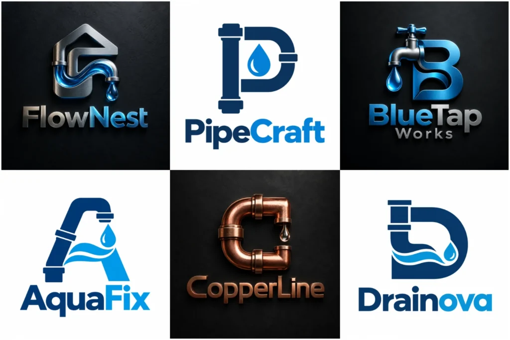
Explore Our Trade Branding Portfolio
Explore a varied selection of trade-focused concepts built to show different branding possibilities, from bold symbols and compact wordmarks to balanced icon-and-text layouts. Each piece is developed with attention to originality, proportion, readability, and practical use across real brand applications.
The collection demonstrates visual range and design thinking, without suggesting that every concept shown was created as a paid client project. Use it as inspiration when deciding what feels right for your brand.
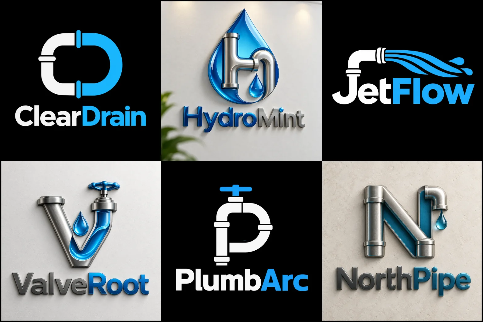
What Should Your Visual Identity Communicate?
Customers often contact a plumber because they need a practical problem solved quickly and professionally. Your branding should support that expectation.
A well-planned identity can make the company name easier to notice and remember while creating a consistent appearance across customer touchpoints. It should feel appropriate for the type of work you do rather than simply following familiar industry trends.
A residential service may benefit from an approachable and straightforward look. A company working with contractors, property managers, builders, or commercial facilities may prefer something more structured and technical.
Businesses serving both markets often need a balanced direction that feels accessible without looking casual.
Start With the Business, Not the Symbol
It is tempting to begin by choosing a faucet, wrench, pipe, or water drop. A better starting point is understanding what the company needs to communicate.
Consider the type of customer you want to attract, the services you provide, and how you want the business to feel.
A local repair company may need a clear and friendly identity that is easy to spot on a service vehicle. A larger mechanical contractor may need a more restrained system that also fits proposals, uniforms, site signage, and commercial documentation.
Starting with the brand position makes it easier to decide whether the final design should feel bold, minimal, traditional, modern, technical, or approachable.
Using Industry Symbols Without Looking Generic
Pipes, valves, tools, water, and fixtures are relevant visual cues, but many companies already use them.
The goal is not necessarily to avoid familiar imagery. It is to interpret it in a more distinctive way.
A customized graphic brand mark might simplify a pipe connection into a memorable shape, integrate a water element into a letter, or use negative space to combine two ideas.
Simple visual ideas usually reproduce more reliably than detailed illustrations. Tiny fittings, realistic water effects, several tools, and multiple decorative elements can make a mark difficult to recognize when reduced.
One clear idea is often more useful than several competing symbols.
When an Icon and Business Name Work Together
For many service companies, using both a symbol and the company name creates a practical branding system.
A combined brand mark allows the name to remain prominent while giving the business a separate visual element for applications where less space is available.
The symbol may sit beside the wording, above it, or become part of the lettering itself.
This structure can work well across vehicle graphics, uniforms, websites, social profiles, quotations, invoices, and signs.
It does have a limitation. Long business names can make the complete lockup too wide for small spaces, so the design may need alternative horizontal and compact arrangements rather than forcing one layout everywhere.
A Cleaner Approach for Modern Service Brands
An identity does not need several trade-related graphics to explain what the company does.
Some businesses are better suited to clean modern logos that rely on strong typography, controlled shapes, balanced spacing, and one recognizable visual feature.
This direction can be especially useful for companies offering several related services, such as drainage, heating, maintenance, installations, renovation work, or property services.
A less literal concept can leave more room for future expansion.
Minimal does not mean plain, however. Removing too much character can result in a mark that looks interchangeable with other businesses. Distinction can come from customized lettering, unusual proportions, negative space, or a carefully constructed symbol.
Exploring Line-Based Concepts
Pipework naturally creates bends, connections, routes, and continuous lines. These characteristics can translate well into a clean line-based logo when the concept is kept controlled.
A single line might suggest flowing water, connected piping, a fixture, or part of a letterform.
This can create a lighter and more refined appearance than a heavy illustrated badge.
Line thickness matters. Very thin details may disappear when embroidered, printed at a small size, or viewed from a distance. The final artwork should remain clear outside a large presentation mockup.
Choosing Colors With a Purpose
Blue is widely associated with water and is therefore a familiar choice in this industry. That does not mean every company needs the same blue-and-white palette.
Navy can create a more established appearance, while brighter blues may feel more energetic. Teal can provide a contemporary alternative.
Orange or red may add visibility and warmth. Green can make sense when water efficiency or environmentally conscious services are genuinely part of the brand position.
Black, charcoal, gray, and white can support a more industrial or restrained look.
The important question is not which color is most common. It is which palette supports your intended brand personality while remaining practical across vehicles, clothing, print, signage, and digital use.
Typography Matters More Than Many Businesses Expect
Customers need to identify the company name quickly, particularly when viewing a moving vehicle, roadside sign, search result, or mobile screen.
Clear typography therefore deserves as much attention as the icon.
Strong sans-serif lettering can create a clean, direct appearance. Condensed type can help longer names fit into compact layouts. Serif typography may work for a more established or traditional direction.
Custom changes to individual letters, spacing, corners, or proportions can add personality without making the wording difficult to read.
Highly decorative scripts and extremely thin fonts should be used carefully because they can lose clarity when reproduced at small sizes.
Designing for Real-World Applications
A good identity should work beyond a large digital preview.
Service vehicles are often one of the most visible brand applications. The company name and main visual element need enough clarity to be understood from a reasonable distance.
Uniforms introduce different reproduction requirements. Embroidery may not preserve extremely fine lines, tiny gaps, or subtle effects.
Printed materials create another set of needs. Quotes, invoices, business cards, folders, stickers, and service documents may use the design at relatively small sizes.
Digital applications include website headers, profile images, local listings, social platforms, email signatures, and advertising.
Considering these situations early helps create an identity that remains useful when applied to the business rather than looking good only as a presentation image.
Residential and Commercial Brands May Need Different Visual Cues
The same general trade can serve very different audiences.
Residential customers may respond well to branding that feels approachable, straightforward, and easy to understand. The design can still look professional without becoming overly formal.
Commercial contractors often need a stronger sense of structure. Their identity may appear beside construction firms, engineers, facility managers, developers, and other professional service providers.
Companies working across both areas should avoid leaning too far in either direction.
An overly playful design may feel less suitable for commercial documents, while an extremely corporate identity may feel distant to homeowners. The right balance depends on where most of the business comes from and where the company plans to grow.
Does Your Tagline Need to Be Inside the Logo?
Not always.
A tagline can explain a specialist service, geographic area, or positioning statement, but small text becomes difficult to read when the design is reduced.
It can be more practical to create a primary version that focuses on the company name and main visual element, then use an extended arrangement when there is enough room for supporting text.
This gives the brand more flexibility across different applications.
If the business name already explains what you do, adding another descriptive line may provide little benefit.
How to Stand Apart From Similar Local Businesses
Many trade companies use comparable colors, symbols, and layouts. Looking different does not require choosing something unrelated to the industry.
Instead, examine where originality can come from.
It might be the relationship between the icon and company initials, the way the lettering is customized, a distinctive geometric structure, a less predictable color combination, or a visual idea connected specifically to the business name.
Competitor research can also be useful.
Looking at nearby companies helps identify visual patterns that are already heavily used. The purpose is not to copy those brands but to understand what your identity may be competing against when customers see several providers together.
What to Decide Before Starting the Design
A useful creative brief does not need to be complicated.
Start with the company name and the main services offered. Explain whether your customers are mainly homeowners, businesses, builders, property managers, or a mixture.
Then think about brand personality. Words such as dependable, direct, friendly, technical, established, modern, premium, or rugged can help define an appropriate visual direction.
It also helps to share examples you like and explain why you like them.
Perhaps you prefer the typography rather than the icon. Maybe you like the simplicity, spacing, color balance, or overall structure.
You can also identify things you want to avoid. This is especially helpful when certain symbols, colors, or styles are already overused by competitors in your area.
LogoPixa can use this information to build a clearer design direction around the actual needs of your business.
Design Choices That Can Create Problems Later
Using too many symbols is one of the most common issues.
A house, wrench, pipe, faucet, drop, and initials do not all need to appear together. Too many ideas compete for attention and make the identity harder to recognize.
Complex effects can cause similar problems. Heavy shadows, metallic textures, realistic water, and intricate illustrations may not translate well to every printing or production method.
Another issue is allowing the icon to dominate the company name. A memorable symbol has limited value if customers cannot identify the business behind it.
Following competitors too closely can also reduce distinction. Familiar industry cues can be useful, but copying the same symbol, colors, composition, and typography makes brands harder to tell apart.
Explore More Logo Options
Browse more logo design by industry to explore branding options created for different types of businesses.
You may also be interested in:
- contractor brand identity
- transport branding
- landscape business identity
- cleaning service branding
- architecture branding
Frequently Asked Questions
What makes a strong logo for a plumbing company?
It should be clear, recognizable, relevant to the business, and practical across different applications. The company name should remain readable, and any symbol should add meaning without creating unnecessary complexity.
Does the design need a pipe or water drop?
No. Those symbols can work, but they are only two possible directions. Typography, initials, geometric forms, abstract shapes, or concepts connected with the company name can also create an effective identity.
Which colors are suitable for this type of business?
Blue and navy are common because of their association with water, but they are not mandatory. Teal, green, orange, red, black, gray, and other combinations can work when they match the intended brand personality.
Can the logo work for both plumbing and heating services?
Yes. If the business provides several services, the design can use a broader visual concept instead of focusing too heavily on one specific fixture or service.
Is a simple design better than a detailed one?
Simple designs are often easier to recognize and reproduce, but simplicity alone does not make a design effective. It still needs enough character to distinguish the company from competitors.
Should the company name include the word “plumbing”?
Not necessarily. If the existing name already communicates the service clearly, extra wording may not be needed. New or less descriptive company names may benefit from a supporting descriptor when immediate clarity is important.
Will a detailed design work on uniforms and vans?
It may become difficult to reproduce. Fine details can disappear in embroidery or at smaller sizes, while complicated graphics may be harder to read from a distance. Practical applications should be considered during the design process.
Should I include a tagline?
Only when it adds useful information. Long or small taglines can create readability problems, so they are often better used in an extended version rather than being permanently attached to the main mark.
Can a professional trade identity still feel friendly?
Yes. Clear typography, balanced proportions, approachable shapes, and suitable colors can create a professional appearance without making the company feel overly corporate.
What information should I provide before the design begins?
Provide the company name, core services, target customers, preferred brand personality, color preferences, examples you like, ideas you want to avoid, and the main places where the identity will be used.