
Landscaping Logo Design
Explore the portfolio to see how thoughtful symbols, typography, color, and layout can give an outdoor service brand a clear, memorable, and professional presence in real use.
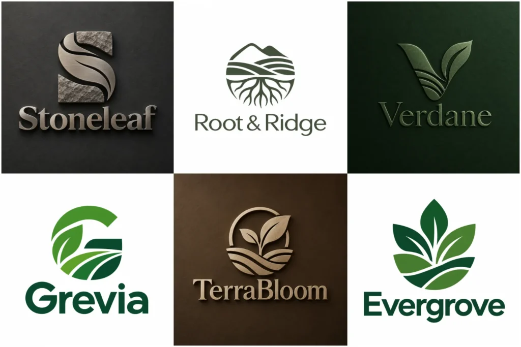
Explore Our Landscaping Logo Portfolio
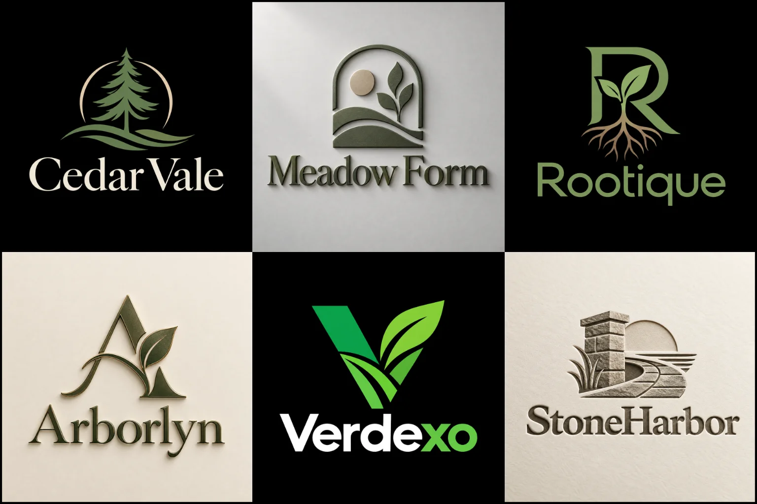
Browse a range of original concepts created to show different directions for lawn care, garden services, hardscaping, maintenance, and broader outdoor brands. The collection includes clean symbols, bold name-led layouts, natural forms, and more structured identities, all designed with practical use in mind.
Each example highlights balanced composition, readable typography, distinctive ideas, and the flexibility needed for websites, uniforms, trailers, signage, social profiles, printed marketing, and everyday customer touchpoints across different brand settings.
Build the Identity Around the Work You Actually Do
Landscaping covers more than one kind of business. A company focused on weekly lawn maintenance may need a different visual personality from a landscape designer working on high-end residential spaces.
Hardscaping companies may want a stronger, more structural appearance. Garden specialists can lean toward softer organic forms, while full-service landscape contractors may need a broader identity that does not limit the brand to one particular task.
Before deciding on a symbol or style, consider what customers mainly hire you for. Lawn care, planting, landscape construction, irrigation, garden maintenance, outdoor living spaces, and property upkeep can each influence the visual direction.
The logo does not need to illustrate every service. Trying to show grass, trees, paving, water, tools, houses, and flowers in one mark usually creates clutter. One focused idea is often more effective.
Natural Symbols Without the Generic Look
Leaves, trees, grass, lawns, and plants make sense for an outdoor business, but they are also among the most frequently used images in this industry.
Using one is not automatically a problem. The important part is how the idea is developed.
A leaf could be integrated into a letter instead of appearing as a separate stock-style icon. Negative space might suggest a garden path, lawn edge, horizon, or growing form. A symbol could also come from the company name, local landscape character, initials, tools, terrain, or the way different outdoor spaces connect.
An icon-based logo design can be particularly useful when a business has a clear visual idea that can be simplified into a memorable symbol. However, a standalone icon may provide less name recognition for a new company, so the business name often still needs an important role in the wider identity.
Originality usually comes from simplifying and reshaping familiar ideas rather than adding more decoration.
Match the Logo Structure to Real Branding Needs
Many landscaping companies benefit from a text and symbol logo because it keeps the company name visible while providing a separate visual element. This arrangement can adapt well to wide vehicle graphics, square social profiles, uniforms, signage, and other spaces with different proportions.
A symbol-only direction may suit a company that already has strong recognition or needs a compact secondary mark. A name-led identity can also work when the business name itself is distinctive enough to carry the brand.
Companies wanting a clean appearance may consider a simple logo style. Fewer elements can improve clarity, particularly on equipment, embroidery, mobile screens, and small printed materials. Simplicity still needs personality, though. Removing too much detail can leave the design looking ordinary or interchangeable.
A modern brand identity may suit landscape designers, outdoor living specialists, newer contractors, and businesses targeting contemporary residential or commercial projects. Clean does not have to mean cold or overly technical. Organic shapes and natural character can still be retained.
Color Should Support the Brand, Not Define It Alone
Green is strongly connected with plants, gardens, lawns, and outdoor environments, which makes it a natural option for many landscape businesses. It is not the only suitable choice.
Deep forest tones can create a grounded feel, while brighter greens may appear energetic and fresh. Earthy browns, stone-inspired neutrals, charcoal, warm beige, muted blue, or other supporting colors can help distinguish a company from competitors using similar palettes.
Color also needs enough contrast for practical applications. A combination that looks attractive on a white website may become difficult to read on a dark truck, work shirt, yard sign, or photograph.
The underlying mark should remain understandable even when color options are limited. This is why shape, spacing, and typography matter just as much as the palette.
Typography Changes How the Company Feels
Lettering can make the same symbol feel established, approachable, premium, rugged, or contemporary.
Strong sans-serif typography can suit contractors and maintenance companies that want a straightforward presence. More refined lettering may work for landscape architecture, garden design, or premium residential services. A traditional serif can create an established character when that tone matches the company.
Decorative scripts should be handled carefully. They can introduce personality, but thin strokes and elaborate letterforms may become difficult to read from a moving vehicle or at a distance.
The company name should remain one of the clearest parts of the design. Customers seeing a truck, trailer, uniform, or property sign often have only a short time to identify the brand.
Design for Trucks, Signs, Uniforms, and Screens
A landscape logo rarely stays in one place. It may appear on a work truck in the morning, a lawn sign in the afternoon, and a social media profile later that day.
That makes scalability and layout flexibility important.
The identity should be considered for uses such as:
Work trucks and trailers
Yard and roadside signs
Staff shirts, jackets, and hats
Equipment decals
Website headers and mobile screens
Social media profiles
Business cards and printed marketing
Estimates, invoices, and other customer-facing materials
Small details that look impressive in a large mockup may disappear when embroidered or reduced to a profile image. Very thin lines can also become difficult to reproduce, while long company names may require a more compact secondary arrangement.
The strongest design is not simply the one that looks good at a large size. It is the one that keeps its character when the application changes.
Give the Brand a Clear Personality
Two landscape companies offering similar services can still need completely different identities.
One may want to feel dependable and practical for homeowners who need regular property maintenance. Another may focus on custom gardens and want a more refined visual character. A commercial contractor may need something structured and confident, while a small residential company could benefit from a friendlier appearance.
Think about the qualities customers should associate with the business. These might include precision, care, reliability, craftsmanship, natural beauty, strength, simplicity, or attention to detail.
Those qualities can influence the symbol, letterforms, proportions, line weight, spacing, and color direction without needing to be written directly into the logo.
Avoid Trying to Explain the Entire Business in One Mark
A common mistake is asking the logo to communicate every service at once.
Putting a tree, mower, shovel, house, paving stone, water drop, sun, and grass inside one design may describe the industry, but it usually weakens visual focus.
Other problems include using an unchanged stock-looking leaf, placing several unrelated fonts together, relying on extremely fine lines, or choosing an elaborate design mainly because it looks impressive on a 3D mockup.
A tagline can also create unnecessary complexity when it is too long. Supporting wording can be useful in certain applications, but the main company name and core identity should still work without depending on a sentence underneath.
Good branding simplifies the message instead of trying to turn the logo into an advertisement.
What to Decide Before Starting the Design
A clearer brief makes it easier to develop a direction that fits the business rather than relying on assumptions.
Start with your exact company name and decide whether a tagline genuinely needs to appear with it. Explain your main services and the type of customers you want to attract. It also helps to identify whether the business should feel modern, established, friendly, premium, rugged, natural, or somewhere between these qualities.
Share where the identity will appear most frequently. A company relying heavily on vehicle branding may have different layout needs from a garden designer whose website and project photography are the main customer touchpoints.
Visual references can help communicate preferences, but they should be used to explain direction rather than provide something to copy. It is equally useful to mention symbols, colors, fonts, or industry clichés you would prefer to avoid.
Creating a Practical Identity With LogoPixa
LogoPixa approaches the project around the individual company rather than beginning with a ready-made industry symbol.
The business name, services, audience, personality, preferred direction, and important applications help shape the creative approach. From there, different possibilities can be explored through typography, meaningful symbols, proportions, negative space, and color.
A promising concept should then be judged without relying only on presentation effects. The flat mark needs to remain readable, balanced, and recognizable on the surfaces where the business will actually use it.
The aim is a focused visual identity that feels appropriate for the landscaping industry while still giving the individual company its own character.
Explore More Logo Options
Browse more logo design by industry to explore branding options created for different types of businesses.
You may also be interested in:
- trucking brand identity
- property brand identity
- plumbing logo
- cleaning service branding
- architecture branding
Frequently Asked Questions
What makes a good logo for a landscaping company?
A strong design is clear, recognizable, relevant to the business, and practical across different applications. It should communicate the right personality without becoming crowded with plants, tools, and other industry symbols. Readable typography and a distinctive overall shape are especially important for vehicles and outdoor signage.
Does a landscaping logo need a tree or leaf?
No. Trees and leaves can work when the concept is developed in an original way, but they are not required. The idea can come from the company name, initials, outdoor spaces, growth, terrain, garden paths, craftsmanship, or another relevant part of the business.
What colors work well for a landscaping brand?
Green and natural tones are common because they connect easily with outdoor services, but there is no required palette. Dark neutrals, earthy colors, blue, stone tones, or more distinctive combinations may work depending on the audience and desired personality. Contrast and practical visibility should influence the choice.
Should lawn care and landscaping companies use the same type of logo?
Not necessarily. A lawn maintenance company may benefit from a straightforward and approachable identity, while a landscape design or outdoor living company may need a more refined direction. The services, customers, pricing position, and primary brand applications should guide the design.
Will a detailed logo work on uniforms and vehicles?
It can, but detail must be controlled. Fine lines, small wording, complicated textures, and tiny decorative elements can disappear in embroidery or when viewed from a distance. A simpler structure is usually easier to reproduce consistently across different materials.
Should I include a tagline in the logo?
Only when it adds useful information and can remain readable. A long tagline can make the design crowded, particularly on social icons, uniforms, and smaller signs. The main identity should normally remain strong even when supporting wording is removed.
Is a modern or traditional style better for a landscaping business?
Neither is automatically better. A contemporary approach may suit landscape designers, outdoor living specialists, or newer brands, while a more established or traditional look may fit long-standing contractors and craftsmanship-focused companies. The right direction should match how you want customers to perceive the business.
How can I avoid having a logo that looks like every other landscaper?
Avoid selecting a symbol only because it is commonly associated with the industry. Look at the company name, audience, services, personality, and competitive environment for more specific ideas. Even familiar natural imagery can become more distinctive through custom shapes, negative space, thoughtful typography, and controlled composition.