
Cleaning Company Logo Design
LogoPixa focuses on original concepts, clear typography, balanced symbols, and practical layouts. Explore the portfolio to find a visual direction that matches your business.
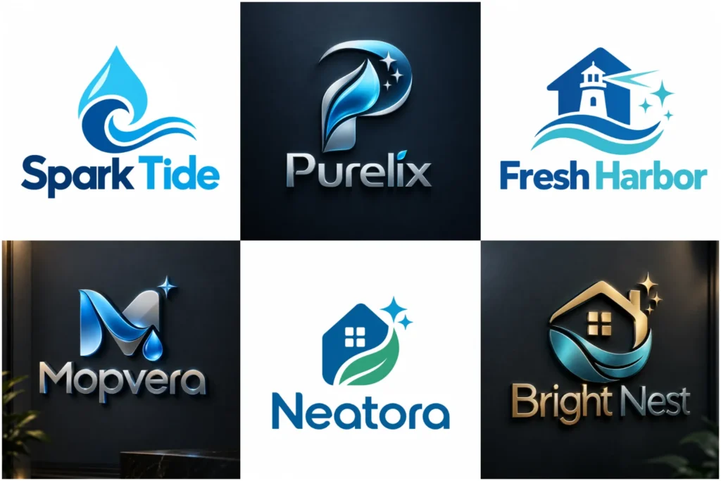
Explore Our Cleaning Logo Portfolio
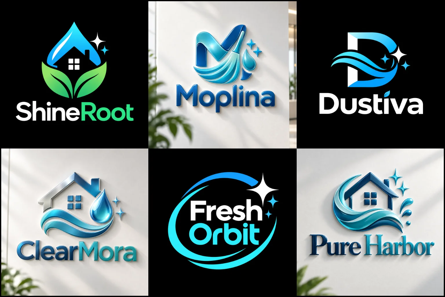
Browse cleaning-focused logo concepts created with different symbols, typography choices, color directions, and brand personalities. The collection includes simple, modern, friendly, bold, and more refined approaches without treating one visual formula as suitable for every company.
Each concept is presented with attention to originality, proportion, readability, and professional execution, helping you consider how an identity may work on vehicles, uniforms, websites, social profiles, signage, printed materials, and other everyday applications.
What Should a Cleaning Brand Communicate?
A cleaning business usually needs to communicate trust, care, reliability, and a sense of order. That does not mean the logo has to literally show someone cleaning.
The strongest direction depends on the customers you want to attract.
A residential service may benefit from an approachable, fresh identity that feels comfortable and dependable. Commercial cleaners may need a more structured appearance that works well when presenting services to offices, property managers, facilities, schools, or other organizations.
Specialist services can require another direction entirely. Carpet cleaning, window cleaning, pressure washing, janitorial services, housekeeping, move-out cleaning, and eco-conscious services all create different opportunities for visual positioning.
Before selecting an icon or color, decide what customers should feel when they see your business name. Clean? Professional? Friendly? Efficient? Premium? Environmentally responsible? Established?
That answer gives the design a stronger foundation than simply choosing a familiar cleaning symbol.
Cleaning Symbols Can Work Without Looking Generic
Sparkles, water drops, bubbles, spray bottles, brooms, homes, gloves, leaves, and cleaning tools are immediately associated with the industry. Their familiarity can make the service easier to understand, but it also means they are frequently used.
The answer is not necessarily to avoid every familiar symbol. The important part is how the idea is developed.
A sparkle could be integrated into a letter instead of floating beside the company name. A water drop might use negative space to reveal another meaningful shape. A home outline could be simplified or connected with the initials rather than becoming another standard house icon.
Businesses wanting a recognizable object-based identity can explore custom pictorial logos, where a familiar subject becomes the central visual element.
Literal imagery should still match the service. A residential house symbol may make sense for home cleaners but can unnecessarily limit a company focused mainly on offices, industrial spaces, or multiple commercial sectors.
Choosing a Logo Structure That Fits the Business
Cleaning businesses can use several logo structures successfully. The choice should depend on the company name, brand positioning, and where the identity needs to appear.
A symbol paired with the business name is often practical because customers can understand both the visual mark and the company behind it. Custom combination logos are particularly useful when a business wants a recognizable icon while keeping its full name prominent.
A short, distinctive company name may also work with typography as the main feature. In that case, carefully adjusted lettering can create personality without relying on another cleaning icon.
Long business names need extra care. Trying to fit a detailed symbol, long name, tagline, and multiple service descriptions into one logo can quickly make the identity crowded.
The best structure is usually the one that communicates clearly without asking every element to compete for attention.
Simple Design Can Make a Cleaning Brand Feel More Focused
Cleaning businesses often benefit from visual clarity because their branding appears in many fast-view environments. A potential customer might see the identity on a moving vehicle, social media profile, search result, uniform, flyer, or small mobile screen.
This makes unnecessary detail a practical problem.
Clean minimalist logos can suit businesses that want a tidy, professional appearance built from fewer shapes, controlled typography, and clear spacing. A simple identity can also be easier to reproduce at different sizes.
Minimalism has limitations, however. Removing too much can leave a logo looking like plain text beside a basic sparkle or drop. Simplicity works best when the remaining details have enough character to make the brand identifiable.
Modern Does Not Have to Mean Cold or Corporate
Many cleaning companies want a fresh, current identity without looking overly technical.
A contemporary logo style can combine clean lettering, simplified forms, balanced spacing, and controlled color while still feeling friendly and accessible.
Rounded shapes can create a softer personality. Strong geometric forms may feel more organized and business-focused. Wider lettering can appear confident, while lighter typography can create an airy and refined impression when readability is maintained.
The visual direction should reflect the type of customer you serve rather than following a trend simply because it looks new.
A family-focused home cleaning service and a large commercial maintenance provider can both look modern while having completely different personalities.
Choosing Colors Beyond the Expected Blue
Blue is common in cleaning branding because it can create a fresh and orderly appearance. Green is also frequently connected with natural or environmentally conscious positioning.
Both can work, but neither is required.
Turquoise, teal, navy, aqua, fresh greens, softer neutrals, brighter accents, and carefully selected contrasting palettes can all support the right brand personality. Some companies may even benefit from darker colors when they want a stronger commercial or premium presence.
Color should help customers distinguish important elements rather than making the logo dependent on several shades or effects.
It is also useful to consider how the identity looks without color. Vehicle graphics, uniforms, invoices, stamps, embroidery, and certain printed applications may require a simplified or one-color treatment.
If the core design disappears when gradients or effects are removed, the underlying concept may need more work.
Typography Changes How Customers Read the Brand
The company name often occupies more space than the symbol, so typography deserves serious attention.
Heavy sans-serif lettering can feel dependable and strong. Rounded fonts may create a friendlier tone. More refined letterforms can support premium home services, housekeeping brands, or businesses targeting higher-end properties.
The font alone is only part of the decision.
Letter spacing, capitalization, weight, width, alignment, and customized characters can change the entire impression of the logo. A small modification to one letter may also provide a distinctive detail that connects naturally with the symbol.
Highly decorative fonts should be used carefully. If customers cannot read the company name quickly on a van, uniform, mobile screen, or storefront, style has started to interfere with function.
Design for the Places Customers Will Actually See It
A cleaning logo rarely stays in one location.
It may need to appear on:
Service vehicles and vans
Staff shirts and uniforms
Website headers
Social media profiles
Business cards
Flyers and door hangers
Quotes and invoices
Cleaning equipment
Bottles or product labels
Property signage
Digital advertisements
Each application creates different challenges.
A wide horizontal layout may work perfectly on a website or vehicle but fit poorly inside a square social profile. A detailed icon can look attractive at presentation size but become unclear when embroidered on a shirt.
This is why practical usability should influence the design from the beginning rather than being considered only after the logo looks finished.
Different Cleaning Services Need Different Personalities
The cleaning industry covers much more than general home cleaning, so branding should avoid treating every company the same way.
Residential cleaners can often use warmer, more approachable visual language because homeowners are inviting a service into personal spaces.
Commercial cleaning companies may benefit from stronger structure, straightforward typography, and an identity that appears professional across proposals, uniforms, vehicles, and property-management communication.
Eco-friendly services can use natural references, but a green leaf alone does not automatically communicate a distinctive environmental brand. The concept can connect cleanliness and sustainability more thoughtfully through color, shape, negative space, or typography.
Specialist businesses such as carpet cleaners, window cleaners, pressure washing companies, post-construction cleaners, or sanitation services can draw inspiration from the actual service without illustrating every piece of equipment.
A clear focus usually creates a stronger identity than trying to show every service inside one mark.
Should Your Tagline Be Inside the Logo?
A tagline can provide useful context, particularly when the business name does not explain what the company does.
However, it should normally remain secondary to the main identity.
Long taglines can become difficult to read on social icons, uniforms, vehicle graphics, and other small applications. They can also make the logo feel crowded when combined with a detailed symbol and long business name.
If a tagline matters to your branding, it can be treated as an optional supporting element rather than permanently locking it into every version of the logo.
The company name and primary mark should still work without it.
Common Problems That Make Cleaning Logos Look Weak
One frequent problem is combining too many obvious symbols. A house, broom, water drop, leaf, sparkle, and spray bottle do not become more meaningful simply because they appear together.
Another issue is depending on stock-style imagery. A familiar icon placed beside standard typography may describe the industry, but it gives customers little reason to associate the design with one specific company.
Very thin lines can also cause problems when printed, embroidered, or reduced. Complicated gradients and dimensional effects may look attractive in a presentation but make everyday reproduction harder.
Other issues include poor spacing, difficult-to-read fonts, excessive colors, awkward proportions, and trying to place a long service list inside the identity.
A professional mark should simplify the brand rather than turn the logo into a miniature advertisement.
What to Prepare Before Starting Your Logo
You do not need to understand design terminology before requesting a logo, but some business information can make the creative direction much clearer.
Start with your exact company name and explain the main services you provide. Identify whether you primarily serve homeowners, businesses, property managers, rental properties, offices, hospitality businesses, or another audience.
It also helps to describe how the brand should feel. Words such as friendly, dependable, polished, energetic, premium, eco-conscious, simple, bold, or corporate provide more useful direction than asking only for something that “looks good.”
Share any colors you prefer or want to avoid. You can also provide visual references to communicate a general direction, but they should be treated as inspiration rather than something to copy.
Finally, mention where the logo will be used most often. A business relying heavily on vehicle branding may have different layout priorities from one that mainly attracts customers through digital platforms.
Building Originality Around the Business Itself
Originality does not always require an unusual object.
Sometimes the strongest idea comes from the company name, initials, service method, local positioning, or a simple relationship between two shapes.
A common cleaning symbol can become more distinctive when its construction is connected specifically to the brand. Typography can also become part of the concept instead of functioning only as supporting text.
Negative space, customized letterforms, purposeful geometry, unusual proportions, and simplified visual connections can all create individuality without making the identity complicated.
The goal is not to make customers solve a visual puzzle. The idea should remain clear while giving the business something more ownable than a generic template.
Creating a Practical Identity With LogoPixa
LogoPixa develops the visual direction around the information that matters to your business, including the company name, services, customers, desired personality, preferred visual approach, and real-world uses.
The design can then be shaped through typography, symbols, spacing, proportions, and color rather than beginning with a random cleaning icon.
A useful identity should be clear enough for everyday applications, distinctive enough to feel connected to your business, and flexible enough to support your branding without unnecessary complexity.
Explore More Logo Options
Browse more logos for different industries to explore branding options created for different types of businesses.
You may also be interested in:
- landscape business identity
- plumbing service branding
- construction branding
- cafe branding
- interior brand identity
Frequently Asked Questions
What type of logo works well for a cleaning company?
Combination marks are often practical because they keep the business name visible while adding a recognizable symbol. Pictorial marks, word-focused identities, and simple geometric concepts can also work. The right structure depends on your company name, audience, services, and main branding applications.
Does a cleaning logo need a broom or spray bottle?
No. Familiar cleaning imagery can communicate the industry quickly, but it is not required. A distinctive symbol, customized lettering, initials, negative space, or another concept connected to the business can create a relevant identity without showing cleaning equipment.
What colors are suitable for a cleaning business logo?
Blue, teal, aqua, and green are common choices, but there is no required palette. The colors should support the personality and positioning of the business while providing enough contrast for clear use across digital and printed applications.
Can I use a house symbol if I offer residential cleaning?
Yes, especially when home cleaning is central to your service. However, the symbol should be developed distinctively. Businesses planning to expand heavily into commercial cleaning may prefer a concept that does not visually limit the brand only to homes.
Should commercial and residential cleaners use the same logo style?
Not necessarily. Residential brands may benefit from a warmer or friendlier appearance, while commercial services may prefer a more structured and business-focused direction. A company serving both markets can use a balanced identity that does not lean too far toward either extreme.
Are minimalist logos suitable for cleaning services?
They can be. Simple forms and clear typography work well across vehicles, uniforms, websites, and small digital spaces. The main risk is making the design so basic that it becomes generic, so simplicity should still include distinctive brand details.
Should I include all my cleaning services in the logo?
Usually not. Listing many services can make the identity crowded and difficult to read. The logo should identify the business, while your website, vehicle graphics, advertisements, and other marketing materials can explain individual services.
Can an eco-friendly cleaning company use a leaf in its logo?
Yes, but leaves are widely used in environmentally positioned branding. A more distinctive result may connect natural elements with the company name, cleaning concept, typography, or another meaningful feature instead of relying on a standalone generic leaf.
Does my tagline need to be part of the logo?
Not always. A tagline can provide context, but it may become unreadable at smaller sizes. It can often work better as an optional supporting element while the main company name and symbol remain clear on their own.
How can I make my cleaning logo look different from competitors?
Start with your own business rather than common industry templates. Your name, target customers, service focus, personality, initials, positioning, and preferred visual character can provide more specific ideas. Custom typography, thoughtful shapes, negative space, and controlled proportions can then make the concept more distinctive.