
Dental Logo Design
The aim is a clear visual identity that looks confident on signage, appointment cards, websites, social media, uniforms, and printed material. Explore the portfolio to compare different creative directions before choosing the look that fits your practice.
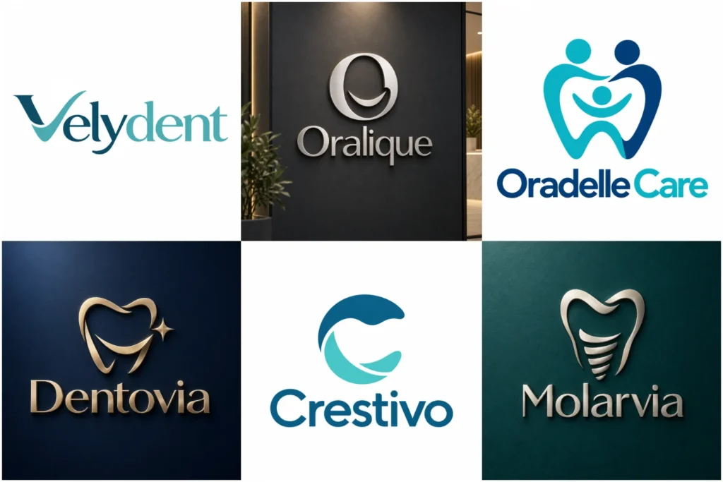
Explore Our Dental Branding Portfolio
Browse a varied collection of dental branding concepts built with different symbols, typography styles, layouts, and visual moods. Some ideas are clean and minimal, while others use distinctive shapes, initials, or carefully developed dental references.
The work is presented to show originality, professional execution, and practical brand thinking rather than suggesting every example is a paid client project. Use the portfolio to identify approaches that feel suitable for your clinic, specialty, or audience.
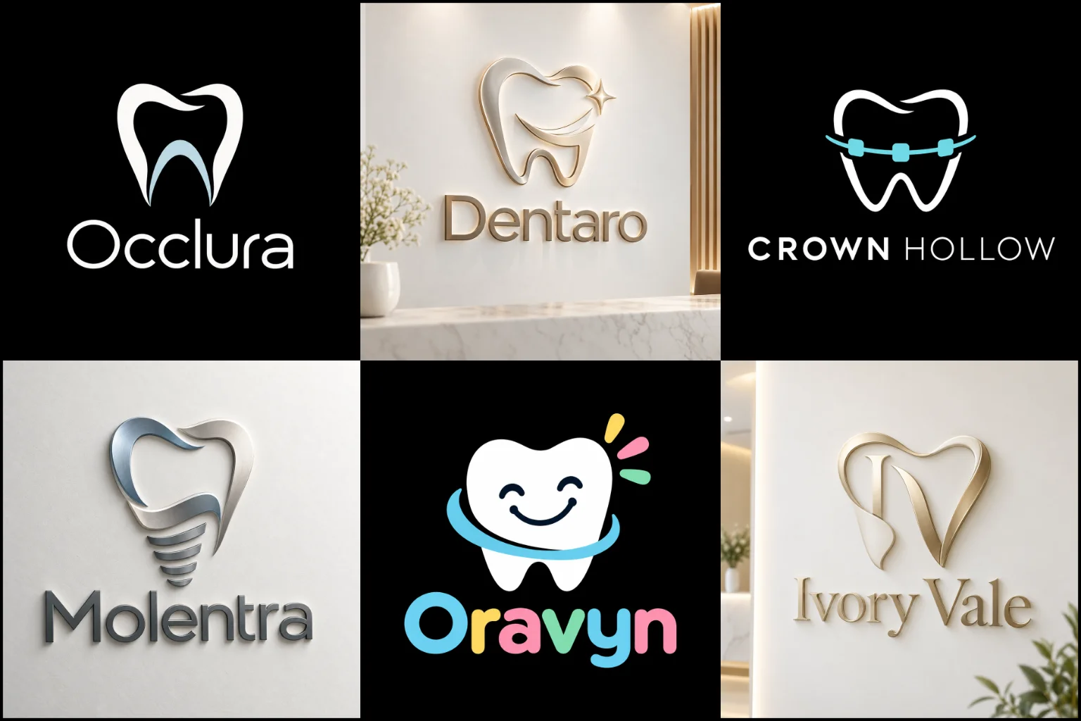
What a Strong Dental Identity Should Communicate
People often see a practice logo before they meet the dentist or enter the clinic. The design therefore needs to support the right first impression. For many practices, that means a sense of cleanliness, professionalism, care, confidence, and approachability.
The visual tone should still match the actual business. A family dental clinic may want to feel warm and welcoming. A cosmetic dentistry brand may lean toward a refined, polished direction. An orthodontic practice may prefer something clean and contemporary, while a specialist clinic may need a more clinical and precise character.
Good branding does not need to explain every service inside one symbol. Its job is to give the practice a distinct visual identity that people can connect with the name over time.
Choosing a Logo Structure That Fits the Practice
The right structure depends on the clinic name, how established the practice is, and where the identity will appear.
A recognizable symbol can work well when the idea has enough personality to stand on its own. Practices interested in an image-led identity can explore custom pictorial logos for examples of how a clear object or visual idea can become the main brand mark.
For many dental businesses, a symbol paired with the practice name is a practical starting point. custom combination logos allow the name and icon to support each other, while giving the brand more flexibility for different layouts.
A short clinic name can also work as a typography-led identity. In that case, the lettering needs enough character to be memorable without becoming difficult to read.
Using Dental Symbols Without Looking Generic
Teeth, smiles, dental mirrors, toothbrushes, braces, implants, crowns, and tooth-shaped negative space are familiar references. They can communicate the field quickly, but they are also widely used.
The problem is not using a tooth. The problem is using a tooth in the same predictable way as everyone else.
A stronger concept may simplify the form, combine it with initials, introduce meaningful negative space, or connect the dental reference to something specific about the practice name or positioning. The result should still be easy to understand without becoming a complicated puzzle.
Some clinics may not need an obvious dental object at all. A distinctive letterform, geometric symbol, abstract shape, or carefully constructed wordmark can create a more individual identity when it suits the brand.
When a Minimal Direction Works Well
Dental branding often benefits from visual clarity because the identity must work across signs, websites, uniforms, documents, social profiles, and small printed items.
clean minimalist logos can be a strong direction for practices that want a calm, modern, and uncluttered appearance. Fewer elements can improve readability and make the mark easier to reproduce at different sizes.
Minimal does not automatically mean better, however. Removing too much can leave the logo looking like a generic clinic icon. Simplicity works best when the remaining shape, typography, proportions, and spacing are distinctive enough to carry the identity.
A practice built around a friendlier or more expressive personality may need more warmth, character, or visual detail than strict minimalism provides.
Line Work for a Clean and Refined Look
A carefully drawn outline can give a dental brand a light, precise appearance. Tooth contours, smile forms, initials, or abstract curves can sometimes be reduced into elegant line-based symbols.
A single-line logo style may suit clinics that want a refined identity without heavy visual elements. It can work especially well when the shape remains recognizable with very few strokes.
The limitation is reproduction. Lines that are too thin may disappear on small signs, embroidery, stamps, or compact digital icons. A line-based concept needs enough weight, spacing, and contrast to stay clear in practical use.
Typography Matters as Much as the Symbol
The clinic name should not feel like text added after the icon is finished. Typography helps decide whether the identity feels friendly, clinical, premium, modern, traditional, or highly technical.
Clean sans-serif lettering can create a straightforward contemporary impression. A refined serif may support a more established or premium position. Rounded letterforms can feel softer and more approachable. Custom letter modifications can also add distinction without reducing readability.
Spacing deserves equal attention. Tight lettering can look crowded on signage, while excessive spacing may weaken the connection between words. Long names often need careful hierarchy so the full practice name remains readable rather than being squeezed into one line.
If the practice uses a dentist’s name, initials, or a location in the brand, the arrangement should still feel balanced and easy to scan.
Color Should Support the Brand, Not Follow a Formula
Blue, teal, green, white, and cool neutrals are common in healthcare branding because they can create a clean and controlled visual feel. Their popularity does not mean every dental practice should use the same palette.
Color should reflect the personality and positioning of the business. A family clinic might prefer a warmer, friendlier combination. A cosmetic practice may use a more restrained premium palette. A children’s dental brand may need brighter accents, while a specialist clinic might prefer something quieter and more technical.
Contrast is especially important. The logo should remain clear on both light and dark backgrounds and still make sense when color is limited.
It is useful to judge the concept in a simple one-color version before relying on gradients or decorative effects. If the design only works because of color, the underlying structure may not be strong enough.
Different Dental Practices Need Different Visual Signals
A general dentistry practice usually needs an identity broad enough to represent routine care without tying the brand to one procedure.
Cosmetic dentistry often calls for a more polished appearance, but overly delicate typography or beauty-style symbols can make the clinic feel disconnected from professional dental care. The design should balance refinement with credibility.
Orthodontic branding may use alignment, movement, smile structure, or geometric rhythm as inspiration. Braces can be shown literally, but a more subtle concept may age better.
Pediatric dental practices can use softer shapes, brighter colors, and friendlier forms. Still, the identity should not become so childish that it feels unsuitable to parents or difficult to use as the practice grows.
Specialist practices such as endodontics, periodontics, prosthodontics, oral surgery, or implant dentistry may need more precise positioning. An overly broad tooth symbol may not communicate the right level of specialization, yet a highly technical illustration can become difficult to recognize. The best balance depends on the audience and how the clinic wants to be perceived.
Designing for Signs, Screens, and Everyday Use
A dental logo is rarely used in only one place. It may appear on exterior signage, reception walls, appointment cards, prescription pads, websites, online booking pages, social media, email signatures, uniforms, treatment documents, vehicle graphics, advertising, or branded supplies.
This makes scalability important. Fine details that look attractive on a large presentation may disappear on a profile image. A very wide layout may fit a building sign but become awkward on a square social icon. A complicated symbol may also be harder to reproduce in embroidery or single-color printing.
A practical identity should have a clear primary form and enough visual flexibility to stay recognizable across different spaces. The core concept should remain consistent even when the layout changes.
Common Problems That Can Weaken a Dental Brand
Generic tooth icons are only one issue. A design can also feel unprofessional when several unrelated ideas are combined into one mark, when fonts compete with each other, or when decorative effects do more work than the actual concept.
Another common problem is making the logo too delicate. Very thin lines, tiny gaps, light type weights, and complex gradients may look polished on a large screen but lose clarity in real applications.
Using too many healthcare cues can also make the identity feel interchangeable with medical clinics, pharmacies, or wellness businesses. The visual idea should still make sense for dentistry and for the specific practice.
Trends should be used carefully. A fashionable style may look current today, but the main structure should be strong enough to remain useful after that visual trend changes.
Building a Brand Around More Than a Tooth
A memorable dental identity can come from several sources: the clinic name, initials, local character, founder surname, target audience, specialty, philosophy, architectural environment, or a broader idea connected to care and confidence.
This gives the designer more room to create something individual.
For example, a practice with a distinctive two-word name may be better served by a custom letter relationship than another tooth silhouette. A clinic focused on families may use welcoming forms without adding cartoon characters. A cosmetic brand may suggest precision and refinement through spacing and proportion rather than relying on a sparkle icon.
The strongest direction is the one that feels relevant to the practice and remains understandable in daily use.
What to Include in Your Design Brief
A useful brief does not need to describe the finished logo. It should give enough business context to guide the creative decisions.
Practice or clinic name, including any exact wording that must appear
Main services or specialty
Target audience and location type, if relevant to the brand
Desired personality, such as modern, friendly, refined, clinical, premium, or approachable
Preferred colors and colors you want to avoid
Symbols or visual themes you like or dislike
Examples of branding you find appealing, used as direction rather than something to copy
Main places where the identity will be used
Whether you prefer a symbol, initials, name-led design, or are open to recommendations
Clear information helps LogoPixa develop a direction around the business rather than decorating a generic dental icon.
Creating an Original and Practical Identity With LogoPixa
A useful dental brand mark should feel connected to the practice while remaining simple enough to use confidently. That requires more than choosing a tooth graphic and adding a clinic name beneath it.
LogoPixa can develop the visual direction around the information you provide, including your audience, services, preferred personality, naming structure, color preferences, and intended applications. The aim is to create a clear concept with balanced typography, controlled proportions, suitable symbolism, and practical brand use in mind.
You do not need to arrive with a complete visual idea. Knowing what your practice should communicate, what you want to avoid, and where the logo will appear is often more useful than specifying every design detail.
Explore More Logo Options
Browse more logo design by industry to explore branding options created for different types of businesses.
You may also be interested in:
- tech brand identity
- healthcare branding
- legal brand identity
- hair salon branding
- logos for schools
Dental Logo FAQs
Should a dental logo include a tooth?
No. A tooth is an obvious and useful industry symbol, but it is not required. Initials, typography, abstract forms, smile-inspired shapes, or other relevant concepts can create a stronger identity when they fit the practice better.
What colors work well for a dental practice?
There is no required palette. Cool colors and clean neutrals are common, but the best choice depends on the clinic’s audience, personality, positioning, and existing brand environment. Contrast and readability matter more than following an industry color rule.
Is a simple logo better for a dental clinic?
A simple design can be easier to recognize and reproduce, but simplicity alone does not make a logo effective. If the concept becomes too generic, the practice may lose visual distinction. The goal is clarity with enough individual character.
Can a dental logo work without an icon?
Yes. A strong name-led design can work well, particularly when the practice name is short or distinctive. In that approach, typography, spacing, letter construction, and proportion carry more of the brand personality.
How can I avoid a generic tooth logo?
Start with the practice rather than the symbol. Consider the name, initials, specialty, audience, positioning, and preferred personality. If a tooth is used, it can be customized through shape, negative space, proportion, or a meaningful visual connection instead of relying on a stock-style icon.
What logo style suits cosmetic dentistry?
Cosmetic practices often benefit from a refined, controlled visual identity, but there is no single required style. Clean typography, balanced spacing, subtle symbolism, and a restrained palette may work well when they reflect the actual positioning of the practice.
What should a pediatric dental logo look like?
It can use friendlier shapes, softer forms, and brighter accents, but it still needs to feel professional and trustworthy to parents. Excessive detail or overly childish imagery may reduce flexibility as the practice expands.
Will the logo need to work in black and white?
It is useful for the core design to remain recognizable in a single-color version. This supports applications where full color is unavailable or impractical, such as some forms of printing, stamps, engraving, or embroidery.
How do I choose between a symbol and a name-based logo?
Consider how distinctive the clinic name is, how much space is usually available, and whether you want a separate icon for smaller uses. A symbol can provide a compact identifier, while a name-based design keeps attention on the business name. A combined structure can offer elements of both.