
Coffee Shop & Cafe Logo Design
Whether your space feels modern, cozy, artisan, playful, or premium, the design should match the experience you want to offer. Explore the portfolio to see different visual directions and branding possibilities clearly.
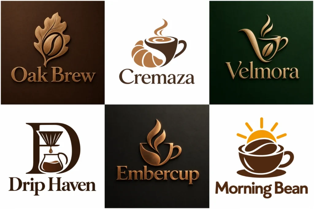
Explore Coffee and Café Logo Ideas
The portfolio showcases a varied mix of original café and coffee branding concepts, from refined wordmarks and simple symbols to detailed badges and flexible combination marks. Each design is approached with careful typography, balanced composition, and practical use in mind.
The goal is not just to create something attractive on screen, but a visual identity that can work naturally across storefront signs, cups, menus, packaging, social media, and other customer touchpoints.
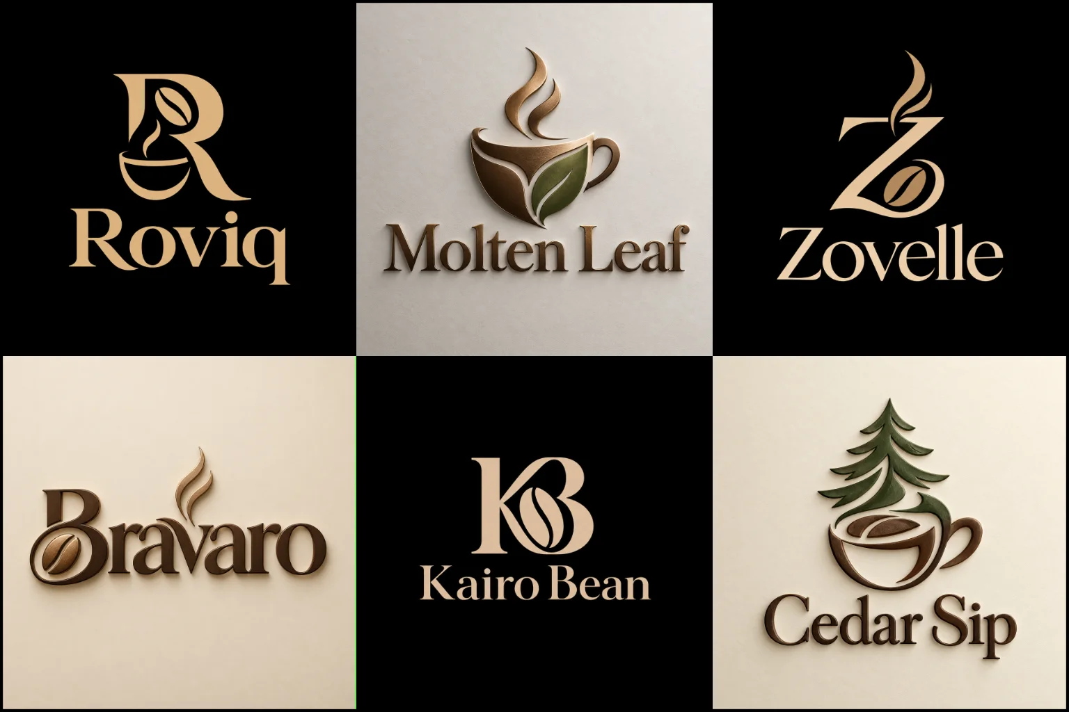
Your Logo Should Match the Experience Inside
People often form an impression of a café before tasting the coffee. The storefront, menu, packaging, interior style, social profiles, and visual identity all contribute to expectations.
A neighborhood coffee house with warm wooden interiors may need a very different identity from a bright specialty coffee bar focused on pour-over brewing. A dessert café may benefit from a softer or more expressive look, while a premium roaster may need something restrained and sophisticated.
This is why the design direction should begin with the character of the business rather than with a trendy coffee icon. The logo needs to communicate the right atmosphere while remaining recognizable and easy to use.
LogoPixa approaches café branding by considering the business name, audience, positioning, environment, products, and places where the identity will appear.
Finding the Right Visual Direction for Your Café
There is no single logo style that works for every coffee business. The strongest direction depends on what customers should feel when they encounter the brand.
A contemporary espresso bar may benefit from clean modern logos built around simple typography and controlled shapes. This approach can create a crisp appearance that works especially well for urban cafés, takeaway coffee brands, and minimal interiors.
For an artisan roastery, traditional coffee house, or business inspired by heritage aesthetics, classic vintage branding can provide more character. Badges, carefully selected typefaces, subtle decorative elements, and handcrafted influences can support that style, but too much detail may reduce readability at small sizes.
A clean line-based logo is another useful option for cafés that want an elegant, lightweight identity. Simple line illustrations can reference cups, beans, steam, brewing tools, architecture, plants, or other relevant ideas without making the mark feel heavy.
The purpose is not to choose a style because it is fashionable. It is to choose one that fits the business and can remain useful as the brand grows.
More Than Coffee Beans and Cup Icons
Coffee-related symbols can be effective, but familiar imagery needs thoughtful execution. A generic cup with steam may communicate the industry quickly, yet it can also make one café look similar to many others.
A more distinctive concept can come from the business name, location, specialty, atmosphere, origin story of the name, brewing method, architecture, or another meaningful characteristic of the brand.
For example, an identity might draw inspiration from a mountain name used by a roaster, a recognizable letter within the café name, a botanical element connected with coffee cultivation, or a subtle visual reference to a brewing process.
The concept should still be understandable. Originality does not mean making the symbol so abstract that customers cannot connect it with the personality of the business.
Typography Has a Major Role in Café Branding
The business name is often one of the most visible parts of a café identity, so typography deserves as much attention as the icon.
Bold geometric lettering can create a modern urban feel. Refined serif typography may suit an established or premium coffee house. Rounded letterforms can feel friendly and casual, while handcrafted lettering can support an artisan atmosphere when used carefully.
Readability is essential. Decorative fonts may look attractive at a large size but become difficult to read on takeaway cups, small labels, loyalty cards, social profile images, or mobile screens.
Spacing also matters. Letter spacing, line arrangement, weight, proportions, and the relationship between the symbol and business name can determine whether a logo feels professionally balanced or visually awkward.
A Flexible Logo Can Work Across More Brand Touchpoints
Coffee businesses often use their identity in many different formats. A logo may appear above a storefront one day and on a tiny cup sticker the next.
A combined brand mark can be especially practical because it brings the symbol and business name into one identity while allowing the visual elements to work together clearly. Depending on the final design system, this type of structure can adapt well to signs, menus, packaging, delivery materials, digital profiles, and promotional graphics.
However, adding more elements does not automatically make a logo stronger. If the business has a short, memorable name, a simple typographic approach may be more effective. If the name is long, the layout needs additional care so that it remains balanced and readable.
The best structure is the one that fits both the identity and the places where customers will actually see it.
Designing for Cups, Menus, Packaging, and Storefronts
A café logo is rarely used in only one place. It needs to remain functional across physical and digital applications.
On a storefront, the design should be recognizable from a useful viewing distance. On a coffee cup or pastry label, it needs enough clarity to remain legible at a smaller scale. On menus, delivery packaging, websites, and social media, the identity should feel consistent without dominating the entire layout.
This practical thinking can influence how much detail belongs in the design. Thin decorative elements may disappear when printed small. Extremely wide layouts can be difficult to use in square social profiles. Complicated illustrations may lose impact on stamps or small stickers.
A visually appealing concept becomes more valuable when it also handles these everyday branding situations well.
Choosing Colors That Support the Brand Personality
Brown is strongly associated with coffee, but a café identity does not have to use brown simply because it sells coffee.
Warm neutrals can create a comfortable, earthy atmosphere. Black and cream can feel refined and timeless. Green may support an organic or fresh positioning, while brighter colors can make a youthful café or dessert concept feel more energetic.
Color should support the brand rather than become the entire concept. The logo also needs enough contrast to remain clear against the backgrounds where it will appear.
It is useful to consider how the identity behaves in simpler applications too. A strong mark should not depend entirely on complicated gradients, effects, or multiple colors to remain recognizable.
Different Coffee Businesses Need Different Branding Priorities
A specialty roaster may want the identity to emphasize craft, origin, quality, and knowledge of coffee. A local neighborhood café may care more about warmth, familiarity, and approachability.
Drive-through coffee businesses often benefit from bold, easily recognized marks because customers may see the branding quickly from a vehicle. Bakery cafés may need an identity that comfortably represents both drinks and food without becoming overloaded with symbols.
Mobile coffee carts and pop-up cafés have different practical needs again. Their branding may appear prominently on vehicles, carts, banners, cups, and social media, making simplicity and visibility particularly important.
For a business planning several locations, consistency becomes more important. The identity needs enough personality to feel distinctive while remaining straightforward to reproduce across different environments.
What Makes a Café Logo Memorable?
Memorability usually comes from a clear idea rather than from adding more visual elements.
A distinctive letter treatment, an unexpected use of negative space, a recognizable silhouette, or a carefully simplified symbol can give an identity personality without making it complicated.
The relationship between the name and symbol also matters. When the two feel connected, the design is easier to understand as one brand rather than as an icon placed beside unrelated text.
A memorable identity should also feel appropriate. A playful cartoon character might work well for a family-focused dessert café, but it could feel out of place for a quiet premium espresso bar. Likewise, an extremely formal identity may not suit a casual student café.
Good design balances recognition, relevance, simplicity, and character instead of pushing one quality at the expense of everything else.
Building an Identity Around Your Business Name
The name itself can often provide the strongest starting point for a logo.
Names connected with places, animals, plants, people, objects, emotions, or particular concepts may naturally suggest visual ideas. Other names work better through typography, letterforms, initials, or abstract shapes.
A designer should not force a literal coffee reference when the name already offers a stronger branding opportunity. Sometimes a subtle connection produces a more distinctive result than placing a coffee bean directly into the design.
It is also worth considering how customers will say, remember, search for, and recognize the name. The visual identity should support the name rather than make it harder to understand.
Creating a Professional Café Identity With LogoPixa
LogoPixa focuses on developing a visual direction that fits the character of the business instead of relying on a standard café template.
The design process considers the brand name, intended audience, desired atmosphere, industry cues, typography, symbolism, proportions, and practical applications. The aim is to create an original identity that feels considered and remains useful beyond a single presentation mockup.
If you are opening a new café, refreshing an existing coffee brand, or preparing a specialty concept for launch, reviewing different design directions can help you decide whether your identity should feel modern, handcrafted, traditional, playful, bold, or understated.
Explore More Logo Options
Browse more logo design by industry to explore branding options created for different types of businesses.
You may also be interested in:
Frequently Asked Questions
What should a coffee shop logo include?
It should include only the elements needed to communicate the brand clearly. This may be the business name, a symbol, distinctive typography, or a combination of these. Coffee cups, beans, and brewing tools are optional rather than required.
Does my café logo need a coffee cup or coffee bean?
No. These symbols quickly communicate the industry, but they are widely used. A concept based on your business name, location, specialty, or brand personality may create a more distinctive identity.
Which logo style works best for a modern coffee shop?
Simple typography, restrained shapes, and clean compositions often work well for contemporary cafés. However, the right style depends on the interior atmosphere, audience, menu, positioning, and overall personality of the business.
Can a vintage logo work for a new café?
Yes. A newer business can use a vintage-inspired identity if the style matches its atmosphere and positioning. The design should still be carefully simplified so it remains readable on signs, packaging, cups, and digital platforms.
Should my coffee shop logo match the interior design?
They do not need to look identical, but they should feel connected. A highly luxurious identity may feel inconsistent with a playful casual interior, while a rustic café may feel disconnected from an extremely futuristic logo.
What colors are suitable for a café logo?
Brown, cream, black, green, red, and warm neutral tones are common, but there is no required café color palette. Colors should reflect the personality of the business and provide enough contrast for practical use.
Can the same logo work on cups and storefront signs?
A well-planned identity can be designed with both uses in mind. Fine details that look good on a large sign may disappear on a small cup, so clarity, proportions, and scalability should be considered during the design process.
Is a simple logo better for a coffee shop?
Simple designs can be easier to recognize and reproduce, but simplicity alone does not guarantee a strong identity. The logo still needs a relevant concept, appropriate typography, balanced proportions, and enough personality to distinguish the brand.
How do I choose between a symbol and a text-based café logo?
Consider the business name and how customers are likely to encounter the brand. A distinctive short name may work well as typography alone, while a symbol can provide an additional recognizable element for cups, signs, social profiles, and packaging.
Can a café logo also represent bakery or dessert products?
Yes, particularly when the café serves more than coffee. The concept does not need to illustrate every product. A broader brand idea can often represent the complete experience more effectively than combining cups, bread, cakes, and other items into one complicated symbol.
What information is useful before designing a café logo?
The most useful information includes the business name, type of café, target audience, preferred atmosphere, important products or specialties, desired visual direction, color preferences, and the main places where the identity will be used.
When should an existing café consider updating its logo?
An update may be worth considering when the current identity is difficult to read, looks inconsistent with the business, does not reproduce well, feels outdated compared with the actual customer experience, or no longer reflects how the café is positioned.