Technology Logo Design for Modern Tech Brands
LogoPixa develops clear logo concepts around your company name, audience, product, and brand personality rather than relying on generic tech symbols. Explore the portfolio to see different directions and find a visual approach that fits how your business should be perceived.
Explore Our Technology Logo Portfolio
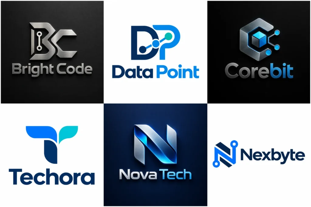
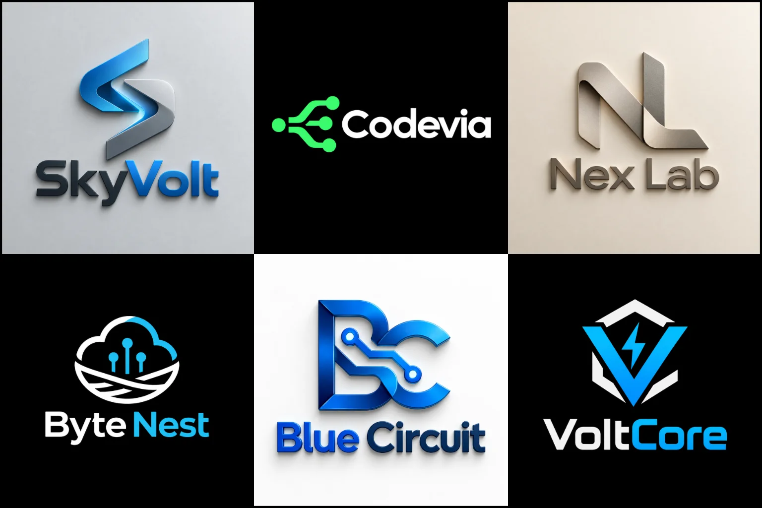
Explore a varied selection of technology-focused logo concepts built with original symbols, custom typography, geometric forms, abstract ideas, and flexible layouts. The portfolio shows different levels of simplicity, energy, precision, and visual character while keeping practical use in mind.
Each concept is presented professionally so you can judge the core idea, not just decorative effects, and see how a strong identity can translate across common digital and everyday brand applications.
A Tech Logo Should Communicate More Than Innovation
Technology companies often want to look innovative, but innovation alone is too broad to define a useful visual identity.
A cybersecurity company may need to communicate protection, control, and reliability. A software startup might want to feel accessible and progressive. An AI platform may need a more intelligent, technical personality, while an enterprise IT company could benefit from a stable and professional appearance.
The design direction should come from what the business actually does, who it serves, and how customers should perceive it.
This prevents the identity from becoming another generic combination of blue gradients, circuit lines, pixels, or glowing effects.
A clear concept can still feel advanced without using obvious futuristic imagery.
Technology Brands Have Different Visual Needs
The technology sector includes businesses with very different audiences and products.
Logo requirements can vary across:
SaaS platforms
Software companies
Artificial intelligence businesses
Cybersecurity brands
Cloud services
IT support companies
Data and analytics platforms
Fintech businesses
Robotics companies
Electronics brands
Telecommunications
IoT products
Developer tools
Digital agencies
Technology consulting
Health technology
Business automation platforms
A consumer app may benefit from a friendly, simple identity that feels approachable on a mobile screen. An enterprise software company may require a more controlled visual system that works in sales presentations, dashboards, documentation, and corporate environments.
The industry label alone should never decide the style.
Building a Symbol Around the Brand Idea
Technology logos are often symbol-led because a compact visual mark can work well for software icons, profile images, favicons, app interfaces, and other digital spaces.
The challenge is making the symbol meaningful without turning it into a literal diagram of the product.
Ideas such as connection, automation, intelligence, speed, security, integration, communication, data, transformation, networks, and precision can be expressed through shape relationships rather than obvious illustrations.
For brands that want a conceptual identity, custom abstract logos can provide more creative freedom. A non-literal symbol can represent a broader idea without restricting the company to one product or service.
That flexibility is useful for technology businesses whose products may change or expand, although an abstract symbol still needs enough structure and personality to avoid looking random.
Geometry Works Well When It Has a Purpose
Circles, grids, angles, nodes, lines, polygons, repeated modules, and interconnected forms naturally fit many technology identities.
They can communicate systems, accuracy, organization, movement, or connectivity.
However, simply combining geometric shapes does not automatically create a technology brand.
A stronger approach gives those shapes a reason to exist. They might form an initial, create meaningful negative space, represent a connection between elements, or establish a distinctive silhouette.
A shape-based logo style can work particularly well for software, engineering, data, AI, infrastructure, fintech, and B2B technology brands that want a structured appearance.
The limitation is familiarity. Basic hexagons, network nodes, and symmetrical polygons are widely used in the technology sector, so custom construction matters.
Typography Can Be the Main Identity
Not every technology company needs an icon.
A distinctive company name can become the primary visual asset when the lettering is developed carefully.
Clean sans-serif typography is common in the sector because it can feel clear and current, but using a standard font without modification can make the identity look unfinished.
Spacing, width, weight, capitalization, letter connections, custom characters, and subtle modifications can give the name a recognizable personality.
For a short or memorable brand name, custom wordmark logos may provide a simpler solution than adding a separate technology symbol.
Wordmarks can work especially well for SaaS products, software companies, digital platforms, developer services, and technology consultancies where the business name needs to become familiar.
Long names may require a different structure because they can become difficult to use in small spaces.
Modern Does Not Have to Mean Trendy
Technology branding often changes quickly because designers respond to new interface styles, products, devices, and visual trends.
Gradients, soft dimensional effects, glowing forms, rounded typography, futuristic fonts, and certain abstract symbols may become popular for a period.
A current appearance can be useful, but the logo should not depend entirely on a short-lived visual treatment.
A contemporary logo style can combine clean typography, controlled geometry, strong proportions, negative space, and distinctive details without copying whatever happens to be popular at the moment.
The goal is to make the brand feel current while retaining enough individuality to remain useful when visual trends change.
Choosing Between a Symbol, Wordmark, and Combined Identity
The right logo structure depends on the company name, recognition needs, and where the identity will appear.
A standalone symbol can be compact and useful for app icons or product interfaces, but a new business may still need its name displayed nearby while customers become familiar with the mark.
A wordmark keeps attention on the company name and avoids introducing an unnecessary symbol. It can become less practical when the name is unusually long.
A custom combination logo brings a symbol and company name together. This can be useful for technology businesses that need a complete identity for websites and presentations while also having a separate icon for smaller digital placements.
There is no single structure that works best for every technology company. Practical applications should influence the decision.
Avoiding Common Technology Logo Clichés
Some symbols communicate technology immediately, which is exactly why they are frequently overused.
Common examples include:
Circuit boards
Microchips
Generic network nodes
Binary numbers
Wi-Fi signals
Robot heads
Brains made from circuits
Random pixels
Globe grids
Generic shields for cybersecurity
Lightning bolts
Infinite loops
Letter initials placed inside hexagons
These ideas are not automatically wrong. A familiar symbol can still work if it is developed around a distinctive concept.
The problem appears when the icon could be placed beside almost any technology company name without changing its meaning.
Starting from the brand name, product, audience, values, or a specific idea usually creates more opportunities for originality.
Color Should Match the Brand Personality
Blue appears frequently in technology branding because it can feel professional, calm, and dependable. That does not mean every software or IT business needs to use it.
Purple can create a more imaginative or digital impression. Green may support themes such as efficiency, progress, sustainability, or financial technology. Black and neutral palettes can feel controlled and sophisticated, while brighter accents can make consumer-facing products feel more energetic.
The right palette depends on positioning rather than industry conventions.
Contrast also matters. A logo may appear on light and dark interfaces, website headers, mobile screens, presentation slides, social media graphics, and printed materials.
The underlying design should remain recognizable without depending entirely on gradients, effects, or multiple colors.
Designing for Apps, Interfaces, and Small Screens
Digital products create practical logo requirements that traditional businesses may not face as often.
A wide horizontal identity might work well in a website header but become difficult to place inside a square app icon.
Highly detailed symbols can lose definition when reduced to favicon size. Thin lines may disappear, and small gaps can visually close.
A strong technology identity should therefore have a clear silhouette and controlled detail.
The main logo and compact brand symbol do not always need to use exactly the same arrangement. A flexible visual system can allow the company name to appear in wider spaces while a recognizable icon handles compact placements.
These decisions should be considered during concept development rather than after the design has been finished.
AI Brands Need More Than a Brain Icon
Artificial intelligence companies face a particular branding challenge because many businesses are currently using similar visual language.
Brains, neural networks, spark symbols, robot faces, connected dots, and glowing gradients can identify the category quickly, but they can also make unrelated companies appear interchangeable.
The stronger question is what the AI product actually helps people do.
An automation platform, research tool, image application, analytics product, enterprise assistant, and machine-learning infrastructure company all solve different problems.
Their identities should not automatically look the same simply because they use artificial intelligence.
A visual concept based on the product experience, outcome, workflow, or brand name can often produce a more distinctive direction.
Cybersecurity Logos Need Credibility Without Looking Generic
Shields, locks, keys, fingerprints, and circuit patterns are closely associated with digital security.
They communicate protection quickly, which can be useful, but they are also extremely common.
A security identity can instead explore controlled geometry, negative space, defensive structures, layers, boundaries, verification, monitoring, or initials from the company name.
The visual tone also matters.
A consumer privacy product may need to feel simple and reassuring. Enterprise cybersecurity can require greater authority and technical precision.
Overly aggressive imagery may create the wrong impression when the actual service is built around trust, reliability, and professional risk management.
SaaS and Software Brands Need Flexible Identities
Software branding appears across many touchpoints, including product interfaces, login screens, websites, browser tabs, mobile apps, email communication, documentation, support portals, presentations, and social profiles.
This makes flexibility particularly important.
The identity needs enough character to become recognizable without becoming visually distracting inside the product itself.
Simple forms can work well, but excessive simplification creates another problem: many software brands begin to look nearly identical.
Distinctive letterforms, custom geometry, unusual negative space, or a recognizable symbol structure can add personality while keeping the design practical.
A Strong Logo Should Work Without a Mockup
Three-dimensional signs, device screens, embossed surfaces, and realistic mockups can help buyers imagine a logo in context.
They should not be used to judge the underlying design alone.
Lighting, shadows, textures, and perspective can make an ordinary logo appear more impressive than it actually is.
The flat version should still have balanced proportions, readable typography, recognizable shapes, and a clear concept.
This is particularly important for technology brands because much of the identity will eventually appear in flat digital interfaces.
Presentation should support the logo rather than compensate for weaknesses in it.
What Makes a Tech Identity Feel Original?
Originality does not require making the logo complicated.
It usually comes from making a few decisions that are specific to the business.
A distinctive feature could come from:
The structure of the company name
Meaningful initials
A product function
A specific customer problem
Connected letterforms
Custom negative space
An unusual geometric relationship
A recognizable silhouette
Carefully modified typography
A visual metaphor connected to the service
A simple mark with one strong idea is often easier to recognize than a complicated symbol trying to explain every feature of the company.
Think About Where the Logo Will Actually Appear
Before choosing a design direction, consider the places where customers are most likely to encounter the brand.
That might include a website, mobile app, software dashboard, browser extension, app marketplace, social account, trade show display, product packaging, hardware device, presentation, email signature, documentation, or business card.
Each environment creates different requirements.
For example, a detailed mark might perform well on a large screen but poorly as a browser icon. A long company name may fit a website header but become awkward inside a mobile interface.
Designing around actual use cases can prevent unnecessary problems later.
What to Share Before Starting Your Logo
A useful creative brief does not need to be complicated, but it should give the designer enough information to understand the business.
Helpful details include:
Company or product name
What the technology or service does
Primary audience
Main competitors or market category
Desired brand personality
Preferred visual direction
Colors you like or want to avoid
Symbols you do not want used
Main places where the logo will appear
Examples that communicate your taste
References are useful for showing direction, but they should not become designs to copy.
It is also helpful to explain why you like a reference. You may like its typography, simplicity, geometry, spacing, color treatment, or overall personality rather than the actual logo concept.
Creating a Focused Identity With LogoPixa
LogoPixa can develop a visual direction around the technology behind your business without forcing the identity into familiar industry clichés.
The process should begin with understanding the company name, product, audience, positioning, and practical applications. From there, typography, symbols, shapes, proportions, and color can support one clear idea.
Whether the suitable direction is a compact digital symbol, a typography-led identity, an abstract mark, or a flexible symbol-and-name arrangement depends on the individual brand.
A good technology logo should make the company easier to identify, not make the business look like every other technology company.
Explore More Logo Options
Browse more industry-specific logos to explore branding options created for different types of businesses.
You may also be interested in:
- medical brand identity
- logos for jewelry brands
- fitness brand identity
- esports logo design
- logos for dental practices
Frequently Asked Questions
What makes a good logo for a technology company?
A good tech logo is clear, distinctive, scalable, and relevant to the company rather than the technology industry in general. Strong typography, controlled shapes, useful proportions, and an identifiable core idea usually matter more than decorative futuristic effects.
Does a technology company need a futuristic logo?
No. A futuristic appearance may suit some AI, robotics, gaming, or emerging technology brands, but it can feel inappropriate for other businesses. The design should match the company’s audience, positioning, product, and personality.
Which logo type works best for a software company?
There is no single best type. Wordmarks can work well for distinctive names, abstract symbols can create a compact visual identifier, and combination marks can provide both a readable company name and a separate icon. The choice should depend on actual brand applications.
Should a tech logo include a circuit, chip, or network symbol?
Only when the symbol supports the specific concept. These graphics are widely used, so a generic version may make the brand look similar to competitors. A custom idea connected to the company name, product, audience, or purpose can create more distinction.
What colors are suitable for technology branding?
Blue, purple, green, black, neutral tones, and brighter accent colors can all work. The best choice depends on the personality the business wants to communicate and the backgrounds where the identity will appear. There is no required technology color palette.
Can a technology logo be minimalist?
Yes, especially when the brand needs a clean identity for digital interfaces and small screens. However, reducing detail too far can make the logo generic. A minimalist direction still needs distinctive typography, proportions, or a recognizable visual idea.
Is an abstract logo suitable for an AI or SaaS company?
It can be. Abstract forms can communicate concepts such as intelligence, connection, automation, movement, or integration without showing a literal product. The symbol still needs purposeful construction so it does not look like an arbitrary geometric shape.
Should an app icon and the main company logo be identical?
Not necessarily. The full logo may include the company name, while a simplified symbol can work more effectively inside square app icons, favicons, and other compact spaces. Both should still feel like parts of the same visual identity.
How can I avoid getting a generic tech logo?
Provide clear information about what your business does, who it serves, its personality, and what common symbols you want to avoid. Building the concept around the individual brand gives the designer more useful direction than simply requesting something modern or futuristic.