
Bakery Logo Design
Explore the portfolio to see how different creative directions can express warmth, craft, freshness, tradition, or a more modern personality without losing clarity in everyday use.
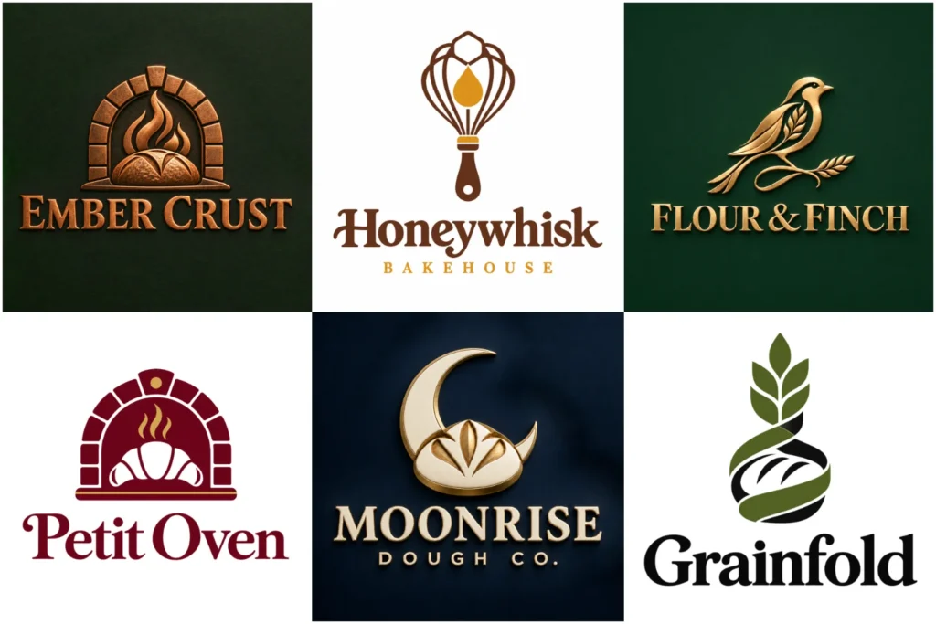
Explore Original Bakery Logo Concepts
The portfolio brings together original concepts across a range of bakery moods, from friendly neighborhood shops to refined patisseries and contemporary dessert brands. Each example shows careful attention to composition, lettering, visual balance, and scalable detail.
Some pieces may be exploratory rather than commissioned work, but every design demonstrates a practical branding approach that can translate effectively to packaging, signage, menus, uniforms, websites, and social profiles while retaining a consistent brand character.
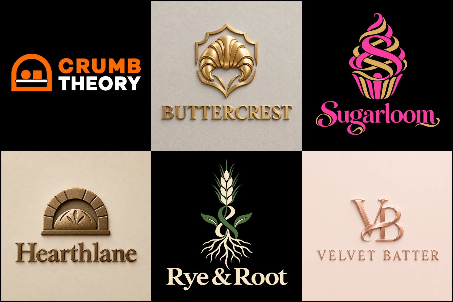
Give Customers the Right First Impression
Customers often form an opinion about a bakery before tasting anything. The name, storefront, packaging, photography, and logo work together to suggest what kind of experience they can expect.
A handcrafted bread shop may benefit from an earthy, established identity. A colorful cupcake business might need something more cheerful and expressive. An artisan patisserie could require elegant lettering and restrained details, while an online dessert brand may need a bold mark that remains clear on mobile screens.
The purpose is not simply to place a loaf, cake, or whisk beside the business name. A successful identity communicates the bakery’s personality without becoming complicated or predictable.
Different Bakeries Need Different Visual Directions
Bakery businesses can vary significantly in their products, audience, price range, and selling environment. The visual direction should be based on those differences.
Common bakery categories include:
Artisan bread and sourdough shops
Cake studios and custom cake businesses
Cupcake and cookie brands
Pastry shops and patisseries
Home-based baking businesses
Dessert cafés and takeaway counters
Wholesale and commercial bakeries
Gluten-free, vegan, or specialty bakeries
Online bakeries and delivery-focused brands
A home baker selling celebration cakes may need a warm and personal identity. A wholesale bread supplier usually requires a more structured and versatile system. Choosing the direction around the actual business helps the finished mark feel credible rather than decorative.
Choosing the Right Logo Format
The logo format affects how easily the identity can be used across bakery boxes, labels, stamps, shop signs, and digital channels.
A Combination Mark Logo brings the business name and symbol together. This is often useful for newer bakeries because customers can see the name while gradually becoming familiar with the icon.
A Pictorial Mark Logo uses a recognizable image, such as a carefully developed pastry, grain, oven, or baking-related object. It can become memorable, but the symbol must be distinctive enough to avoid looking like generic stock artwork.
Businesses with a strong heritage or handcrafted positioning may consider a Vintage Logo. This direction can create warmth and character, although excessive distress, decorative borders, or tiny details may reduce readability.
A refined Line Art Logo can suit cake studios, boutique bakeries, and delicate pastry brands. It works best when the lines are controlled and simple enough to reproduce at small sizes.
Familiar Bakery Symbols Without a Generic Result
Bread, wheat, rolling pins, cakes, ovens, chef hats, and whisks are familiar industry symbols. They help viewers understand the business quickly, but they are also widely used.
Originality comes from how an idea is interpreted. A wheat stem might be integrated into a letterform. The negative space inside an initial could suggest a loaf. A pastry shape may be simplified into a distinctive silhouette rather than drawn as a detailed illustration.
Not every bakery needs an obvious food icon. Typography, monograms, abstract forms, patterns, or packaging-inspired shapes can communicate the right character without relying on a literal baking symbol.
The chosen concept should remain easy to understand, but it should not feel interchangeable with dozens of other bakery identities.
Typography That Matches the Bakery
Lettering has a major influence on how a bakery brand feels. Soft serif type can suggest craft and tradition, while clean sans-serif lettering may suit a modern café or packaged food brand. Script styles can introduce warmth and elegance, particularly for cake or pastry businesses.
Highly decorative fonts require restraint. Thin strokes, tight spacing, and elaborate flourishes can become difficult to read on stickers, social media images, and small packaging labels. A beautiful wordmark loses value if customers cannot identify the bakery’s name.
The typography should also support the symbol instead of competing with it. Letter spacing, line length, weight, and alignment all need to feel intentional.
Selecting an Appropriate Color Palette
Bakery branding is not limited to brown, cream, and pastel pink. The right palette depends on the products and market position.
Warm neutrals can communicate natural ingredients and traditional baking. Rich green, burgundy, navy, or deep brown may create a more established or premium appearance. Bright colors can suit playful dessert businesses, while a restrained monochrome palette may work for a contemporary artisan bakery.
Color also needs to perform outside the main presentation. The identity should remain recognizable in black and white, on kraft packaging, against light or dark backgrounds, and in single-color printing.
If the logo only works with gradients, shadows, or a specific background, its practical use may be too limited.
Designed for Packaging and Everyday Brand Use
Bakery logos appear on surfaces of many sizes and materials. A shop sign offers plenty of room, but a pastry seal, bread tag, or social profile image may provide very little space.
A practical identity should work across:
Bread bags and cake boxes
Product labels and ingredient stickers
Wrapping paper and tissue
Rubber stamps and embossing
Menus and price cards
Storefront signs and window graphics
Aprons, uniforms, and delivery bags
Websites and ordering platforms
Social media profile images
Printed advertisements and promotional materials
Some applications may require a simplified icon or compact secondary arrangement. Planning these uses early helps prevent readability and reproduction problems later.
Balancing Personality With Clarity
A bakery logo should have character, but adding more decorative elements does not necessarily make it more memorable. Multiple icons, long taglines, ornate borders, fine lines, and several font styles can weaken the visual hierarchy.
A clearer design usually gives each element a purpose. The business name should be readable, the central concept should be identifiable, and supporting details should not distract from either.
Simplicity does not mean that every bakery must use a plain or minimalist style. Detailed identities can work well when their structure is controlled and alternate versions are available for smaller applications.
Information to Prepare Before Starting
A focused brief helps the designer make decisions based on the business instead of assumptions. Before beginning, it is useful to define:
The exact bakery name and any required tagline
The main products being sold
The intended customer group
Whether the bakery operates online, from home, wholesale, or through a physical shop
The desired brand personality
Preferred and unwanted colors
Competing brands or visual styles to avoid
Where the logo will be used, such as on packaging, signage, menus, or social media
Any meaningful story, ingredient, location, or tradition connected to the name
References can help communicate preferences, but they should guide the overall mood rather than become designs to copy.
A Focused Route From Brief to Identity
The design should begin with the bakery’s positioning, audience, products, and practical requirements. These details guide the choice of typography, imagery, composition, and color.
Early concepts explore different ways to express the same business. One route might focus on the name, another on a distinctive product or ingredient, and another on the atmosphere customers should associate with the bakery.
Refinement then improves the strongest direction by adjusting proportions, spacing, letterforms, shapes, and visual balance. The mark should also be reviewed at different sizes and on realistic applications before it is treated as a usable identity.
LogoPixa can help turn the selected direction into a clear and original brand mark built around how the bakery actually sells and presents its products.
Explore More Logo Options
Browse more logo industries to explore branding options created for different types of businesses.
You may also be interested in:
- interior design branding
- dining brand identity
- hotel brand identity
- food business branding
- coffee brand identity
Frequently Asked Questions
What makes a good bakery logo?
A good bakery logo reflects the business’s products and personality while remaining clear, recognizable, and practical. It should work on both large signs and small packaging without relying on unnecessary detail.
Should my logo include bread, cake, or wheat?
It can, but it is not required. Familiar baking imagery communicates the industry quickly, although it should be interpreted in an original way. Some businesses are better represented through distinctive typography, initials, or a less literal symbol.
Which colors work well for a bakery brand?
Warm neutrals, natural greens, soft pastels, deep reds, and rich browns are common choices, but no single palette suits every bakery. Colors should match the products, audience, atmosphere, and market position.
Is a script font suitable for a bakery?
Script lettering can suit cake studios, patisseries, and brands seeking a handcrafted or elegant feel. It should be tested carefully because highly decorative scripts can become difficult to read at small sizes.
Can one logo work on boxes, labels, and shop signs?
A well-planned identity can work across these applications, but it may need responsive versions. A full arrangement can be used on signs and boxes, while a compact icon may work better on seals, labels, and social profiles.
Should a home bakery look different from a retail bakery?
Not necessarily, but the operating model affects the design priorities. A home bakery may depend heavily on social media and packaging, while a retail bakery also needs strong storefront visibility and signage.
Is a detailed vintage design suitable for small labels?
It can be, provided the details remain legible when reduced. If the full design becomes unclear, a simplified secondary version may be needed for stickers, stamps, or small product tags.
How do I choose between a playful and premium direction?
Consider the products, pricing, customer expectations, and buying experience. A children’s cupcake brand may benefit from a playful identity, while a specialist patisserie may need a more restrained and refined appearance.