
Construction Logo Design
Whether you are launching a company or updating an outdated identity, the goal is a mark that fits your business and works across real applications. Explore the portfolio to see different creative directions.
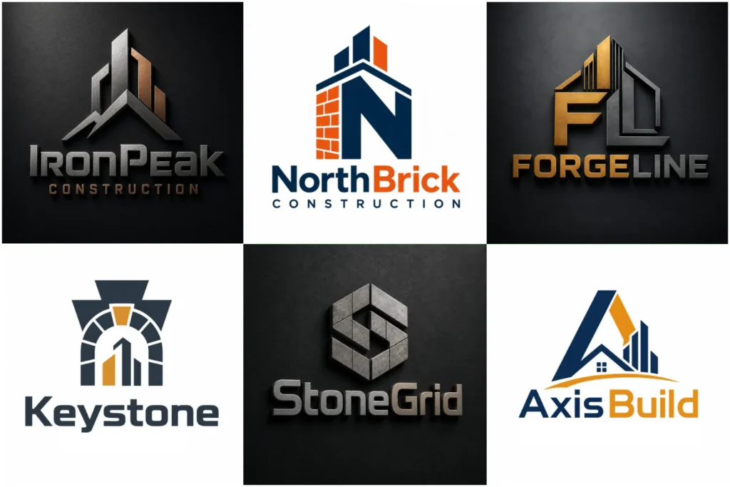
Explore Construction Logo Concepts
Browse a range of professionally developed concepts created to show different approaches to building and contractor branding. The collection includes bold symbols, structured typography, architectural references, monograms, and clean contemporary layouts.
Each concept is developed with originality, visual balance, readability, and practical brand use in mind. These examples can help you identify the direction that feels appropriate for your company, whether you prefer something industrial, established, modern, technical, or straightforward.
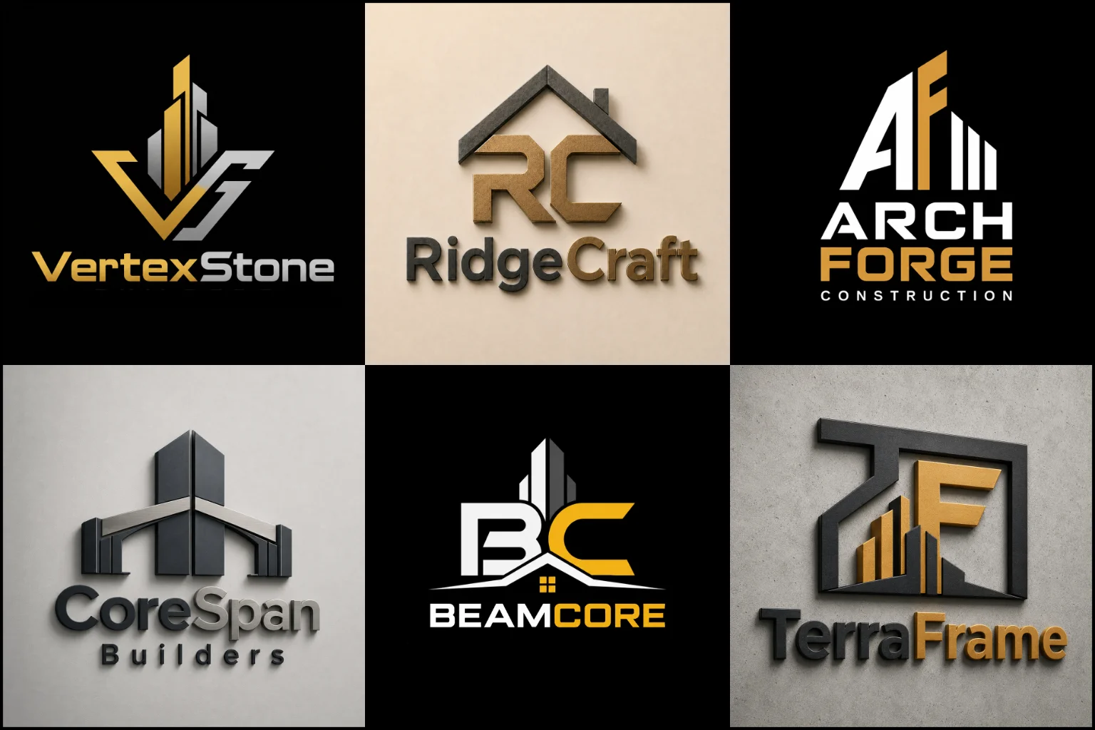
Building a Brand That Looks Reliable
Construction companies often compete in markets where customers compare several contractors before making contact. Your identity may appear on a website, estimate, truck, job-site sign, uniform, equipment, social profile, or business card before anyone speaks with you.
That makes clarity important.
A useful construction identity should be recognizable without becoming complicated. It needs enough character to feel distinctive, but it should also remain clear when printed small, enlarged for signage, embroidered on workwear, or placed on a vehicle.
The visual direction should also match the actual company. A residential remodeler may need a very different identity from a commercial contractor, engineering firm, excavation company, or luxury home builder.
What Makes a Construction Logo Effective?
There is no single symbol or layout that every contractor should use. Strong identities usually come from several design decisions working together.
Clear structure: Construction is closely associated with planning, precision, strength, and organization. Balanced shapes and controlled spacing can communicate those qualities without relying on obvious construction graphics.
Readable typography: Company names need to remain legible on signs, vehicles, uniforms, websites, and paperwork. Decorative lettering can work in some cases, but readability should not be sacrificed simply to make the design unusual.
Memorable form: A mark should have enough individuality that it does not look interchangeable with dozens of competitors.
Useful proportions: Horizontal, stacked, and compact arrangements may be considered depending on where the identity will appear.
Controlled detail: Fine lines and complicated illustrations can disappear at small sizes or become difficult to reproduce on physical materials.
Symbols That Can Work for Construction Brands
Roofs, buildings, tools, cranes, hard hats, houses, beams, and skylines are common in the industry. These symbols are not automatically bad, but using them without a distinctive idea can make a company look generic.
A Pictorial Mark Logo can work when a recognizable object genuinely represents the company. A custom building form, structural component, or industry-related object can become memorable when it is simplified and interpreted in an original way.
Companies wanting both a recognizable symbol and a clearly visible business name may prefer a Combination Mark Logo. This format provides flexibility because the icon and name can often work together or separately depending on the application.
The important part is not how many construction elements can be placed inside the logo. It is how clearly one strong idea can represent the business.
Using Initials and Company Names Effectively
Many contractors operate under a family name, surname, initials, or a short company abbreviation. In those cases, typography can become a major part of the identity.
A Monogram Logo may be suitable when initials are already important to the business name. Interlocking or custom-built letterforms can create a compact mark for helmets, equipment, vehicle doors, profile images, and uniforms.
The letters still need to be easy to understand. Excessively abstract monograms may look interesting at first but become difficult for customers to identify.
For companies with established or heritage positioning, an Emblem Logo can also be considered. Emblems can create a strong badge-like presence, especially for trades, contractors, and firms that want a traditional or established appearance. The limitation is that detailed emblems require careful simplification so they remain usable at smaller sizes.
Choosing the Right Visual Style
The design style should reflect how the company wants to be perceived, not simply what is currently popular.
A Modern Logo may suit developers, architectural contractors, commercial builders, engineering businesses, and newer construction companies that want a clean and current appearance. Modern does not have to mean overly minimal. Strong typography and simplified forms can still communicate substance and experience.
A Geometric Logo is another natural direction because geometry connects well with architecture, measurement, structure, planning, and construction. Angles, grids, blocks, negative space, and carefully controlled shapes can produce distinctive symbols without showing literal tools or buildings.
Traditional businesses may prefer heavier typography and established visual cues, while premium residential builders may benefit from more restrained lettering and refined proportions.
The right direction depends on the company, market, services, audience, and intended applications.
Construction Businesses That Need Different Branding Approaches
The construction industry includes many different types of businesses, so one visual formula should not be applied to all of them.
A general contractor may need an identity that feels versatile because the company handles several types of projects. A roofing company can use a more focused visual direction, while an excavation contractor may benefit from heavier forms that match large equipment and outdoor applications.
Home builders often need branding that appeals directly to homeowners. Commercial construction companies may want something more corporate and structured. Renovation specialists can lean toward approachable, modern branding, while engineering and infrastructure firms may require a more technical appearance.
Relevant sectors can include:
General contracting
Residential construction
Commercial construction
Home building
Remodeling and renovation
Roofing
Concrete work
Excavation
Carpentry
Masonry
Electrical contracting
Plumbing
HVAC
Engineering
Architecture and development
Landscaping and outdoor construction
Interior contracting
Property development
Understanding what the company actually builds is usually more useful than choosing a symbol simply because it looks related to construction.
Typography Should Match the Company
Bold sans serif typefaces are common in contractor branding because they can remain readable from a distance. However, that does not mean every construction business needs heavy block lettering.
Typography can communicate different characteristics.
Wide uppercase lettering may feel stable and established. Condensed lettering can create a compact industrial appearance. Clean geometric type can support a contemporary building company. A serif typeface may suit a heritage contractor or premium residential builder when used carefully.
Custom letter modifications can also create distinction without making the company name difficult to read.
Good typography depends on more than the font choice. Balanced spacing, clean kerning, and consistent proportions help the logo feel polished, professional, and complete.
Choosing Colors for a Construction Brand
Construction branding often uses dark blue, black, orange, yellow, red, gray, green, or earth tones, but no color automatically communicates trust, strength, or quality.
The right palette depends on the brand position and competitive environment.
Black and charcoal can feel strong and controlled. Blue can create a professional and corporate appearance. Orange or yellow can provide high visibility and connect naturally with job-site environments. Earth tones may suit builders working with timber, landscaping, sustainable construction, or natural materials.
A color combination should also remain practical when reproduced on vehicles, safety clothing, equipment, printed documents, and digital backgrounds.
The identity should still make sense in one color because some applications will not support the full palette.
Avoiding Generic Contractor Branding
One of the biggest challenges in this industry is similarity.
Search through construction businesses in almost any city and you will find repeated combinations of roofs, houses, hammers, skyscrapers, hard hats, and initials inside buildings.
These elements can still be used, but they need a stronger concept behind them.
Instead of simply placing a roof above a company name, the shape might integrate with a letter. A building form could be created through negative space. Initials might be structured like beams. A simple architectural form could reflect a particular service or company characteristic.
Originality does not require making the design complicated. Often, a small but thoughtful idea creates more identity than adding several construction symbols together.
Practical Use Matters as Much as Appearance
A contractor’s logo rarely stays on a website alone.
It may appear on:
Work trucks and trailers
Construction equipment
Hard hats
Safety vests
Work shirts and jackets
Building signs
Project boards
Temporary site fencing
Business cards
Estimates and invoices
Proposal documents
Social media profiles
Website headers
Email signatures
Printed advertisements
A design that looks attractive on a large computer screen may fail when embroidered or printed on a small surface.
For that reason, line thickness, text size, icon complexity, spacing, and contrast should be considered during the design process rather than after the logo is finished.
Should the Logo Show Exactly What the Company Does?
Not always.
A roofing company can use a roof-related symbol because it immediately communicates the service. However, a general contractor planning to expand into development, remodeling, or commercial projects might find an overly specific symbol restrictive later.
The business name, positioning, and growth direction should influence this decision.
Sometimes a broader symbol creates more flexibility. Initials, abstract structural shapes, geometric forms, or typography-based identities can represent the company without tying it permanently to one service.
Literal imagery can improve immediate understanding. Broader branding can provide more room for expansion. Neither option is automatically better.
Designing for Local Contractors and Larger Firms
A small local contractor may depend heavily on truck graphics, signs, referrals, and local search. The company name therefore needs to be highly visible and easy to remember.
A larger construction firm may have more applications, including uniforms, reports, proposals, presentations, project signage, digital platforms, and multiple business divisions. A flexible identity system becomes increasingly important as the company grows.
This does not mean a small business needs a simple-looking identity while a larger company needs a complicated one. Both benefit from clear design. The difference is usually in how the identity needs to function across different environments.
Refreshing an Outdated Construction Identity
A business does not always need to abandon everything recognizable about its existing brand.
If customers already know the company name, initials, color palette, or a particular symbol, those elements can sometimes be refined instead of removed.
Common reasons for updating an identity include outdated typography, excessive detail, poor readability, inconsistent proportions, weak digital performance, or a design that no longer reflects the services the company offers.
The goal of a redesign should be improvement, not change simply for the sake of change.
LogoPixa can develop a new visual direction or refine the overall branding approach based on the company name, services, audience, and preferred character while keeping practical use in mind.
What to Consider Before Choosing a Concept
Before deciding on a final direction, imagine the design outside the presentation mockup.
Would the company name be readable on a moving truck?
Can the symbol be recognized on a social profile?
Will thin details survive embroidery?
Does it still work without a background effect?
Does it represent the type of projects the company wants to attract?
Could it still fit the business if services expand?
Does the design resemble competitors too closely?
A concept should answer practical questions as well as visual ones. A dramatic mockup can make almost any design look impressive, but the underlying mark needs to work without lighting effects, textures, shadows, or presentation styling.
Explore More Logo Options
Browse more logo industries to explore branding options created for different types of businesses.
You may also be interested in:
- logos for architecture firms
- logos for plumbing companies
- logos for cleaning businesses
- logos for property businesses
- logos for trucking companies
Frequently Asked Questions
What should a construction company logo include?
It should include only the elements needed to create a clear and recognizable identity. This may be a company name, initials, symbol, or a combination of these. Construction tools and buildings are optional rather than required.
Does my logo need a house or building icon?
No. Literal construction imagery can help communicate the industry quickly, but initials, geometric forms, abstract structural ideas, or strong typography can work equally well when they fit the brand.
What colors work well for contractors?
Dark blue, black, gray, orange, yellow, red, green, and earth tones are commonly used, but color should be chosen according to the company’s personality, audience, competitors, and applications rather than industry convention alone.
Should a construction logo be bold?
Bold forms are useful for vehicles, equipment, signs, and workwear, but visual strength does not always require very heavy shapes. Premium builders, architects, and specialized contractors may benefit from a more refined approach.
Can initials be used instead of a construction symbol?
Yes. Initial-based identities can work particularly well for businesses with long names or companies commonly known by their initials. The letterforms should remain recognizable rather than becoming overly abstract.
Is a detailed emblem suitable for a contractor?
It can be, particularly when the company wants an established or traditional identity. However, the detail must be controlled so the emblem remains readable when used on smaller applications.
Should the logo match the colors of construction equipment?
Not necessarily. Equipment colors can influence the palette if branded vehicles and machinery are major applications, but the company should still choose colors that create a consistent and distinctive identity across all uses.
Can the same logo work on trucks, uniforms, and websites?
A well-planned identity can be designed for all of these environments, although different arrangements may sometimes be useful. A horizontal version may work better on a vehicle, while a compact symbol may be more suitable for a profile image or helmet.
How can a contractor avoid a generic-looking logo?
Start with the company’s actual name, services, personality, market, and positioning instead of selecting a common construction icon first. Custom typography, negative space, distinctive letterforms, and original symbol ideas can create stronger differentiation.
Is a simple logo better for construction businesses?
Simple designs often reproduce more reliably, but simplicity alone does not make a logo effective. The goal is to remove unnecessary detail while keeping enough character to make the identity recognizable and appropriate for the company.
Should an established contractor redesign an old logo?
Only when there is a clear reason. If the existing identity has recognition, useful elements can sometimes be retained and refined. A redesign may be worthwhile when the current mark is difficult to read, outdated, hard to reproduce, or no longer reflects the business.