
Combination Mark Logo Design for a Flexible Brand Identity

Explore Our Combined Logo Portfolio
Explore a portfolio of combination marks where each clear symbol and business name work together through balanced typography, familiar lettering, and meaningful imagery. These concepts show how a custom identity becomes recognizable and distinctive across digital and printed applications. Different styles, layouts, and graphic symbols help customers understand the brand, while practical visual structure supports flexible use over time. See how each format connects ideas, develops clarity, and gives every business room to build.
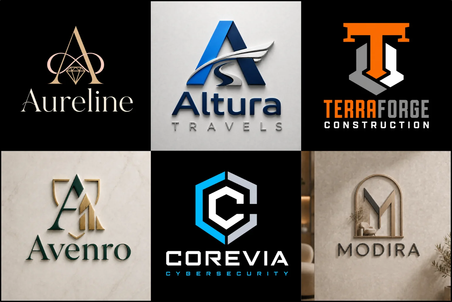
What Is a Combination Mark
It is a logo structure that pairs a distinct icon with the company name. These two elements work together, giving the audience identification while providing brand clarity, memorable character, and a professional appearance.
The full arrangement builds recognition during early stages, while approved versions may place the icon beside, above, or separately from the wording. This flexibility provides brand consistency across websites, labels, merchandise, presentations, and small spaces.
The symbol does not always need a literal connection to a product or service. A relevant, original idea can instead clearly communicate the brand’s values, personality, direction, or intended meaning without becoming predictable or complicated.
Typography gives the symbol support. A suitable typeface, easy to read, controlled weight, letterforms, and balanced proportion help parts belong within one composition, preventing the text from dominating or the icon from appearing visually unrelated.
Because the parts can be rearranged, this format offers practical adaptability for print and digital media. Careful planning produces a primary logo, horizontal and stacked variations, and compact options that remain recognizable at different sizes.
Why Businesses Choose This Format
A business may choose a combined identity because it includes a memorable icon and clear company name. This balanced relationship allows immediate identification, helping audiences understand the brand while recognition becomes stronger across different platforms.
The icon and wordmark stay combined when used together, then appear separately where space is limited. This flexibility helps the identity adapt to a website header, avatar, favicon, email signatures, packaging, signage, and square layouts.
This format also suits businesses that need visual character and direct communication. In restaurant branding, a recognizable symbol can suggest the cuisine or dining experience, while the business name remains visible and easy to understand.
For a new or growing business, text paired with imagery reduces reliance on symbol recognition alone. The wording clearly explains the company, while the symbol adds personality, can improve recall, and allows future brand development.
A business may prefer this format for creating an identity without sacrificing adaptability. When typography, colors, and positioning are well structured, the result feels unified, distinctive, readable, and practical across many online and physical applications.
When This Logo Style Works Best
It works best when a business needs a symbol and word-based name to communicate together. This structure makes a new brand easier to remember, while giving customers enough information to understand its identity quickly.
This format is especially useful when the icon may later appear alone on an app, browser tab, social image, or product. A strong silhouette supports recognition, while the company name maintains clarity during brand development.
This format can also work well for brands exploring a Modern Logo direction while still keeping both the company name and a recognizable symbol visible.
This flexibility is particularly useful in logos for construction companies, which may appear across wide site signs, vehicles, uniforms, safety equipment, and digital materials. Horizontal and stacked arrangements help the identity adapt without losing contrast, readability, or visual balance.
The style is appropriate when a brand wants a modern, premium, friendly, or established impression without relying entirely on text. Selecting a meaningful, original symbol helps distinguish competitors and avoids generic, overused, or copied ideas.
It becomes less suitable when a long name, detailed artwork, or oversized tagline creates a crowded result. Testing across small-size applications and large displays ensures every component remains clean, balanced, scalable, readable before production begins.
Situations Where It May Be Less Suitable
It may be less suitable when a long company name and complex symbol must compete within limited space. At small sizes, details, narrow gaps, or fine lines can disappear, reducing clarity and recognition.
Businesses seeking a purely text-based identity may find the symbol unnecessary, especially when the name already communicates the offer. Adding another element can weaken focus, create repetitive meaning, and make the overall design feel heavy.
For brands needing a contained badge, crest, or emblem, an open symbol-and-name layout may not fit the desired structure. A traditional seal often provides stronger authority, while a mascot better suits character-led, approachable communication instead.
This format can also become unsuitable when applications require simple reproduction. Embroidery, one-color printing, tiny favicons, or a restricted panel may expose production difficulties, particularly when separate components cannot be reduced, displayed, or prepared properly.
Before committing to this approach, consider every requirement rather than rating only the first impression. If flexibility, readability, or originality still suffers after refinements, another logo style may offer a clean and more useful foundation.
Connecting the Symbol and Brand Name
Connecting a symbol with the brand name requires a clear visual relationship. Their proportions, spacing, and shared tone should feel intentional, helping viewers interpret both elements as one coherent identity instead of separate, unrelated pieces.
The chosen font should support the symbol’s geometry without copying it closely. Matching stroke weight, curves, and visual rhythm creates unity, while thoughtful capitalization and letter spacing protect readability and keep the name visually distinctive.
The relationship should remain stable across horizontal, stacked, and compressed layouts. Adequate space prevents the name from competing with the symbol, while careful alignment keeps both parts balanced consistently on light, dark, or cropped backgrounds.
When the symbol appears alone, it should retain the strongest qualities of the complete mark. Repeated use beside the name helps audiences associate both parts, allowing independent applications without losing their shared sense or identity.
Final review should evaluate the connection at different sizes and applications. Check contrast, silhouette, spacing, and hierarchy, then refine any detail that weakens recognition, ensuring the combined artwork stays responsive, accurate, and practical across media.
Choosing a Meaningful Symbol
A meaningful symbol begins with the brand’s main purpose, target audience, and market context. In interior design logo, the symbol may reference space, structure, proportion, or materials without relying on an obvious illustration of furniture.
Strong choices connect the company’s values with a simple image, shape, or abstract form. The symbol should feel relevant, distinctive, and readily remembered without excessive detail, decoration, or a complicated visual explanation across different applications.
Researching competitors carefully helps reveal overused ideas and creates room for a more original direction. A successful symbol avoids stock appearances, copied templates, and familiar industry clichés while remaining understandable to its intended business community.
Practical performance also matters greatly. The selected symbol must retain visual clarity when enlarged, reduced, printed, displayed on a screen, or placed consistently across a wide range of materials, backgrounds, packaging, signage, and digital applications.
Before final selection, assess whether the symbol works with the company name, matches the desired feeling, and permits future growth. The best choice balances simplicity, relevance, originality, flexibility, and long-term memorability without unnecessary visual complexity.
Typography That Supports the Symbol
Typography should complement the symbol rather than compete with it. A clean letter structure, balanced spacing, and controlled weight help the name remain readable while preserving the mark’s visual emphasis and professional character throughout applications.
When the symbol uses geometric forms, matching typography can create unity. Rounded forms feel softer and approachable, while sharp details reinforce a precise identity. The chosen treatment should guide the eye naturally across both elements.
Spacing determines whether the symbol and name sit comfortably together. Designers should manage the distance, alignment, and scale so neither element appears stretched, uneven, or dominant. Careful construction keeps the arrangement balanced across practical layouts.
Typeface selection must address how designs reproduce. Simple fonts remain clearer on a card, website, package, or sign, while expressive lettering may sacrifice clarity at smaller sizes. A reliable vector file enables accurate scaling everywhere.
Useful typography creates flexibility beyond the main logo. The company name may work beside, below, or separately from the symbol, provided the same proportions and visual hierarchy are applied consistently across print and digital materials.
When the symbol uses structured shapes, a Geometric Logo approach can help create a stronger visual relationship between the icon and typography.
Color Choices and Visual Hierarchy
There is no fixed number of colors, but a palette is generally easier to manage. Assigning the strongest tone to the central symbol creates clear emphasis without weakening the company name.
Color contrast should reflect importance, not decoration. A dark symbol can lead attention, while light typography remains accessible. The relationship must stay clear in black-and-white, because color alone should not carry meaning or separate parts.
When two colors appear, roles should remain distinct: one establishes recognition, while the second provides balance. Consistent application prevents visual conflict, strengthens symbol-typography interaction, and avoids an unfinished or incorrectly assembled look across practical applications.
Scale affects hierarchy. On larger displays, subtle secondary colors may feature more clearly, but small formats require fewer distinctions. Testing vector files and raster previews reveals whether the order remains readable without changing the identity.
Before approval, evaluate every variation on contrasting brand backgrounds, print materials, and multiple digital screens. A refined system should allow flexible use while preserving exact emphasis, dimensions, and a consistent visual pattern across each application.
Layouts That Create More Flexibility
Flexible arrangements include horizontal, stacked, and icon-first versions while maintaining the same visual relationship. This adaptability is useful in hospitality branding, where the complete lockup may appear on signage and websites, while a simplified symbol works better on room accessories, social profiles, and smaller branded items.
A clear order between elements makes the layout easier to understand. A geometric icon may occasionally move above the name, but both versions should share visual cues. This prevents common problems, protects the importance of each part, and keeps the overall look connected when making alternate lockups.
When comparing logo approaches, the best layout may depend on space, audience, and application. A second monogram usually works only when recognition is established. A pictorial mark relies on recognizable imagery, while a non-literal symbol can offer greater flexibility through digital, packaging, marketing, or entertainment use. For example, several lockups can preserve hierarchy without making the elements identical.
Simplicity, Recognition, and Originality
Brands that need a cleaner visual system may also consider a Minimalist Logo, especially when simplicity, scalability, and clear recognition are priorities.
Strong combination marks contain enough detail to feel distinctive without becoming unusual for the wrong reason. The visual link between the name and symbol should feel intentional, because a negative association can weaken recognition. Nobody remembers every detail; what comes through is the clearest way the identity communicates.
Businesses choose this format because the advantages include clearer introductions, stronger recall, and easier adaptation than a text-only identity. The key is using enough detail to introduce meaning without clutter. These benefits do not appear automatically; they depend on thoughtful structure and a symbol with greater relevance.
This style works best when the brand’s nature benefits from a visible idea and customers want the logo to explain something immediately. Its suitability depends on the particular business. However, turning every concept into a detailed illustration may reduce flexibility.
It may be less suitable when a word-based or symbol-only direction already communicates clearly. A poorly built monogram can create difficulties, while an extremely detailed symbol inside a minimal layout may become unreadable, or it looks unclear at small sizes. The correct choice should not be based only on popularity, because some brands require much less visual information and a particular structure that contains fewer elements.
Meaningful symbols can use familiar objects or more conceptual forms. They do not need to show the exact item being sold. A strong idea usually expands with the brand, remains energetic, and can apply across uses. The most suitable execution balances the same message with both practical and technical needs.
Clarity at Small and Large Sizes
A clear identity should remain readable whether it is displayed at a small or large size. This is important in cleaning service branding, which commonly appear on uniforms, vehicles, product labels, websites, and printed materials. Balanced spacing and practical detail help the symbol and name retain their intended hierarchy.
Typography should support the symbol rather than compete with it. A modern sans typeface may solve spacing issues, while a serif can add character when its detail remains accessible. The company word may be short, yet people still need clear letterforms. Unnecessary decoration can be removed, but useful character should remain included.
Type choice is not only about tradition or fashion. It affects balance, directs attention, and may require modifications when the symbol changes. If essential information loses clarity, the typography no longer supports the mark. Such decisions should protect readability at every size.
Color should apply a clear hierarchy. A logo usually needs a controlled palette, not a personal preference applied randomly. Darker tones can increase emphasis, while neutral, white, or black versions may reduce distraction. A full-color identity should also have an effective single-color option.
Practical requirements may make some colors unavailable, so contrast must remain strong. This makes reproduction easier on screens, print, signage, and merchandise while preserving the intended visual order.
Using the Identity Across Brand Materials
A flexible identity should work on the front of packaging, websites, social profiles, uniforms, and stationery without losing recognition. Brands can repeat the symbol, name, or simplified lockup according to available space while keeping the overall system consistent.
A useful portfolio focuses on practical use and demonstrates how different approaches behave in practical settings. Each concept should be presented clearly, showing a variety of modern and expressive solutions without suggesting that every brand should look alike. The best examples focus on execution, not decoration.
When paying attention to how the symbol and name relate, the design presents clearer possibilities. A layout may be supported by packaging, social media, or signage, and each version can be judged by how closely it serves the client. This is a practical way to compare other options like alternate lockups.
The format is especially useful when a business needs a recognizable symbol but also wants its name visible. The design can work across a particular application while keeping enough flexibility for future use.
Custom Design Versus Templates and Generators
Templates and logo generators are widely available and commonly provide a quick starting point. Their automated process can produce a familiar look, but limitations appear when a brand needs an asset designed specifically for its market, tone, or long-term use.
Many systems automatically create similar results from the same components. However, purchasing a standard template may mean the design has been reused by other businesses. Users should review licensing, ownership, and exclusivity rather than rely on appearance alone.
A custom project considers business context, practical applications, and identity goals before producing the final mark. There is no guarantee that custom work ensures trademark registration, but a considered design process can reduce avoidable similarities and provide a more focused direction.
How LogoPixa Develops the Identity
LogoPixa begins by reviewing all supplied information to identify the strongest direction. The aim is not merely producing an attractive symbol, but building a clear system whose typography, layout, and meaning work together without conflict.
During the process, concepts are considered, compared, and judged against practical needs. Realistic applications reveal limitations, while feedback supports improving structure and construction. A promising direction is then refined so its final form has stronger visual influence and remains usable.
Information to Share Before the Project Starts
A useful brief should explain what the business does, who it serves, and how the identity should look. Share relevant information, a clear business description, and any brand themes you want explored. This reduces guesswork and gives the designer better guidance.
Share examples and provide references you like, but clarify what specifically feels useful. Mention a tagline, naming rules, color preferences, or an exact symbol request when these details are required. It also helps to know which applications matter most.
You do not need to enter every design field or make all decisions yourself. Explain the desired impression, practical needs, and preferred direction exactly enough to guide exploration. Style and function matter equally, and a strong project uses the brief to reach a more suitable finished result.
Reviewing a Logo Concept Properly
Review the entire concept before changing individual details. Ask whether the symbol, typography, spacing, and color reflect the agreed goals. Simply saying that an option is attractive or unattractive gives limited direction.
Useful feedback explains the concern and how it may affect the project. For example, mention whether the tone feels too formal, too playful, or different from the intended audience. Avoid asking for changes based only on a favorite style or personal taste.
When sharing opinions, distinguish between brand needs and individual preferences. The most suitable design is not always the first one people choose. Each concept should be evaluated according to the required uses, and the final direction that stays consistent should also feel right for the business.
Final Files and Practical Variations
Final deliverables should include suitable files for different ways of using the identity. SVG, EPS, and AI are common vector types, while PNG can provide a transparent background. JPG is useful for simple previews, and PDF supports convenient viewing or print sharing.
The exact package may depend on the project scope and required applications. A professional set can allow dark, light, and full-color versions without losing visual quality. Each file should follow practical dimensions rather than one fixed size.
Vector formats support scaling, while raster formats use fixed pixels. The actual files supplied should follow the agreed standard and be organized according to usage. Clear sharing helps clients select the correct variation for such applications.
Building a Practical Identity With LogoPixa
A practical identity is suited to real business use today while leaving room for future growth. LogoPixa introduces a structured approach that uses clear decisions, focuses on usability, and helps brands gain consistency. Clients can share their goals and preferences throughout the project.
Explore More Logo Options
Discover other logo types and find the right visual direction for your brand.
Frequently Asked Questions
What Does a Combination Mark Mean?
A combination mark is designed by joining a symbol with a word-based company name. The two elements are usually arranged to work together as one recognizable identity.
Can the Icon and Company Name Be Used Separately?
Yes, sometimes the icon and name can be separated after the complete logo has established recognition. Both versions should remain consistent and approved for their intended uses.
Is This Style Suitable for a New Business?
Its suitability depends on whether a new business needs both a recognizable symbol and a clearly readable company name. It is often useful when early name recognition matters.
Which Industries Can Use This Type of Logo?
Almost any industry can use it, including services, technology companies, manufacturers, and retailers. The final execution should be adapted to the specific audience rather than copied from other industries.
Should the Symbol Show What the Company Sells?
Not necessarily. A symbol can represent a value, result, or broader idea. This allows the identity to remain useful when the business expands, changes products, or enters another location.
How Is It Different From a Pictorial Symbol?
A pictorial symbol primarily uses an image as the identifying element. A combination mark formally joins imagery and wording, making the relationship important because recognition relies on both parts.
How Is It Different From an Emblem?
An emblem usually places the wording and symbol inside one enclosed structure. A combination mark keeps the elements more flexible, allowing horizontal, stacked, or separate arrangements.
Can a Long Company Name Work With This Style?
Yes, but spacing, line breaks, and letter proportions must be handled carefully. A shorter secondary version may also help when available space is limited.
How Many Colors Should the Logo Use?
There is no fixed number. A limited palette is generally easier to manage and often more effective. The design should also remain clear in black-and-white.
What Makes the Symbol Memorable?
A symbol does not become memorable automatically. Clear meaning, distinctive form, balanced detail, and consistent use help customers recognize it over time.
Will the Complete Logo Remain Readable at Small Sizes?
It should, but small applications may use a simplified layout or the icon alone. The other full version can remain available for larger placements.
Are Templates Suitable for a Professional Brand?
Templates are widely available and can provide a basic starting benefit, but a standard design may appear around several businesses. Always test whether it meets your specific needs.
Can the Design Be Changed in the Future?
Yes. Minor changes are usually possible and can be handled without replacing the identity. Major revisions may affect recognition and should be planned carefully.
Which File Formats Are Useful?
SVG, EPS, and AI are commonly used vector files. PNG supports transparency, JPG works for quick previews, and PDF is useful for viewing, printing, and such sharing needs.
Can the Logo Be Used for Both Print and Digital Media?
Yes, provided the correct file is selected for each medium. Different types of artwork may be needed for websites, social platforms, printing, signage, and packaging.
Does a Custom Logo Guarantee Trademark Registration?
No. Approval depends on existing registrations, the specific category, the relevant jurisdiction, and local law. Other factors may apply, so professional trademark advice should be considered for such decisions.
What Information Is Needed Before Design Begins?
Share exact business information, useful visual references, and your preferred direction. Details about the audience, services, practical applications, and desired tone will help guide the design.