
Law Firm Logo Design
Whether you are launching a new office or replacing an outdated mark, the goal is a professional identity that fits your firm rather than a legal cliché. View the portfolio to explore suitable directions.
Explore Our Legal Logo Portfolio
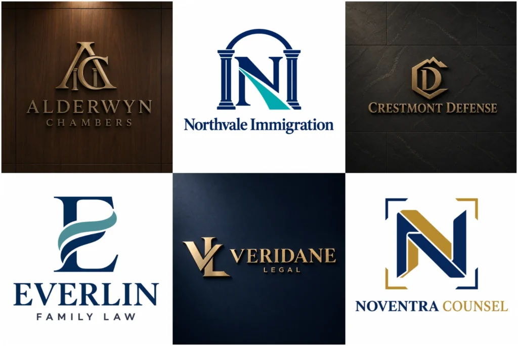
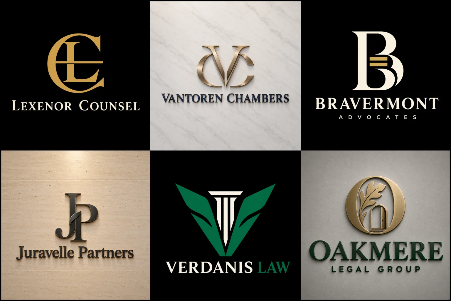
This portfolio presents a range of original legal-brand concepts, from restrained wordmarks and partner initials to structured emblems and flexible symbol-and-name systems. Each piece is shown to demonstrate thoughtful composition, legible typography, balanced spacing, and professional execution.
The collection also considers practical use across websites, office signs, business cards, letterheads, social profiles, and document templates. Some designs may be conceptual work, allowing you to judge range without assuming every example represents a commissioned client project.
What Should a Legal Logo Communicate?
A legal logo needs to establish confidence without making the firm appear distant or unapproachable. The right tone depends on the practice, its clients, and the nature of its work.
A corporate law office may need a restrained, structured identity. A family law practice could benefit from a calmer and more supportive appearance. Criminal defense, personal injury, intellectual property, property law, estate planning, and mediation firms may each require a different balance of authority, energy, and accessibility.
The objective is not simply to make the business look “legal.” It is to express the specific qualities that help clients understand the firm, such as experience, discretion, precision, stability, or modern thinking.
Building the Design Around Your Practice
A strong identity begins with the firm’s positioning rather than a predetermined icon. Before choosing symbols, fonts, or colors, it helps to define who the practice serves and how it wants to be perceived.
Important considerations include:
The firm’s primary practice areas
Whether it serves individuals, businesses, or both
The number and length of partner names
Local, national, or international market positioning
Traditional, modern, premium, or approachable brand character
The places where the logo will appear
Existing recognition that may need to be preserved
These details help prevent a mismatch. An identity designed for a large commercial practice may feel too formal for a community-based office, while a casual visual direction could weaken the credibility of a specialist corporate firm.
Choosing a Suitable Logo Structure
Different logo structures solve different branding problems. The best option depends on the firm’s name, reputation, audience, and expected applications.
Custom monogram logos can turn partner initials into a compact, recognizable symbol. This approach is useful when the full business name is long or difficult to fit into profile pictures, favicons, and small digital spaces. However, unfamiliar initials usually need to appear with the full name until the firm has built sufficient recognition.
Custom wordmark logos place the firm’s name at the centre of the identity. Carefully selected typography, spacing, and letter proportions can make a name distinctive without relying on an icon. Wordmarks work especially well for short or established names, although very long partner-name combinations may require an alternate arrangement.
Custom emblem logos can create a formal, institutional impression by containing text and imagery within one structured mark. They may suit heritage practices, chambers, associations, or firms seeking a traditional presence. Their limitation is complexity, particularly when the logo must be displayed at a small size.
Clean minimalist logos remove unnecessary detail and support clear reproduction across print and digital media. Minimalism can make a practice look confident and current, but simplicity still requires a distinctive idea. A generic font paired with a basic scale or column is not enough to create a memorable identity.
Moving Beyond Common Legal Symbols
Scales of justice, gavels, courthouse columns, shields, and law books are immediately associated with the legal profession. They can provide clarity, but their widespread use also makes them difficult to own visually.
A familiar symbol can still work when it is redrawn around the firm’s initials, name, location, or area of expertise. It should feel like part of one coherent design rather than a stock icon placed beside the business name.
Not every practice needs an obvious legal image. Abstract forms, meaningful letter construction, architectural geometry, or a distinctive typographic detail can create a more individual identity. The concept should remain understandable and appropriate without depending on complicated explanations.
Symbols also need to reflect the firm accurately. A courthouse may suggest litigation, while a shield can imply protection or defence. Using either for an unrelated specialist service could create the wrong expectation.
Typography That Supports Credibility
Typography often carries more responsibility in a legal identity than the icon itself. It controls how serious, established, modern, or approachable the firm appears.
Serif typefaces can suggest tradition, knowledge, and permanence. Sans-serif fonts often create a cleaner and more contemporary impression. Some firms benefit from combining the two, using one for the main name and another for supporting information.
The choice should never be based on style alone. Letters must remain clear at small sizes, and similar characters should be easy to distinguish. Kerning, capitalization, line spacing, and name hierarchy are particularly important when several surnames appear together.
Decorative scripts and very thin letterforms should be used cautiously. They may look elegant at a large size but can become difficult to read on mobile screens, embroidered clothing, building directories, or small printed materials.
Selecting an Appropriate Color Direction
Navy, charcoal, black, deep green, burgundy, and muted gold are commonly associated with authority and stability. These colors can be effective, but a firm does not need to follow the same palette as every competitor.
Color should support the intended personality and create enough contrast for comfortable reading. A commercial firm may prefer a controlled neutral palette, while a modern specialist practice might use a sharper accent color. A client-facing practice dealing with sensitive personal matters may benefit from a warmer, less severe combination.
A good identity must also work in black and white. This matters for contracts, stamps, photocopies, legal documents, newspaper advertising, and situations where full-color printing is unavailable. Color can strengthen the design, but it should not be the only feature separating important elements.
Making Long Firm Names Easier to Use
Multiple surnames, professional titles, and practice descriptions can make legal identities difficult to balance. Shrinking everything into one line usually harms readability.
A better structure may place the full name across two controlled lines, create a compact initial-based symbol, or separate the legal descriptor from the primary name. The hierarchy should make it immediately clear which wording identifies the practice and which wording provides supporting information.
Terms such as “Attorneys at Law,” “Legal Consultants,” or a specialist practice area should only be included when they add useful context. Too much wording can make the mark crowded and less flexible.
Future developments should be factored into the design from the beginning. If partner names may be added or removed, the visual system should not depend on one arrangement that becomes unusable after a naming update.
Designing for Legal and Digital Applications
A logo may look impressive on a presentation board but fail in everyday use. Practical testing helps identify problems before a design becomes part of the firm’s identity.
The mark should remain recognizable across:
Website headers and mobile navigation
Email signatures and social media profiles
Business cards and stationery
Contracts, reports, and document templates
Office signs, reception walls, and directories
Presentation covers and digital advertisements
Branded folders, envelopes, and promotional materials
Fine details, narrow gaps, weak contrast, and lengthy taglines often disappear at small sizes. A flexible identity may use a primary arrangement for spacious layouts and a compact version for restricted areas while preserving the same visual character.
Originality, Trademarks, and Professional Responsibility
Original design reduces the risk of looking interchangeable with nearby practices. It also helps a firm build a visual identity connected to its own name and positioning.
Visual originality does not automatically confirm that a mark is legally available. Similar trademarks may exist in other locations, legal categories, or related services. Before registration or widespread commercial use, the business should conduct an appropriate trademark search and obtain qualified legal guidance where necessary.
Legal advertising rules can also vary by jurisdiction. Firm names, specialist claims, professional titles, and descriptive wording should be checked against the regulations that apply to the practice. A designer can control the visual presentation, but the firm remains responsible for confirming regulatory compliance.
When Is a Logo Refresh Enough?
A complete redesign is not always necessary. If the existing symbol has recognition and still represents the practice, improving typography, spacing, color, and alignment may solve the main problems.
A broader redesign may be more appropriate when the current mark is difficult to read, relies on outdated effects, closely resembles competitors, or no longer reflects the firm’s services. Changes to the business name, partnership structure, audience, or positioning can also justify a new direction.
Before choosing a direction, identify which familiar elements are worth preserving and which no longer serve the firm. Removing every familiar element without a clear reason can discard useful recognition.
Preparing a Clear Design Brief
Useful information at the beginning of a project leads to more relevant creative decisions. The brief does not need to prescribe the final symbol, but it should explain the firm clearly.
Helpful details include:
The exact business name and required spelling
Any initials or shortened name commonly used
Main legal services and preferred clients
Desired brand qualities
Competitors or visual similarities to avoid
Preferred and restricted colors
Required professional titles or descriptors
Current branding that should be retained
Important print and digital applications
LogoPixa uses this context to develop a visual direction that is clear, original, memorable, and practical for the firm’s real branding needs. Sharing honest preferences also makes it easier to distinguish necessary requirements from optional ideas.
Create an Identity That Fits Your Firm
Your logo should help prospective clients identify the practice and form an appropriate first impression. It should also give the firm a consistent foundation for its website, documents, signage, and wider communication.
Explore the portfolio to identify the directions that feel relevant to your practice, then share your business name, legal focus, audience, and preferred character with LogoPixa. These details provide a stronger starting point than choosing a symbol based only on industry convention.
Explore More Logo Options
Browse more business logo categories to explore branding options created for different types of businesses.
You may also be interested in:
Frequently Asked Questions
What makes a good logo for a law firm?
A good legal logo is distinctive, readable, appropriate for the target client, and easy to use across different formats. It should communicate the firm’s character without depending on unnecessary detail or vague symbolism.
Does a legal logo need scales of justice or a gavel?
No. These symbols provide quick industry recognition, but they are widely used and can appear generic. Typography, initials, abstract forms, or a more specific concept may create a stronger identity.
Can partner initials be used as the main symbol?
Yes. Initials can form a compact mark for social profiles, signs, stationery, and other restricted spaces. The full firm name should usually accompany the monogram where the initials alone may not be recognized.
Which colors are suitable for a legal practice?
Dark blue, charcoal, black, green, burgundy, and restrained metallic tones are common choices, but suitability depends on the firm’s audience and personality. Readability, contrast, and black-and-white performance matter more than following a traditional palette.
Should the practice area appear in the logo?
It can help when the firm specializes in one clear area, but it may become restrictive if services expand. The wording should be short, accurate, and necessary enough to justify the added visual complexity.
How should a logo handle several partner names?
The names can be arranged using controlled line breaks, typography, and hierarchy. A compact monogram may support the full name, but text should not be reduced so much that it becomes difficult to read.
Is a minimalist identity suitable for every legal business?
No. It works well for practices seeking clarity and a contemporary image, but some firms need a stronger sense of heritage or institutional authority. The style should support the firm’s actual positioning.
Can an established practice modernize its logo without losing recognition?
Often, yes. Recognizable elements such as initials, colors, or the basic symbol can be retained while typography, proportions, and spacing are refined. The extent of change should depend on the condition and relevance of the existing identity.
How can a firm check whether a logo is legally available?
A visual comparison is not enough. The business should carry out an appropriate trademark search in the relevant jurisdiction and classes, then seek qualified legal advice if registration or potential conflict requires professional assessment.
What information should I provide before the design begins?
Provide the exact firm name, practice areas, target clients, preferred brand character, color preferences, competitors to avoid, and main applications. Also identify any existing elements that must be retained.