
Medical & Healthcare Logo Design
Each concept is developed for clarity, relevance, and confident everyday use across signs, websites, uniforms, reports, and patient materials. Explore the portfolio to see how different visual directions can express care, expertise, accessibility, and professionalism without relying on tired industry clichés.

Explore Healthcare Logo Concepts
This portfolio presents a range of original medical and wellness logo concepts, from restrained wordmarks to distinctive symbols and flexible combination layouts. The work explores different moods, audiences, and applications while maintaining strong typography, balanced proportions, and usable forms.
Some pieces may be concept work created to demonstrate a design direction. Together, they show how a professionally executed identity can remain clear on a clinic sign, appointment card, mobile screen, uniform, or social profile.
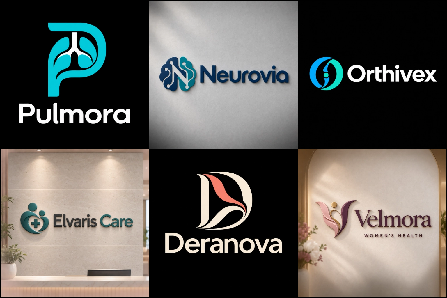
A Visual Identity That Builds Confidence
Healthcare decisions are personal. Patients often look for signs of professionalism, safety, compassion, and reliability before contacting a provider. A well-designed logo supports that first impression by presenting the organization clearly and consistently.
The identity should reflect the actual service rather than relying on a general medical appearance. A family clinic may need to feel approachable and reassuring, while a diagnostic laboratory may benefit from greater precision and structure. A mental wellness practice might use softer forms, whereas a surgical or specialist center may require a more clinical and authoritative direction.
A strong logo cannot replace the quality of care, but it can help a medical organization communicate its character more clearly.
Different Healthcare Services Need Different Identities
The healthcare industry includes many types of organizations, each with its own audience, environment, and communication needs. Using the same visual formula for every provider can produce a forgettable result.
LogoPixa can shape the design direction around businesses such as:
Hospitals, clinics, and urgent care centers
Private doctors and specialist practices
Pharmacies and pharmaceutical brands
Diagnostic laboratories and imaging centers
Telehealth platforms and healthcare applications
Physiotherapy and rehabilitation services
Mental health and counselling practices
Home healthcare and senior care providers
Medical equipment and supply companies
Wellness, nutrition, and preventive care services
Veterinary clinics and animal healthcare providers
The brand’s specialty should influence its symbols, typography, colors, and overall personality. A children’s clinic, for example, can feel friendly without becoming childish. A medical technology company can look innovative without appearing cold or overly technical.
Choosing the Right Logo Structure
The way a logo is constructed affects where it can be used and how quickly people understand it.
A combined brand mark connects the business name with a symbol. This is useful for new clinics and healthcare companies because patients can see both elements together. However, a long practice name can make the full layout too wide, so a compact secondary arrangement may also be necessary.
A graphic brand mark uses a recognizable symbol that can work well for application icons, profile images, uniforms, and small signs. The image must be distinctive and relevant, since an unclear symbol may confuse patients or suggest the wrong medical specialty.
For organizations with a clear name and broad service range, a carefully designed wordmark may be more appropriate than an industry icon. The right choice depends on recognition needs, available space, and how the identity will be used.
Familiar Medical Symbols Without a Generic Result
Crosses, hearts, pulses, shields, leaves, hands, stethoscopes, and human figures are widely associated with care. They offer quick category recognition, but they are also heavily used. Simply placing one of these symbols beside a name rarely creates a distinctive identity.
A stronger concept may reshape a familiar object, combine two relevant ideas, or use negative space to add meaning. A rehabilitation center might connect movement with recovery, while a telemedicine platform could combine communication and care in a simple digital form.
Not every medical business needs an obvious healthcare symbol. Abstract forms, meaningful initials, or custom typography may provide a more original solution when the business name already communicates the service.
Symbols must also avoid creating false expectations. A logo should not imply emergency treatment, hospital-level care, or a particular specialty when the organization does not provide it.
Simplicity Has Benefits and Limits
A clean and simple logo can communicate calmness, organization, and professionalism. It is particularly useful for websites, appointment systems, mobile applications, prescription packaging, and other spaces where clarity matters.
Simplicity does not mean removing every detail. If a concept becomes too basic, it can resemble existing healthcare brands or lose its intended meaning. The design still needs a recognizable idea, considered proportions, and a clear connection to the organization.
Fine details should also be tested carefully. A clean line-based logo can feel elegant and reassuring, especially for wellness, therapy, or specialist practices. However, very thin strokes may disappear on embroidery, small labels, or distant signage. Line weight must be controlled according to practical use.
Colors That Support the Right Message
Blue is commonly connected with trust, calmness, and clinical professionalism. Green can suggest health, renewal, and wellbeing. Softer neutrals may create warmth, while brighter accents can make digital healthcare brands feel more accessible and energetic.
These associations are useful, but they should not dictate every design. A brand can use an unexpected palette if it suits the service and remains appropriate for its audience.
Important color decisions include:
How the palette appears on screens and printed materials
Whether text and symbols have enough contrast
How the logo works in one color
Whether competitors use very similar combinations
How patients may interpret the overall mood
Whether the colors suit the physical environment
Too many colors can make a healthcare identity feel busy. A focused palette is usually easier to apply consistently across reception areas, forms, uniforms, packaging, websites, and social media.
Typography Must Stay Clear
Healthcare branding often appears in situations where people need information quickly. The business name should therefore remain readable at small sizes, from a reasonable distance, and across different formats.
Clean sans-serif typefaces can feel modern and accessible. Serif lettering may add authority or a more established character. Rounded forms can make a family, therapy, or wellness brand feel approachable. The decision should be based on the organization’s personality rather than a passing design trend.
Letter spacing, weight, capitalization, and name length all affect readability. Decorative fonts should be used carefully because intricate shapes can become unclear on exterior signs, mobile screens, or printed patient materials.
A tagline should only be included when it adds useful context. If it becomes unreadable at normal viewing sizes, it may be better treated as supporting brand text rather than a permanent part of the main logo.
Designed for Real Healthcare Touchpoints
A logo may look attractive in a presentation but still fail when placed into everyday use. Medical identities need to perform across both large and small applications.
Common placements include:
Building signs and reception walls
Websites and patient portals
Mobile application icons
Appointment cards and forms
Medical reports and letterheads
Staff uniforms and identification badges
Medicine or product packaging
Vehicle graphics and directional signs
Social media profiles
Email signatures and digital documents
The design should remain recognizable in full color, black, white, and simplified form. It also needs enough visual strength to work on a large sign without becoming too detailed for a small screen.
Vertical, horizontal, and compact arrangements may be useful when the brand appears in spaces with different proportions. These arrangements should feel connected rather than looking like unrelated logos.
Balancing Professionalism With Human Care
An identity that feels highly clinical may communicate expertise but seem distant. A design that is too soft may appear welcoming but lack authority. The goal is to find the right balance for the service and audience.
Shape language can help create that balance. Rounded corners and open forms often feel more approachable, while controlled geometry can suggest precision and stability. Typography can reinforce either direction without making the logo severe or overly casual.
Patient demographics matter as well. A pediatric practice, senior care provider, cosmetic clinic, and medical research company should not communicate in exactly the same way. Understanding who will see the identity helps determine the appropriate level of warmth, energy, and formality.
What to Prepare Before the Design Begins
Clear information helps the designer make decisions based on the business rather than assumptions. Before starting, consider providing:
The exact business name and correct capitalization
Any tagline that genuinely needs to appear
The medical specialty or primary service
The people the organization serves
The qualities the identity should communicate
Preferred and unwanted colors
Symbols that should be considered or avoided
The main places where the logo will appear
Relevant competitors or visually similar organizations
Existing branding that must be retained or replaced
Reference designs can help explain personal preferences, but they should guide the visual direction rather than become material to copy.
Developing an Original and Practical Identity
LogoPixa approaches healthcare branding by considering the organization’s specialty, audience, personality, and everyday applications. The aim is to develop a clear concept that feels connected to the service and remains useful beyond a single mockup.
A successful direction should be easy to recognize, appropriate for the people it serves, and flexible enough for future use. It should also avoid unnecessary complexity, weak symbolism, confusing letterforms, and visual similarities that make the brand difficult to distinguish.
If you are preparing to launch or refresh a healthcare brand, share the business details, preferred direction, and intended applications. This creates a stronger foundation for a focused and relevant logo concept.
Explore More Logo Options
Browse more industry-specific logos to explore branding options created for different types of businesses.
You may also be interested in:
Frequently Asked Questions
What makes a good medical logo?
A good medical logo is clear, trustworthy, relevant, and easy to use. Its visual style should match the organization’s specialty and audience while remaining readable across signs, websites, uniforms, and printed materials.
Does a healthcare logo need a cross or stethoscope?
No. Familiar symbols can communicate the industry quickly, but they are not required. Custom typography, initials, abstract forms, or a more specific symbol may create a stronger connection to the individual organization.
Which colors work best for healthcare branding?
Blue, green, teal, and neutral tones are common because they can feel calm and professional. The best palette depends on the service, audience, competitors, environment, and level of contrast needed for practical use.
Can a medical logo look warm and friendly?
Yes. Rounded shapes, open compositions, balanced colors, and approachable typography can add warmth without making the identity look informal. The appropriate level of friendliness depends on the type of care being provided.
Should a clinic use an icon and business name together?
Using both can help a newer organization connect its name with a recognizable symbol. However, some practices are better served by a distinctive wordmark. The choice should be based on the name, available space, and intended applications.
How can a logo represent more than one medical service?
A broader concept is usually more effective than combining several literal medical objects. An adaptable symbol can express ideas such as care, connection, progress, protection, or wellbeing without limiting the brand to one department.
Will a detailed logo work on uniforms and small screens?
Not always. Thin lines, small text, and intricate shapes can lose clarity when embroidered or reduced. The design should be tested at realistic sizes, and a simplified version may be needed for compact applications.
What information should I provide before ordering?
Provide the exact business name, specialty, target audience, desired brand personality, preferred colors, unwanted symbols, and main logo applications. Mention any existing visual elements that need to remain consistent.
Should a pharmacy and a wellness brand use the same visual style?
Usually not. A pharmacy may require stronger clinical clarity and product visibility, while a wellness brand may use a softer or more lifestyle-focused direction. Each identity should reflect its actual service and customer expectations.
Can the logo be used for both print and digital branding?
A well-planned identity can be designed for both. The composition, contrast, line weight, and readability should be considered for websites, social profiles, signage, reports, stationery, packaging, and other expected uses.