
3D Logo Design That Gives Your Brand Depth
The goal is not simply to add effects, but to create a distinctive mark that still feels clear and professional. Explore the portfolio below to see different approaches, finishes, and visual directions across practical brand applications.
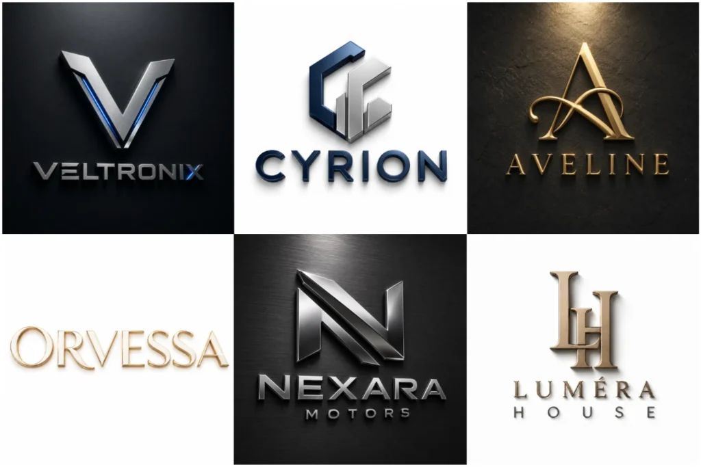
Explore Our 3D Logo Portfolio
Our portfolio shows a range of three-dimensional logo concepts with different forms, materials, lighting styles, and brand personalities. Each piece is created to demonstrate original thinking, balanced composition, and careful execution.
Some designs are presented as realistic mockups to show how a logo could appear on walls, packaging, signage, or digital branding. This makes it easier to compare styles and understand how a concept may work in practical brand settings.
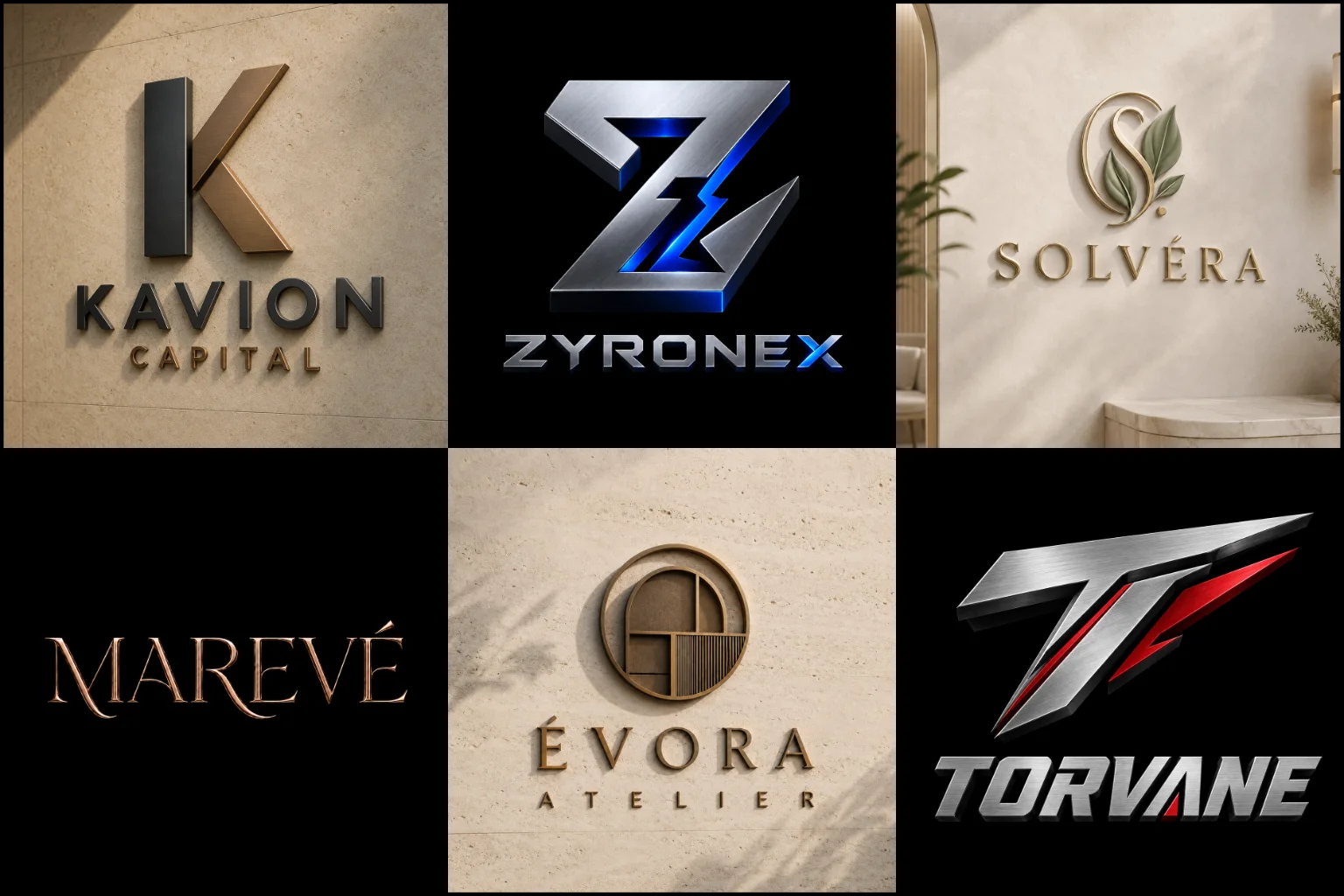
What Makes a 3D Logo Different?
A three-dimensional logo uses depth, perspective, lighting, shadows, texture, or dimensional forms to create a stronger sense of physical presence. Instead of appearing completely flat, the design can look raised, carved, embossed, metallic, illuminated, layered, or constructed from realistic materials.
The dimensional effect should support the identity rather than become the identity itself. A strong concept still needs recognizable shapes, appropriate typography, balanced proportions, and a clear relationship with the brand.
Adding bevels, gradients, reflections, or shadows to an ordinary symbol does not automatically make it effective. The underlying logo should remain visually strong before realistic effects are introduced.
When Does a Three-Dimensional Style Work Well?
This approach can be particularly useful when a brand wants to communicate depth, strength, precision, technology, premium quality, or physical presence.
It can work naturally for businesses in industries such as architecture, real estate, automotive, construction, gaming, technology, engineering, entertainment, manufacturing, luxury products, and creative services.
The style can also support brands that regularly use signage, displays, product packaging, presentation graphics, videos, social media visuals, or promotional materials where dimensional presentation can attract attention.
Industry alone should not determine the style. Brand personality matters just as much. A highly minimal wellness company, for example, may benefit more from a restrained flat identity than a detailed metallic treatment.
When a 3D Logo May Not Be the Right Choice
More visual depth does not always mean a better identity.
Detailed lighting, textures, reflections, and material effects can lose clarity when a logo becomes very small. They may also reproduce differently across printing methods, embroidery, stamps, engraving, monochrome documents, and other restricted applications.
Businesses that need an extremely simple or understated identity may be better served by a flat visual system.
That is why practical usability should come before decorative effects. A dimensional presentation works best when the core mark remains recognizable without depending entirely on realistic rendering.
The Foundation Comes Before the Effects
The strongest dimensional identities begin with a solid underlying concept.
Shape, typography, spacing, proportions, and negative space need to work together before materials or lighting are introduced. This helps prevent the design from becoming visually impressive at first glance but difficult to recognize later.
A professional approach also considers how the symbol relates to the company name. The icon should not overpower the wordmark, while typography should remain readable against dimensional surfaces and lighting effects.
The result should feel like one coherent identity rather than a flat logo with unrelated effects added afterward.
Different Visual Directions for a 3D Identity
There is no single appearance that every dimensional logo should follow. The right treatment depends on the character of the brand and where the identity will appear.
A metallic finish can create a refined or industrial feel through materials such as brushed metal, chrome, steel, gold, or bronze.
An embossed or engraved treatment can make the design appear pressed into or raised from paper, leather, stone, wood, or another surface.
An architectural style can use structured geometry, depth, and controlled perspective to create a strong physical presence.
A soft dimensional treatment may rely on subtle depth and gentle shadows instead of dramatic reflections or heavy textures.
For technology and entertainment brands, more futuristic approaches can use illuminated edges, layered geometry, glass-like surfaces, or controlled light effects.
Illuminated edges, layered forms, and controlled lighting can work particularly well in logos for gaming brands, creating energy and depth while preserving a clear, recognizable silhouette.
The best direction is the one that fits the brand rather than the effect that looks most dramatic.
Choosing the Right Logo Structure
A dimensional treatment can be built around different types of logo structures.
A conceptual logo mark can work particularly well in three dimensions because geometric or conceptual forms can be developed with layers, depth, and perspective.
A brand initials logo can turn initials into a compact dimensional symbol while keeping the brand recognizable.
A mascot brand identity can also work especially well in three dimensions when a brand uses a character-based identity. Depth, lighting, expression, and dimensional rendering can give the mascot more personality while keeping its main silhouette recognizable.
Dimensional mascots can therefore work effectively in logos for sports teams, adding visual impact to uniforms, merchandise, social content, venue graphics, and promotional materials.
A combined brand mark gives more flexibility by pairing a symbol with the company name, allowing both elements to be presented together or adapted for different branding situations.
The structure should be chosen based on recognition, readability, and brand needs rather than simply because it offers more opportunities for visual effects.
3D Logo Versus a 3D Mockup
These two terms are often confused.
A dimensional logo is an identity created with visual depth as part of its design or presentation. A 3D mockup, on the other hand, places a logo onto a realistic surface or environment to demonstrate how it might look in use.
For example, a logo displayed as polished metal letters on an office wall may be a mockup presentation. The original identity underneath may still be a simple flat vector mark.
This distinction matters when reviewing concepts. A realistic presentation should not hide weaknesses in the underlying logo. Buyers should evaluate the shape, typography, proportions, and recognizability of the identity as well as the quality of the mockup.
Keeping the Logo Clear and Recognizable
Depth should strengthen visual hierarchy rather than create unnecessary complexity.
Too many highlights, textures, shadows, outlines, and material effects can compete with the main symbol. This is especially problematic when the logo needs to appear at smaller sizes.
Contrast also matters. Letterforms and symbols should remain clearly separated from the background, even when realistic lighting is involved.
Clear silhouettes and strong contrast are particularly important in logos for trucking companies, since the identity must remain readable on vehicles, uniforms, paperwork, signage, and digital platforms.
Perspective should be controlled as well. Extreme viewing angles may create impressive artwork, but they can distort letters and make the brand name harder to read.
A successful design balances visual impact with immediate recognition.
Using 3D Branding Across Digital Media
Digital platforms give dimensional identities plenty of room to work.
hese digital applications can also strengthen logos for DJs, where the identity may appear on event screens, promotional videos, social graphics, posters, and performance visuals.
They can create strong visual presence on websites, social media graphics, promotional banners, video introductions, presentations, digital advertisements, profile graphics, and branded content.
Larger digital formats can preserve details such as lighting, texture, material finishes, and subtle shadows that may be difficult to reproduce at very small sizes.
Even online, adaptability remains important. A highly detailed version that works in a website header may need a simpler presentation for a small profile image or favicon.
Planning these situations early helps create a more flexible identity system.
Using the Logo in Physical Branding
Three-dimensional presentation can also help buyers visualize a brand in physical environments.
Dimensional presentation can be especially effective in logos for construction companies, which often need a strong presence on site boards, vehicles, equipment, office walls, and exterior signage.
Common applications can include storefront signs, reception walls, office displays, exhibition stands, packaging, product branding, printed promotional material, and environmental graphics.
A realistic mockup is useful for visualizing these situations, but production requirements may differ significantly from screen presentation.
Materials, fabrication methods, printing limitations, surface finishes, lighting, and viewing distance can all affect the final appearance. Always consider the real application before relying on fine details or complex effects.
Color, Material, and Lighting Choices
Color plays a major role in how dimensional branding is perceived.
Dark backgrounds can provide strong contrast for chrome, silver, gold, illuminated, or brightly colored elements. Lighter backgrounds can create a cleaner presentation for embossed, matte, soft-metal, or minimal dimensional effects.
Material choices also communicate different personalities. Polished metal can feel precise and premium, while stone may feel established and substantial. Glass-like surfaces can appear modern, while matte materials usually create a quieter and more restrained result.
Lighting should reveal the structure of the logo rather than distract from it. Highlights and shadows need to make the form easier to understand, not harder to read.
What to Consider Before Ordering
Before choosing a visual direction, think about where your logo will actually be used.
Consider your website, social profiles, packaging, signage, printed documents, advertising, uniforms, merchandise, videos, and any industry-specific applications.
It also helps to decide whether you prefer a subtle dimensional appearance or a more realistic presentation with visible materials and lighting.
If you already have a logo, determine whether you want the existing identity presented in a dimensional style or whether the underlying concept itself needs improvement.
Sharing clear references can help communicate your visual preferences, but they should be used for direction rather than copied. An original identity should reflect your own brand rather than reproduce another company’s design.
Building a Practical Visual Identity with LogoPixa
LogoPixa approaches dimensional branding as more than a visual effect. The focus is on creating an identity that has a clear concept first, then developing the depth, materials, perspective, and presentation around that foundation.
The design direction can be shaped by your company name, industry, audience, brand personality, and intended applications.
This makes it easier to create a visual identity that feels distinctive while remaining practical enough to represent the business across different branding situations.
Explore More Logo Options
Discover other visual logo styles and find the right visual direction for your brand.
Frequently Asked Questions
What is a 3D logo?
A 3D logo is a logo presented with visual depth through elements such as perspective, lighting, shadows, layers, bevels, textures, or realistic materials. The effect can range from subtle dimensional depth to a highly realistic physical appearance.
Is a three-dimensional logo suitable for every business?
No. It works well for many brands, but businesses that require a highly minimal, understated, or extremely flexible identity may benefit more from a simpler flat approach. The right choice depends on brand personality and intended use.
What is the difference between a 3D logo and a logo mockup?
A 3D logo uses dimensional characteristics as part of its appearance. A mockup shows a logo on a realistic surface or in a realistic environment, such as signage, packaging, or a wall. A flat logo can also be displayed through a 3D mockup.
Can a 3D logo be used on a website?
Yes. Dimensional logos can work well on websites, banners, presentations, social media graphics, and other digital applications. The design should still remain readable at the sizes where it will actually appear.
Will detailed 3D effects work at small sizes?
Not always. Fine textures, highlights, shadows, and small dimensional details can disappear when the logo is reduced. A strong core shape and clear typography help preserve recognition.
Can my existing logo be turned into a 3D style?
Often, yes. An existing logo can be presented with depth, realistic materials, embossing, lighting, or other dimensional treatments. However, weaknesses in the original logo may become more noticeable, so the base design should be evaluated first.
Should I choose a metallic 3D logo?
Metallic finishes can work well for luxury, automotive, property, technology, engineering, and other brands where a polished or substantial appearance fits the identity. They should not be chosen only because they look premium in a mockup.
Can a three-dimensional logo be printed?
It can be printed, but complex effects may reproduce differently depending on the printing method, material, size, and number of available colors. A simpler version may be more practical for certain physical applications.
What information should I provide before starting?
Useful information includes your company name, industry, target audience, preferred style, color direction, intended applications, and any visual references that explain the type of appearance you like or want to avoid.
Should the logo still work without 3D effects?
Ideally, the underlying identity should remain clear and recognizable even when realistic lighting, textures, or dimensional presentation are removed. This gives the brand more flexibility across different digital and physical uses.