
Custom Emblem Logo Design for Strong Brands
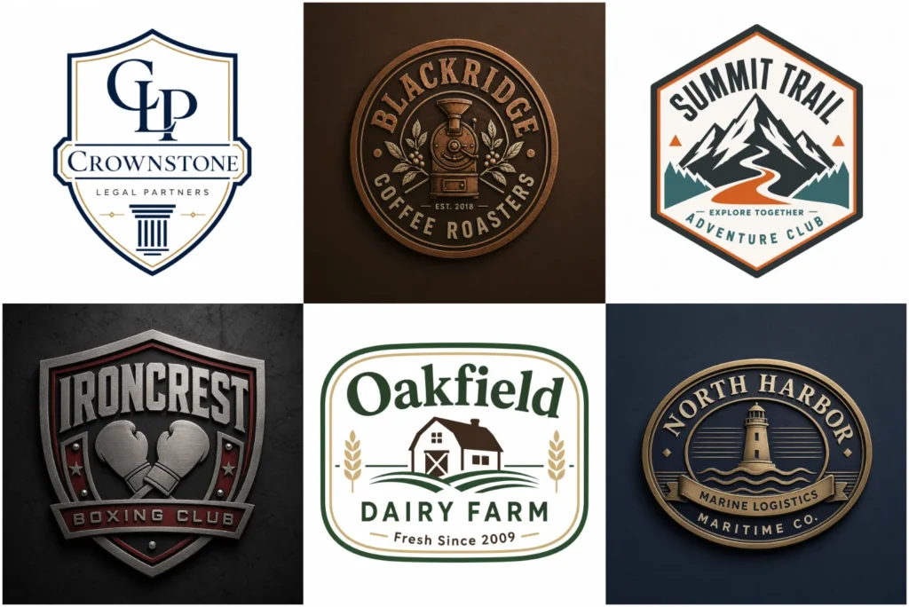
Explore Our Emblem Logo Portfolio
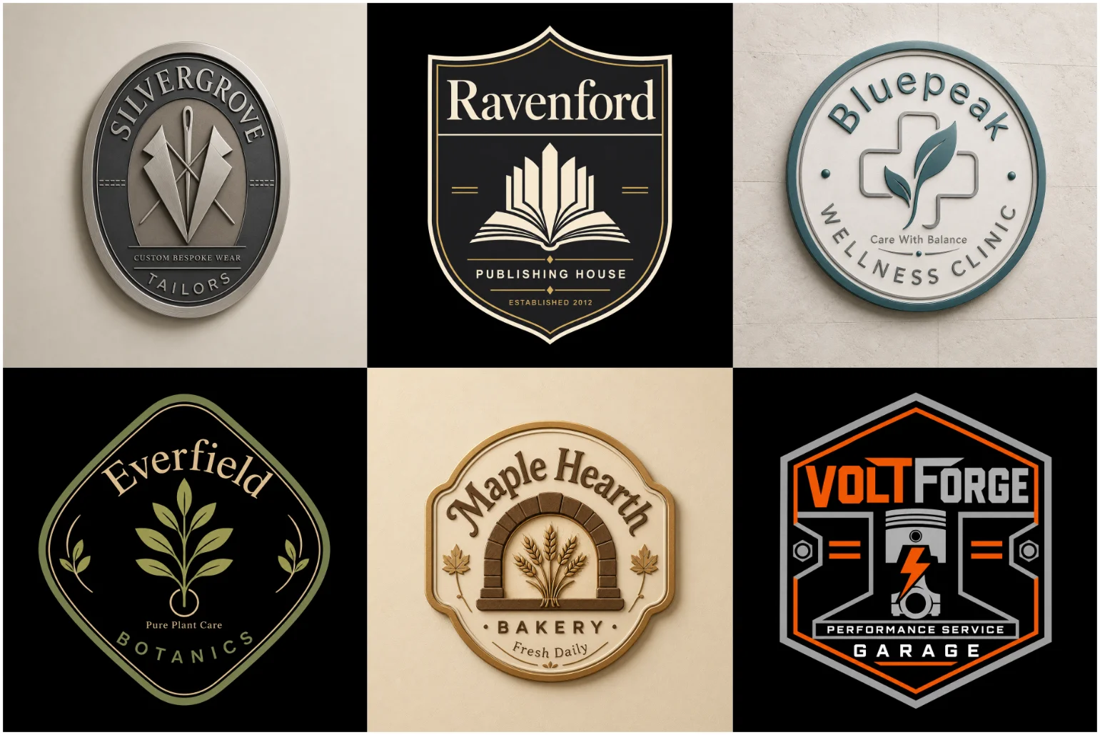
Explore a portfolio where every emblem is built around a clear brand identity, not unnecessary decoration. From my experience, strong results come from balanced typography, controlled spacing, and a recognisable structure that remains clear across packaging, clothing, and digital use. Each badge, crest, or shield is refined for readability, scalable production, and practical applications such as printing, embroidery, and signage. The collection includes modern, vintage, and minimal directions, with every concept shaped to feel original, professional, and relevant to real business needs.
What Is an Emblem Logo?
An emblem logo turns a name, symbol, and supporting details into one connected mark. Instead of separating its parts, it contains them within a clear shape, giving the identity a complete, official, and dependable presence.
In practice, I treat the outer frame as structure, not decoration. It controls spacing, protects readability, and helps lettering, icons, dates, or a slogan appear as one balanced unit across labels, uniforms, signs, and merchandise.
Traditional versions often use shields, seals, ribbons, serif typefaces, and decorative borders, while modern emblems favor simple geometry and fewer elements. Whether detailed or minimal, a design succeeds only when its proportions stay clear and its central concept remains instantly recognizable.
A strong emblem is not automatically detailed. Removing excessive artwork can improve mobile use, embroidery, stamping, and small sizes. The real test is whether its silhouette, text, and meaning survive without losing character or recognition.
From breweries and gyms to outdoor brands, this format communicates membership, heritage, quality, or authority efficiently. It also works naturally in barber shop branding, where disciplined typography and a compact structure can express tradition and craftsmanship.
Why Businesses Choose Emblem Logos
Businesses often choose emblem logos because a compact composition creates trust, while the enclosed shape keeps every visual element organised. In client work, I have seen this structure make established companies appear authoritative and dependable.
Unlike marks, emblems give a company one complete identity that stays joined across signs, uniforms, packaging, and social media. Their bold frame helps customers recognise the business, even when the logo appears at smaller sizes.
Balance offers advantage: symbols, initials, colours, and lettering can represent history, values, and personality without feeling scattered. When designed with suitable detail, an emblem supports premium positioning while remaining memorable across different industries and platforms.
Traditional Emblem Styles
Traditional emblems remain effective because restraint, not decoration, gives them authority. In my experience, heritage-inspired frames, classic lettering, and controlled banners help established institutions communicate continuity without making the identity feel dated or overly ceremonial.
Rather than copying historic crests, strong layouts simplify their structure for modern use. Well-designed logos for schools, universities, and public institutions use meaningful symbolism, typography, and balanced spacing to remain clear across signage, documents, and uniforms.
The most successful approach preserves authenticity while improving usability. A distinctive seal, meaningful colour palette, balanced line thickness, and careful reproduction standards allow the emblem to maintain prestige across screens, embroidery, packaging, and large-format applications.
Modern Emblem Styles
Modern emblems succeed when cleaner geometry replaces unnecessary decoration. A Modern Logo approach can be a good fit when the identity needs cleaner forms, contemporary typography, and a more current visual appearance. I often develop a simplified circle, combine confident letterforms with controlled spacing, and test the result across websites, packaging, signage, and compact profile images before approval.
Rather than imitate historic badges, contemporary systems favour geometric forms, restrained tones, and flexible variation. This approach keeps the emblem visible, distinctive, and appropriate across products, favicons, advertisements, uniforms, and applications without weakening its identity.
Vintage And Retro Badge Designs
Vintage badge identities feel trustworthy when engraved textures, curved borders, and handmade character are handled with restraint. This approach works especially well in cafe branding, where an emblem can add warmth and a sense of history without looking careless or forced.
The best retro systems preserve detail but simplify reproduction. For restaurants, packaging, and signage, craftsmanship must support clarity. Often, lettering, balanced design, and a structured layout create a memorable, professional identity with lasting charm today.
Minimal Emblems For Digital Brands
Minimal emblems succeed when every feature earns its place. Brands that need an even simpler identity can explore a Minimalist Logo approach built around reduced detail, clean spacing, and strong recognition. I usually test a compact icon against small screens, checking whether space, typeface, and single-colour contrast keep the identity clear for digital startups and established platforms.
A version works better than detailed artwork when it stays adapted, easy to read, and clear in black. Balanced shapes, full-colour choices, and organised files help an emblem perform across apps, websites, advertisements, and graphics.
Typography And Lettering
In emblem work, typography controls recognition before imagery does. I shape characters for balanced spacing, choose a sans-serif when clarity matters, and keep every letter readable so the appearance remains confident across packaging and signage.
A strong type system is rarely decorative alone. Its style must suit the audience, while adjusted words, weight, and rhythm support the emblem’s form. From experience, small refinements improve authority without making lettering feel forced.
Symbols And Brand Meaning
A symbol becomes valuable when its meaning reflects the industry, not decoration alone. I often begin with audience research, then shape a clear connection between the emblem, service, and the values customers should recognise immediately.
Effective emblems avoid obvious imagery by drawing from nature, local history, or cultural detail. An inspired symbol feels stronger when its structure remains simple, distinctive, and relevant across packaging, signage, uniforms, and digital platforms today.
Shapes Used In Emblem Designs
Shape determines how an emblem feels before viewers read its name. A Geometric Logo approach can work particularly well when circles, angles, symmetry, and structured forms play an important role in the identity. I often use circular forms to express community and unity, while Angular structures communicate strength, authority, and practical protection across demanding applications and industries.
A successful outline must also support reproduction. Rounded geometry may feel friendly, whereas sharper boundaries serve Security or Construction identities. My process tests each form at large and compact sizes before final approval in practice.
Colours That Support Your Brand
Colour choices shape recognition before viewers study detail. I usually pair blue with trust, use gold for professionalism, and reserve Red for energetic emphasis, ensuring every tone supports the emblem’s intended audience and market position.
Practical testing matters because colours behave differently across screens, fabric, print, and surfaces. A white option may protect clarity on Dark settings, while simplified palettes match varied materials and reproduce accurately without weakening visual consistency.
Industries That Benefit From Emblems
Emblems suit trade groups, fitness clubs, and automotive services because a contained mark communicates authority quickly. The same sturdy structure makes them effective as logos for trucking companies, especially across vehicle graphics, uniforms, and signage where recognition must be immediate.
Emblem structures are especially effective in logos for sports teams and streetwear labels because they adapt naturally to merchandise, uniforms, and signage. A custom system keeps the main identity consistent while allowing simplified versions for screens, patches, packaging, and promotional use.
Explore Other Logo Design Styles
Not every identity needs an emblem. A Wordmark keeps the focus on naming, while a Lettermark shortens complex names. Pictorial and Abstract approaches build recognition through a memorable image and clear symbolic thinking.
Brands seeking more personality may prefer a Mascot, while a Combination logo uses text and imagery together. The best choice matches practical needs, supports long-term ideas, and creates a unique, flexible alternative to badge-style emblems.
Emblems For Clothing And Merchandise
Clothing emblems require practical planning because fine details can blur on fabric. I prepare simplified versions for T-shirts, jackets, caps, and bags, leaving controlled gaps so stitching remains clear and the identity retains its character.
Production requirements change between embroidery, transfers, and screen printing. Small adjustments, limited colour, and prepared files help the emblem reproduce consistently, while a full merchandise package keeps every application useful, recognisable, and properly aligned.
Making The Logo Scalable
A scalable emblem needs Clean geometry, controlled lines, and intentional spaces. When the mark is displayed on a roadside sign, tiny pictures, or packaging, every part should remain readable without appearing crowded or losing its identity.
Scaling becomes difficult when detail is excessive. I create a limited version that can fit small surfaces, simplify rearranging where necessary, and prevent essential details from disappearing while helping the identity compete and look impressive.
Custom Design Vs Ready-Made Templates
A custom identity grows with the business because its direction begins with research, not recycled templates. It considers the existing market, introduces a new viewpoint, and expands through specific applications rather than offering a merely quick visual fix.
Ready-made options may use familiar stars, generic shapes, or repeated layouts across many locations. A unique template can still be modified, but truly customised work avoids relying on ready-made structures and protects long-term originality.
Our Logo Design Process
We begin by collecting information, studying competitors, and identifying the preferred visual direction. Early learning shapes multiple compositions, while unnecessary symbolism is avoided so the overall concept remains relevant to the audience and the brand’s future.
Next, we refine proportion, colour, and placement through focused feedback. Each creative decision receives careful attention because proportion can influence recognition, with forms constructed and modified as needed. Once the strongest option is approved, production files are prepared.
What You Receive
The final package includes EPS, SVG, PDF, AI, JPG, and PNG files for print, digital editing, and online sharing. These formats follow a professional standard, with practical variations for different applications.
You also receive a transparent-background version and artwork specially prepared for your website or presentation cover. This supports both Common and common production needs, including certificates, packaging, uniforms, and vehicles.
Why Choose LogoPixa?
Every customer receives a clearly chosen design strategy, direct communication, and practical guidance. Our work stays useful because we consider business expectations, real application limits, and the purpose behind each project.
We use feedback to refine the selected route while keeping the central goal clear. As the identity grows, thoughtful decisions protect a well-designed system instead of introducing recycled ideas that weaken the original sense of the company.
Start Your Custom Logo Project
Share your business information, visual examples, and preferred references. Tell us what you like, what you dislike, and whether the emblem needs a slogan or tagline, allowing the initial direction to support confident brand building.
Include practical details such as your location, audience, product, and intended uses. Clear input helps us understand your speciality, recommend a suitable visual approach, and explain how the mark can work easily across different places.
Custom Emblem Logo Design For Strong Brands
Build an identity that feels professionally made and supports a growing business. A successful emblem combines visual authority with flexibility, whether it represents a family enterprise, government department, Government programme, or modern commercial organisation.
That may include a restaurant, food label, gaming club, adventure centres, or sports teams. Strong emblem designs should balance tradition, work widely, feel current rather than outdated, and clarify what those visual choices mean.
The system is defined by connected elements that should not operate separately, yet may resemble a crest or official stamp.
Explore Our Emblem Logo Portfolio
Our portfolio demonstrates how one emblem format can support vintage, contemporary, and minimal identities. Each concept responds to its brief, with a deliberate selection of shapes, lettering, colours, and visual styles.
Browse the work for practical inspiration, then View how each brand solution addresses distinct goals. Rather than follow a predictable formula, every project begins with exploration, a clear reference, and purposeful visual movement.
Explore More Logo Options
Discover other logo types and find the right visual direction for your brand.
Frequently Asked Questions
What Information Should I Provide Before Starting?
Provide your business name, target audience, examples you like, your preferred style, and any tagline. Also explain what the organisation offers, where it operates, and which values should guide the emblem.
Can The Design Include A Slogan?
Yes. A short phrase, founding date, or establishment detail can be added when space allows. The slogan should remain readable and support the main identity instead of crowding the emblem.
Can You Create A Modern Emblem?
Yes. Modern emblems use clean geometry, current technology, and purposeful simplicity. We avoid a negative visual impression by balancing a major idea with realistic detail, ensuring the result works effectively across current platforms.
Are Emblem Logos Suitable For Social Media?
Yes. Simplified versions can appear in profile images, posts, and page covers. The emblem may also be displayed at smaller sizes, provided contrast and spacing are tested for mobile screens.
Can The Logo Be Used For Embroidery?
Yes. Artwork for shirts should use controlled engraving detail and adequate spacing. Embroidery becomes especially difficult when tiny details or thin strokes are included, so simplified production artwork is recommended.
Which File Formats Will I Receive?
You receive AI, EPS, SVG, PDF, PNG, and JPG formats. Editable files support future editing, while transparent artwork suits a website, social media, print, and presentation cover use.
Can You Improve My Existing Emblem?
Yes. We can assess an existing emblem’s overall structure while preserving recognisable features. Proportions, spacing, and readability can be improved, particularly when the original artwork feels outdated or performs poorly at small sizes.
How Many Colours Should The Design Use?
Most emblems work well with two or three colours. A focused palette improves consistency and makes reproduction easier. Green may communicate nature, health, or growth.
Meaning is often linked to audience expectations, while surrounding backgrounds and material context influences perception and can suggest better colour choices.
What Is The Difference Between An Emblem And A Combination Logo?
An emblem keeps its graphic and text within one integrated form. A combination logo normally has separate components that can work independently, be rearranged, or appear elsewhere without remaining identical.
Can I Request Revisions?
Yes. The available number of Revisions depends on the selected package. Clear feedback helps us make focused adjustments without changing the approved strategy or moving the design away from its intended purpose.
How Do I Choose Between A Detailed And Minimal Style?
The better direction depends on use. A basic emblem suits small digital settings, while detailed artwork may serve workshops, heritage organisations, or formal applications where texture and visual depth remain clear.
Will My Logo Be Original?
Yes. We develop artwork specifically for your organisation rather than tracing an existing template, copying stock imagery, or relying on a ready-made emblem. This protects individuality and supports consistent ow